Today the team at Flexibits launched Fantastical 2.4 for Mac, and it is a release packed full of improvements. There’s nothing revolutionary here, but the changes make an already excellent calendar app even better.
Travel Time
A long-requested feature, Fantastical now includes travel time as an option when setting event alerts. No longer do you need to provide a fixed alert time for each event – though that option still remains – because the travel time option will select an alert time that’s tailored to each event and the distance you’ll have to travel to get there, plus a few minutes of cushion.
Attachments
File attachments are now supported for events in Fantastical, with some stipulations. If you have an iCloud, Exchange, or other supported CalDAV-powered calendar, the full range of attachment powers will be at your disposal. With events on those types of calendars you can add, remove, and view attachments. If your calendar is Google-based, you still won’t be able to add or remove attachments directly from Fantastical, but you can view any attachments already present.
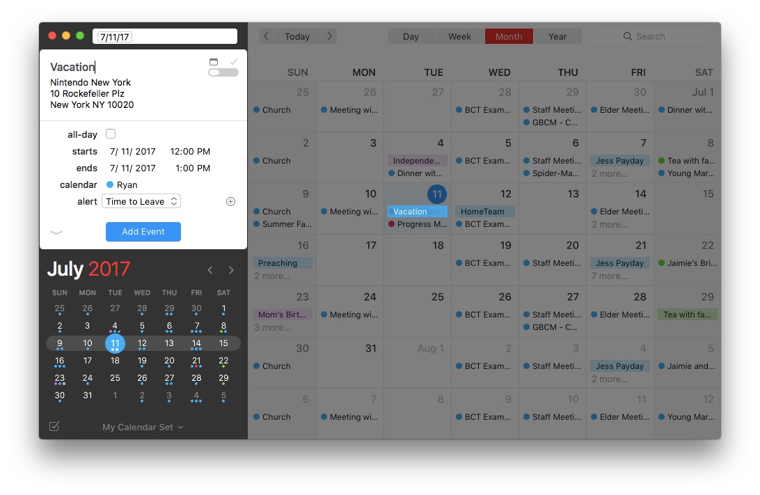
Month View
The popular month view in Fantastical has received two significant improvements. One is that if a day contains so many events that they won’t all fit, you can now click the ‘more’ button at the bottom of that day and the hidden events will pop out. When they pop out, they temporarily cover a portion of the day underneath so you can view all the day’s events in the same view. The second improvement is that you can now customize the number of weeks that are displayed at once, ranging from two on the low end to eight on the high end. This is a much-appreciated feature for tailoring the calendar to your personal needs – if you like plenty of breathing room for your events, you can display a smaller number of weeks, whereas if you want to pack a ton of information onscreen, now you can do that too.
Miscellany
Combined Duplicate Events: When you manage a variety of different calendars, including some that may be shared with family members or coworkers, your calendar app can quickly get clogged up with duplicate listings for the same event across those shared calendars. For example, if my wife and I are attending a wedding, which of us puts that on our calendar? Probably both of us, because we’ll both be attending. But Fantastical now condenses those duplicate events so they’re displayed as a single event only, reducing the visual clutter of your calendar while ensuring everyone keeps events on their own calendars as needed. For those who may not like this approach to duplicate events, you can turn it off in the app’s preferences.
Invitation Improvements: Google calendars have received three improvements in the area of invitations. Now you can add a customized message with your invitation response, and you can also view other people’s messages by hovering over their names on the invitation. Lastly, if an invitee is bringing guests with them, you can now see that information as a +1 to their response (or whatever the correct number is). With Exchange calendars there are two small updates to invitations: you can now forward invitations to other Exchange users, and you can respond to invitations without notifying the sender.
Undo and Redo: If you add, remove, or edit an event or reminder and wish to take that action back, now you can thanks to built-in support for undo and redo.
Push Updates for Facebook Events: Whenever a Facebook event has its information updated, or you first confirm that you’ll be attending a Facebook event, those changes are now pushed immediately to Fantastical.
Fantastical was already one of the most powerful, customizable calendar apps on the market, but the improvements in today’s update offer even more in the areas of power and flexibility.
Fantastical 2.4 is available on the Mac App Store and a trial version is available directly from Flexibits.