This Week's Sponsor:

Kolide

Ensure that if a device isn’t secure it can’t access your apps.  It’s Device Trust for Okta.


Search results for "gboard"

iOS 6 Wishes

I read two great articles over the past few days detailing how Apple could improve iOS by taking a page from its competitors’ book (specifically, Android and Windows Phone 7) to enhance the way apps communicate with each other, and by looking at the way webOS handles multitasking and application windows on the TouchPad. They are good articles with some clever ideas, so make sure to check them out.

I have been writing a lot about ecosystems, file sharing and inter-app communication in the past months. After the public launch of iCloud last October, I’ve argued that Apple’s cloud solution is the platform for the next decade that might as well become the “operating system” itself, although it (and, by reflection, iOS) still lacks document-oriented functionalities to facilitate the process of creating and moving documents between apps. I have also made the case for a “universal save” option for iOS apps that might take advantage of iCloud, and, fortunately, it seems Apple is listening.

Today I’d like to go on the record with a list of features and options I’d like to see in a future version of iOS. I’m not typically huge on lists or “feature request” (last one was a series of predictions for WWDC ‘11), but I believe it’s worth discussing the direction where Apple is headed with its mobile operating system and, while we’re at it, propose solutions to improve existing apps and system utilities. I’ll check back on this list after WWDC ‘12. Read more


OS X Mountain Lion: The iOS-ification Continues This Summer

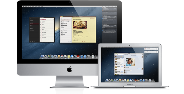
Earlier this morning Apple caught the Internet by surprise with a series of major announcements regarding the future of OS X. To put it simply, Apple officially unveiled OS X Mountain Lion, or version 10.8, the next major iteration of OS X that will become available later this year – the initial targeted release date is a vague “this summer” – through the Mac App Store. A preview of Mountain Lion was given to a few selected tech blogs, including The Verge, Macworld, Daring Fireball, and The Loop, which we are linking back to summarize the new features of Mountain Lion and reflect upon the changes previewed by Apple.

The basic theme of Mountain Lion is iOS-ification.

Apple took the best features of iOS, and in particular iOS 5, and brought them “back to the Mac”, giving them a desktop-class facelift to make applications and services suitable for the Mac environment. Mountain Lion will feature some familiar faces for iOS users: iChat has been renamed Messages and integrated with the iCloud/iMessage ecosystem from iOS; Notes and Reminders are now standalone apps; Notification Center, Game Center, AirPlay Mirroring, Share Sheets, and a new security system called GateKeeper are now part of OS X as well.

In this post we’ll provide a quick description of the new features, a Storify bundle that aggregates the most interesting links and tweets about Mountain Lion (which is available as developer beta today), and some thoughts on what Mountain Lion means for Apple and its users. Read more


The Problem With The iOS Home Screen

I’ve been thinking about the problems I have with iOS’ Home screen concept for years now, but I never fully grasped what was, exactly, that with time made using the Home screen – and thus the whole system of Springboard pages – clunky and annoying. Until it hit me earlier today, and suddenly everything started to make sense.

The iOS Home screen is conceptually broken. Not “broken” as in unusable, unstable or technically flawed. From an engineering standpoint, the iOS Home  screen works. The concept of the Home screen we interact with today is broken because the Home screen wants to be a real, physical, tangible surface while providing access to the gates of the intangible: apps. Apps are data, information, connectivity, presentation, media. Digital content isn’t tangible in the sense that it exists in a physical space, unless you count the atoms and the electrons and the bits that make using an app possible. But that’s a long stretch. The iOS Home screen is based on the concept that app icons are objects on top of it;  this has created a series of issues over the years.

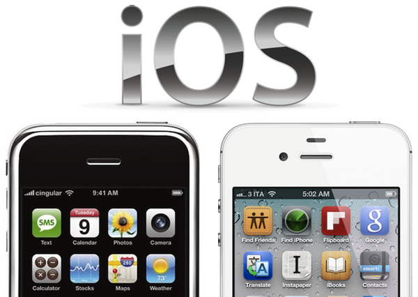
Throughout the release history of iOS, Apple had to compromise and, I believe, implement functionalities the original Home screen wasn’t meant to support. First users wanted third-party apps, Apple waited, but eventually allowed developers to create software to install on an iPhone or iPod touch. Apps are the most important addition to the operating system to date, and they kickstarted the App Store revolution we’re witnessing. In allowing third-party developers to create apps, however, Apple essentially lost control over the display of objects on the Home screen – Apple may be able to check upon the inner workings of an app, but they can’t ban apps based on lack of taste in choosing an icon. And with that, developers were free to choose Home screen icons that don’t necessarily resemble real-life objects, thus breaking the metaphor of manipulating “badges on a table”, as I like to think of it. Have you noticed how almost every built-in, Apple-made iOS app has an icon that resembles a real-life object? The only exception? The App Store and iTunes icons. Which are marketplaces for digital content.

Apple states it clearly in the iOS Human Interface Guidelines:

When virtual objects and actions in an application are metaphors for objects and actions in the real world, users quickly grasp how to use the app. The classic example of a software metaphor is the folder: People put things in folders in the real world, so they immediately understand the idea of putting files into folders on a computer.

Think of the objects and scenes you design as opportunities to communicate with users and to express the essence of your app. Don’t feel that you must strive for scrupulous accuracy. Often, an amplified or enhanced portrayal of something can seem more real, and convey more meaning, than a faithful likeness.

Portray real substances accurately. Icons that represent real objects should also look as though they are made of real materials and have real mass. Realistic icons accurately replicate the characteristics of substances such as fabric, glass, paper, and metal, and convey an object’s weight and feel.

Later, users wanted multitasking and folders. Unsurprisingly, Apple gave them implementations of these features that look like objects, in this case objects with linen. Here’s where the situation gets more complex: folders and the multitasking tray, unlike app icons, actively interact with the Home screen, they don’t just sit on top of it. The way Apple designed them, the multitasking tray resides as linen below the Home screen, and folders are tiny containers with a linen background that expands atop of the Home screen. You can see how the entire concept of Home screen as a surface starts crackling under the design weight of  these features: is the Home screen a surface that has another layer underneath? Another one above as well? What do you mean I have music controls in the multitasking tray, too?

Most recently, iOS users began asking more vigorously for a better notification system, a unified reading environment for magazines, and widgets. Apple gave them Notification Center and Newsstand, but didn’t announce anything widget-related, at least for the Home screen. The Home screen, with iOS 5, got two new additions: a new layer, Notification Center, and a new default icon, Newsstand, which isn’t really an icon but it’s a folder with a different background and shelves.

As I said, I believe choosing the right approach to delivering new functionalities and keeping the original Home screen concept got trickier for Apple over the years. What started as a black background with a few default apps turned into a customizable area of hundreds of app icons with folders and multiple pages with a series of additional layers managed by the overly abused linen texture. But the seed of the broken concept can be seen way back into iPhone OS history: think about Spotlight and Springboard page indicators. What are they – how do they fit into the metaphor of a physical surface with objects on top of it? Surfaces don’t have search boxes and indicators. Notebooks have pages, but you have to flip them and turn them and touch them. Websites have search boxes, but they’re bits and lines of code.

If you follow my theory, you can understand how things start making sense from this perspective. You can’t move multiple app icons at once not because of some technical limitation, but because, I believe, in the original Home screen vision inspired by physics apps were meant as a single entity to manipulate, one at a time. On a table, you can’t “select” multiple buttons and pretend they’re all going to move as you touch only one. That doesn’t make any sense in real life. I could expand this concept to the entire skeuomorphism Vs. interface design, but I’ll leave that for another time. My concern right now is the Home screen, the first thing you see when you unlock a device, when you close an app, the place where you manage your apps, your content. There’s a lot of weirdness and inconsistencies going on in some Apple apps and interfaces, but the Home screen is the prime example of a user interface meant for 2007 which was subsequently patched and refined and patched again to accomodate new functionalities introduced in iOS (the same happened with the Home button). You could argue that some proposed features, such as widgets, haven’t been implemented yet because of technical constraints. It’s fair argument, and I’ll take it. Yet I think that, even if complex from an implementation standpoint, it’s the concept itself that makes widgets difficult with the current Home screen.

The problem Apple needs to overcome is that the Home screen tries to be a real object while providing access to the gates of the digital world. To reinvent it, Apple needs to tear apart the whole concept and rebuild it from the ground up.


Hack Brings Auto-Correct Bar To Default iOS 5 Keyboard

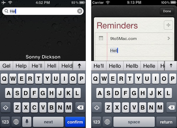
As reported by 9to5mac, it appears Apple’s iOS 5 comes with a software functionality to enable an Android-like extra keyboard row for auto-corrections and common suggestions systemwide.

Screenshots of the feature, first posted by Australian developer Sonny Dickson, seems to suggest the feature had been present in iOS 5 since the first beta seeded to developers, but have only been recently re-discovered. The images posted by Dickson show an additional row on top of the standard system keyboard on the iPhone and iPad, which in the provided examples includes suggestions to auto-complete “Hel” with common options like “He’ll”, “Help” or “Gel”. It appears that once enabled, the keyboard bar replaces iOS’ standard auto-correction popup. 9to5mac shares a method on how to enable the feature without a jailbreak.

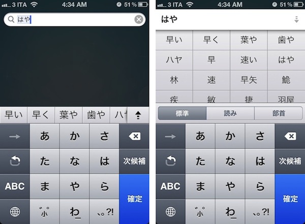
The extra keyboard row, however, isn’t completely new to iOS 5. The OS already uses a similar (if not the same) system for the Japanese Kana keyboard, with text suggestions displayed in a bar that you can scroll, and expand with the arrow icon also seen in Dickson’s screenshots. For this reason, we believe the hack simply extends the Japanese keyboard’s functionalities to other iOS 5 keyboards.

As usual with unofficial iOS 5 features discovered by developers hacking around the system, don’t expect complete and reliable functionality from the keyboard bar. As Panorama Mode has shown earlier this week, there’s a reason Apple has decided not to include a certain feature in the final version of iOS 5, and early reports from users who have activated this tweak indicate the keyboard bar may crash the iOS Springboard. Still, this is an interesting discovery that we’d be curious to try out with the new iPad split keyboard, also a new feature in iOS 5.


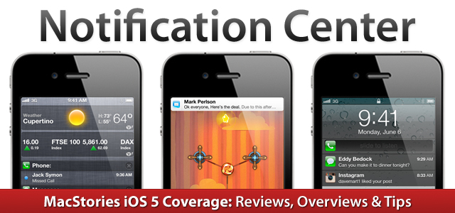
iOS 5: Notification Center


Notification Center is one of the key features of iOS 5, one that will profoundly change the way iPhone and iPad users approach the incoming stream of data and notifications on mobile devices. There is no doubt Notification Center is among the most anticipated new functionalities to land on iOS, but before we delve deeper into its advantages over the old notification system of iOS 4.x and its (very few) shortcomings, here’s a bit of background history that should better put Notification Center into context.

Looking at Notification Center now – and playing with it for at least a day – it’s clear the system is indisputably better than what we used to have on our devices in the pre-iOS 5 era. Criticized both by the tech press and average users alike, the old notifications had, really, one main problem: they became annoying with time. And by “became” I mean that they began to show their utter nature of a system built for non-connected applications as soon as the App Store turned into a platform for the always-on individual who’s constantly connected, even when he plays Angry Birds or is eating a new meal at a restaurant a friend suggested.

The old notifications were built for a different set of apps. Read more


13-inch MacBook Air Review

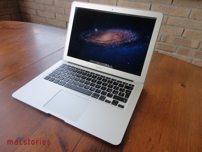
The new MacBook Air is the best Mac I’ve ever owned. This machine is shaping the future of OS X, both as an operating system and a bridge between iOS and the desktop.

In October 2008, I bought my first Mac. I had been a Windows PC user for seven years, and I was accustomed to using a PC at home for my browsing and writing needs, and at work – where my boss demanded we used PCs as he said they were more “reliable” and “fast”. After months of reading and peeking through Apple’s FAQ pages and video tutorials, I decided to buy a MacBook Pro. It was a 15-inch Unibody model with glossy screen, 4 GB of RAM, multi-touch trackpad, and Core 2 Duo processor. Back then, it was my first Mac but also the best computer I ever had. The moment I took it out of the box – and I was immediately impressed by Apple’s attention to detail in packaging and overall presentation – I knew that machine was going to change the way I “did work” on a computer. And it did. A few months later my boss fired me, and I started MacStories.

That MacBook Pro has been with me until last week.

Last year, I bought an iMac. Being the kind of Mac user that travels back and forth every day between his office (where I spend most of my day writing and managing the site) and his home, I was tired of being constantly forced to pack my MacBook Pro inside a bag, carry it around, gently place it on the passenger seat of my car, and pray that the hard drive wouldn’t die because of the terrible roads we have here in Viterbo. In spite of the fact that the MacBook Pro was the best computer I ever had, I slowly came to a point where I couldn’t stand carrying it around anymore. I decided to buy an iMac and make it my “home computer” so that I could offload media on it, backup documents, and do all those other things you’re supposed to do on “a home computer”. I bought a 21.5-inch model – again with a glossy screen – as I thought I wouldn’t ever need anything bigger than that. I was right. I’m happy with my purchase – the iMac is the finest piece of desktop hardware Apple has come up with in the past decade. Sure, my 2009 iMac doesn’t feature a Thunderbolt port and won’t get the performance boost of a Sandy Bridge-enabled machine, but it’s a trusted companion that I plan to keep for at least the next two years (that is, unless something really bad happens to the hardware, or Apple comes out with a desktop computer so revolutionary that it’ll be impossible to say no and don’t buy it).

For me, an iMac is the perfect desktop computer. It sits there, it makes my desk more elegant and classy than it could ever be, and more importantly it never failed me.

But I still had a problem with the MacBook Pro being a clumsy machine I didn’t want to carry around with me all the time. Read more


Hide Apps and Folders in Launchpad with Launchpad-Control

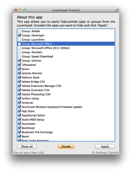
A problem I have with Launchpad (and the SpringBoard on iOS) is that while you can rearrange and group apps, sometimes you just want to hide apps or get rid of them completely. This is possible on iOS via a Jailbreak, but how can we hide unnecessary apps and folders in Launchpad on the Mac? Andreas Ganske’s Launchpad-Control is your ticket to greater control.

Launchpad-Control is super simple to use. Download it, unzip the archive, and drag the icon to your Applications folder in your Finder’s sidebar. When you open Launchpad-Control, you’re presented with a list of all the apps displayed in your Launchpad. Simply uncheck the folders or apps you don’t want to see, click Apply, then wait as your dock is killed and comes back into view. When you own open Launchpad, all of the apps you wanted to hide will no longer be active. It’s so simple to use, but fair warning: using this app comes at your own risk!

You can download Launchpad-Control from http://chaosspace.de/. Remember to donate if you find this free utility useful!

[via @ChaosCoder]


Apple Releases OS X Lion, USB Thumb Drive Coming at $69

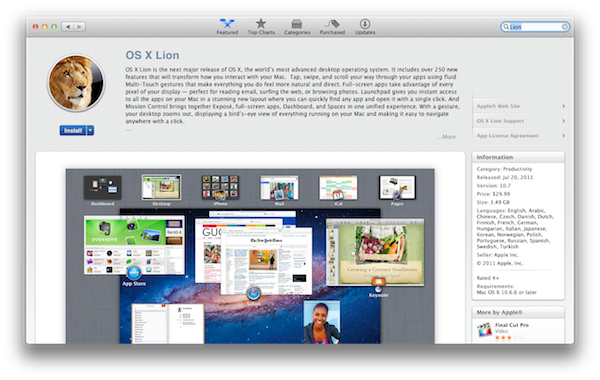
As widely expected, Apple released the next major version of OS X, Lion, on the Mac App Store today. The new OS is now available at $29.99 as digital-only download and is propagating through all the international App Stores at the moment of writing this.

You can download OS X Lion here. OS X Lion Server is available as a separate add-on here.

Lion is a major upgrade to Apple’s desktop OS that introduces over 250 new features and blends several typical desktop UI elements with design concepts and implementations first explored on the iPhone and iPad. Indeed, at the “Back to the Mac” event in October 2010, Apple described Lion as “OS X meets the iPad”. The Launchpad, for example, is a new way to install, organize and launch apps that’s heavily inspired by iOS’ Springboard, which lays out app icons in a grid against a default background with possibility of creating, moving, and deleting folders. Mission Control, a new way to manage app windows, combines the best elements of Snow Leopard’s Exposè and Spaces to create a new experience that unifies windows, desktops and full-screen apps in a single, easy to use interface. Lion brings hundreds of changes and subtle refinements, most of them delightfully added throughout the whole operating system in apps like iChat and System Preferences, others immediately visible like “All My Files” and “AirDrop”, two new Finder features to browse all documents and share files locally with others, respectively.

Lion brings new functionalities and APIs that should make users and developers alike excited to try out the new OS. For instance, developers can enable the new Automatic Termination and Resume APIs in their applications to make sure the “state” of an app is always saved upon quitting, and resumed on the next OS boot or app launch. This behavior can be reversed, but it’s enabled by default to put the emphasis on an operating system capable of saving your work and “app state” without you even thinking about it – app state means anything from open windows to position on screen and mouse cursor. Similarly, the new Auto Save when combined with Lion’s Versions will allow you to never worry about “saving” a document again, and have the OS perform continuos versioning in the background that you can access from a new Time Machine-like UI. Versions allow you to restore a document’s previous changes and edits from any point in time since you first created it.

Lion is a milestone in Apple’s desktop OS history, and we’ll have a complete review, as well as a detailed installation guide, in a few minutes on our site’s homepage.

Update: In the official press release, also embedded below, Apple confirms that Lion will be made available on a USB thumb drive at $69 for users without broadband access.

Mac OS X Lion is available as an upgrade to Mac OS X version 10.6.6 Snow Leopard® from the Mac App Store for $29.99 (US). Lion is the easiest OS X upgrade and at around 4GB, it is about the size of an HD movie from the iTunes Store®. Users who do not have broadband access at home, work or school can download Lion at Apple retail stores and later this August, Lion will be made available on a USB thumb drive through the Apple Store® (www.apple.com) for $69 (US). Mac OS X Lion Server requires Lion and is available from the Mac App Store for $49.99 (US).

Read more


iUsers Allows User Accounts on the iPad

Everyone may not have to share Macs and iOS Devices with others, but there are many of us that do. For the Mac, it’s easy and a great idea to set up User Accounts for times when someone needs guest access or has a different OS setup than what we normally use from day to day. A common complaint for iOS users is that there are no User Account options, only parental controls and such. Dave Caolo recently posted on 52 Tiger how to child proof your iPhone, which we recommend reading. He lists many ways to child-proof your iOS device but an easier way for Apple to do this would allow User Accounts on iOS devices.

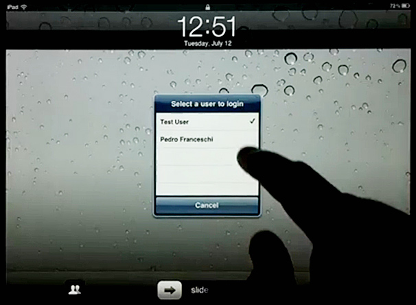
iUsers for iPad is a Cydia hack for jailbroken iPads by Pedro Franceschi that gives you something close to having OS X’s user accounts. The hack is set up inside Settings.app » Extensions » iUsers. Add a user by simply tapping “Add User”, insert a name, passcode and choose whether they have admin rights or not. This means each user can have their own set of app positioning, home screen wallpapers, settings, etc. Now this won’t save your iPad from wondering fingers or accidental App Store purchases but it does offer some deal of restriction for your personal iPad setup.

According to the video, if you want to switch accounts once they are added, simply go to the lock screen and tap the Accounts button. The iPad does a quick springboard reboot (which could bother some people) after selecting the account you want to open and it even remembers apps states for each account. Obviously this is dangerous for backups, but if you want to try something like this, it looks cool.

This isn’t Pedro’s first Cydia tweak, back in May we showed you PhySwitch, which lets you cycle through apps with the volume keys. iPad Jailbreakers, if you want to try out iUsers, add the repo: cydia.iblogeek.com to see it in your Cydia apps.

Demo video after the break. Read more