Apple Releases Ads Spotlighting the Apple Watch and iPhone 7

Apple posted three advertisements to YouTube, one featuring the Apple Watch Series 2, and two showcasing the iPhone 7.

The Apple Watch Series 2 ad, titled Go Time, highlights the Watch’s fitness features and water resistance. Backed by Sinnerman, a classic song by Nina Simone, the ad begins at dawn showing a swimmer getting ready for an early morning workout. The swimmer adjusts his goggles and pulls his hand out of the water to start a workout on the Apple Watch. Through a series of quick cuts, the ad shows other people involved in all sorts of activities, including yoga, running, jumping into a pool, biking through a rainstorm, dancing, and sprinting out of the subway. In between each activity are clips showing off features of the Watch like the Activity app, Messages, notifications, the Workouts app, and the Breathe app, which is new to watchOS 3.

Morning Ride starts with a man looking out into a thunderstorm while checking Apple’s Weather app on an iPhone 7. AC/DC’s Thunderstruck starts playing in the background as he gets ready for his morning bicycle ride despite the rain. He mounts his iPhone to the handlebars of his bike, starts a tracking app, and prepares to take off into the rain. The thirty-second spot ends with the lines ‘the water-resistant iPhone 7’ followed by ‘practically magic.’

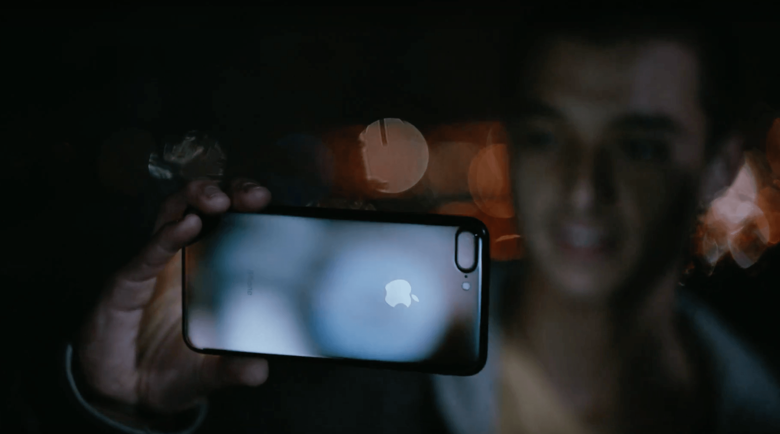
Midnight highlights the iPhone 7 Plus in Jet Black. The ad follows a young man as he skateboards around a city in the middle of the night taking photos with his iPhone. Backed by In A Black Out by Hamilton Leithauser, he takes videos as he passes through sprinklers, showing off the water resistance of the phone, captures moths flying around a single light bulb, and photographs a deer that wanders into a gas station. The ad concludes with the young man on a hill overlooking the lights of the city and ends with the tag line ‘low-light camera on iPhone 7’ followed by ‘practically magic.’

Each of the three ads does a good job focusing on the personal side of the new features of Apple Watch Series 2 and the iPhone 7. The ads don’t focus on specs; instead they emphasize how the advancements of each device expand their utility in everyday scenarios.

You can watch each of the ads after the break.

Read more


iOS 10 Actionable Notifications, the Lock Screen, and 3D Touch

Junjie, developer of Due for iOS, on changes to the Lock screen and actionable notifications in iOS 10:

To my surprise, when users upgraded their iOS 9 devices to iOS 10 this week, I started receiving feedback that they were no longer able to snooze or complete their reminders from their Lock Screen. Many thought I’ve removed the feature from Due, or that there was a bug with Due in iOS 10. Of course, neither of which is the case.
[…]
Unlike iOS 8 and iOS 9, swiping a notification from right to left in iOS 10 no longer reveals the notification actions. Instead, depending on the device that you use, it now displays either View and Clear on non-3D Touch devices, or just Clear on 3D Touch devices.
[…]
So while users can now access all four notification actions in iOS 10, they need to go through an additional, unintuitive step of pressing the View button. However, for users with 3D Touch enabled phones like the iPhones 6s and 7, pressing firmly on the notification will reveal the notification actions menu.

I was talking about this with my girlfriend earlier today, and it’s something I didn’t consider in my review. For some reason, she can’t use 3D Touch. Every time she presses on the screen, she ends up swiping or activating tap & hold accidentally. I don’t know what it is about the way she grips the phone or touches the screen – we’ve tried every setting, and she just can’t take advantage of 3D Touch in her daily iPhone usage. She ended up disabling 3D Touch altogether because it’s useless to her.

Here’s a problem, though: with iOS 10’s notification design, this means she can’t swipe on a notification and have instant access to actions. There’s an extra step:

  1. Swipe notification on the Lock screen;
  2. Tap the new ‘View’ button;
  3. Tap actions in the expanded notification.

Step 2 is what people who don’t use 3D Touch need to go through now, and it feels like a regression. I wish I had mentioned this in my story, but I didn’t think of it because I use 3D Touch and pressing notifications is second nature to me.

Perhaps Apple could improve this by automatically expanding a notification with a long swipe. Instead of revealing two buttons – View and Clear – a long swipe to the left could trigger the View button, expand a notification, and avoid the additional tap required for non-3D Touch users in iOS 10.

Permalink

The iMessage App Store and Paid Stickers

Ortwin Gentz, one of the developers behind Where To, has noticed that the majority of iMessage apps and sticker packs in the top charts seem to be paid ones. He collected some numbers from the iMessage App Store and concluded:

The distribution of business models is even more interesting. In contrast to the iOS App Store where freemium titles dominate the top-grossing charts, the overwhelming revenue in the iMessage App Store comes from paid titles. This reminds me of the early days of the App Store where In App Purchase wasn’t even available.

Probably the #1 reason for this is the lack of IAP in no-code sticker packs. These sticker packs consist only of the actual artwork and are easy to create for designers who don’t want to code.

Currently, basic sticker packs – the ones that only require dropping a bunch of image files into Xcode – can’t offer In-App Purchases. As soon as Apple offers an integrated solution to bring In-App Purchases to iMessage sticker packs without writing code, I have no doubt we’ll see the iMessage App Store follow the “Free with In-App Purchases” model of the iOS App Store.

Unless Apple is deliberately pushing artists towards paid packs because they do not want to repeat what happened with the App Store? The perception of sticker packs right now reminds me of the early days of the App Store – that good work is worth paying for.

Permalink


Game Day: Rubek

This week I’ve been playing a great-looking, tough puzzle game called Rubek from Xigma Games. As the name suggests, it’s a game involving colored cubes. Rubek is played from a three-quarters perspective, similar to Monument Valley. You guide a white cube along a path through each puzzle to the final goal by swiping on the screen to roll the cube.

The path you take is segmented into squares of different colors, including some with a small plus symbol in the center. Roll onto a colored square with a plus and the side of your cube the lands on that square changes to that color. This is where the game gets tough. You can roll any side of your cube across a dark grey square, but if you try to roll across a colored square along the path, the side of your cube that touches the square must match its color. The combination of color matching while accounting for where the six sides of your cube will land gets hard fast.

Your score is determined based on the number of moves necessary to complete the puzzle. At the end of each level you get a star rating based on how many moves it took you to finish the level. Rubek has over 75 levels in total, which add new mechanics as you progress like trigger blocks that modify the puzzle’s map when you roll over them, keeping the game fresh as you play through the levels.

https://youtu.be/BXhbP1jbSaw

Rubek’s settings let you turn off sounds and include a color-blind option that lets you adjust the color scheme used in the game. I’ve spent the last couple of months trying lots of different kinds of iOS games and found some great ones, but it’s nice to get back to a puzzle game, which is one of my favorite genres of all. Rubek is the sort of game you can play for 5 minutes or an hour depending on how much time you have, which I always appreciate, and it’s challenging without being frustrating. If you enjoy multidimensional puzzle games, Rubek is worth a try.

Rubek is available on the App Store for $1.99.


Copied 2.0

There’s a great update to Copied, my favorite clipboard manager for iOS, released on the App Store today.

I’ve been using Copied since version 1.0 and it’s a good example of an iCloud-based app that has always worked reliably (same with Ulysses). I use Copied to store bits of text and images and keep them synced across devices. Just this past week, I stored several shortcode templates in Copied for the special formatting of my iOS 10 review. I love the app.

I haven’t had time to properly test the new version yet, but based on a few minutes of playing around with it, I think it has some terrific enhancements. The widget has been redesigned for iOS 10 and it can show more clippings at once. You can now create text formatters (with templates or JavaScript) to reformat text in specific ways before pasting it. There are rules to save clippings into lists based on text matches. There’s a built-in Safari View Controller browser and both extensions (action and custom keyboard) have been rewritten with text formatter integration.

There’s a lot to try in the latest Copied, and I’m already considering some text formatter scripts for my Markdown workflows. Copied 2.0 is a free update on the App Store.

Permalink


watchOS 3: The MacStories Review

This month will mark the two-year point since the Apple Watch was first unveiled to the world, and nearly a year and a half since the product first made its way into the hands of consumers. Two years is a long time in technology in general, but particularly so for Apple. In this time the Apple Watch has gone from a product developed in secret, deep within Apple’s headquarters in Cupertino, to the most popular smartwatch in the world. Millions of units have been sold, and surveys have pegged customer sat as extremely high.

Yet despite these positives, the Apple Watch has spent its first two years of existence as a flawed product. This is not due to the Watch’s hardware, which was beautifully designed, decently powered, and boasts enough battery life to easily last a day. Rather, the Achilles’ heel of the Apple Watch has been its software.

watchOS has had problems from the start. Apple shipped its first version in an incomplete state, in which third-party applications were purportedly supported, but unable to run natively on the Watch itself. Instead, the logic of each app was executed on the connected iPhone, and the Watch was used as a dumb display for the results. This method was astoundingly slow in practice, not to mention that it rendered the Watch incapable of nearly anything beyond telling the time when disconnected from its iPhone.

It’s not surprising then, that only two months after the Watch’s release to consumers in April 2015, Apple introduced the first iteration on its operating system, watchOS 2. As I discussed in my review of watchOS 2 last year, version 2 did not significantly change any visual designs or interfaces. Rather, it was a foundational update meant to create the base of a more mature operating system, establishing important building blocks that could be iterated upon in the future.

The foundation created by watchOS 2 seems to be paying off, as this year’s major update to the system, watchOS 3, does indeed build up from that base. However, many of the other aspects of watchOS 2 turned out to be failures, and a year in the wild has proved the update unable to fulfill many of the promises Apple made about it.

There were two standout watchOS 2 features which did not hold true. First, the data surfaced by watchOS 2 apps was supposed to be updated more frequently in the background so as to keep them consistently relevant. Second, the move from running app logic on the iPhone to running it on the Watch itself was supposed to make watchOS apps more responsive and fast.

Perhaps when compared to the incomplete and unacceptable performance of watchOS 1, it could be argued that these goals succeeded, but I would disagree. After a year of using watchOS 2 with my Apple Watch strapped to my wrist nearly every single day, I can say unequivocally that apps were not fast enough to cross the threshold of “useable”, nor was data ever updated consistently enough for me to trust that it was not stale.

In lieu of these and other letdowns in watchOS 2, and after over a year of Apple Watches being in consumers’ hands, the next update to Apple’s smartwatch operating system had a lot riding on its shoulders. Would it double down on the sins of its predecessors, adding more interfaces like the spinning circles of friends and the whimsical yet impractical honeycomb Home screen? Would Apple try even harder to achieve the impossible goal (for current hardware, at least) of all apps running as smoothly as iOS apps and updating consistently?

Thankfully, while the rest of us spent the last year debating Apple’s intentions, Apple spent it hard at work.

For this year’s update, Apple took a hard look at the state of its smartwatch operating system, and it found many features wanting. Showing an uplifting ability to admit when they were wrong, Apple did not shy away from tearing out anything that wasn’t working, including features that were emphasized and promoted in announcements and marketing just last year.

watchOS 3 is still the same watchOS that you know, but its changes have cut deeply and ruthlessly at its origins. Apple is stripping away the cruft and honing watchOS down to a purer form. The strong system foundation of watchOS 2 and general design language of watchOS 1 are still present, but this year’s improvements have made both far more effective.

Read more