Instagram Launches IGTV Video App Featuring Longer-Form Video

Instagram announced a video service today that is available as a standalone app called IGTV. The new service will be available soon from a button in the top right-hand corner of the Instagram app’s main screen too.

IGTV features vertical video that is longer than is available in Instagram’s Stories feature. Currently, channels created by new accounts and ones with fewer followers are limited to uploading videos that are 15 seconds to 10 minutes long, but TechCrunch reports that eventually all accounts will be able to upload videos up to one hour long.

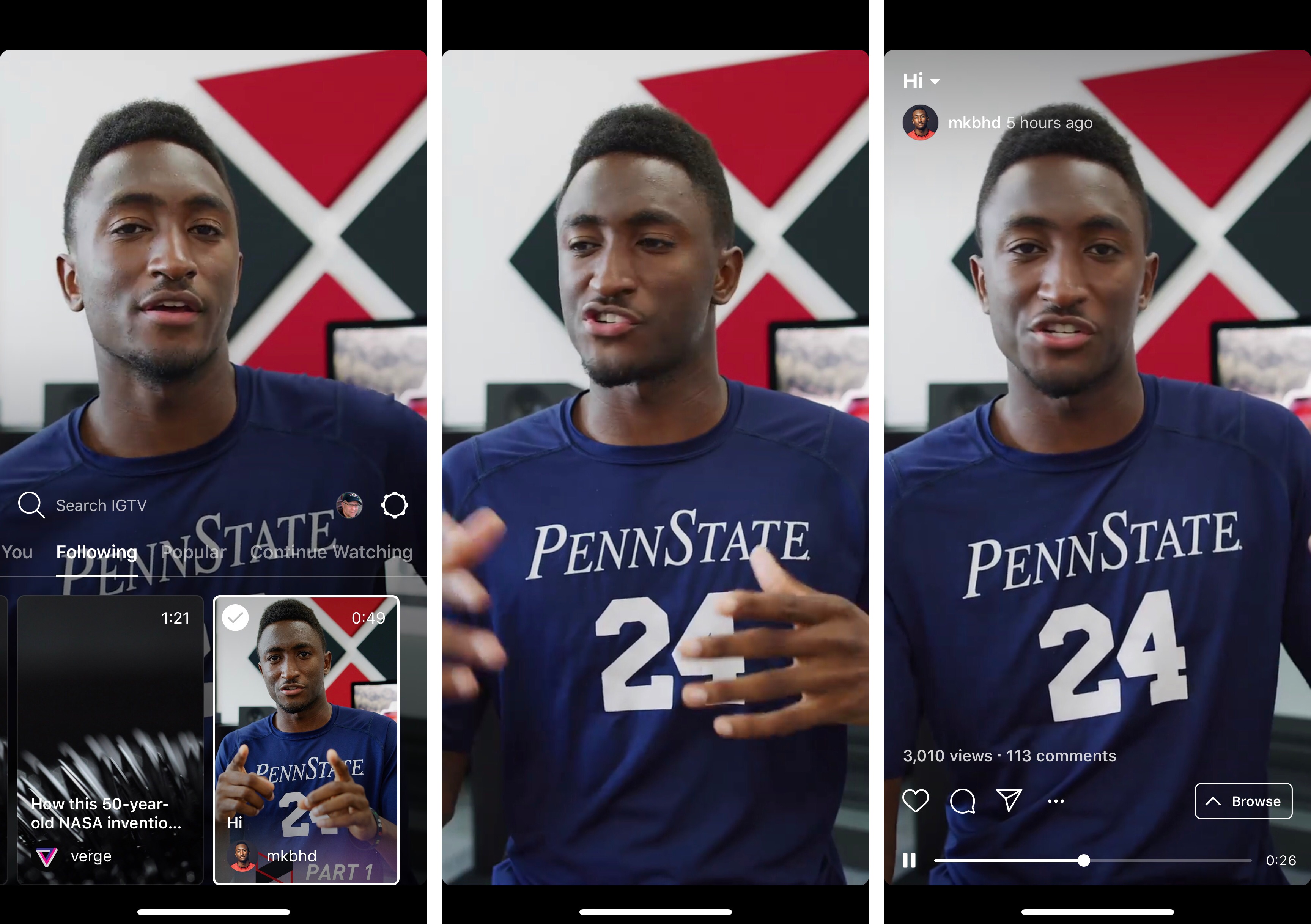
When you first open the app, it opens to a ‘For You’ section of videos from people you follow on Instagram along with a selection of popular content. The currently-selected video dominates the top two-thirds of the screen. The bottom third of the screen is a horizontally-scrolling, tabbed thumbnail interface for picking other videos. The included tabs are ‘For You,’ ‘Following,’ ‘Popular,’ and ‘Continue Watching,’ which are self-explanatory. You can also swipe between videos in a tab the same way you would in Instagram Stories.

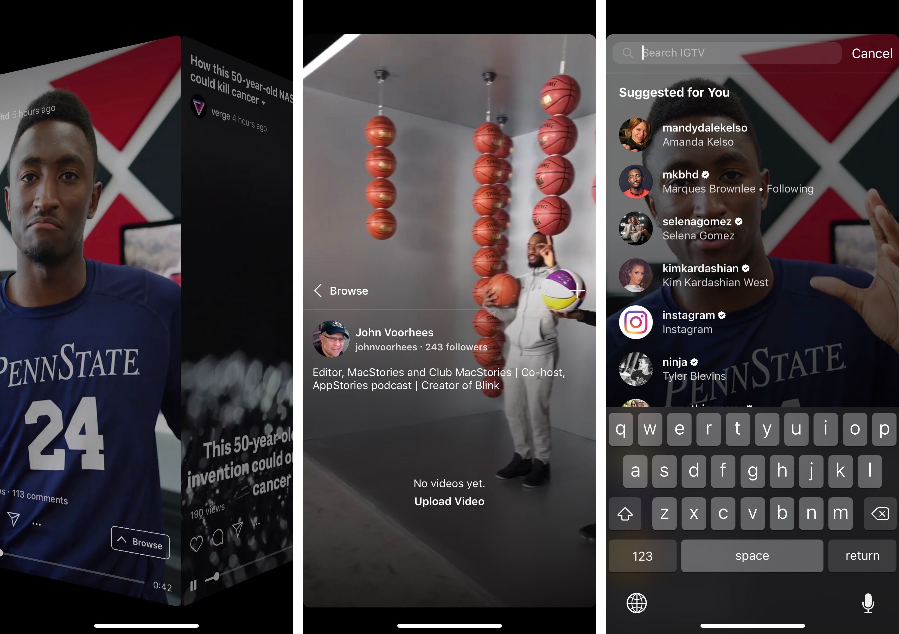
Swiping down dismisses the thumbnails and other UI, so the video dominates the screen. A tap on the video reveals play/pause controls, a scrubber to advance or rewind the video, and buttons to mark videos as favorites, comment, share it with other Instagram contacts, copy a link to the video, report it, or hide it. Tapping the title of the video displays its description, which can include URLs that open in Safari View Controller. TechCrunch says users will be able to subscribe to channels, though that doesn’t seem to be implemented in this initial release.

Although there is currently no advertising in the app, that is coming based on Instagram CEO Kevin Systrom’s comments during the event today. According to the TechCrunch report on the event:

“There’s no ads in IGTV today,” says Systrom, but he says it’s “obviously a very reasonable place [for ads] to end up.” He explained that since creators are investing a lot of time into IGTV videos, he wants to make that sustainable by offering them a way to monetize in the future.

Overall, I like what I’ve seen in the short time I’ve been using IGTV. Only a couple of the accounts I follow have posted videos so far, but I expect that will change as creators experiment with this new outlet. One big disappointment from a design standpoint though, is that the app does not support full-screen iPhone X video.

IGTV is available on the App Store as a free download.


AppStories, Episode 60 – The Apps of WWDC 2018

On this week’s episode of AppStories, we discuss the new and updated apps announced at WWDC 2018.

Sponsored by:

  • 1Password - Go ahead. Forget your passwords.
    1Password remembers them all for you.
  • DEVONthink – Document management reinvented for Mac and iOS.
    • Get 10% off DEVONthink Personal, Pro, or Pro Office for the Mac with the coupon code APPSTORIES.
AppStories+ Deeper into the world of apps

AppStories Episode 60 - The Apps of WWDC 2018

0:00
38:39

AppStories+ Deeper into the world of apps

Permalink

Drafts 5.2

Tim Nahumck:

When writing my review, I needed a way to navigate between the different sections, and all of the subheadings I had created. I had developed an action to navigate to each of the markdown headers, which I was happy with at the time. It was nice to have that functionality to switch around where I was in my review.

Well, I’m happy to say that I have been Sherlocked.

In the upper right corner of the editor, there is a small triangle icon; when you tap the icon, you are presented with a navigation menu. Not only does this navigate headers in Markdown, but it also navigates projects in TaskPaper, and code blocks in JavaScript. It also include a top and bottom button, as well as a select all button.

Drafts 5.2 came out while I was in San Jose for WWDC, and I’ve been meaning to check out the new features since I started getting back into a normal routine. Tim Nahumck, of course, has a great overview of the changes in this version of Drafts, along with some useful examples you can download.

As Tim points out, the ability to navigate headers of a Markdown document through a dedicated “section popup” is a terrific addition to Drafts. Few text editors designed for people who write in Markdown get this right; one of the reasons I still keep Editorial on my iOS devices is because it lets me navigate longer pieces with a header navigation tool. However, the implementation in Drafts 5 is more powerful, modern, and can be controlled with the keyboard (you can invoke the switcher with ⌘\ and, just like Things, dismiss it with ⌘. without ever leaving the keyboard).

Speaking of Editorial, every update to Drafts 5 is pushing me toward converting all my old Markdown workflows to Drafts actions powered by JavaScript. Automation in Drafts involves a lot more scripting than Editorial’s visual actions, but I feel like Drafts 5 is a safer bet for the future. I’ve been putting this off for a long time; maybe I should spend a few days finalizing the process before I start working on a certain annual review.

Permalink

Connected, Episode 197: Retire Hate for Negative Love

Recovered from WWDC, Myke previews his summer’s work, Federico shares what he knows about Shortcuts and Stephen gets super nerdy about Dark Mode in macOS Mojave.

On the latest episode of Connected, I go into more detail on Shortcuts and discuss my initial plans and goals for this year’s iOS review. You can listen here.

Sponsored by:

  • Squarespace: Make your next move. Enter offer code CONNECTED at checkout to get 10% off your first purchase.
  • Pingdom: Start monitoring your websites and servers today. Use offer code CONNECTED to get 30% off.
  • Casper: The Internet’s favourite mattress. Get $50 off select mattresses with the code ‘CONNECTED’.
Permalink


Tame Your Inbox with SaneBox’s Customizable Tools [Sponsor]

At its core, SaneBox is about making sure that only your most important messages hit your inbox. Other messages are safely stored in automated folders like the @SaneLater, @SaneBulk, and @SaneNews folders for reviewing later.

But email sorting is just the tip of the iceberg. With custom folders, custom snooze settings, and @SaneReminders, SaneBox takes email management to the next level.

Set up a custom folder and train it by dragging in a few messages. SaneBox will send all messages from the senders to your new folder. It’s a painless way to organize messages for a special project.

SaneSnooze folders can be customized to defer messages anywhere from hours to weeks. SaneBox comes with default snooze folders like @SaneTommorrow and @SaneNextWeek, but adding custom snooze folders lets you set when messages reappear in your inbox with precision.

SaneReminders are a great way to keep on top of tasks. Send yourself a reminder to do something later or get a reminder that someone hasn’t responded to a messages. For example, blind copy [email protected] and the message will show up back in your inbox only if the recipient doesn’t reply within 3 days.

Also, don’t forget that SaneBox works on top of your existing email setup. There’s no app to download or new email account to set up. You can use any email client you want.

Sign up today for a free 14-day SaneBox trial to take back control of your email. MacStories readers can receive a special $25 credit automatically by using this link to sign up.

Our thanks to SaneBox for sponsoring MacStories this week.


iOS 12 Will Add New Emergency Calling Feature

Apple has announced a new emergency calling feature for iOS 12, which wasn’t revealed at WWDC two weeks ago. The new functionality will provide automatic, precise location information to first responders when iOS 12 users call 911 in the United States. According to Apple’s press release:

Approximately 80 percent of 911 calls today come from mobile devices, but outdated, landline-era infrastructure often makes it difficult for 911 centers to quickly and accurately obtain a mobile caller’s location. To address this challenge, Apple launched HELO (Hybridized Emergency Location) in 2015, which estimates a mobile 911 caller’s location using cell towers and on-device data sources like GPS and WiFi Access Points.

Apple today announced it will also use emergency technology company RapidSOS’s Internet Protocol-based data pipeline to quickly and securely share HELO location data with 911 centers, improving response time when lives and property are at risk. RapidSOS’s system will deliver the emergency location data of iOS users by integrating with many 911 centers’ existing software, which rely on industry-standard protocols.

The FCC has mandated that mobile phone carriers locate callers within 50 meters 80% of the time by 2021. According to Apple’s press release, Apple’s HELO technology is capable of meeting and exceeding those standards today, and with the adoption of RapidSOS’s protocol this fall in iOS 12, those benefits will be enjoyed by 911 call centers too.


Fixing 3D Touch

Eliz Kılıç:

I should start with the obvious. 3D Touch is broken! The user experience is far from great. Apple introduced 3D Touch and its new related interactions Peek and Pop in 2014. It’s been almost 4 years since its first introduction, yet people don’t know/use 3D Touch. Why would they? Even tech-savvy users don’t know which buttons offer 3D touch. Let alone regular users.

What would happen if we decide to make all links same color and style as the regular text? People would not know what to click on right? Why is 3D Touch be any different? We rely on our vision to decide actionability before anything else. If you can’t distinguish 3D Touchable buttons from those that are not, how are you supposed to know you can press on them? Look at this screenshot and see if you can tell which of the buttons can be 3D Touched.

I couldn’t agree more with the idea of “decorating” buttons with 3D Touch visual cues.

Here’s the thing: I use 3D Touch a lot, and I love the fact that it’s the modern equivalent of a contextual click, but, anecdotally speaking, I’ve never seen any of my friends or relatives use it. Not the quick actions on the Home screen, not peek and pop. It’s like 3D Touch just isn’t there for them. It’s hard to say whether the very concept of 3D Touch is flawed or if iOS’ design prevents discovery of this unique interaction. However, the argument that an interface with little depth doesn’t lend itself well to a gesture built around pressing into UI elements is a compelling one. It’ll be interesting to see what happens with future iPads and iPhones, too.

Permalink