This Week's Sponsor:

TRMNL

The E-ink Companion For Your Favorite Tools


Apple Hires Sony Executives to Lead Video Programming Efforts

Apple has announced that Jamie Erlicht and Zack Van Amburg are joining the company to lead the company’s worldwide video programming efforts as part of Eddie Cue’s team:

“Jamie and Zack are two of the most talented TV executives in the world and have been instrumental in making this the golden age of television,” said Eddy Cue, Apple’s senior vice president of Internet Software and Services. “We have exciting plans in store for customers and can’t wait for them to bring their expertise to Apple — there is much more to come.”

Erlicht and Van Amburg were responsible for hits such as Breaking Bad, Better Call Saul, The Crown, Rescue Me, and more while at Sony Pictures Television. Apple has been ramping up its video production efforts for quite some time now and if there was any remaining doubt that the company is serious about getting into original content creation, the hiring of Erlicht and Van Amberg should put those doubts to rest.

Permalink

Twitter Launches Redesigned UI Across iOS, Web, and Other Platforms

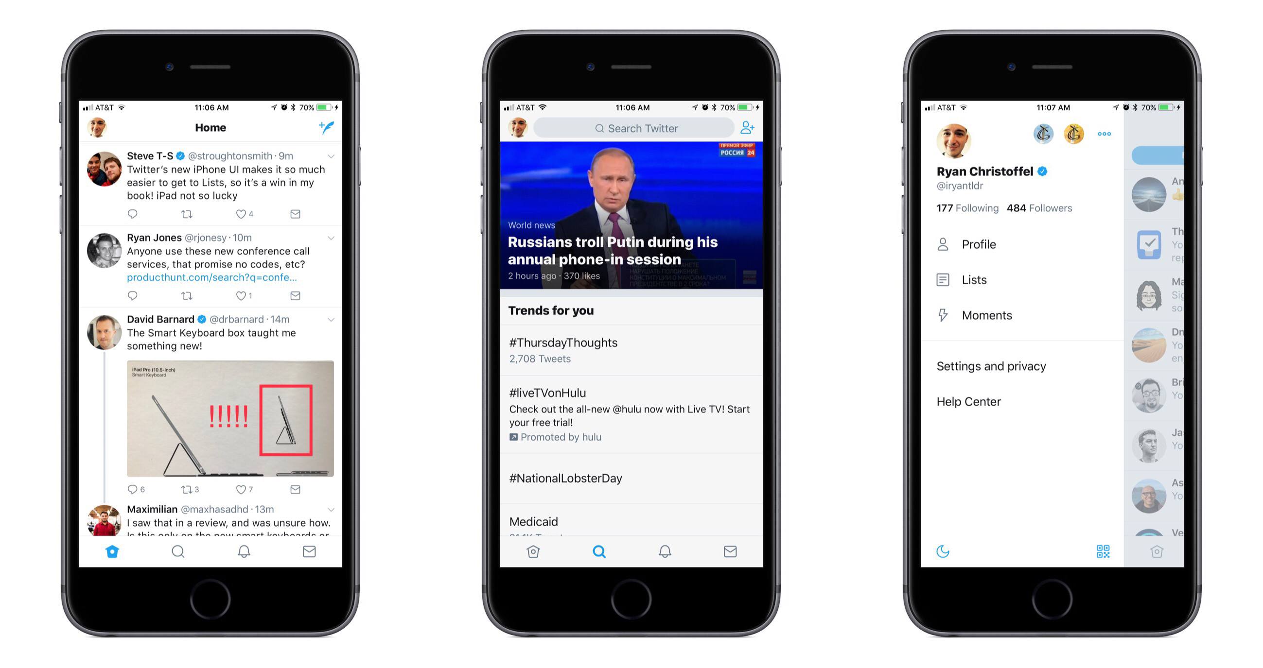
Announced in a blog post earlier today, Twitter has a major update to its iOS app and other platforms rolling out to all users starting today.

The new design is inspired by Twitter’s Android client – and while that detail scared me at first, using the updated iOS app for a few minutes allayed all my fears. This is a clean, beautiful redesign that brings few drastic alterations, and instead focuses on lots of nice polishing touches.

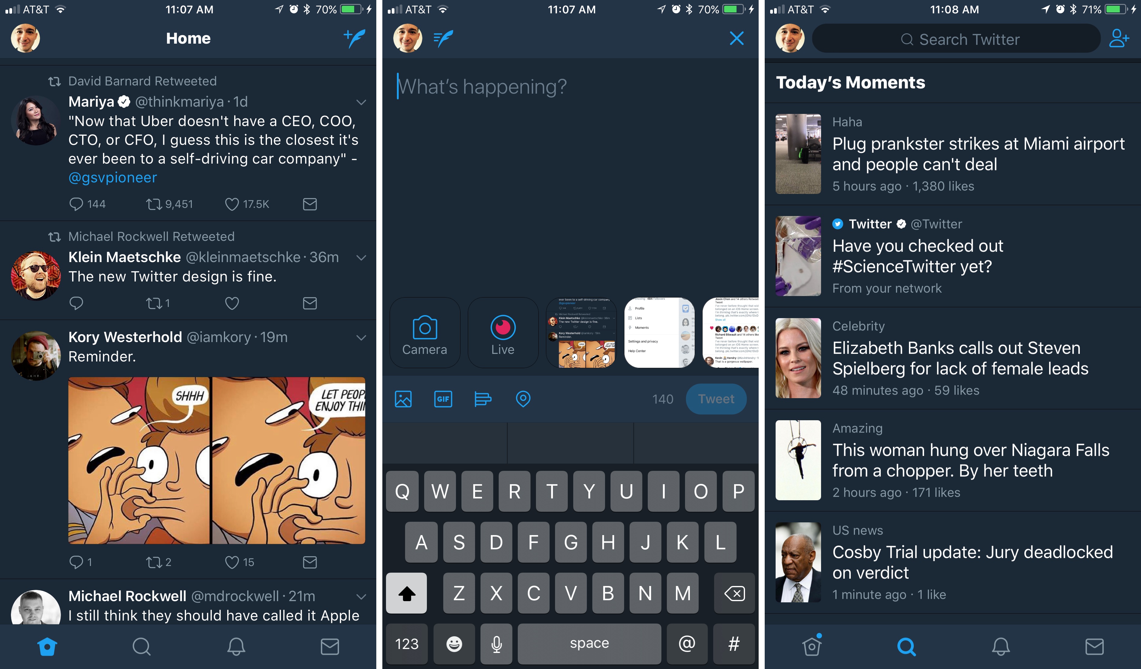
The most significant change to the iOS app is the existence of a new sidebar menu that pops out from the left side of the screen. This menu provides a quick way to switch between different accounts, and also lists your Following and Follower counts, navigation buttons to access your Profile, Lists, created Moments, and Settings, as well as a handy toggle to switch Night Mode on and off. Everything in the sidebar is clear and well organized, with plenty of breathing room; my initial impression of this new menu is entirely positive.

Outside of the sidebar menu, the rest of the app feels very familiar, but with a variety of small tweaks that improve the overall experience.

  • The reply icon has changed to a speech bubble, purportedly to create less confusion for new users.
  • With your Profile now available from the sidebar, that leaves only four main navigation tabs: Home, Search, Notifications, and Messages. They all have fresh new icons that look great.
  • Safari View Controller is now the default viewer for opening links. For a long while Twitter had been testing Safari View Controller with some groups of users, but making it universal is a welcome, long-overdue change.
  • Reply, Retweet, and Like counts will update in real-time as you use the app.
  • A variety of visual improvements, such as updated typography that includes the use of bold headers for different sections, rounded avatars, and more.

There’s more to explore, but that covers the bulk of changes.

Overall, I am a big fan of this redesign. The changes add up to a freshly improved, yet still familiar Twitter app, and my fear that it would too strongly resemble an Android app were unfounded. It may closely resemble Twitter for Android, but this still feels very much like an app that belongs on iOS.

Twitter says the changes are rolling out over the next several days, so it’s possible you may not see them yet. Twitter for iOS is available on the App Store.


Connected, Episode 146: Dubbed Dub Dub Follow Up

Recovering from San Jose, the boys wade through an ocean of follow up, then talk about the new iPads and review Planet of the Apps.

On this week’s Connected, a lot of WWDC follow-up and more about Apple’s new iPad Pros. You can listen here.

Sponsored by:

  • Incapsula: Secure and accelerate your website. Connected listeners get one month free.
  • Squarespace: Make your next move. Enter offer code WORLD at checkout to get 10% off your first purchase.
  • Storyworth: A new way to bring the family together.
Permalink

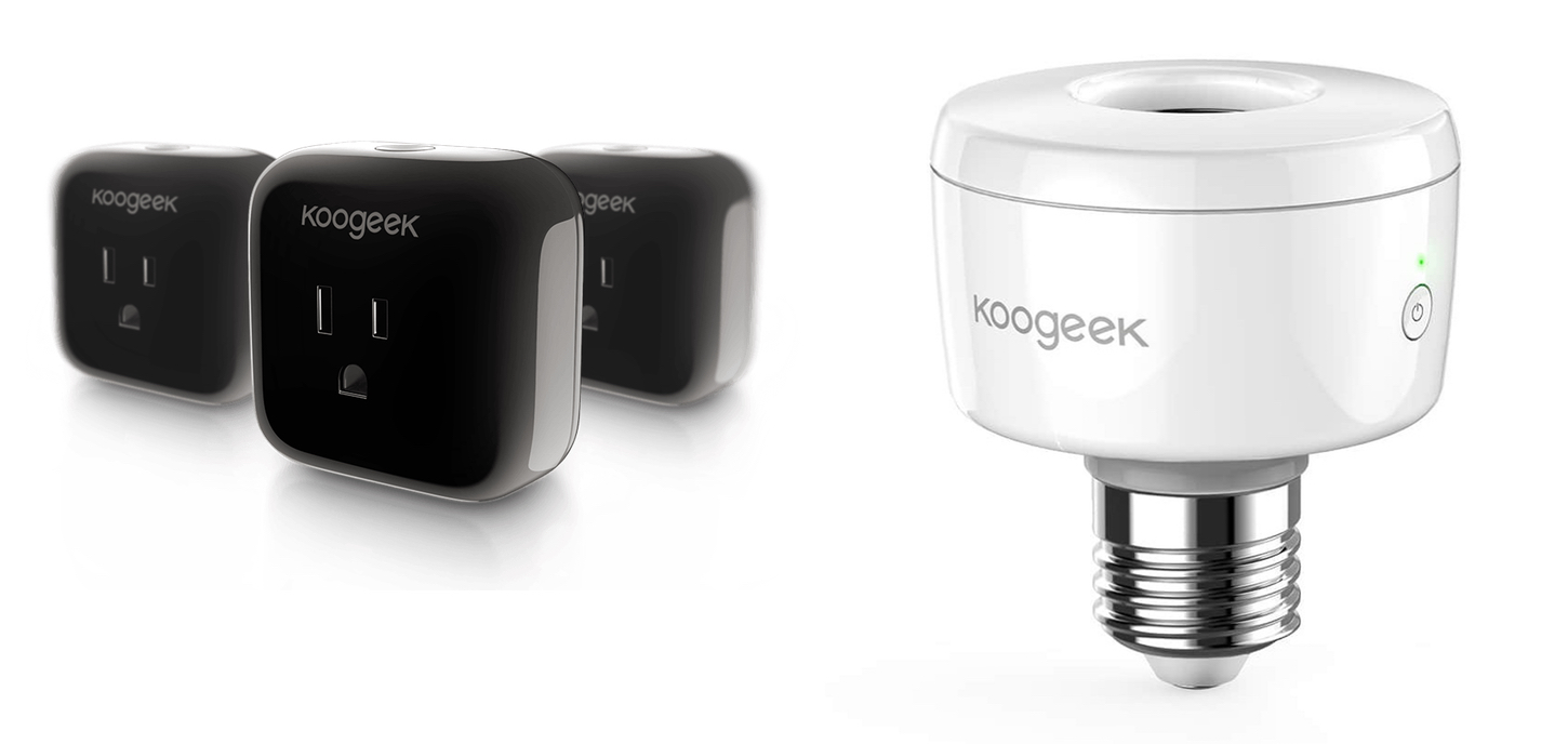
Koogeek HomeKit-Enabled Smart Plug and Light Socket Review

Koogeek may not be a name brand that jumps to mind when you think about home automation, but the company has built a substantial lineup of HomeKit-enabled devices. I’ve had a Koogeek smart plug for about a year and recently received a Koogeek lightbulb socket for review. I’m fairly new to home automation and have found both products to be a good way to dip your toe into home automation despite some limitations.

Read more


NotePlan Calendar + Markdown + Notes Comes to iOS

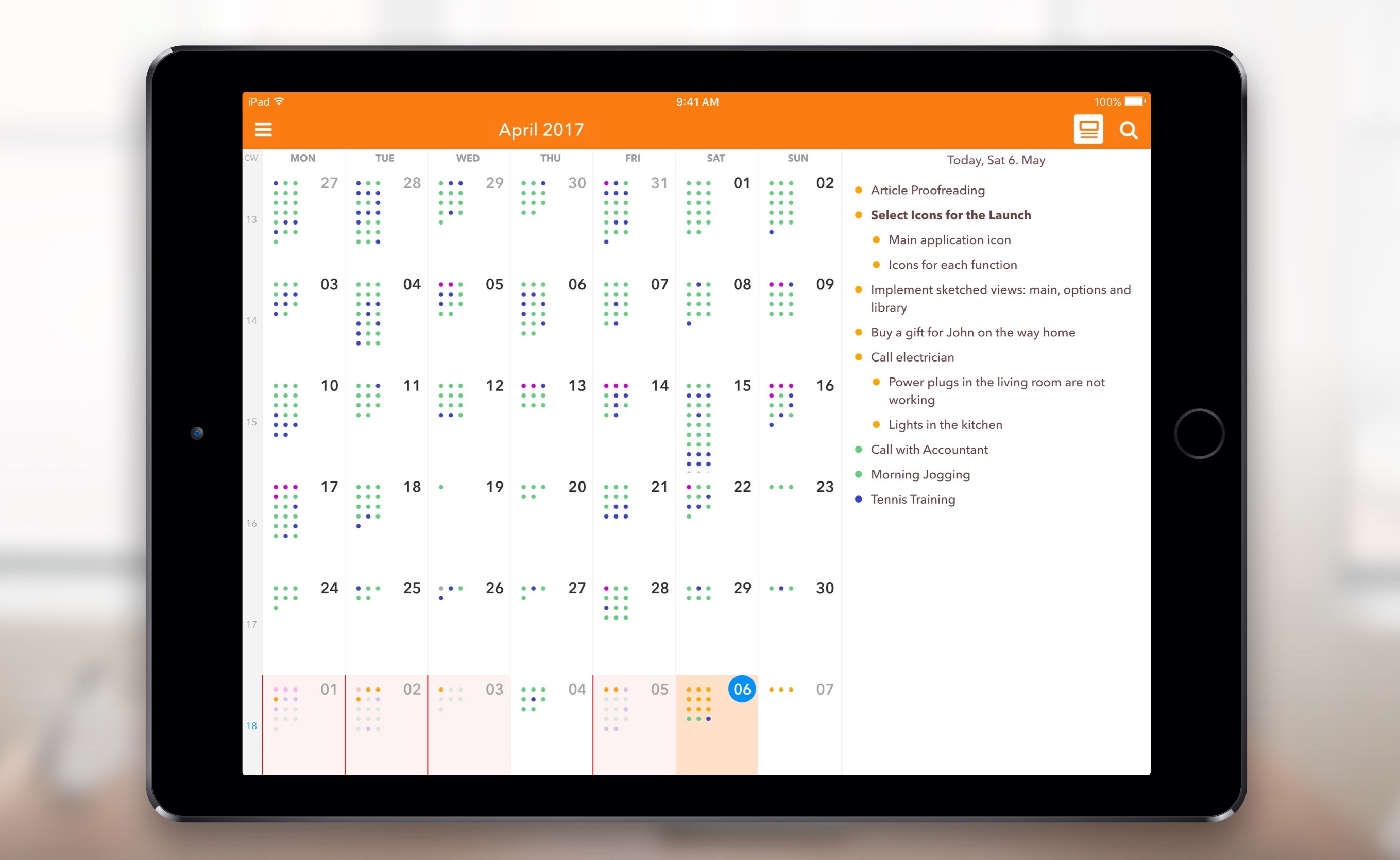
When I first heard about NotePlan, I was intrigued. It was a Mac app that used a text format (Markdown) as a calendar-based system, a note for each day, allowing you to easily create tasks and take notes, then see it all in an organized calendar. NotePlan for iOS was released today, and it’s enough to sell me on the idea.

I have a lot of side projects (I suppose my whole life is side projects these days), and organizing todo lists is vital. I love using the TaskPaper format, with TaskPaper on Mac and Taskmator on iOS, to track action items for individual projects. I also have a calendar, and a bucket of notes. Combining all of this in one place is appealing to me, and being able to use it on both Mac and iOS makes it truly useful.

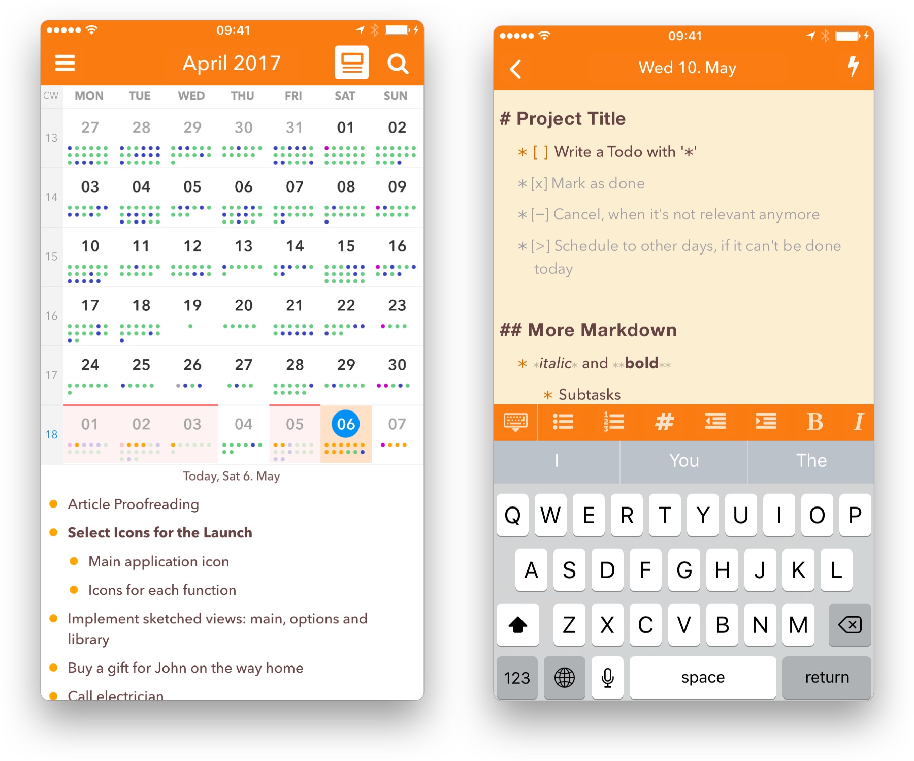
In NotePlan, tasks are created as Markdown lists. You can have it recognize any list item as a task, or tell it that only lines with a checkbox (- [ ] Thing to do) are action items. There’s an extra keyboard row available when editing that makes it easy to create items, complete or cancel them, or even schedule them for a future date.

Tasks can sync to Reminders lists as well, so it can incorporate into other workflows (and even shared lists). In the calendar view you can tap a day to see the note and associated task lists for that date.

Each day on the calendar gets a note, and you can add freeform notes in the All Notes area. A note can be bits of information, its own action list, or both. You can use #tags anywhere in the notes to organize, and wiki style links ([[title]] or [[YYYY-MM-DD]]) to reference other notes. Tasks added to freeform notes can be scheduled to the calendar with a tap, so you can use notes as a central project repository and schedule out the day’s (or week’s) tasks as you’re ready to tackle them.

NotePlan on iPhone

NotePlan on iPhone

On the new iOS version, you can drag and drop tasks around by pressing a text block until it turns blue and sliding it into place. You can also press and hold until it turns blue, then release and press another one to expand the selection between them, at which point NotePlan will offer you a toolbar to allow batch completion, rescheduling, etc.

I’d label NotePlan as a day planner, not a task manager like OmniFocus or Things. It’s ideal for planning out your day, Bullet Journal style. You won’t find extensive project management features or perspective overviews, but the combination of scheduling, tagging, and (plain text, portable) notes in one place makes it a true productivity tool.

If words like productivity, GTD, Markdown, TaskPaper and Bullet Journal cause a stirring within you, you’re probably the right audience for this one. Check out NotePlan for iOS, and then try out the Mac version for fully-synced productivity. Today and tomorrow, NotePlan for iOS is $11.99. After that, the price will be $14.99. NotePlan for Mac is $16.99.


Apple Doubles Down on App Store Curation

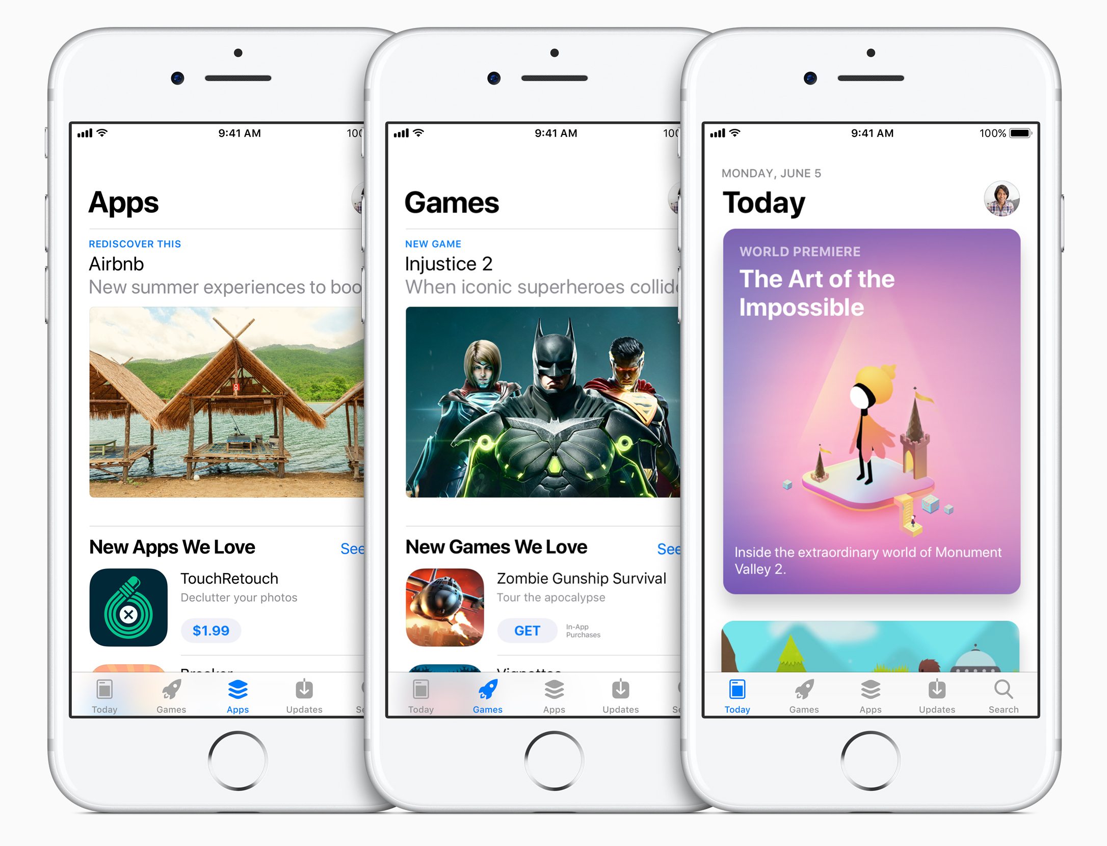
Manton Reece’s assessment of the redesigned App Store coming to iOS 11 is spot on:

The old App Store was designed like a database. Databases are good at showing grids and lists from an algorithm. But the App Store should tell a story about new apps. A blog-like format is the best way to do that.

This plays to Apple’s strengths in design and taste. Where Google might hire more engineers to improve their store, Apple should hire more writers.

Three years ago, Reece argued that Apple should invest heavily in App Store curation, which is precisely what it appears to be doing. The depth and breadth of the new App Store content that Apple has planned is unclear, but during a WWDC session on the changes to the App Store, product manager Pedraum Pardehpoosh declared Apple’s intent to ‘double down’ on editorial curation. If the initial content included with the iOS 11 beta is any indication, Apple may be on track to make the App Store a regular destination for users instead of a place people go to only when they have a specific need.

Permalink