This Week's Sponsor:

Inoreader

Boost Productivity and Gain Insights with AI-Powered Intelligence Tools


Unobstruct Clears a Path to a Better Web Reading Experience

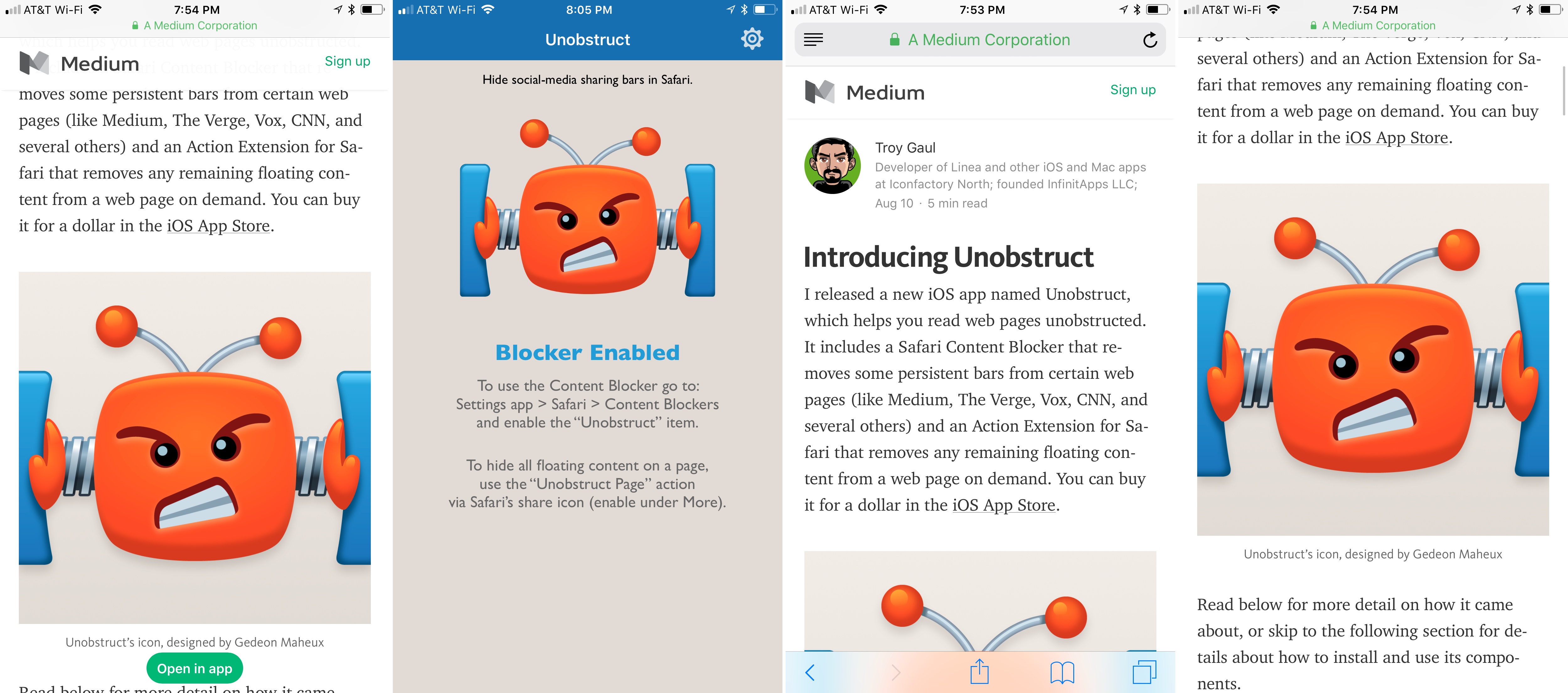
Too many websites wreck the reading experience by floating interface elements on top of articles. One of the worst offenders has been Medium, which John Gruber called out on Daring Fireball recently. Medium has made some improvements since then but didn’t eliminate floaters, and there are many other sites with social media buttons, branded navigation bars, and other material that hovers over webpages even as you scroll down the page. The practice makes it especially hard to read on the smaller screens of mobile devices.

Inspired by the Daring Fireball article and a JavaScript bookmarklet to which Gruber later linked, Troy Gaul, a developer at The Iconfactory, created Unobstruct, a Safari content blocker for iOS that eliminates floating bars, buttons, and other UI elements. The simple app, which Gaul fittingly announced in a post on Medium, removes any HTML that is set to sit on top of a site’s content and not scroll.

Unobstruct doesn’t hide persistent navigation bars by default because doing so would make it impossible to get around some sites. Instead, you can use the app’s action extension from the share sheet to hide the bar. Later, if you need the navigation bar, you can simply reload the page to get it back.

I love Unobstruct’s colorful and feisty robot icon. It adds a bit of fun and whimsy to an otherwise utilitarian app. For insight into the icon’s design, be sure to check out Ged Maheux’s blog post, in which he details how he started the design by making rough sketches in The Iconfactory’s drawing app Linea, then moved to Adobe Illustrator after Gaul had picked his favorite.

Unobstruct doesn’t block as broad a variety of webpage elements as some content blockers, but its singular focus on floaters pays off. In my testing, the app worked flawlessly to remove floating buttons automatically, as did the extension for eliminating navigation bars. Branding and sharing are important to websites, but they shouldn’t get in the way of the core experience – reading. The trend of obscuring content with floaters is a shame, but I’m glad I have Unobstruct to make browsing those sites a little nicer each day.

Unobstruct is available on the App Store.


HomePod Follows in iPhone 4’s Steps

The HomePod firmware that was accidentally posted last month by an Apple employee has led to a wealth of knowledge about Apple’s upcoming iPhone.

Most leaks in recent years have come from Apple’s expansive supply chain. A rear shell here and a camera component there slowly fill in the details about unreleased hardware. It’s a slow process normally, but one the rumor cycle has become accustomed to over the years.

The HomePod is obviously different. While the accidental leak contained just software, inside its depths were details about all sorts of unannounced features. Developers even found icons depicting the next-generation iPhone.

Whoops.

This isn’t the first time that Apple has leaked from the top about an upcoming iPhone.

Read more


Game Day: kubrain

Gamebra.in’s new puzzle game, kubrain, proves that there is still room for creativity and innovation in the color matching puzzle genre popularized ages ago by Tetris. Like many other games in the category, kubrain requires players to match colored blocks as they descend onto a playing field, but there’s a mind-bending twist. The playing field is a 3D cube that players can rotate to make room for incoming blocks. The result radically changes the way you approach the game compared to other matching games creating a challenging and novel gaming experience that is fun to play and difficult to master.

Read more


Welcome to Macintosh Season 3 Announced

In 2015, Mark Bramhill, burst onto the Apple podcast scene seemingly out of nowhere with a new tightly-edited podcast called Welcome to Macintosh. Besides the high production values that Bramhill brought to that first season, the show succeeded by offering concise, compelling storytelling about interesting and sometimes obscure moments in Apple’s history.

Today, Bramhill announced Season 3 of Welcome to Macintosh, which will be published every other Friday beginning August 18th. Season 3 is the result of a successful Kickstarter campaign that raised $17,000 to cover travel and other production costs. Backers of the project will receive behind-the-scenes videos and a special podcast feed available alongside the new Season 3 episodes, all of which are accessible from a special Members page on Macintosh.fm.

Season 3 features 10 all-new episodes and kicks off with a multi-episode series on how emoji are created and Bramhill’s efforts to convince the Unicode Consortium to approve a new emoji he created himself. I won’t spoil the episodes, but I had the opportunity to listen to two of them, including the first called ‘Will You Be My Emoji?,’ and they didn’t disappoint. As with earlier seasons, Bramhill’s skillful storytelling left me eager for more.

In connection with today’s announcement, Bramhill released a short promotional teaser episode. ‘Will You Be My Emoji?’ will be released on August 18th and subsequent episodes every other Friday thereafter.

You can listen to Season 3 on Macintosh.fm or subscribe to Welcome to Macintosh from iTunes, Apple’s Podcasts app, or any other podcast player using the show’s RSS feed.


The Internet Archive Brings Back HyperCard

Today is the 30th anniversary of the introduction of HyperCard, a system for building interactive media. HyperCard featured database features, form-based layouts, and a programming language called HyperTalk, which made it a powerful and flexible tool that had a loyal following. To mark the occasion, the Internet Archive has built on its previous Macintosh emulation project to bring HyperCard back through emulation.

As Jason Scott describes it on the Internet Archive Blog:

HyperCard brought into one sharp package the ability for a Macintosh to do interactive documents with calculation, sound, music and graphics. It was a popular package, and thousands of HyperCard “stacks” were created using the software.

Additionally, commercial products with HyperCard at their heart came to great prominence, including the original Myst program.

The Internet Archive already has a collection of HyperCard stacks that you can try using its browser-based emulator, and if you have stacks you created, you can upload them to add to the collection. HyperCard played a big role in exposing a generation to programming and influenced the architecture of the web we use today, so it’s fantastic to have the opportunity to take it for a spin again.

Permalink

Streets Adds User-Generated Panoramas and Extends Its URL Scheme

When I first reviewed Streets by FutureTap over a year ago, I was impressed with the beautiful Google Street View panoramas that it allows users to browse. Whether you want to armchair travel around the globe or just see what a coffee shop looks like before you leave home to meet a friend, Streets makes it effortless to navigate between map and panorama views. In addition to browsing Streets’ gallery of famous locales, it keeps a list of recent searches, favorites, and allows you to search addresses and your contacts for places.

With the update today, Streets expands its photographic content with user-generated panoramas. When you zoom into the map view, you will see little blue dots, some of which represent panoramas from users. When you switch to the panorama view, those images are now part of what you’ll see. Pull down on the drawer that extends from the top of the panorama view and, among other things, you’ll see information about the photographer that took the shot. If you also have FutureTap’s app Where To? installed, some panoramas allow you to open that app for more details about the location you are viewing.

Also, Streets has extended its URL scheme to allow the app to put images on the clipboard. When Apple acquired the Workflow app last spring, the app lost the ability to use Google’s Street View imagery as part of workflows. Streets’ URL scheme extension is a clever work-around that allows Workflow users who have Streets installed to get Street View images once again.

Whether I’m planning a trip or meeting a friend for lunch, Streets has become my go-to method of checking out a location in advance. The simple navigation makes it a great choice when you’re mobile and using your iPhone or sitting back and enjoying Streets’ panoramas on an iPad. With its latest update, Streets has upped its imagery game and added an excellent solution users with Street View workflows.

Streets is available on the App Store.


Swarm Shifts Focus to Become a Personal Travel Timeline

Swarm received an update this week that takes the app in a new direction. The latest version of the app deemphasizes location sharing with friends, mayorships, and sticker and coin collecting. Those elements are still there, mostly tucked away behind the ‘Friends’ tab, but the focus has shifted. Now, the app centers around the creation of a personal timeline as a sort of journal of places you’ve visited.

Read more


Ulysses Announces Move to Subscription Pricing

Ulysses, the popular text editor and 2016 Apple Design Award winner, announced today that it has adopted a new subscription pricing model. A post on the Ulysses blog by Ulysses co-founder, Marcus Fehn, covers the details:

  • Users can try Ulysses for free for 14 days before deciding whether to subscribe. After 14 days, Ulysses works in a read-only mode, but documents can still be exported.
  • Ulysses subscriptions are $4.99/month or $39.99/year.1
  • Subscribing unlocks both the iOS and macOS versions of Ulysses.
  • Students can subscribe for $10.99 for six-month periods.
  • Existing users can take advantage of a limited-time lifetime discount equal to 50% off the monthly subscription price.
  • Users who recently purchased Ulysses on macOS will be given a free-use period of up to 12 months depending on when they purchased the app. Users who bought Ulysses on iOS can receive up to an additional 6 months of free use.

Existing versions of Ulysses for iOS and macOS have been removed from the App Store and Mac App Store, but have been updated for iOS 11 and High Sierra, so they will continue to work for now if you decide to not subscribe. However, new features will be limited to the new versions of Ulysses that were released on the app stores today. I downloaded both versions and was impressed by the seamless transition, which explained the move to subscription pricing, the limited-time discount offer, and automatically gave me two free months of use even though I bought the apps nearly two years ago.

My personalized onboarding for the macOS version of Ulysses.

My personalized onboarding for the macOS version of Ulysses.

In addition to the announcement on the Ulysses blog, Max Seelemann, one of Ulysses’ founders, wrote a post on Medium explaining the company’s thinking behind moving to a subscription model that is worth reading. It’s a backstory that has become familiar. Pay-once pricing is not sufficient to sustain ongoing development of professional productivity apps like Ulysses. While Ulysses has enjoyed success, funding the kind of development that pro users expect through growing the app’s user base is not sustainable in the long-term. As Seelemann explains, several options were considered over a long period, but ultimately it’s subscription pricing that gives Ulysses the security and flexibility needed to maintain the app.

I’m glad to see Ulysses adopt subscription pricing. I can’t say that would be the case for every app I use, but I use Ulysses every day. I want it to be actively developed and available for a long time. The tricky part about subscriptions, as we’ve discussed in the past on AppStories, is that the value proposition for each person is different. One person’s mission-critical app might be another’s nice-to-have app and the success of a subscription model depends on picking price points that appeal to a sustainable segment of users. However, the flexibility that Ulysses has adopted with different monthly, yearly, and student pricing tiers in comparison to its pre-subscription pricing strikes me as an approach that is well-positioned to succeed.

Ulysses is available as a free download with a 14-day free trial on the App Store and the Mac App Store.


  1. A full rundown of pricing for each country where Ulysses is sold is available on its pricing page↩︎