This Week's Sponsor:

Direct Mail

Professional Email Marketing Built Just for Mac Users


Alfred 1.1 Released: Address Book, Filter Actions & More Improvements

Alfred 1.1 Released: Address Book, Filter Actions & More Improvements

This release brings some great feature improvements to Address Book, Hotkeys and Extensions:

  • In the Address Book contact viewer, take action on contacts’ details.
  • Select text in any app & open Alfred to take action on it with a hotkey
  • Set default actions on filter extensions, like uploading a file to Flickr automatically
  • Replace existing Powerpack extensions easily when updates are released
  • Many more improvements and tweaks to make your Alfred experience even better.

It is hard to have a case of the Mondays when your week starts off with a great update to Alfred. Users of the non-Mac App Store version can download version 1.1 and start enjoying many of Alfred’s enhancements to the PowerPack features: Address Book, Hotkeys, and Extensions. From my understanding, the next update to Alfred was going to be a maintenance release but with Address Book getting so much love, the developer decided to make it a more substantial release.

PowerPack users can now view Address Book contact notes, messaging information, as well as social information from within Alfred. Also added was the ability to assign a default action or pre-existing Extension to phone numbers and email addresses. A similar Action option was added to Filters as well. There is a new configurable hotkey for more advanced options when opening Alfred and you will find a whole lot more in the official change log. I am really interested to see how the Alfred scripting community is going to run with these changes. If you find a clever way to use these new default actions be sure to share it in the comments below.

Permalink

Fair Labor Association Begins Its Inspections Of Apple’s Suppliers

The first inspections by the Fair Labor Association began today at Foxconn City in Shenzhen according to an Apple Press Release issued just a short time ago. It is the beginning of special, voluntary, audits of Apple’s final assembly suppliers that was announced earlier in January this year when Apple joined the Fair Labor Association.

“We believe that workers everywhere have the right to a safe and fair work environment, which is why we’ve asked the FLA to independently assess the performance of our largest suppliers,” said Tim Cook, Apple’s CEO. “The inspections now underway are unprecedented in the electronics industry, both in scale and scope, and we appreciate the FLA agreeing to take the unusual step of identifying the factories in their reports.”

A team of labor experts led by FLA president Auret van Heerdan will interview thousands of employees at Apple’s suppliers about working and living conditions, health, safety, working hours, compensation and communication with management. Inspections of the facilities and reviews of procedure documentation will also be undertaken in the FLA assessment.

An initial report with early findings and recommendations will be released by the Fair Labor Association and will be followed up by inspections of the Quanta and Pegatron facilities later this Spring. Apple’s full press release is located after the break.

Image via Wired.

Read more


VLC 2.0 for Mac Final Design Previewed, Coming This Week

Popular media player VLC is about to reach version 2.0 final and Felix Kühne, current lead developer of VLC’s Mac OS X port, has posted a series of screenshots detailing the final user interface design that we’ll see in the 2.0 update once it goes public “later this week”. The screenshots, available over at Kühne’s blog, show a dramatic change from VLC’s current design on the Mac, with a new sidebar for your playlists, Internet sources, and media on your computer and local network. The new design was created by Damien Erambert, and the first concepts date back to 2008. The interface of VLC 2.0 for Mac will offer a series of advantages over the older version from a functionality standpoint as well:

VLC 2.0’s interface for Mac is dramatically different from its previous revision, both technically and usage-wise. Playlist and video output share the same window, service discovery modules can be easily accessed through a sidebar and various audio + video filters are available through the respective panels. Besides that, the interface is noticeably faster and easily expandable. Speaking of that, we also added support for VLC’s lua-based extensions, which allow you to get info about the current movie from Allociné, post to Twitter, fetch subtitles automatically, etc.

Previously known as VLC 1.2, VLC 2.0 is a major rewrite of the application, which now includes several bug fixes, new features, and a redesigned interface. Alongside improved performances and optimizations for Lion, VLC 2.0 comes with many new features including initial support for Blu-Ray Discs, new subtitle management and blending in video outputs, support for multiple files inside RAR archives, and an all-new 64-bit version for Windows users (VLC 2.0 for Windows won’t feature a new interface as seen on OS X). A complete list of changes from VLC 1.x to VLC 2.0 is available here; the developers didn’t mention anything specific about the “mobile port” for iOS and Android devices.

VLC 2.0 will be available later this week at VideoLAN’s website. More screenshots of the final Mac UI have been posted on Flickr.


MacStories Reading List: February 5 - February 12

The past week has been an interesting one, for a couple of reasons. First, we’ve seen Kickstarter breaking records for its most funded campaign, a record that didn’t last long as a new game by Tim Schafer quickly pulled in $400,000 in 8 hours. Then Path, the cool kids’ alternative to the “evil” Facebook, found itself in the middle of a PR brouhaha as it was caught uploading a user’s Address Book email addresses to its servers. Ouch. Luckily, the company was smart enough to reverse its decision and issue an update in less than a day. There’s more: Apple has started warning developers against manipulating the App Store’s charts, and more people every week are considering using the iPad as their only work machine.

It’s this week’s Reading List, best served with a good cup of coffee. Enjoy. Read more


App Journal, Episode 10: Daedalus Touch, Lovely Charts, Inside the World of Dinosaurs, Skip Tunes

App Journal is a series aimed at showcasing apps we have enjoyed using on our iPhones, iPads, and Macs, but decided not to feature in a standalone, lengthy review here on MacStories. App Journal is a mix of classic reviews, app recommendations, and a diary of our experiences with apps that still deserve a proper mention.

After a two month period of inactivity, the App Journal is back and we’ve got some cool apps to share. From text editing to beautiful diagrams and (gasp) dinosaurs, make sure you don’t miss Episode 10 of App Journal, brought to you directly from the MacStories Team, good coffee, and, why not, Italy’s snow.

If you’ve got apps to recommend, our Tips inbox is just a click away up in the site’s toolbar. Enjoy!

Federico Viticci - Daedalus Touch

When Cody reviewed the first version of The Soulmen’s Daedalus Touch for iPad back in May, I was intrigued by the app’s unique take on portable text editing and document management, but ultimately didn’t pull the trigger on a purchase as I didn’t believe I needed yet another take on Dropbox and text editors. Cody wrote:

Daedalus is interesting. Everything you create in Daedalus becomes a sheet, which exists under a topic sheet that creates a stack. It reminds me of writing a screenplay or developing a report with a cover sheet, but what’s more interesting is how you navigate between these sheets. A majority of the interactions in Daedalus involve pinch-to-zoom actions, which is a bold navigation choice that’s almost pulled off perfectly. You zoom in and out of stacks, and are able to browse between multiple sheets with simple flicks.

After seeing The Soulmen release a couple of updates to bring new functionalities and improve support for things like external hardware keyboards and system clipboard, I thought I could give the app a shot, especially considering it’s on sale at $2.99 on the App Store. In our review, Cody detailed how Daedalus Touch is different from the majority of text editors available on iOS as it allows you to navigate multiple stacks of documents through touch-based interactions based off gestures such as swipes and pinches to navigate in and out of sheets and paper stacks. Having used Daedalus, I think what’s really cool is that – attention to detail and elegant design/typography aside – Daedalus allows you to sync different Dropbox folders independently, meaning you’ll be able to, say, keep your standard notes in a first stack and your book writing project (with additional notes, chapters, and maybe drafts) in another stack. What I’d like to see in a future version of Daedalus Touch is support for more file formats (.md would be a good choice) and automatic sync to avoid the need of hitting “Save” every time.

If you’re looking for a different take on Dropbox-powered text editing, Daedalus Touch is an interesting option at $2.99 for a limited time. Read more


Instagram 2.1 Released: Updated UI, Lux, New Sierra Filter

A major update to photo-sharing application Instagram was released today, and for the first time it includes new interface element designed by the extremely talented (and recently hired by Instagram) Tim Van Damme. Whilst the original Instagram launched a trend of “apps with a large action button in the bottom toolbar”, Instagram 2.1 has been refreshed to include a more standard – yet beautiful to look at – toolbar with icons to browse your feed, liked items, profile, and of course take a new picture. You can see more of Instagram’s new pixels over at Tim’s Dribbble.

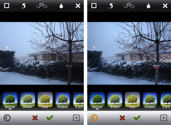
The new Instagram also features a new filter, Sierra, and a photo enhancing system called Lux that, according to the company, will enable you to make your photos more vibrant with just one touch. This functionality reminds me of Camera+’s Clarity effect, and it’s interesting to see how Lux is meant to enhance the original look of a photo, not apply a vintage effect. I wonder if this will signal a change in the Instagram community’s overall trend towards heavily modified photos.

We’ve given you a new way to instantly transform the look and feel of your photos. In just one tap, Lux works its magic by making your photos more vibrant and bringing out details you couldn’t see before. Use it with a filter or without.

I’ve played around with the update, and it’s solid. The app seems a little faster, the new UI is very elegant, and I think the Lux effect is very promising in that it will help users avoid the need of applying effects to photos just to make them look “different” – I like how Lux focuses on making an iPhone’s default output simply better. Other improvements in this update include the possibility of tapping on a push notification to get directly to a photo, and an option to change your profile photo from your profile page.

Instagram 2.1 is available on the App Store.


“Okay, I’ll Remind You”

A few minutes ago Apple uploaded two new iPhone 4S commercials on its website and official YouTube channel. The ads, as with previous iPhone 4S promotional videos, focus on Siri, and they might just be the best ones about the voice-based assistant yet.

The ads, called “Rock God” and “Road Trip”, share a common theme: people talking to their assistant using natural language and a friendly tone, not simply asking a piece of software to execute commands.

In Road Trip, a guy and his girlfriend are organizing a road trip to California. Look at the initial setting: it’s cold outside, they’re about the get in the car, and they want to get from the cold of East Coast in February to the sunny Santa Cruz in California. The guy asks Siri, and they’re on the road. Camera cuts to the guy’s face in the car. He’s looking for a barbecue in Kansas City. Camera cuts to girl’s face in the car. She’s looking for a rodeo. Camera changes again, this time the couple doesn’t know where they are, and the girl asks “Where are we?”, with the look of someone who knows Siri will have an answer. They’re in Santa Rosa. Change again. How big is the Grand Canyon? Sure enough, Siri can look that up on Wolfram Alpha or Wikipedia. But then the gas runs out: how about finding a station the guys can walk to? Finally, the ad reaches its climax when our two characters have seemingly reached their destination, or are fairly close, and are looking at the stars. She asks: “What does Orion look like?”. Siri displays sky data inline. The video closes with the opposite setting of how it began: sunny California, he’s wearing a t-shirt, looking at the horizon, and she’s telling Siri like you would do with an old friend – Remind me to do this again. Siri, with its human-like voice, replies: Okay, I’ll remind you.

The second commercial, Rock God, has a more “fun” approach. There’s this kid that “has to get a guitar”, and he’s so excited about it he needs to ask Siri now. Why is he so excited about getting a guitar? What’s the story here? Perhaps, I imagine, he has just decided with his friends that it’s time to put a band together and start playing. So, Siri gives him location info about stores selling musical instruments, and in the next scene our kid is learning how to play. How do I play London Calling? Whole Lotta Love? How about that chord? Siri displays information on screen. Fairly regular stuff for now. Then the ad changes – our character is sending a message to Julie and Kate about playing at the garage tonight. Apple’s music stops. The kids are playing – they’re doing rock ‘n’ roll! – and finish their song. “Call me Rock God”, the kid tells Siri, softly.

You see, these aren’t just ads. In 30 seconds, we’re told stories. In 30 seconds, we are not shown technical features and RAM specifications, we’re given real examples of real people we can relate to. We’re shown two young people in love with each other that just want to get to California and see the sunset together. We’re shown a young boy with a simple dream, playing guitar, yet a dream that’s important to him – something that makes his life worth living and enjoying even for those 30 minutes when he gets his band mates together and nothing else matters. Just music. Call me Rock God.

In 30 seconds, we’re shown how technology can make people’s lives better. We’re reminded, once again, that this industry, this love for the latest gadget, doesn’t necessarily have to be about tech specs – it’s the technology married with the liberal arts. It’s about playing London Calling with your friends. It’s about driving to California with the woman you love and watch the stars just for one night.

He would be proud.

Read more


Smartr Contacts

Sometime in the past five years, the Address Book got social. Our contact cards suddenly gained Twitter handles and Facebook links, whilst users more oriented towards business relationships decided to add their LinkedIn pages alongside standard phone numbers and email addresses. More importantly, the Address Book became mobile: adding a new entry to the Contacts app on our iPhones pretty much equals to exchanging business cards now and, unsurprisingly, a new category of apps has arisen from the need of turning old cards into digital reinterpretations of that paper stack full of contacts we’d keep on our desk, but never properly organize.

From this premise, Xobni (that’s Inbox spelled backwards), makers of a popular email plugin for Outlook and Gmail, released Smartr for iPhone a few weeks ago on the App Store. Developed as a mobile companion to Xobni on the desktop, Smartr leverages all the features made possible by a digital interface (search, social integration, slick design, APIs) to provide you with a social address book that’s always up to date and keeps tracks of your communication with friends, family, and work contacts over time. It is very smart indeed.

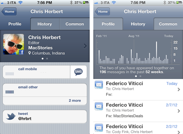
Smartr basically creates rich profiles for all your contacts, aggregating data from Twitter, Facebook, LinkedIn, and email to form a complete overview of someone you might have communicated with in the past. In pulling this data from various social networks, Smartr uses its proprietary matching technology (the “Xobni Cloud”) to analyze and compare your contacts (from your Address Book, an interesting subject following Path’s recent PR fiasco) against conversation history from email (Gmail is fully supported), usernames from Twitter and Facebook, status updates, and so forth. Once a contact is matched, a rich profile view is created featuring name, photo, phone number, and email addresses. Smartr even allows you to swipe across the top section of a profile view to switch between a person’s various social profiles, which upon tap will correctly launch the official Twitter and Facebook apps (if installed).

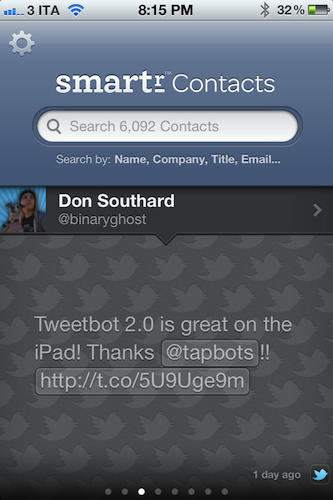
But what to do with these rich, automatic and integrated profiles? Well, Smartr is largely focused on search, unlike, say, a tool like Friends that’s more geared towards interacting with people from your Address Book found on other social networks. Smartr’s prominent interface element is, in fact, a search box that lets you look up contacts by name, company, title, or email. I wish the app supported @username-based look-ups, as I might remember exchanging a message or two with @hrbrt, but I can’t recall his full name from further email communications. Smartr is fast: Searching more than 6,000 contacts on my iPhone takes seconds and the information is always up to date, as Smartr is also web-based in that Xobni’s servers are constantly analyzing and matching your contacts to provide the best results. You can read more about Xobni’s privacy policy here.

Once you’ve found a contact (I managed to retrieve contact information and conversation history from messages dating back to 2008), you can interact with the profile view to compose new emails, call a phone number, or send a new message. The History tab in the top toolbar will give you access to a nicely designed graph showing how many times you’ve appeared in a conversation with a contact, with the actual messages listed below and available for inline viewing if the associated email address is also configured in Smartr (the app will use the standard iOS mail view to enable this). The third tab, Common, shows a list of common contacts between you and the contact you previously looked up.

Smartr is very fast, reliably accurate, and has proven to be a nice addition to my workflow, especially for those times I want to look up an old contact (typically developers) that I want to get in touch with again. I wouldn’t mind paying for Smartr, but the app is free, and available on the App Store. If mail integration is your thing, make sure to check out Xobni’s popular Gmail plugin as well.