Skitch For Mac Updated with FTP, Custom Styles, More Sharing Options

I like Skitch. However, after the move to Evernote and the release of a new Mac app, Skitch didn’t exactly go through a “smooth” transition. Namely, features were removed, and existing Skitch users weren’t thrilled with the new Evernote-only nature of the software. Last month, Evernote published a blog post detailing how, after receiving lots of feedback from their users, they decided removing functionalities people had become dependent upon was a bad move. For the past few weeks, I have been testing the 2.0.3 update to Skitch for Mac, which brings back many of the features that made the original Skitch one of my favorite Mac apps.

A feature that I’ve been using on a daily basis is FTP support. In Skitch 1.0, you could take a screenshot, quickly annotate it, and send it off to your own server via FTP. I share a lot of screenshots, and I like the combination of an easy-to-use image annotation app with my own server and my own URLs. FTP integration was the right balance between Skitch’s annotations (which I prefer to Apple’s ones in Preview) and the power of putting images on a server that’s only mine. Skitch 2.0.3 adds a new FTP/sFTP option in the Sharing tab of the Preferences, allowing you to configure multiple FTP accounts. The configuration is similar to other FTP clients for Mac (you’ll find the usual Base URL, port, and directory settings) and it took me a minute to set up with my credentials.

Once configured, you’ll be able to send images from Skitch directly to your FTP server. Unfortunately, there’s no option to assign keyboard shortcuts to a specific FTP account, so you’ll have to click on Share > FTP or right-click an image to upload via FTP. Personally, I’ve set up a Keyboard Maestro macro that uses AppleScript GUI scripting to let me share via FTP easily with just a keystroke.

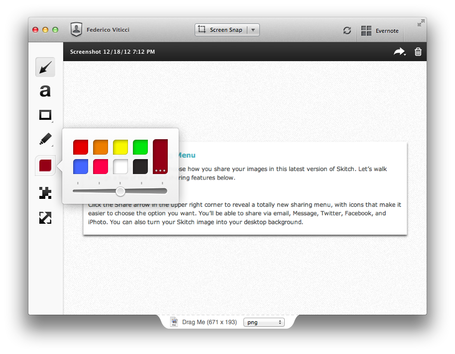
An updated sharing menu is available both from the menu bar and the Skitch image editor. From the latter, an arrow in the upper right corner reveals a dropdown menu with options for email, Messages, Twitter, Facebook, and iPhoto. You can also set a picture as desktop background, or set the kind of link that you want to generate from Skitch. More ways to share Skitch links now include direct image URL, HTML code, HTML thumbnails, and forum code. In addition to more sharing options, the new Skitch comes with an Auto Copy feature as well, allowing you to automatically place a link to a Skitch image (shared publicly) in the clipboard.

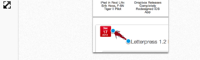
Aside from various improvements and bug fixes, other features I like include timed screenshots and custom styles. In the tools palette of the editor, you can now set a custom color for your annotations, choose between preset sizes from the same color swatch, or define your own size by manually adjusting the blue dots of the marquee around text and shapes. For me, this alone is a welcome improvement that is still easy to use and doesn’t add complexity to the editing interface of Skitch. I don’t use this functionality with Skitch, but version 2.0.3 introduces timed screenshots, letting you perfectly time areas to capture with a countdown timer.

I’m looking forward to more updates from the Evernote team on Skitch. After a series of initial missteps – possibly dictated by a need to release the app – it’s good to see features coming back, sometimes in different forms, to Skitch, which remains my favorite app for screenshot annotations on the Mac. Skitch 2.0.3 is available today on Evernote’s website.


Apple Releases iOS 6.0.2

Apple just released iOS 6.0.2. The software update is now available in iTunes. According to Apple, the update includes “improvements and bug fixes”, including a fix for a bug that ”could impact Wi-Fi”. At the moment of writing this, iOS 6.0.2 is only showing up in iTunes, as Apple’s own software update tool for iOS is returning an error.

iOS 6.0.2 is available only for the iPhone 5 and iPad mini.


Letterpress 1.2 Brings HTML5 Replay Feature

Letterpress 1.2 Brings HTML5 Replay Feature

Loren Brichter’s Letterpress is my favorite iOS game. It’s no surprise that the game has been adopted so quickly and listed by Apple as a runner-up for Game of the Year on the “Best of App Store” list for 2012. Letterpress is fun, clever, and incredibly addictive. As I detailed in my original review (and as Loren himself explained in our interview), Letterpress has also a strong strategic component that, again unsurprisingly, has already been largely discussed.

Today’s Letterpress update brings a new feature that may appear as “minor” at first sight. While Letterpress got a quick “rematch” functionality in version 1.1, the 1.2 update released today brings “replay” – a way to literally replay a match word-by-word in an HTML5-powered webpage you can share with friends.

I asked Brichter about the technical details of Replay, because – try it for yourself here from a Mac or iOS device – I had to know how he managed to archive a match’s list of words and play it back with an interactive slider. In version 1.2, the app creates a JSON version of the history of the game, which is then “replayed” via JavaScript and HTML in the browser. The Replay webpages support touch controls (you can move the slider with a mouse on a computer) and the letter tiles “wiggle” just like they do in the app if you touch a word in the list. You can also simply tap the board (click on a computer) to advance one step at a time. It’s a simple feature that’s been executed extremely well.

There are two aspects to consider about Replay. From a strategic standpoint, it can be useful to analyze an opponent’s previously shared links for possible patterns and/or past mistakes. But I also wanted to ask Brichter about the technological component of Replay; he told me that, with this technology in place, he could now consider other neat visualizations for Letterpress games: for instance, he mentioned charts for scores and word lengths as possible implementations of the Replay webpage, which simply requires server-side updates. Brichter is also thinking about documenting the data format to allow other developers to build analysis tools for Letterpress. It may be “just a game”, but Brichter has several ideas to turn Letterpress into more than just a Game Center-enabled game.

Letterpress 1.2 is available on the App Store. It also brings an updated dictionary and funny release notes.

Permalink

YouTube Capture for iPhone by Google

YouTube Capture for iPhone by Google

Google released YouTube Capture for iPhone Monday afternoon, a brand new app that lets anyone record and upload up to 720p landscape videos to YouTube from an iPhone or iPod touch. YouTube Capture allows people to touch up videos with color correction, add stabilization, trim videos to shorter lengths, and add music tracks. Plus, recorders can share their videos automatically to their Google+, Twitter, and Facebook accounts when uploading video. YouTube Capture can additionally upload videos from the Camera Roll. Download it for free from the App Store.

Permalink

iPad in Real Life: Erik Hess, F-5N Tiger II Pilot

I believe people aren’t using iPads only as devices to “watch videos” or “catch up on reading”. Perhaps many people are; but there are some individuals who, thanks to the power and portability of the iPad, have managed to fit the device into their workflows and personal lives in ways that most of us wouldn’t expect. I think these stories deserve to be told. And they need to be told by the people who experience them first-hand.

For the first installment of a (non-regular) “iPad in Real Life” series, I asked Erik Hess to show me how the iPad has improved his flying experience in the cockpit.

Erik Hess spent 13 years as a pilot in the US Navy flying F–14B Tomcats and F/A–18E/F Super Hornets from aircraft carriers. He’s now a full-time designer and partner at high90 and continues to fly the F–5N Tiger II as an adversary pilot in the US Navy Reserve. He posts occasionally at his blog The Mindful Bit and you can find him on Twitter.

I asked Erik to share his experience in using the iPad as a flight-aiding tool in the cockpit. The result is a detailed account written by Erik himself covering a wide range of aspects from software used and replacing paper charts to portability and the importance of the Retina display. Perfect for what I was looking for, I left Erik’s thoughts mostly untouched because I believe, for this series, I should let these voices speak for themselves. Aside from minor editing, I chose to offer Erik’s own story, rather than my summary of it.

Read more


Sponsor: Check the Weather

My thanks to Cross Forward Consulting for sponsoring MacStories this week.

Check the Weather is a fast, accurate, and beautiful weather app for iOS. It’s universal, so with a single download you’ll get native iPhone and iPad versions. Check the Weather is powered by accurate and powerful weather data (including hazardous weather alerts from the National Weather Service and Dark Sky integration in the U.S.); the app is localized in seven different languages and presents all the basic weather data in a simple and elegant interface.

I use Check the Weather on my iPad on a daily basis because it provides a beautiful overview of my day (I use the app with the Avenir Next font), as well as upcoming days with good-looking weather icons and high/low temperature values.

Find out more about Check the Weather here.


Apple: iPhone 5 First Weekend Sales in China Top Two Million

Apple has just announced that they’ve sold over two million iPhone 5s in China since it launched three days ago on Friday, December 14th. That compares to the more than five million that were sold in the first weekend of the iPhone 5’s availability back in October (where it was available in nine countries).

“Customer response to iPhone 5 in China has been incredible, setting a new record with the best first weekend sales ever in China,” said Tim Cook, Apple’s CEO. “China is a very important market for us and customers there cannot wait to get their hands on Apple products.”

Apple has also re-iterated that the iPhone 5 will be available in more than 100 countries by the end of December, which Apple says will be “the fastest iPhone rollout ever”.

Read more


Slow Feeds 2.0 Does “Fever for Google Reader”

Slow Feeds 2.0 Does “Fever for Google Reader”

I have been testing Slow Feeds 2.0, a major update to Slow Feeds released today that adds new features and an iPad version. For those who don’t know Slow Feeds, it’s a neat concept: the app analyzes your Google Reader account, and puts “slow feeds” – articles from blogs that don’t post 20 articles per day – in a separate section. From my old review:

Slow Feeds won’t replace your daily RSS app (it doesn’t want to), yet at the same time, I believe it really has a chance of becoming an app many will use alongside their RSS client on a daily basis. Slow Feeds’ core concept is so clever, and so naturally implemented, I am now wondering why, in retrospective, others didn’t come up with it first.

Slow Feeds 2.0 is a solid update. The developer is extremely clear about his main source of inspiration for the new Hot Links section: Shaun Inman’s Fever. Hot Links doesn’t look at “slow” or “high volume” blogs, it simply collects links that are the most discussed and “linked-to” in your account. Just like Fever, only for Google Reader (and with less features: there are no “kindlings” or “sparks”). It is a natural evolution of what Slow Feeds already did; now the app comes with four different browsing options: Slow Feeds, High Volume, Hot Links, and Starred. With just one app, I can catch up on the different kind of RSS feeds I want to receive every day. I only have two minor complaints right now: there’s no way to hide the sidebar/middle panel in landscape mode, so the web view for a Hot Link is too small for most websites (the app uses panels in portrait mode); second, the sites that are linking to a Hot Link should be listed in the app (Sunstroke gets this right for Fever).

Slow Feeds 2.0 also has an Images view that extracts every image from the articles in your feeds, and displays them as a large “photo wall” on screen. Unfortunately, the feature doesn’t have much utility for mea right now, as I don’t want to browse a beautiful wall of app screenshots (a common topic among the blogs I subscribe to). Ideally, Slow Feeds could let me pick a “Photography” folder from my Google Reader – and in that case the Images view would come in handy.

Make sure to read more about Slow Feeds’ original concept in my review of version 1.o. Slow Feeds 2.0 is a great update the makes the app more useful for my reading workflow, and I’m looking forward to future improvements.

Permalink

Dropbox Releases Completely Redesigned iOS App

Dropbox has today launched a major new version of its iOS app, featuring a new UI design, new upload features, and an updated photo experience.

As detailed in a blog post by the company, the new Dropbox aims at simplifying the user interface with “flattened out” colors, simpler lines, and less visual complexity. For instance, the new tab bar of the app doesn’t come with text labels, using only icons to indicate folders, Photos, Favorites, and Settings. In a way, the Dropbox redesign is somewhat reminiscent of the latest Rdio update for iOS, also focused on flat colors and an overall simplification of graphical elements.

The new Dropbox changes the upload system as well. In the previous version, there was an Uploads section to upload items from the iOS Camera Roll to a specific folder; users needed to specify the folder before starting the upload process. In Dropbox 2.0, every folder – including the main Dropbox one – has got a “+” button in the upper toolbar with two options: “Upload Here” and “Create New Folder”. I look forward to trying this feature in particular as I use the Dropbox app to upload photos on a daily basis to different folders; I don’t know whether an upload button dependent on the folder you’re currently viewing will eventually make me save taps, or require more navigation around folders.

Photos are also part of my Dropbox workflow, and the new app introduces a new browsing experience for them. According to Dropbox “all of your photos” including those you have “uploaded from other devices” will be available in the new Photos tab. This view comes with a grid interface to browse photos from newest to oldest. Interestingly, sharing options for photos now include separate entries for “Post on Facebook” and “Facebook Message”. The Photos view retains the Camera Uploads functionality of the previous version (though personally I use CameraSync for this, a third-party app that offers more settings for Dropbox photo uploads).

The new Dropbox app is available on the App Store.

Update: Based on my first tests, it appears only photos uploaded with the app’s Camera Uploads feature are recognized in the Photos tab; it doesn’t seem like the app is recognizing photos I uploaded with third-party apps like CameraSync. Too, like in the previous version of the app, you can’t star folders.

More screenshots below.