Apple’s MagSafe 2 connectors and are probably the best thing we have going for laptops right now. Your dog can trip over the cable, get run over by the vaccum, or yanked out by kids running around the house, and the cord just magically detaches itself from the MacBook without sending the machine to the floor. Which is great — that’s exactly what we want.
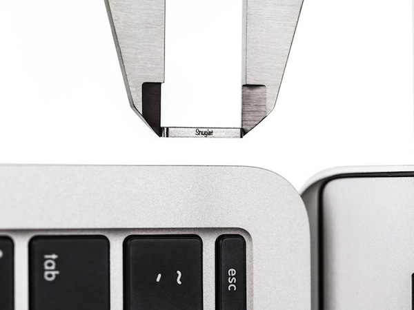
Unlike their first generation counterparts, the redesigned MagSafe connectors are not very forgiving when charging a laptop in your lap, on the bed, or on the sofa. In attempt to better balance the strength of the MagSafe connector, Tetrio has developed the Snuglet, a small ring that tightens the MagSafe connector just enough so that it stays in place when we’re using it, but is still supposed to come out of the laptop when it accidentally gets pulled. It pops into the charging port on your MacBook and is later removed with a removal tool (it looks kinda like a SIM tray ejector tool).
I won’t lie. I’m admittedly super skeptical of this particular KickStater because if it fails to prevent a falling MacBook then it’s really not that useful. I would love to see a proper demo video showing that the MagSafe 2 still works to save your MacBook’s skin when the cord is tripped on, especially with a laptop as light as the MacBook Air.
Tetrio are asking for $9,000 for their campaign, raising $2,977 so far. The first 250 backers can pre-order a pair of Snuglets for $12, while the second batch of 250 can pre-order it for $15. Everyone else can pledge $19 for their very own pair of Snuglets. Learn more about this Kickstarter and back the Snuglet here.