Soon after Google announced they would shut down their RSS platform Reader this July, Feedly confirmed they would build an API clone – codenamed Normandy – to ease the transition from Reader to Feedly for users and third-party developers. Essentially, this meant Feedly had been working on its own RSS syncing service with support for third-party clients to complement its own set of native apps.
In a blog post published today, Feedly has announced that they have been working with developer partners over the past two months to ensure the feedly API, based on the Normandy project, could launch with an ecosystem of native third-party apps. And among the apps that will support Feedly before July 1 (when Google will shut down Reader) there’s Silvio Rizzi’s Reeder, one of my favorite RSS apps for the iPhone and iPad.
We are also hearing from users that saving their feeds is not enough: One of the key features of Google Reader was that they had an ecosystem of apps – apps that people love and depend upon.
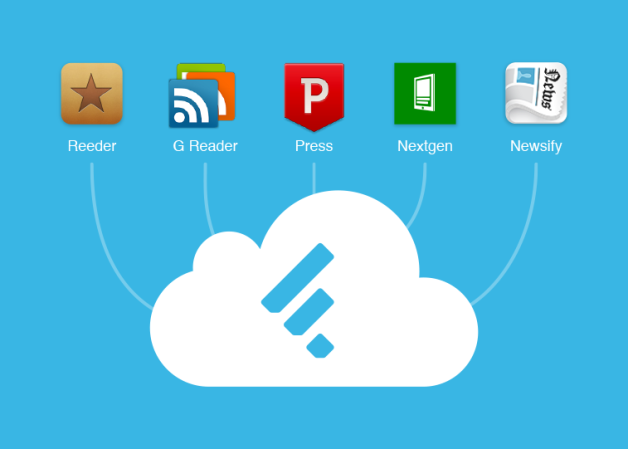
We have been working behind the curtains with the developers of Reeder,Press, Nextgen Reader, Newsify and gReader as design partners for our Normandy project. Today we are excited to announce that you will be able to access your feedly from all these apps before Google Reader retires and that the access to feedly API will be free. More details soon.
I have reached out to Rizzi, who confirmed Feedly support will indeed be added to the next versions of Reeder. His client, which was updated last April on the iPhone to support Feedbin sync and local RSS feeds, will also be updated for Feedly integration. While a precise release timeframe isn’t clear yet, it’s safe to assume Feedly integration will first come to the iPhone and then to Reeder for Mac and iPad (Rizzi made Reeder for iPad and Mac free while he’s working on a major 2.0 update).
Rizzi also told me that Reeder will support Feed Wrangler, David Smith’s RSS service that launched in late April. In my review of Feed Wrangler, I noted:
In the next “few weeks”, an official API will be released to let third-party developers create Feed Wrangler clients, and I think that will be a key aspect for scaling the service’s adoption rate to accommodate different kinds of users and applications. While the platform is solid and reliable, it lacks the beautiful interface polish of Google Reader apps like Reeder, or the power-user functionality of Mr. Reader’s services menu. The official website and apps should serve as an example of what Feed Wrangler can do, but it’ll be up to third-party clients to prove Feed Wrangler’s flexibility.
Again, as with Feedly integration, Rizzi can’t provide a specific release date today. Feed Wrangler, which has become my favorite Google Reader replacement, comes with a series of unique implementations of the decade-old concept of syncing and reading feeds, and it’ll be interesting to see how Reeder will take advantage of it in its custom interface.
Today, another popular RSS app for iPad – Mr. Reader – confirmed that it will add support for Feed Wrangler (alongside Feedbin and Fever) in a future 2.0 update.