This Week's Sponsor:

Copilot Money

The Apple Editor’s Choice Award App for Tracking Your Money. Start Your Free Trial Today


Tweetbot for Mac Review

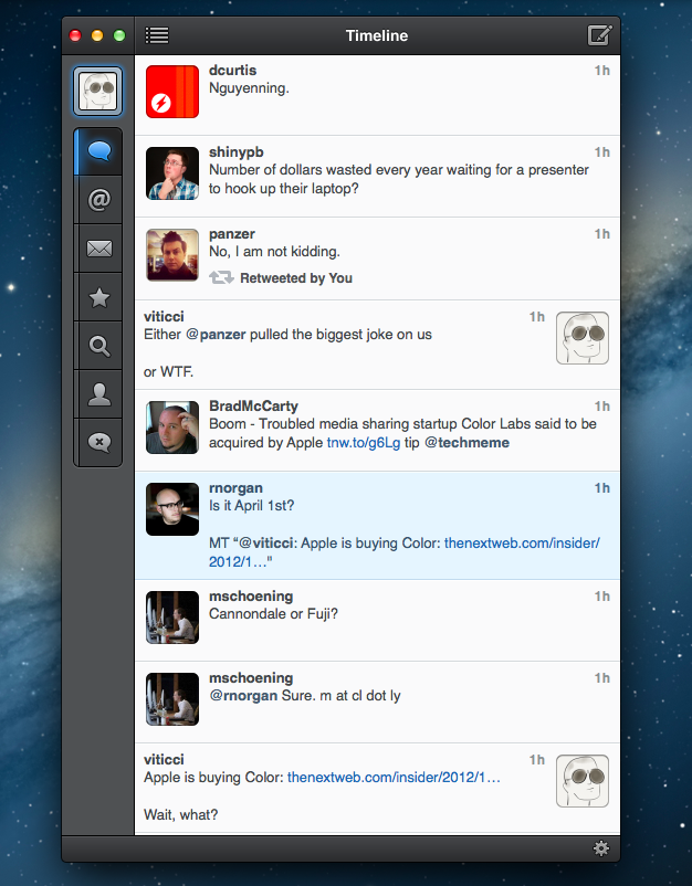
When the first alpha of Tweetbot for Mac came out in July, I said I would take a look at the app again. Here we are, three months later, with the final version of Tweetbot for Mac available on the App Store.

I concluded my review of the public alpha version with:

Right now, Tweetbot for Mac is, in my opinion, already superior to any other client for OS X — and it still can be improved. More importantly, Tweetbot makes better use of Twitter features than Twitter’s own Mac app, and that says a lot about the importance of third-party clients in this ecosystem.

In calling the alpha version of Tweetbot a “superior” product, I took quite a stance. I had been using the alpha for weeks before the public release, and I had the perspective and context to make a conscious and reasonable decision about my statement. I knew I was going to like Tweetbot and use it on a daily basis. Three months later, that’s still the case.

I’ll get to the point right away. Tweetbot is, in my opinion, the best Twitter client for Mac. From my perspective, no other app gets closer to the amount of polish and functionality that Tapbots poured into their latest creation, making it the most powerful, fast, and elegant Twitter app I’ve seen on OS X to date. In hindsight, it’s also a superior product than Twitter for Mac, which, as you may recall, used to be my go-to client. Three months ago I reviewed an app that I knew was going to be great.

In thinking about how I should approach this new review, I came to the conclusion that you don’t need me to go through the backstory of Twitter clients on the Mac. Here’s what I wrote, again, for context:

Ever since Loren Brichter (creator of the original Tweetie, who sold his app to Twitter and went on to work there) left the company, Twitter for Mac — what I had deemed as the best Twitter client for OS X — fell into an unexplainable state of abandon and lack of updates. You would think it’s in Twitter’s best interest to keep a native client up to date with the latest features of the service; and yet, after a solid first version — which came after years of speculation on Tweetie 2 — Twitter started ignoring the app, failing to bring several of Twitter’s new features (such as inline media and updated search) to the desktop. It only got worse recently: after many updates to Lion, Twitter for Mac has started showing new bugs and glitches that haven’t been fixed by Twitter, alongside the ones that have always been there and were never corrected. And then with the release of the Retina MacBook Pro, Twitter’s lack of support for high-res text and graphics became the proverbial final nail in the coffin of what used to be a great app.

Twitter for Mac still hasn’t received an update since last year. Some say it’s no longer in development.

In my review of Tweetbot Alpha, I briefly touched upon features that were missing from the app:

For instance, there is limited support for keyboard shortcuts, there are some rough edges around the interface, and one of my favorite features of Twitter for Mac — being able to navigate and switch sections with gestures — isn’t yet available. Indeed, Tapbots say that features like better management of multiple windows will be coming in the future, and they confirmed in a blog post that they are planning “ on making everything as beautiful and pixel perfect” as they can. Don’t be surprised if, in this version, some pixels will look misaligned or out of place. Eventually, it will all be fixed.

It is with this standpoint that I want to look at Tweetbot again: you don’t need me to know what Tweetbot is or what it looks like. Between the Mac and iOS, we’ve covered Tweetbot extensively here at MacStories.

What follows is my review of Tweetbot 1.0 based on how I use the final version of the app. The little features and the details I’ve come to rely upon, and the overall functionality that makes Tweetbot the best Twitter client for Mac. Read more


Check the Weather

I’m not obsessed with weather apps as much as I am with text editors. Throughout 2012, several developers came out with their own takes on presenting weather data in beautiful interfaces with custom designs; however, when it comes to weather, in spite of my non-obsession, I demand efficiency. Most of the time, many of the “great-looking” weather apps only focus on capturing the user’s attention with pixels, whereas weather software should, in my opinion, pay attention to data quality and information density more than anything else.

For the past week I’ve been using Check the Weather by David Smith, and, interestingly enough, I haven’t gone back to Apple’s Weather app yet. Like I said, I’m not obsessed with weather apps for iOS, but I like to try a new one every once in a while. In the past months I’ve always ended up going back to Apple’s app after a few hours – so there must be something Check the Weather is doing well.

I don’t want advanced data that I don’t understand from a weather app. To grasp the reason why I’m liking Check the Weather, I made a list of the features I need from a weather app:

  • What’s the weather like today
  • What’s the weather going to be like later today
  • What’s the temperature going to be like today
  • When is the sun rising (I live in Italy, work on a US timezone, so I see the sunrise every morning)
  • What’s the weather going to be like tomorrow
  • What’s the weather going to be like this week

With these few “requirements”, I can get a pretty clear overview of weather conditions and temperatures. Check the Weather is remarkably good at this because it presents many data points without cluttering the interface.

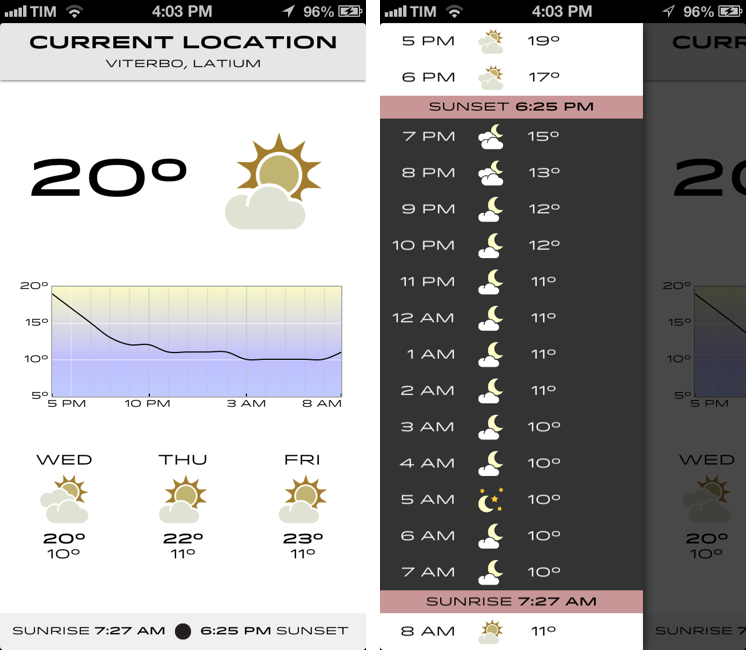
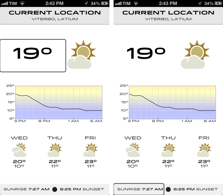
Check the Weather is a dashboard for weather conditions. At the top, there’s a bar that indicates your current location and, through a subtle animation, when the app is checking for updated data. Immediately below this bar, you’ll find the current temperature and weather conditions for your location. And then, underneath conditions, one my favorite features of the app: a graph of temperature for the next 12/15 hours. It’s a simple and effective way to visualize temperature changes (like how it dramatically drops between 6 and 8 PM).

Continuing with the main screen, the bottom part is dedicated to showing weather conditions and low/high temperature forecasts for the next three days and sunrise/sunset times. I particularly appreciate the sunrise functionality, as I mentioned above, and I find it somewhat curious that several developers decide not to include it. I also found it accurate for my location (Viterbo, Italy), and I only noticed a few days ago that moon phase is included in this section as well.

One thing that’s immediately distinctive about Check the Weather is its design. Different from any other weather app I’ve tried, Check the Weather makes extensive use of Hoefler & Frere-Jones’ font Idlewild for all its weather forecasts. While I wasn’t sure about this choice at first, within a few days I’ve come to appreciate the unique look of Check the Weather – this app is not yet another Clear clone. Check the Weather is different (a weather app with a very specific font and focused on data rather than prettiness isn’t something you see every day), and I like it. I can see, though, why this is also a very bold (no pun intended) move on Smith’s side: sometimes, people just want pretty pixels heavy on graphics and animations.

Check the Weather is unique in how it approaches the trend of placing additional information in a panel on the side. The app, in fact, uses two panels to display hourly forecasts and extended forecasts for the next 12 days. Hourly forecasts are nicely implemented, as “dark hours” are embedded between sunset and sunrise – as they should be. I don’t typically use extended forecasts (I think predicting 10 days in advance is a bit too much), but I like how they’re presented nevertheless.

As an Italian who reviews weather apps, the typical dreaded moment arrives when it’s time to talk about data. Simply put: if you live in the US you’ll have more features. While Check the Weather tries to be “global” with accurate data by HAMweather, there are several functionalities that are US-only, such as hazardous weather alerts from the National Weather Service, a doppler radar precipitation map, and integration with Dark Sky for minute-by-minute precipitation forecasts. I haven’t been able to test this, but David told me that Dark Sky API data is available in the precipitation view (swipe up from main screen). I believe Check the Weather is the first app to integrate with the recently announced Dark Sky API, and, even though it doesn’t support push notifications yet, it is a huge plus for US customers. As an Italian, all I can say is that weather data and forecasts were accurate and in line with Yahoo weather (the provider Apple uses).

One thing I’ve noticed about Check the Weather: it is localized in 7 languages (including Italian), and it is fully VoiceOver-enabled.

Check the Weather accessibility

Check the Weather accessibility

Check the Weather’s support for VoiceOver allows users to listen to forecasts.

Check the Weather is refreshingly different. It doesn’t look like any other weather app I’ve tried, and it leverages its uniqueness to provide weather data in a variety of ways that I find useful and intuitive. What I like most about Check the Weather is that it brings me the information I need without confusing me with custom menus or complicated interface designs. At this point, I only hope David will find a way to add more international weather providers and release an iPad version of the app.

Check the Weather is available at $2.99 on the App Store.


RSS.app

RSS.app

RSS.app is a very simple Mac app developed by Joost Schuttelaar following the removal of RSS feeds from Mail and Safari in Mountain Lion. RSS.app sits in the menubar, and checks for updates to your feeds every few minutes or hours. It then displays new article alerts using Notification Center.

The app is almost invisible: It is embedded in the status menu and uses Mountain Lion’s Notification Center to alert you of new posts. You can use RSS.app to import your existing list of RSS feeds from Apple Mail — even after you’ve updated to Mountain Lion.

The list of feeds to check can be configured in the app’s preferences, and you can import feeds from Mail even if you’ve already upgraded to Mountain Lion. The app is extremely simple: it’s got no keyboard shortcuts, menus, or distracting interface elements – it’s just a menubar checker for RSS feeds. Clicking on a notification will take you to the article using your default browser, and that’s it.

As Michael Tsai noted, the app has been rejected by Apple because of rule 2.8, which says “Apps that are not very useful or do not provide any lasting entertainment value may be rejected”.

If you think RSS.app can be useful to you, download it here.

Permalink

Average App Size Increased By 16% Since March

Average App Size Increased By 16% Since March

MacRumors points to new data by ABI Research, showing that, since March 2012, the average app size has increased by 16%:

The iPad 3’s Retina display and Apple’s more liberal submission policy have caused the file sizes of leading iOS apps to grow substantially, especially in games. The latest data from ABI Research shows that the global average app size across all categories was 23 megabytes in September, 16% more than in March.

On March 1, I wrote:

I see two solutions. Either Apple gets the carriers to agree to larger download sizes, establishing a new “average” that should work for most apps (let’s say 60 MB as Panzarino suggests), or they rebuild the download mechanism completely by allowing devices to “ignore” resources they don’t need. The second solution would be a “cleaner” approach, in that it would address the root of this likely scenario — that is, devices downloading apps containing all kinds of images and resources for Retina and non-Retina displays.

As we know, Apple decided to increase the maximum download size over cellular to 50 MB. This, combined with LTE networking, has allowed developers to be more relaxed in regards to their app sizes, and users to have reasonable download times on 4G (or DC-HSDPA). The solution I proposed earlier this year – a way to identify which assets to download for an app on a specific device – would still require a major rework of iOS.

Due to international pricing, this year I had to get a 16 GB iPhone 5. But I regret my decision. Something we’ve learned in the past two years (since the Retina display was introduced in 2010) is that that app sizes are only going up, and you’re never going to wish you got a device with less capacity. You’ll either be fine, or want more. With the iPhone 5 and Retina + Universal games, I find myself having to keep an eye on my available space, which is something I despise doing.

For the future, I hope 32 GB will become the new 16 GB, and I’m looking forward to 128 GB iPhones and iPads.

Permalink

SearchLink: Markdown Links Without The Browser

I don’t know how Brett Terpstra finds the time to do everything he does, but I do know I enjoy the results.

Brett’s latest effort is SearchLink, a system Service to generate Markdown links automatically for a variety of web services. In Brett’s words:

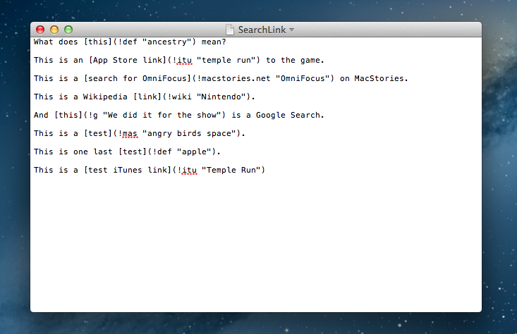
SearchLink is a System Service for OS X that handles searching multiple sources and automatically generating Markdown links for text. It allows you to just write, marking things to link as you go. When you’re done, you run it on the document and — if your queries were good — have your links generated automatically without ever opening a browser.

Essentially, SearchLink is a Ruby script that, in the background, generates valid Markdown for inline links inserted in plain text. These can be links pointing to a Google search, a Mac App Store or iTunes search, last.fm, Wikipedia, and more. Instead of having to switch to the browser when you’re writing, you can just write using SearchLink’s simple syntax. Once you’re done, run the Service, and SearchLink will contact web APIs to transform your text into the first/best result for your query, formatted in Markdown. Read more


Apple Confirms: Media Event on October 23

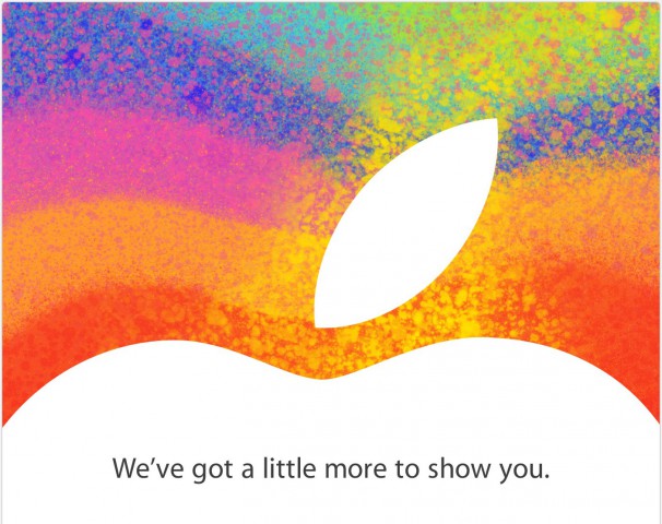
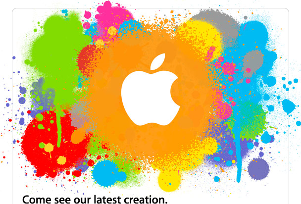
As first reported by The Loop’s Jim Dalrymple, Apple just sent out invitations to the press for a media event taking place on October 23 in San Jose. The invitations show an Apple logo with the tag line “We’ve got a little more to show you”.

Unlike other recent events that have been held at the Yerba Buena Center for the Arts in San Francisco, Apple will hold this event at the California Theatre in San Jose .

According to recent speculation, Apple will unveil a new, smaller 7.85-inch iPad at the event dubbed “iPad Mini”. The device has been long rumored to be a smaller version of the last-gen iPad 2, carrying the same 1024x768 non-Retina display in a thinner and lighter body with a smaller display. The core feature of the iPad Mini should be portability, as well as a reduced price for consumers.

Curiously enough, the invitation is somewhat reminiscent of the one sent for the original iPad event in January 2010.

As noted by Jason Snell, the last time Apple held an event in San Jose at California Theater was for the iPod photo announcement with a Bono/Edge live performance.

Based on more recent rumors, next week may also see the introduction of refreshed iMac, MacBook Pro, and Mac mini lines. Specifically, Apple is rumored to be planning a 13-inch version of the MacBook Pro with Retina display, a thinner iMac, and a new Mac mini model.

To get a sense of what a 7.85” (as opposed to 9.7”) iPad Mini would be like, check out our mockups from July.


Watermark Releases iPhone App

Watermark Releases iPhone App

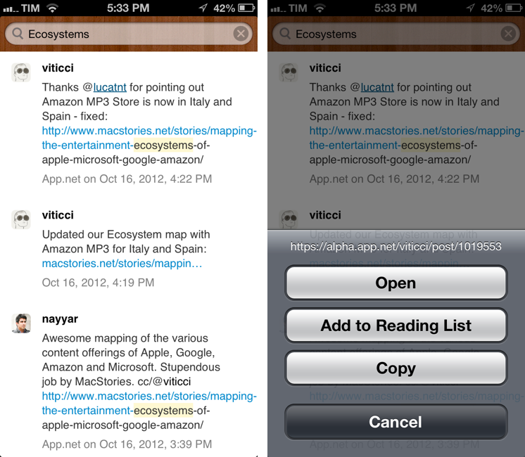
Twitter and App.net archiving and search tool Watermark.io gained a first official mobile companion today, a native app for iPhone. Dubbed “Watermark Mobile”, the free app is very simple, as it’s solely focused on letting you search and copy links to tweets or posts.

Watermark is a searchable archive of tweets and App.net posts. It downloads tweets from everyone you are following, so you can go back and find older tweets later. And it provides a backup of all your own tweets and favorites forever.

Watermark Mobile is, for now, an interface to your archive. There are no options or sidebars – just a search bar to retrieve posts from your Watermark archive. Right now, you can search and tap & hold on a post to copy its link; you can tap on usernames to open their profiles on Twitter or App.net. For a future version of the app, I hope developer Manton Reece will add native integration with Watermark filters and saved searches.

You can download Watermark Mobile for free on the App Store. You can catch up on our previous coverage of Watermark here.

Permalink

Mapping The Entertainment Ecosystems of Apple, Microsoft, Google & Amazon

Please note: An update to this article is available here, it includes the December 2012 iTunes expansion (Music & Movies) as well as Xbox Music.


The choice of what phone or tablet to buy is one that often involves many considerations, chief amongst those is the physical device and the operating system that it runs. But I think there is a third fundamental consideration that is growing in importance: what services and entertainment ecosystems you’ll be able to access. You need only look back to the recent criticism of iOS 6, in which Apple replaced Google Maps with their own Maps app. Summing it up generally, Apple’s Maps app is sub-par to what it was replacing and that mattered to people - enough that Tim Cook felt the need to apologise for the frustration the switch caused.

Today I want to focus specifically on the entertainment ecosystems of Apple, Google, Microsoft and Amazon. I’m referring to the various digital content stores that are run by Apple, Microsoft, Google and Amazon - specifically their Music, Movies, TV Shows, eBooks and App stores. In my mind, there are four general aspects that make a good entertainment ecosystem:

  • Wide selection of quality content
  • Competitive prices
  • International availability
  • Interoperable on a user’s devices

I want to explore the third aspect in depth today, because it’s something that I feel is all too often downplayed by the technology press (which, coincidentally, is based predominantly in the US). I’ll also briefly discuss the fourth aspect as well at the end. Why are these two aspects so important? Well, smartphones and tablets are devices that have universal appeal, so for Apple or any of the other three to win the smartphone or tablet “race” - an entertainment ecosystem that is available across the world, not just in the US, isn’t just a cool extra feature, it’s a necessity. The US may be one of the biggest markets for such devices today, but is there any doubt that these devices will rival the prevalence of personal computers (which are everywhere) in years to come?

I’ve collected data on which countries each service is available in and then added in population figures to create many of the graphs and diagrams you’ll see below, mixed in with some of my own analysis and thoughts. Please note that the five HTML5 map diagrams are interactive, click on the logos of the four companies to compare their coverage.

Read more