Having updated their lineup of MacBook Airs earlier this year, Apple has turned their attention to the MacBook Pro lineup, updating the 13-inch and 15-inch models with more powerful hardware while cutting prices for customers. These updates were announced by Phil Schiller at the Yerba Buena Center in San Francisco, California, during today’s Keynote.
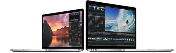
13-inch MacBook Pro with Retina display:
The biggest complaints with previous generation MacBook Pros is that their hardware couldn’t keep up with the Retina display. Many reviewers found the initial 13-inch model to be somewhat lackluster in performance, with laggy scrolling noticeable throughout the OS X interface. With today’s update, the 13-inch model is getting some notable improvements.
First up are design changes to the chassis, with the 13-inch model shedding size and weight. It’s both lighter and smaller than before, weighing only 3.46 pounds and measuring at only 0.71 inches thin.
Next are the performance improvements. New buyers can expect greatly improved performance thanks to Intel’s Haswell processor, and integrated Intel Iris graphics. As the new processor is much more power efficient than what’s found in previous models, the 13-inch model now gets up to 9 hours of battery life when web browsing or watching iTunes movies. As Phil Schiller said on stage, you could watch Christopher Nolan’s Batman trilogy and still have battery life to spare. Just like the new MacBook Airs, the 13-inch MacBook Pro has received PCIe-based Flash storage, 802.11ac for wireless, and updated Thunderbolt 2 ports.
In terms of performance gains, the new processors are 90% faster than the previous generation, wireless throughput is 3x better at similar distances when compared to 802.11n, and flash speeds are 60% faster than before.
The base model 13-inch MacBook Pro with Retina display has been reduced in price by one hundred dollars, starting at only $1299 with the following specifications:
- 2.4 Ghz dual-core Intel Core i5 processor
- 4 GB of 1600 MHz DDR3L memory
- Intel Iris graphics
- 128 GB PCIe-based flash storage
15-inch MacBook Pro with Retina display:
Unlike it’s smaller sibling, the 15-inch model hasn’t received any design changes to its chassis. All of the base improvements found on the 13-inch model are found on the 15-model. 802.11 ac wireless, PCIe-based flash storage, and Thunderbolt 2 come equipped in addition to processor and graphics improvements.
Instead of opting for a dual-core processor, however, Apple is configuring their 15-inch models with a quad-core Crystalwell processor that also comes with integrated Iris Pro graphics from Intel. Optionally, customers can choose to add a discrete graphics solution, Nvidia’s GeForce GT 750m, with 2 GB of video memory that’s great for editing video or playing games. Despite having all this newfound power, the 15-inch model will get up to 8 hours of battery life when browsing the web or watching movies from iTunes.
The base model 15-inch MacBook Pro with Retina display has been reduced in price by two hundred dollars, starting at only $1999 with the following specifications:
- 2.0 GHz quad-core Intel Core i7 processor
- 8 GB of 1600 MHz DDR3L memory
- Intel Iris Pro graphics
- 256 GB PCIe-based flash storage
Both models start shipping today, and can be configured from Apple’s Online Store. For more information, see Apple’s updated MacBook Pro pages at Apple.com.
For more coverage, check out our October 22 news hub and follow @macstoriesnet on Twitter.