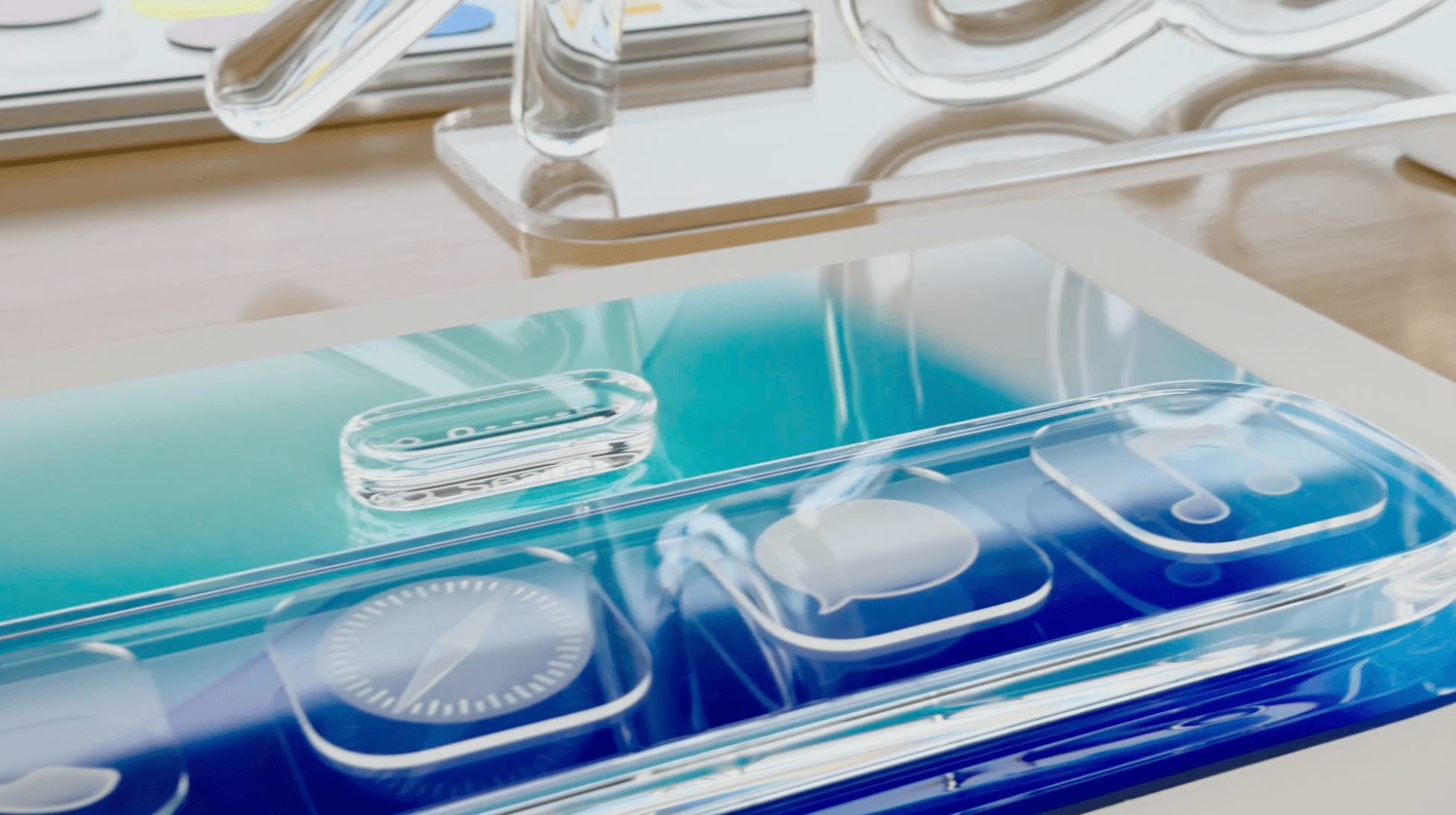
If there was one thing you could guarantee to come out of a major OS redesign, it’s that people would have opinions, and lots of them. Combine that with the fact that the new Liquid Glass design stretches across every Apple platform, and you’ve got a recipe for many, many hot takes.
Amidst the big reactions, both positive and negative, there has been some excellent commentary on not just the content of this new design, but also the whys and wherefores of one of the largest redesigns Apple has ever carried out.
One thing I think we should all be reminded of is the fact that this is the very start of the beta period. This is a time when much is broken, and a lot will change before the update is released to the general public. What is clear about Liquid Glass is that it is an opinionated design that, certainly at this point of development, will not please everyone.
This idea is perfectly laid out by Matt Bircher, writing for his blog Birchtree:
The challenge with opinionated design is that it’s really hard to do when you have 1 billion users; the safe thing to do is to be generic and slowly iterate on what you already have. It’s like flipping a house, painting all the walls white, and staging it with the most generic furniture you can find so as not to impart any personality or offend the sensibilities of anyone who walks in the front door.
A phrase I’m constantly reminded of is something that Federico often says he wants Apple to do: “get weird”. While this may not be the weirdest design ever, Apple is taking a bold leap and trying to do something new, different, and, yes, maybe even a little weird.
Brendon Bigley, writing at his blog Wavelengths, described his delight in installing the new iOS beta – sight unseen – and, despite not liking many parts of it, being thrilled by the opinionated way it had been created:
My designer brain sees Liquid Glass applied to elements like Control Center and thinks “That looks terrible. This is almost illegible.” But I also find myself smiling? Because Liquid Glass is legitimately fun to look at, and fun to use. It’s a huge swing and one I didn’t expect to land in a way that makes me truly feel like I have an entirely new phone from another universe.
However, there are many people who do not share this excitement. David Pierce over at The Verge was decidedly not impressed:
In that broadest sense, it’s logical that this is where Apple landed. It obviously wouldn’t, and probably couldn’t, fundamentally change the look and feel of every device it makes for billions of users around the world. No one wants that. So Apple just took all its elements and made them more universal: everything’s a little more round, a little more contained, a little less designed for a specific screen size.
And:
I’m not impressed, and I’m not optimistic. Apple is at its best when it has strong opinions about how things should work; even the attempt to get out of the way and let your content dictate everything feels like the wrong tack.
One of the loudest complaints about the Liquid Glass design has been the legibility of text on top of the glass-like UI. It’s an understandable complaint and an area of particular concern for those with visual impairments. But Steven Aquino, a disabled writer who delves heavily into the intersection of disability and technology, says he is not concerned:
All the flowery, romanticized marketing bluster regarding harmony means zippo if Liquid Glass isn’t readable. Personally, I find Liquid Glass to look damn cool and quite beautiful; nonetheless, I’m predisposed to be skeptical as a lifelong disabled person and thus was alarmed by some of what I saw in Apple’s marketing video. Fortunately, my fears were quickly allayed by high confidence in Apple’s track record in accessibility and confirmation that changes will be coming.
I connected with Sarah Herrlinger, Apple’s senior director of global accessibility policy and initiatives, for a few minutes after the keynote ended. It was decidedly not an official, on the record interview, but I can confidently report Herrlinger told me her teams worked in tandem with the design team to build Liquid Glass and make it as accessible as possible.
The shock of the new is always significant, but we often become accustomed to it. There is no doubt that Apple has work to do in order to perfect this new design, but I have confidence they will get there.
The biggest example of Apple’s ability to swing big and then refine is the Safari redesign in iOS 15. The discourse coming out of WWDC that year was incredibly fiery; however, Apple iterated on the design until it achieved a great version of the new layout, which was released to the public in the fall.
In the end, I think the malleable reaction from Jay Peters at The Verge will become the most common one when the final versions of Apple’s OS updates are released in the fall:
At first, I hated the big changes. That surprised me. I’m usually fine with UI tweaks. Back in the day, I was on board with even the earliest and worst versions of iOS 7. But after a couple of hours with the iOS 26 developer beta, Liquid Glass is growing on me.
My iPhone still functions like it used to. I have a lot of small complaints, especially with the spacing of settings functions and Control Center. But I expect Apple will tweak and fix a lot of the bigger issues ahead of the official launch of iOS 26 this fall.
It’s going to be a fascinating summer.
You can follow all of our WWDC coverage through our WWDC 2025 hub or subscribe to the dedicated WWDC 2025 RSS feed.


