This Week's Sponsor:

Copilot Money

Copilot Money, The Best Money Tracker, Launches on the Web – Limited-Time: Get 26% Off + 2 Months Free


Posts in reviews

Analytiks

Released yesterday, Analytiks 2.0 by Stelios Petrakis is an interesting widget-type iOS application to quickly check on your Google Analytics account. Whilst I don’t normally bother delving deep into Google reporting while on my iPhone, I have been looking for fresh alternatives to Garrett Murray’s Ego (which took a substantial hit in terms of daily usage after I stopped using Mint), and Analytiks delivers on the need of providing essential information at a glance with an elegant presentation.

Upon first launch, Analytiks will ask you if you’re using a black or white iPhone: this choice – falling back on user input as there is no way for iOS developers to determine the color of a device – will change the interface of the app accordingly, though it can be reverted in the settings. Using Apple’s widget apps for iPhone as a source of inspiration, Analytiks presents multiple sites associated with a Google account as full-screen “cards” you can horizontally swipe and double-tap to “flip back” and reveal more content. You can access up to 5 sites using the app.

The main screen displays a site’s total pageviews for the day and current month, with smaller counts for traffic sources (Facebook, Twitter, Google), visitors, and change since yesterday/past month. Typography is clean and focused, and I agree with the choice of displaying only an essential portion of Analytics data in this view. Pageviews for the day/month, visitors, and social traffic are the data points I want to check upon on a daily basis.

Double-tap (or hit the Dashboard-like icon in the upper right corner), and you’ll be brought to another screen showing various infographics for the past 30 days, 3 months, half year, or year. Here, you’ll find graphs for demographics, top browsers, desktop vs. mobile and PC vs. Mac users, time spent on your site, and new vs. returning traffic. It’s all incredibly pretty, the animations are cute, and the app updates data fast.

Analytiks looks good and it’s easy to use. If I had to nitpick, I’d argue that the data the developer chose to display gets the job done but there could be a section for top articles and referrals also embedded somewhere else in the app – though I recognize that’s also the kind of data that’s more difficult to visualize with fancy graphics and animations. Analytiks doesn’t let you modify time ranges and other data sets, but it does look great on the iPhone’s Retina display and it serves the purpose of being a simple widget to quickly check on some Google Analytics data.

Only $0.99 on the App Store.

Note: Stats pictured above are from my personal site, not MacStories.


Sunstroke - A Solid Fever Client for iPhone

In my review of Reeder 3.0, I mentioned how the app’s implementation of Fever doesn’t allow you to specify a time range to fetch Hot Links. In the way I use Fever, in fact, the possibility to use the app as a way to catch up on important news – rather than constantly checking for updates throughout the day – is a fundamental advantage over standard Google Reader and third-party Reader clients. I recently took a week off the Internet, and relied exclusively on Fever and Flipboard’s Cover Stories to keep up with the most important news I cared about. Being able to set a time range in Fever’s Hot Links is becoming a must-have for me.

Sunstroke by Gone East delivers on the need of a full-featured Fever client for iPhone with solid sharing options, a good interface, and proper Hot Links support. I recently started using Sunstroke as my main Fever client on the iPhone, and I have been very pleased with its results and integration in my workflow. More importantly, Sunstroke concretely allowed me to keep up on the news thanks to its time range-based Hot Links, providing actual tools to filter news I had missed by time period, thereby ensuring I could be brought up to speed on relevant items no matter my absence.

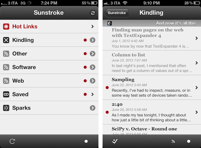
Visually speaking, Sunstroke offers a fairly familiar Fever experience. The main screen hosts Hot Links, Kindling, Saved, and Sparks sections, enabling you to switch between read/unread items and groups configured in your Fever account. I found refresh times to be slightly faster than Reeder’s – albeit it’s worth mentioning how Sunstroke comes with entirely different settings for managing Fever sync.

You can set the app to “sync automatically”, delete items after 2, 4, 6, or 10 weeks, and auto-mark items as read as you scroll. This last feature is extremely well done, with smooth scrolling when skimming through hundreds of subscriptions on my iPhone 4S. Overall, I like Sunstroke’s sync indicators and custom icons in the main screen of the app.

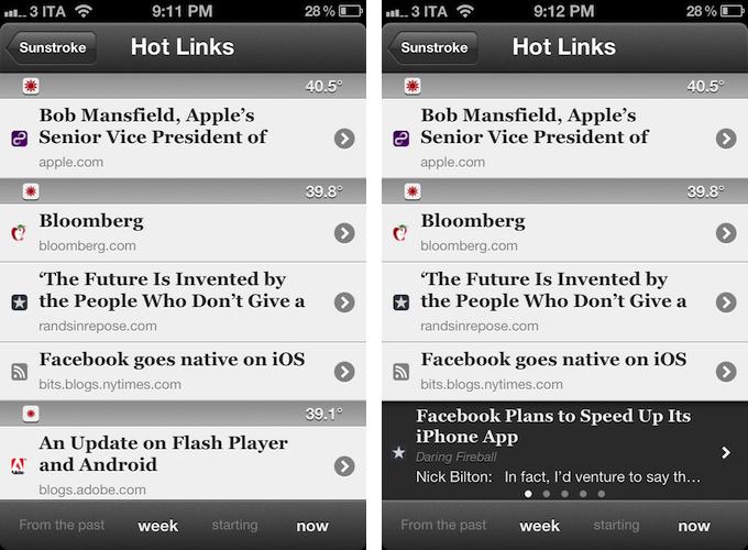
Where Sunstroke really shines is the Hot Links list. Unlike Reeder, a bar across the bottom of the UI lets you display Hot Links “from the past” few days, weeks, and month “starting” now, yesterday, and up to 5 weeks ago. This feature alone made purchasing Sunstroke worth it as it offers a solid yet simple way to set the time range according to which Fever’s hot items will be displayed. Per Fever’s typical presentation, hot items are sorted by “temperature”, and grouped by site.

Sunstroke stores every item from the Fever database on your device, which means every link that contributes to a link’s hotness can be viewed inside the app. This means that a) you can go offline and still tap around links and read articles through Fever’s own mobile viewer (though you can also use the Instapaper mobilizer) and b) you can tap & hold on a hot link to load related items as a swipeable “gallery” inline. The latter option is particularly attractive and well-implemented; my only issue is with the way Fever often cuts off headlines from hot links, but that’s not Sunstroke’s fault.

I found Sunstroke to be very polished in other areas, too. In the settings, you can tell the app to hide unread counts and show newest items first, or to cache images on WiFi-only while also setting a specific cache size.

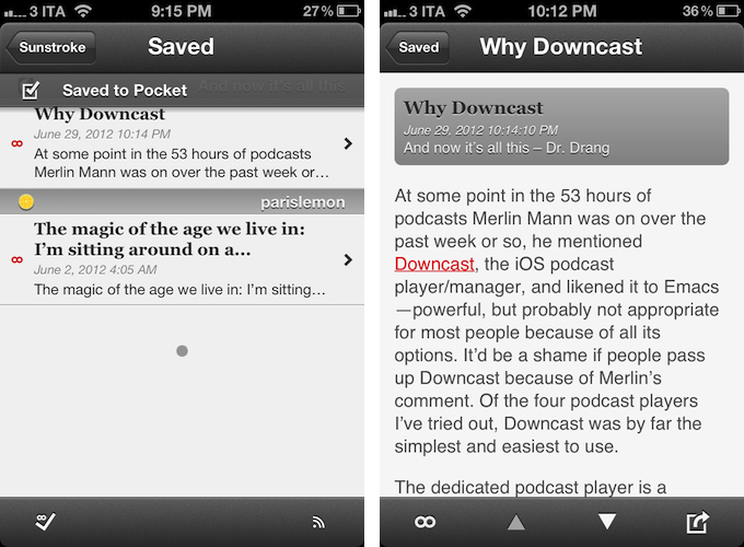
The app supports sharing through a dedicated sharing button and by tapping & holding any link, and the sharing options include Facebook, Twitter, Pocket, Sparrow, and Instapaper. Like Reeder, you can assign toggles for right/left swipe actions – mine are, unsurprisingly, set to Pocket and “Toggle Saved”, but you can also “Toggle Read”. The notification for saved items is also nicely presented and elegant.

Sunstroke is not perfect (the app crashed once in my tests; there is no iPad version for now; options to control font appearance and size would be welcome), but it undoubtedly is the most complete Fever experience currently available on the iPhone. Sunstroke has got good sharing options, great Hot Links implementation, a fast engine and navigation, and, overall, a feature set meant for heavy Fever users that outpaces Reeder’s basic support for the service.

Fever users looking for a solid iPhone client need to check out Sunstroke, which is available at $4.99 on the App Store.


A Fine Impression of Apple’s Modernized Podcasts App

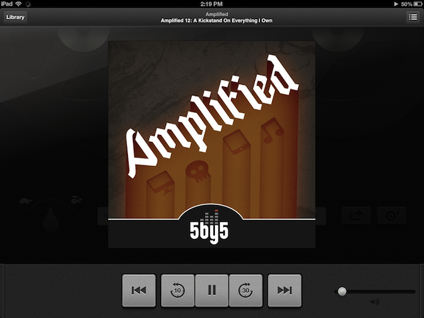
Apple’s Podcasts app is an acknowledgment that podcasts make up a substantial part of entertainment on iOS devices — more people than ever are subscribing to, learning from, and taking part in conversations around the topics that interest them. Long neglected with basic playback controls and mediocre syncing in the Music app, Podcasts is now its own standalone application. You couldn’t miss the news either — the Music app notifies you of this change on your iPhone or iPad when you open it.

With large and indie media networks recording weekly, if not daily, audio and video content, listeners who want “radio on their own time” can subscribe to and take part in discussions that they otherwise can’t be a part of through traditional radio or broadcast TV (i.e. time slots). Podcasts, while not a new concept, give listeners the opportunity to stream and download often short, consumable chunks of content that that’s more accessible than written text — it’s the way to catch up on news if you’re sitting in rush hour traffic, taking the dog for a walk, or doing the dishes.

Over the years, consuming podcasts becomes an incredibly intimate experience. Because people choose to listen on their own time, and often when they’re doing specific activities where they otherwise can’t read or listen to an available live stream, people look for specific features tailored to provide a custom listening experience. Being able to increase the playback rate of podcasts, set sleep timers, create playlists, add bookmarks, and stream podcasts over wireless networks has become increasingly important. Features, more-so than fancy user interfaces, are often preferred by users who regularly listen to podcasts.

Apple’s Podcasts application on iOS is their new central hub for finding, subscribing to, and listening to podcasts on your own terms. In consideration of how Apple’s podcast directory (their Catalogue) and podcatcher intermingle, it’s a pretty typical Apple experience. And in places where I thought Apple would fall short, I’m actually impressed at the amount of stuff they’ve added to their once featureless podcatcher. While Apple has certainly gone above and beyond my expectations in what they’ve provided, I think there can be some room for improvement.

Read more


Review of WTHR - A Simpler, More Beautiful Weather App

I admit it, I have a bit of a fetish for weather apps. My taste in them is a bit different than all the other categories because I am a data geek when it comes to what’s happening outside. Apps like WeatherSnitch do a great job showing you a lot of info on a small screen but many don’t present them to the user very effectively. Until Dark Sky for iPhone came out, I didn’t think I could use a weather app that focused on the important details instead of all of them. Since then I have changed the way I use weather apps and rely on Dark Sky for short forecasts / radar and iOS’ built-in Weather app for extended forecasts until today.

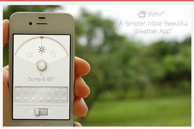
WTHR is a brand new weather app from David Elgena. He wanted to build a weather app based on Dieter Rams’ 10 principles of design so the user could stop wasting time staring at weather radars and atmospheric pressure readings and spend more time enjoying what’s happening outside. WTHR started as a mockup on Dribbble about a month ago and received a lot of attention there. More mockups and a programmer later, WTHR was submitted to Apple and is available today.

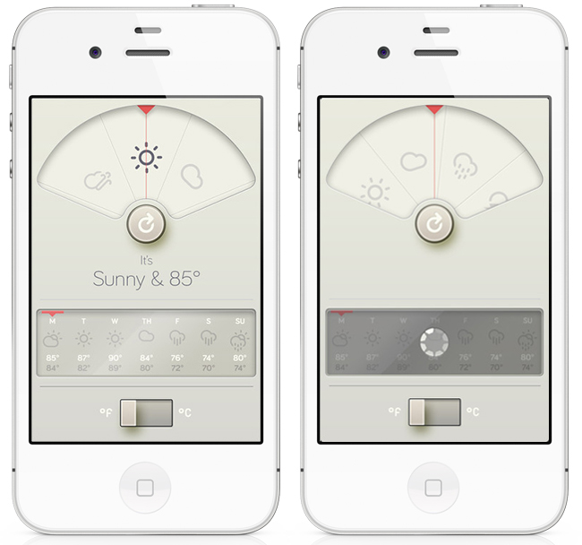
WTHR is one of the best looking weather apps available — I love the style and simplicity of it. I appreciate that it hides the status bar to give your entire iPhone the look of being a handheld weather device with zero distraction. Launch the app, watch the animations, get your forecast and go. Some people may not like the color scheme but if you know Dieter Rams’ designs you understand where the colors come from. When you launch the app, it asks for your location then the UI presents the weather data in a retro-futuristic style. There’s only 2 buttons to interact with, one to refresh the forecast and the other to flip from Celcius to Fahrenheit. The refresh animation is great and the spinning notification in the 7-day forecast almost looks like a Rams dial. Underneath the current forecast is a 7 day extended forecast. All the weather icons are Adam Whitcroft’s wonderful Climacons which look perfect to the stylings of WTHR.

David Elgena told me that they are already working on future updates to include, but not complicate, more features and data like multiple locations and a dark mode. “My intentions with WTHR was really to create something as beautiful as the device that hosts them… and I do believe that even UI designers and app developers could gain inspiration from Dieter Ram’s product designs. Too often we load digital products with features and hidden or hard to use interfaces because we are suddenly given this almost infinitely layered product, the real discipline is control. There is no difference from when Dieter Rams was designing his first clock face…to an app on the iPhone. I look forward to creating more apps in the future…and continually improving upon WTHR.”

The lack of contrast in the 7-day forecast can make you squint a bit — an option to switch to a 5-day forecast could help. I’m glad the app icon wasn’t designed with the same skeuomorphism in mind, as I am not a fan of doing this in iOS because it clashes too much with most other icons. International iOS users – don’t worry, WTHR uses a global geo-location weather API so no one is exempt from using this great app. The weather data is a little different than what iOS uses but only a few degrees at times as Federico noticed in Italy. WTHR has gained a spot on my home screen with its beautiful, focused purpose. WTHR is available for 99¢ via the App Store.


WeatherSnitch 2.1 Brings Full-Screen Weather, New Artworks

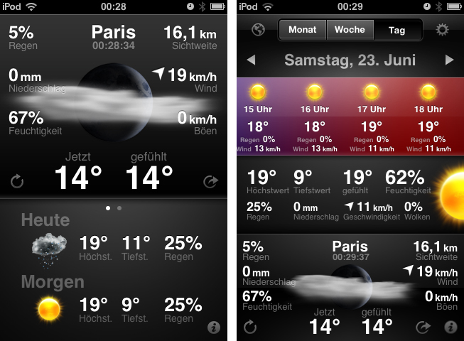
Today is the second time I don’t obey my “never cover stocks and weather apps” principle. I think I’ll have to abandon it completely, as there are way too many cool UIs in this app category. After I reviewed StockTouch some weeks ago, I recently discovered WeatherSnitch 2, a weather app by developer Snitchware (with a website certainly inspired by apple.com). The original WeatherSnitch v1 and this new update are designed as  “one view is all it takes” apps — just fire them up, get to the main screen displaying all relevant information, and continue with your workflow right away. Read more


Transit Beautifully Displays Public Transport Routes Around You

Google GTFS is an acronym some developers and bloggers might already be familiar with. The Google General Transit Feed Specification is a developer tool that public transport services can use to track their bus or train lines on Google Maps via GPS. Using GTFS, created using a bunch of zipped text files (you can get more information on the Google dev pages), public transport companies can voluntarily publish their routes for Google Maps users to incorporate them into route planning. Front-end developers can also benefit from this specification. One of the newest products for the iPhone which incorporates GTFS is Transit by Sam Vermette and Guillaume Campagna, which has been published today.

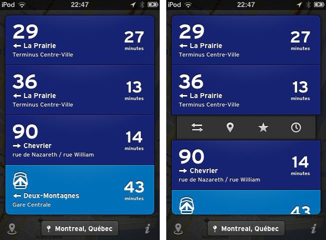
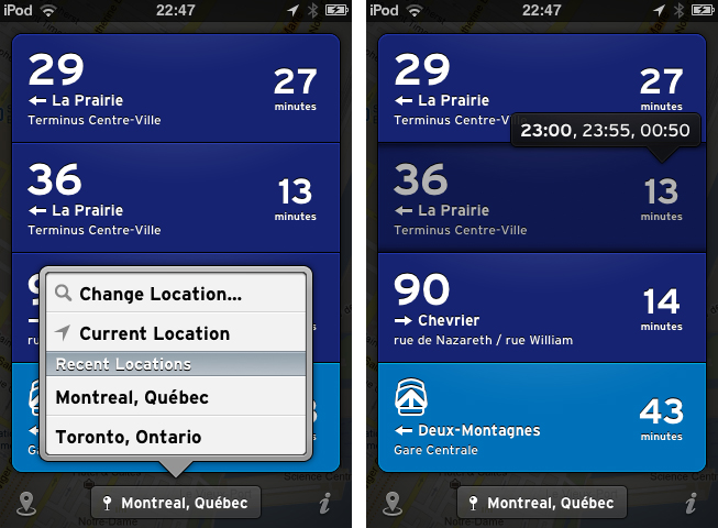
Transit locates you via GPS or Wi-Fi hotspots, and then displays the nearest public transport routes sorted chronologically after their departure. This way, you’re always up to date what traveling possibilities you have around you. If it’s in your home town, you only get what you need and what you’re familiar with, because the app displays only the nearest lines with the “real lines” colors and numbers. Your current location is then displayed in a small panel at the bottom of the screen with the route information in a custom list above it — tap it to change the saved location. Transit also works offline, so you can download foreign cities’ routes before traveling there to save 3G costs and still always be up to date. The bundle downloads can be reached via the location button in the bottom left corner of the screen (along with the amount of public transport agencies displayed).

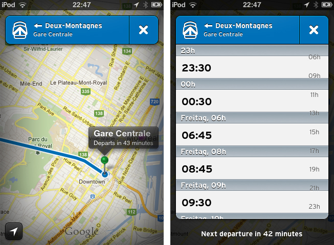
When looking at the list of your closest routes, route information elements inform you with big, readable typography about the next departures with location, time of departure, line information, bus/train stop location, and the route direction. Tap and hold one of them to get the direction and distance to the next stop, or to get the next departure times displayed in a cute popup panel above your finger. When you tap on one of the elements, there are four other actions to perform with it. You can switch the direction if the displayed destination is not the one you’re looking for,  then check the route with the Google Maps view to see other stations and their route distances. Furthermore, you can star routes to mark them as favorites so you can always pin them to the top of your list. You can also browse the whole line schedule for the day in a separate list if you need the information for a departure at a later time. This way you get the information you need quickly and efficiently.

Currently, Transit is only supported in three Canadian cities: Montreal, Toronto and Quebec. But the two developers promised to work hard and want to finish covering Canada by the end of July, with European and U.S. cities following in August. To keep the app clutter-free, Transit will always display the nearest routes and change displayed transport companies when the user is in a new location.

Transit can be freely downloaded on the App Store, however, certain features are restricted until they’re unlocked with a subscription. Using the free version, you cannot view routes offline and the app only displays the three closest routes. By paying $0.99 for one month, $2.99 for six months, or $4.99 for a year, you add the ability to view maps offline and see all routes within a 1.5km radius. This is a very good pricing plan: you can get free transit data in a pinch, or pay to receive the most comprehensive mapping data (which will probably be worth the subscription fee for constant travelers once more cities are added).

But what makes Transit really worth a try is its user interface. The trend of applying outer shadows and light textures to UI elements and buttons has been a common way to style an app in the last years, but not many designers manage to make it unique while still using this method. Sam Vermette did: Transit features a stunning amount of cool interface elements. Some of my favorites are the Tweetbot-like action menus when tapping a list element, the already mentioned small information popups, the black vignette design around the menus and the Google Maps view, and especially the popup list when changing the location. The latter shows a deep care for consistent design: within the list, the developers changed the text display font to the sans-serif font which is used throughout the app. Using Transit’s UI is pretty smooth — the performance only lacked a couple times when online data got fetched.

Another thing I really like about Transit is the icon. It’s unique, simple, and makes my fingers want to touch it.

So, as you could possibly tell from the review, I like Transit very much. I’m thrilled to see it coming to Europe over the next months (although not every public transport agency supports GTFS), because it’s plain, easy to use, but still has a great feature set which really solves the problem of combining multiple public transport agencies in one single, and still awesome user interface. Even if you’re not a resident of Toronto, Quebec or Montreal, I still urge you to download Transit for free on the App Store, take some time looking over its stunning UI, and wait for your city to be supported.

Be sure to keep an eye on Transit’s Twitter account to stay up to date on when new cities are added.


Review: Found

“cmd” + “space”. This is by far the most common and important keyboard shortcut in Mac OS X; opening Spotlight for quick file access. More or less every sophisticated Mac user types this key combination multiple times a day. What if now a developer says “let’s replace Spotlight with a new app that not only scans local data, but Dropbox and Google accounts as well”. Many might find that idea disconcerting and even scary, but for those of you who are interested in an alternative to Spotlight searching on the Mac, you might like Found by Found Software Inc.

After installing the app, Found can be, (attention, bad pun) found behind a menu bar icon. Clicking on it brings up an iOS Notification Center-like interface with an activated search panel at the top, which slides in on the left side of the screen (this means it also works great when in full-screen mode on OS X Lion). Found can also be toggled using a double tap on the ‘control’ key. I know, many people dislike double taps, especially on “real” keyboards, but I personally found it pretty useful, since it is faster to tap twice on one button than using a special key combination while typing. The result of all this was that it flawlessly integrated itself into my writing workflow - Found’s first big advantage compared to Spotlight. The second advantage was that this super quick method allowed me to quickly search and find the name of a song I desperately wanted to hear - much quicker than disrupting my work to go to iTunes and fumble around finding it there.

Read more


Just Type, And You’ll Get Your Perfect Quick Note-Taking Companion

When it comes to notetaking, I’m a Simplenote guy. I work a lot on the road and love typing on my iPad, so I need a syncing service to have all my notes constantly updated on all my devices. Apple incorporated iCloud syncing in their own Notes.app in iOS 5, but I totally detest the app’s interface and standard note typefaces like Marker Felt, or please forgive me the mention, Comic Sans (not in Apple’s notes app of course, but in really bad third-party ones). When I discovered Just Type by Shubham Kedia on Beautiful Pixels yesterday I also immediately checked, if it has any cloud syncing service, and yes, it’s iCloud compatible, but there is no Simplenote support. Because of this, at first didn’t want to test it at all, since I use apps after the “never touch a running system”-method —meaning I’m always afraid when switching from a reliable app to a new one. After some investigation of app screenshots, I decided to install it on my iPad, and thank god I did. Its UI contains some of the best graphic elements I’ve ever seen (Just Type is an universal app, but I’ll only cover the iPad version today).

Read more


PaintCode Automatically Transforms Vectors Into Valid Code

Many developers have problems with designing their apps due to the lack of knowledge on how to transform their graphics into valid and working Objective C code. Because of this, many semi-professional designers either choose iOS-preset interface elements or they design just badly colored, two-dimensional fields. This obviously leads to many incoherent, poorly designed apps no one wants to buy. If you are not able to do better but still want to offer something in the App Store, this is the only way to do so - even if it’s a very malicious one for pixel lovers.

To give developers an edge, Pixelcut is now offering PaintCode for Mac. It combines detailed and full-featured vector creation with a powerful code compiler to immediately convert your created UI elements into valid Objective-C code, which is ready for copy & paste implementation in Xcode. When starting a new design, you can set for which device and canvas, in which code language and which canvas the app has to compile your design. Then you can start creating, for instance, a button with the various shapes the app offers (traingle, star, rectangle and much more), and optionally apply new colors or even gradients to it using the upcoming selection inspector. With every change and addition you make to your graphics, the code will instantly update in the small editor panel in the bottom of the app window. To see the immense amount of time the tool can save, have a look at the screenshot below. I tried the demo version of PaintCode and started out with a simple oval area, with a light outer and inner shadow applied (usually used to make an object seem plastic). Just these two small UI features need more than 40 lines of standard iOS ObjC code. For more complex (and better-looking) elements, this app is a outstanding time saver.

PaintCode is a tool every busy UI designer and app developer should consider buying. It has an immense feature set and works fast and reliable. You can check out and investigate the Xcode files of various design examples created and coded with PaintCode on the app’s website; there’s also a demo video of the app. If PaintCode seems useful to you then, get it on the Mac App Store for a quite expensive, but still justified, $99.99.