This Week's Sponsor:

Dropzone 5

Improve your Drag-and-Drop Workflow


Posts in reviews

Droplr Draw Adds Lightweight Annotation Features To Droplr for Mac

Skitch is my favorite image annotation tool on the desktop and Marco Arment’s Bugshot is on my iOS Home screen, so when I saw the announcement of Droplr Draw last week I knew that it was something I needed to check out. Even if I’m a big fan of Skitch’s feature set on OS X – unlike some, I do like the Evernote integration – the app doesn’t provide the fastest way to capture, annotate, and share a screenshot, and Droplr Draw seemed promising.

Droplr Draw isn’t a separate app: it’s a feature of the Droplr for Mac app for existing Droplr Pro subscribers. Droplr Draw lets you a take a screenshot as you normally would with Droplr, add some annotations to it, upload it, and share it to Droplr. It’s essentially an extra layer between the Finder and Droplr’s cloud that instead of taking a file and returning its public URL opens an editing window first.

Droplr’s Draw view is extremely simple. There are four tools (arrow, rectangle, oval, free form) and a Text button to add annotations to an image with only one color (light blue). Annotations can be moved and resized on the canvas, but there are no settings for thickness, additional shapes, colors, or strokes. Once you’re done adding text or shapes, you can hit the Upload button, and Droplr will upload your file and copy the resulting URL in your clipboard.

The decision to launch Droplr Draw as a feature of the existing Droplr was a good call because Draw isn’t advanced enough to justify a standalone app. As I mentioned above, the app lacks any sort of settings or annotation options, making it an inferior solution to Skitch or even Apple’s Preview.

In my workflow, I have tried to annotate screenshots, coming to realization, on a couple of occasions, that I needed to adjust colors and thickness and that Droplr Draw couldn’t allow me to do that. More importantly, you can’t add images to Droplr Draw as the only available trigger is “Capture and Draw” from the menubar; if I receive a screenshot via email and I need to send it back with annotations, I’d need to take a screenshot of the screenshot if I wanted to use Droplr Draw to annotate it.

Droplr Draw isn’t a Skitch competitor, but it’s a nice addition to Droplr Pro for simple and quick annotations. It doesn’t break any new ground, but it’s a good feature to have in a screenshot sharing service. I’m looking forward to an iOS version.


Radium for iOS: Internet Radio and Sirius XM in Your Pocket

Perhaps uniquely to me, radio is a social gathering, since the radio and not the television is the thing my family and I always convene around instead of the television. We’ll listen to terrible singles and complain through them, and we’ll joke about how every artist feels like they have to fill in dead air by shouting a repetitive string of “yeahs” or “oohs” or other provocative exclamations. Then the next night there’ll be a string of great songs, and maybe it’ll get a little quieter at the table as we listen in.

As a consequence I’m used to radio becoming the thing I have on in the background. You get to know all the songs, the loops they run on, the voices of the DJs and reporters, and it just becomes this sort of comforting noise machine. Why go to Starbucks and soak in the ambient noise[1] when you can turn on the radio?

Sometime in college, I happened across Radium, and I had this instantaneous attraction to it. Imagine my excitement when I discovered I could actually bring that comforting noise machine to my desktop! At the time it didn’t play what was locally airing over FM, but it did bring Internet radio to the desktop through a simple search bar and drop down menu. What made it stick for me was that instead of browsing by station, Radium let you browse by what you were into. It surfaced relevant stations that fit any number of queries from “90’s acoustic” or “covers.” And you’d actually find stations that fit those descriptions.

By the time I got an iPhone, I figured Radium would have made it onto iOS with a big shiny yellow icon, matching the style that pervaded it on the desktop. Not yet.

That was a couple years ago. Today, Radium has arrived on iOS, not with the classic radio I imagined it would be identified by, but by a chocolate drop that’s become Radium’s unusual characteristic since the launch of their updated Mac app earlier this year.

One might wonder how a menu bar app dependent on search would translate to the iPhone, yet CatPig Studios have pulled it off, drawing your attention to all the right places and making what should feel like a sparse list of radio stations feel like a traditional music player, alive and full of personality. It becomes immediately obvious that you should play something, with instructions limited to a lack of artwork and example queries that flash in the search bar. As you begin to search, cover art falls away, and the app searches and updates stations in realtime as you enter your query.

What you can listen to is virtually unlimited as far as Internet radio goes. Radium claims to support over 8,000 stations, which includes NPR and BBC radio. It supports ClearChannel stations, meaning that I can conveniently listen to a local radio stream without having to go through a Flash player on the web or download the iHeartRadio[2] app. If you’re a Sirius XM listener, you can plug in your account info and stream satellite radio straight to your iPhone over an Internet connection. The app also supports other providers such as CalmRadio for classical music and Digitally Imported for electronic music. It’s absolutely convenient and a hallmark of what made Radium such a great app on the Mac.

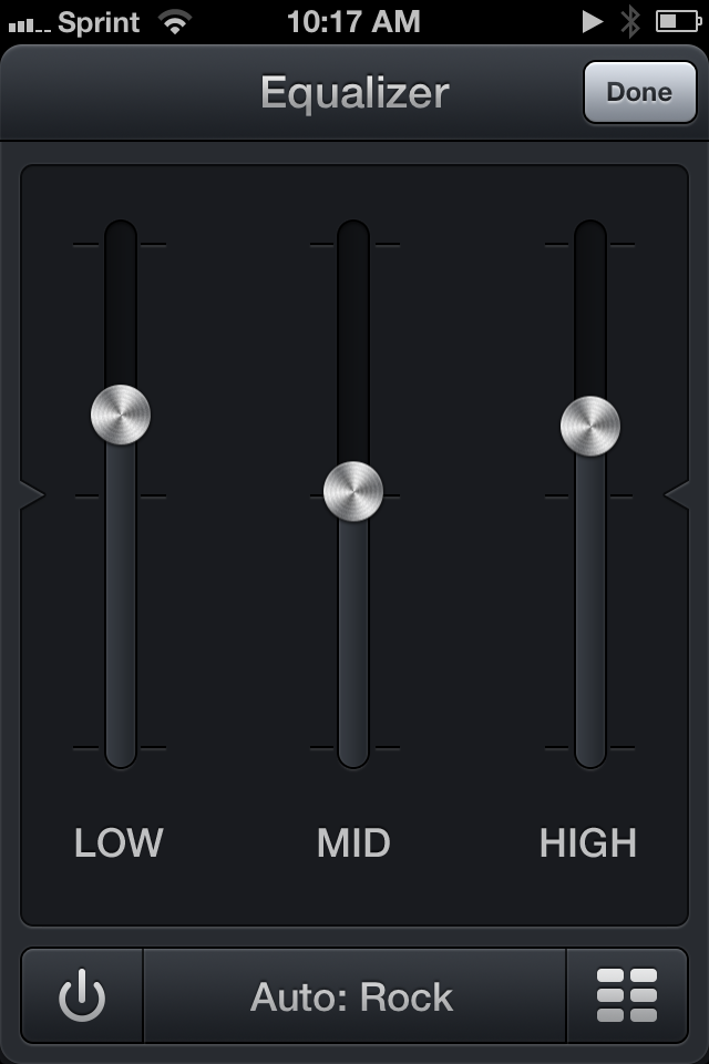
All of the great features that are found in the Mac app can also be found in the iOS app. Tapping on album artwork, provided there’s song data, lets you add the song to a wish list or view it on iTunes to purchase. There’s also a sharing button for copying track data or the station link so others can listen-in. And if you have a Last.fm account, you can plug in your account so you can scrobble and love tracks as you play them. The equalizer is also present, automatically choosing a preset based on what’s currently playing, which you can turn on or off by pressing the inconspicuous power button. Each station is accompanied by a glyph describing what kind of music it plays, and you can change that by tapping on the icon in your list.

Swiping on stations lets you love it so you can quickly find it later. If iCloud sync is turned on, those stations are also shared with Radium on the Mac so you can quickly tune-in from your desktop later.

The big difference between the iOS and Mac apps is that the iOS app is even more delicious.

There’s something gratifying about tugging at the artwork, pulling it down towards the bottom of the display and watching it snap back into place. On cue, the pause button quietly reappears with artist and track info, unwilling to wait for the animation to complete its preprogrammed bounces. Then you’ll flick the other direction and watch the artwork similarly bounce into place above the station listing, the pause button becoming the deciding anchor for the height of the now playing information at the top of the display. It’s possibly rubber band scrolling at its finest and it’s a detail only an app on the iPhone could pull off.

With iOS 7 on the horizon, one might wonder whether Radium is relevant given iTunes Radio, and the possible but unconfirmed inclusion of traditional Internet radio stations currently found in iTunes’ directory. My gut feeling says that Radium and iTunes aren’t competing on the same turf, with Radium’s obvious advantage being the Sirius XM and the ability to play back radio stations traditionally locked to particular content providers or apps. CatPig Studios are in the business of letting you tune-in to the rest of the world, while iTunes and others are in the business of generating personalized playlists labeled as radio.

Radium has been one of the apps I’ve always thought would be a good fit for the iPhone, and it’s finally here. It’s the same Radium you know and love, adapted to iOS and imbued with charming details that make themselves evident as you scroll, flick, and swipe across the interface. It’s Internet radio in your pocket, and it’s impressively inexpensive, regularly costing only $3.99 on the App Store. Until September 3rd, however, you can pick up the app for only $1.99 as part of an introductory promotion.


  1. I don’t have to share a table and I’ve got my own outlet! Two even!  ↩
  2. There’s nothing wrong with the iHeartRadio app, but I just don’t want to be asked to sign in with a Facebook account every time I want to listen to live radio.  ↩

Rymdkapsel

How do I even begin to explain Rymdkapsel?

First there’s the tetris pieces, the various rooms you add on to your ship at any given moment. You can assign these pieces to rooms that create materials, or rooms that create sludge which can be used in a kitchen. These pieces intertwine to create the foundation of your ship, complete with weapons rooms, reactors, and quarters where new minions can be spawned. Vast corridors are needed to connect all of these tetris pieces together, making it necessary to create little microcosms of civilization that live in different sections of your ship.

Next there’s the little pixels, the minions and materials that you’ll watch travel around the ship as they man guns and carry materials to their proper destinations. No single minion is managed individually — they’re just dragged between the available resources on your ship. None of them are individually important, but all of them are equally important. There isn’t necessarily strength in numbers. Do you create a lot of minions and a sprawling city, hoping to complete your defenses on time to protect your civilization? Or do you keep your ship small and narrow, relying on a brave few to explore your surroundings? I chose the former.

Then there’s the enemy. As soon as you begin building you’re attacked and forced to defend yourself. As the game progresses enemies become much more numerous and dangerous. Without the proper defenses you could lose a swath of minions, having to dedicate a significant amount of time into growing sludge and working the kitchens so you can generate more little pixels in their quarters. It’s almost pathetic how helpless they are when they’re exposed.

It’s these enemies that control the pace of the game. You don’t have an infinite amount of time to build your ship and build resources. Instead the enemies come in waves and you must carefully keep an eye on a meter that informs you of when an attack is imminent. Your minions must travel the length of the corridors to reach a weapons room, and if they’re not properly protected the enemy will have their way.

A tutorial is given, but I don’t think the it does the game any justice beyond inviting you into the world. You’re walked through the general concepts of the game as events unfold and things happen, but it’s not until you start experimenting with the pieces that you’ll really begin to understand how all of this stuff fits together. And once you do, you begin to realize that Rymdkapsel is very much like and unlike a lot of our favorite games.

It’s Tetris. It’s an RTS strategy. It’s a tower defense game. It’s a race against the clock. It’s endless. It’s all of these things.

I don’t know how to summarize the game and how it makes me feel. An overreaching atmosphere of tranquility masks impending panic. You want to build quickly to meet objectives, but it’s easy to stretch yourself thin. This is evident when you become aware of how important time and distance are. Rooms have limited space and there has to be a balance when deciding how to expand your ship. Don’t forget that you’ll have to find more resources once your extractors are empty; will you have enough materials to continue on? Your minions are all separate pixels doing their own things, such as building rooms or idling, but they’re managed just like a resource would be. There’s all of this complexity and micromangement but it happens at this macro level and the game is actually really simple. The whole thing works so well and once it clicks you cannot put it down.

Rymdkapsel’s own description as a “meditative space strategy” is perfectly apt. It’s so good. Featured by Apple this week, download Rymdkapsel from the App Store for $3.99.


Photowerks Enhances Apple’s Photos App with Smart Albums

Apple’s Photos app is often criticized for its lack of organizational features that go beyond a list of photos and screenshots, and the company will bring some improvements in this area with iOS 7 and a Photos app capable of organizing items in Moments and Collections. Photowerks, free on the App Store, enhances Apple’s default solution with sorting options and smart albums available today to iOS 6 users.

Photowerks comes with two main features: sorting, which is included in the free download, and Smart Albums, which can be unlocked with a $0.99 In-App Purchase. Once you’ve granted Photowerks permission to access your photos, the free version will allow you to load photos from your Camera Roll, show them as thumbnails on a grid or a list, and sort them (in ascending or descending order) by:

  • Date Taken
  • Location > City
  • Location > State
  • Location > Country
  • Camera > Make
  • Camera > Model

Even without unlocking the IAP, these features prove already handy as, in my opinion, they provide a better view of a stream of photos than what Apple has (or, more appropriately, hasn’t) done with the Photos app. Photos can be viewed in full-screen (where the app will display available information at the bottom), shared to Mail, Facebook, and Twitter, and grouped together to create a new album. Alas, there is no Open In support to send photos to other installed apps, like Evernote and Droplr in my case.

The Smart Albums feature is what really sells Photowerks. As the name suggests, they’re similar to iTunes’ smart playlists in that they let you automatically group photos based on pre-defined criteria that work with the sorting options mentioned above. By using a familiar any/all system for matching rules, Photowerks lets you specify attributes such as “date is after/is not/is/is before” or “model is/is not”; these attributes can be combined to create albums that will be populated with items that match your criteria and that you’ll be able to sort using the same sidebar that you’d use in the IAP-free version of Photowerks. On my iPhone, I have created an album that fetches screenshots taken after June 30 (“date is after June 30, model is not iPhone 5”) and photos taken at the beach (“city is Tarquinia” or “city is Montalto” with Match: Any).

I believe that iOS 7 will reduce the need for Photos.app replacements such as Photowerks, which is why I think the developers should focus on improving the feature that Apple won’t replicate in the short term – smart albums. It would be nice to be able to keep albums in sync across devices (Photowerks is a Universal app) and have access to more attributes for dates (like “past two months” or “this week”), image size, source (like Photo Stream) as well as nested conditions for even smarter filtering. I’m a big fan of the idea of having smart albums based on user-defined criteria, and I hope that the developers will keep on supporting and enhancing Photowerks for iOS 7.

Photowerks is free on the App Store.


Photochop for iPhone Chops and Distorts Your Photos

Released last night by Matt Comi of Big Bucket (well known for his work on The Incident), Photochop is an ingenious iPhone app that allows you to break your photos into tiles and distort them to create either artistic or ridiculously funny collages.

I downloaded the app last night, and started playing around with some photos of my friends (they don’t know I’m using their faces to test new apps). The first thing that I noticed is that Photochop, built for iOS 6, uses a clean UI that looks already fine for iOS 7: with clean lines and iconography, translucent bars, and a photo picker button modeled after the new Photos icon of iOS 7, Photochop looks already at home on my iPhone 5 running iOS 7. There are also some distinct choices, though, that give Photochop a unique look.

Photochop lets you work on one photo at a time, and once you’ve picked a photo from your Camera Roll you can choose between three different grid sizes before breaking it up into tiles; to start editing, you simply tap on the grid. The editing screen is fun: there are buttons at the bottom to nudge, scale, rotate, and delete tiles, and controls at the top to switch between tile mode (the “artistic” one) and warp mode. According to the developer, warp mode is meant to make “people’s faces look weird”, and that is a message that I can completely understand because that’s what I’ve been doing in Photochop with my friends’ faces. Once you’re done editing, you can put pictures inside two types of frame (or leave them without a frame) and export them to the Camera Roll, Instagram (with Open In), Twitter, and Facebook.

From a technological standpoint, I’m quite impressed by Photochop’s image distortion and manipulation, which I’m pretty sure has been made possible by Apple’s advancements in APIs offered to developers in recent years (Update: It’s actually a game engine). In using Photochop, you can see how the app will benefit from the new physics engine APIs of iOS 7: right now, the tiles feel “weightless” in how they don’t bounce and slide across the screen, and I wonder if supporting iOS 7 with new effects and physics effects is something that Comi is already working on.

Photochop is a fun little app with some nice technology under the hood. It’s only $0.99 on the App Store.


Dialogue: Handsfree Calling Through OS X

Dialogue

Dialogue

During my typical work day, my iPhone 5 is sitting on my desk next to my MacBook Air or iPad, usually locked as I’m focusing on writing or researching topics for MacStories. I don’t receive many phone calls, and when I do I don’t mind picking up my phone and using it for the task that phones were made for in the first place (remember when people used to buy phones to make phone calls?). Dialogue, a new Mac app released today on the Mac App Store, wants to remove the annoyance that some people have with switching devices when a phone call comes in; at $6.99, Dialogue uses Bluetooth to route phone calls through your Mac – employing an unobtrusive menubar popover to find contacts and manage connected devices. Read more


HEARD

HEARD appeared on the App Store at the end of June then suddenly disappeared without a trace. There was no blog post and no real explanation on Twitter — just a couple of Tweets asking to get in touch with so-and-so at the time. The whole thing was kind of strange, and I honestly believed the app had been acquired. The app looks to have been pulled due to a bug, and rather than risk poor app reviews, I surmise that the devs decided to pull it. The launch was quiet and there wasn’t too much to lose at the time. After several days, HEARD came back to the App Store with a small update. It’s here for good.

Correction: Apple pulled the application without warning after deciding the app didn’t need full background access. HEARD appealed and won their case, and the app returned to the App Store as it was originally introduced. My assumption was incorrect.

I was disappointed that I didn’t download the app right away after it disappeared (fearing I had missed the chance to try it), given that what it does is nothing short of intriguing. HEARD lets you save anything your iPhone has heard in the past five minutes. The idea that you can suddenly save a conversation to your iPhone that happened five minutes ago sounds magical. But then you start wondering if it’s even all that practical given that you’d likely want more than just five minutes if you’re intent on recording something.

HEARD is an app that runs in the background, its ability to record only limited to how much battery life you have left. By pressing a big red button, HEARD begins actively listening. There’s nothing to log into and no quirky settings to configure. Like you would see with apps like Skype or Voice Memos, HEARD changes the color of the status bar system wide to indicate that the app is listening. When you return to the app, pressing the button again saves whatever was buffered in the last five minutes to its library as a recording. You can then listen in, edit the file’s title, add tags, or delete it if you’re not happy with it. The app continues listening and the cycle begins anew.

That’s what makes HEARD kind of killer. It gives you the potential to record everything that happens. If your phone can hear it, it’s in the app’s buffer for at least five minutes.

While having this kind of power can certainly be useful, is it impractical? Sometimes. Obviously if you want to record a thirty minute meeting then you’re dead in the water unless you use another app. HEARD will let you turn off background audio to record audio snippets, but it only records as long as you hold down the button. If I can put myself in the mindset of the developer, what they’re trying to do is prevent you from accidentally recording something for so long that you run out of storage space. Personally I would like the option of not having to hold down that button, even if it meant I couldn’t leave the app if that’s the tradeoff the developers want to make. I want to use HEARD over Voice Memos and as my destination for everything, both for whatever stuff I happen to capture from the airwaves and stuff that I want to record intentionally.

I would love IFTTT integration. Just imagine saving a snippet and having it automatically end up in Evernote or another app. That’s my only want for this app going forward.

There are some aesthetic things I don’t like, particularly the ‘HEARING’ button in the center of the tab bar. I keep pressing it trying to pause and start recordings to no avail. As for recordings, those text boxes look a little dated. And the only real way to turn off background listening is to flip a switch in the settings or close the app from the multitasking bar (I feel there should be a way to pause background listening). For these things, the app does encourage feedback via a button in the settings.

Given the premise and despite being a sort of purposefully limited voice recorder, HEARD works. I felt this way when HEARD first disappeared, and I still feel this way today, that it’s something that was built for attracting attention from bigger fish in the pond, and I wouldn’t be surprised if someone did snap it up just for the idea. Yet, I do recommend at least trying out HEARD. It’s free, the limitation being that only things heard in the past few seconds can be saved. An in app purchase of $1.99 will unlock the full five minutes. Download it from the App Store.

Update 5:00 pm: @heardapp reached out to me on Twitter to point out an inaccuracy in my review of the app concerning the app’s sudden disappearance. I’ve embedded the tweets below and have updated the review.


Realmac Software Releases Ember - A Digital Scrapbook for Your Mac

Realmac Software, makers of great apps such as Clear, Rapidweaver, Analog, and Analog Camera, have released Ember for Mac today. Last month, Realmac detailed in a blog post what the future of LittleSnapper was and the team explained:

Over last few months, we’ve been getting a few emails asking about LittleSnapper - with some folks wondering if the app is still under development.

As it happens we’ve been heads-down-working on LittleSnapper for some time, and I’m absolutely thrilled today to dispel any rumours of the app’s demise and announce today that we’ve been hard at work on the next version of LittleSnapper: Ember for Mac.

Remember the original Ember? It was a great webapp (saved screenshot) that let you browse and add images to collections for inspiration: I used it all the time before Dribbble became so popular. Back in June of 2011, the Realmac team shut down the service and it was a major bummer for me – but it was understandable. Today, Ember is back as a Mac app, and it works great. Users of the old LittleSnapper are going to love Ember because it’s much more than a simple name change, but rather more like a ‘Pro’ version of the old software.

LittleSnapper users can easily import their libraries upon launching the new Ember app. The only thing you need to do to prepare for Ember is to make sure you’re using the most recent version of LittleSnapper, as only LittleSnapper libraries opened with LittleSnapper v1.8.5 can be imported into Ember. After that, Ember will be populated with all your goodies (Ember also supports importing multiple libraries if you need to do so).

Ember is a great place to store photos, images, drawings, websites, app screenshots, or just about any image that inspires you. Just drag, snap or import the images that you want to keep, then organize them into your own relevant collections. Ember lets you annotate the images you need to give feedback on with drawing and text tools that allow you to give feedback / edits on images; if you need to, you can rotate and crop your images so they are correctly sized and aligned.

Images can be shared via AirDrop, Messages, Twitter, Facebook, Tumblr, Flickr, and CloudApp. In terms of library organization, tags help you sort and projects keep them all neatly organized, while smart projects work just like OS X Smart Folders – you can set the parameters on what they filter and collect.

If you’re looking for inspiration and items to add, Ember has a few options. You can use the built-in web browser (it’s responsive!) and snap from there with built-in tools; the browser has a smart element detection that automatically suggests areas to snap as you roll over a webpage. Under the Subscriptions tab, you can subscribe to a site’s RSS (like Dribbble’s popular feed) and the app will refresh the feed on launch (or manually). Ember has browser extensions that will import snaps from Chrome and Safari there is a menu bar tool for quick and easy snaps from anywhere on your Mac.

Ember can also auto-detect iPhone and iPad screenshots. Drag the PNGs from your iOS device and Ember will automatically sort them into “Phone” and “Tablet”. Preferences let you set your image and text editor of choice, plus snap shortcuts, among other things. Ember will let you open images in your default browser, use Notification Center to let you know when you have new subscription images, and many more nice little touches.

When discussing Ember’s release, Federico asked me what I thought about the lack of sync an/or iOS apps and I answered: “For me, it doesn’t come into play at all with this app because I can import iOS screens. Most of my inspiration/design browsing is from my desktop computer and, if I really need to snap a screenshot from iOS, I can save it to Dropbox so when I get home I can import it into Ember. In a way, that’s like having sync.” Now, I do think syncing ember data across Macs (via Dropbox or iCloud) would be nice but that’s not yet available but could be in a future update.

Ember is a very polished app with a fantastic UI, slick animations, full-screen mode and it’s simply a fun app to use and organize images with. If you’re a digital creative person and want to organize your screenshots, inspirational images and reference files, Ember could be what you need. Ember for Mac is available today via the Mac App Store for $49. The price may be a little steep for some, but Ember is powerful, sexy, smart, and worth every penny.


Agenda 4.0 Review

Agenda 4.0

Agenda 4.0

Savvy Apps’ Agenda, one of the most popular third-party calendar apps for iOS that we’ve been covering on MacStories for years, has been updated today to version 4.0, which adds a beautiful new user interface and builds upon the previous version’s app integrations, support for Reminders, and gesture-driven event management. Agenda 4.0 is sold as a separate app for $1.99 on the App Store.

I’ve had the chance to test Agenda 4.0 before today’s public release, and as I kept using the app I noticed how it was turning into a powerful complement to Fantastical, my favorite calendar client for iPhone. As I have discussed this week on The Prompt, in fact, I’m currently going through my annual re-evaluation of my workflow, and, partly because of my curiosity in regard to iOS 7, I’ve started using Apple’s Reminders on a daily basis again. Reminders are easy to use, the app is fast, and, more importantly, it’s one of the Apple apps that can sync in the background all the time with iCloud. I can integrate Reminders with IFTTT for iPhone, and, overall, I have been enjoying the simplicity and deep system-wide integration of Reminders. While I’m a big fan of Fantastical’s Day Ticker (I think it’s one of the best calendar interfaces ever shipped on iOS), Agenda allows me to view calendar events and reminders in the same list (something that Fantastical for iPhone still isn’t capable of), and with version 4.0 this list is even more polished and clear than Agenda 3.0. Read more