A few days ago after John left Italy to return home, I realized I needed to take a small break from work since we had just spent five days constantly discussing the future of MacStories, the Club, our podcasts, and much more. (Spoiler: we’re already back to work building the future of MacStories, we have...
 Our iPad mini Home Screen Setups
AppStories Episode 248 - Our iPad mini Home Screen Setups
0:00
38:14
38:14
This week, Federico and John go into detail on their iPad mini Home Screen setups, including how they differ from other devices and their use of widgets, Focus modes, and Shortcuts to manage the setups.
 Automation Academy: Diving Deeper into Reminders Actions
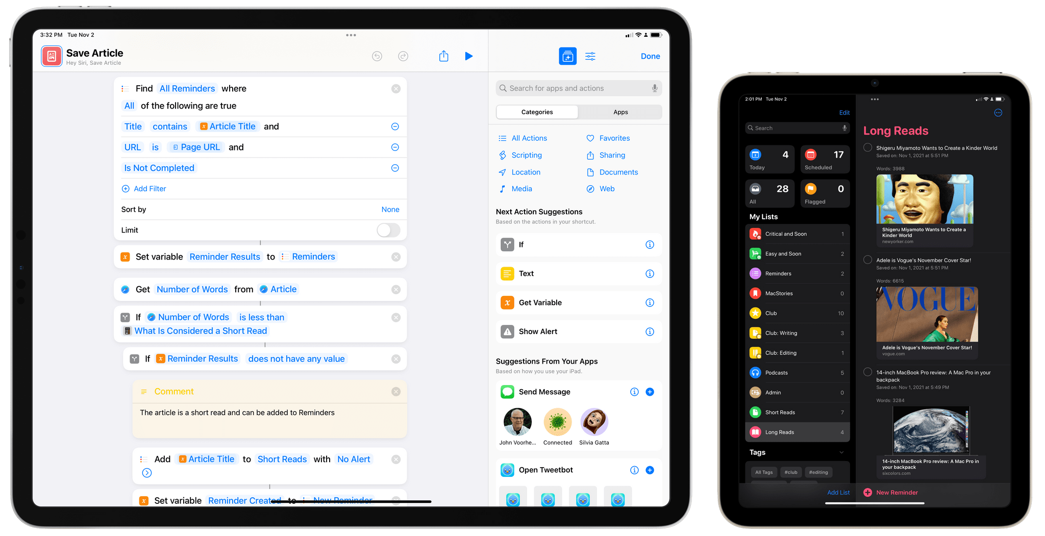
Hello everyone, and welcome to the second lesson of the Automation Academy for Club MacStories+ and Club Premier members. In the first lesson, I covered the new Files actions in iOS and iPadOS 15, explaining how the deeper integration supported by Apple this year enables the creation of more advanced workflows that deal with saving...
Read more
Everything New in iOS and iPadOS 15.1
Week Off Reminder
As announced last week, we will be taking one week off from publishing MacStories Weekly next Friday, November 5th. We’ll be back with a brand new issue on November 12th. – Federico, John, and Alex...
The Making of John’s macOS Monterey Review
[[unplugged_artwork]] In this episode, Federico quizzes John about the making of his macOS Monterey review, covering the research, testing, writing, screenshot creation, and other aspects of the process. Notes: macOS Monterey: The MacStories Review...
Up Next on MacStories Podcasts
Next week on AppStories, Federico and John cover all the new features and changes in iOS and iPadOS 15.1. This week on MacStories Unwind, Federico and John recap the week at MacStories covering John’s macOS Monterey review, Federico’s story about everything new in iOS and iPadOS 15.1, plus a story on third-party Shortcuts...
Dataview Snippets for Obsidian and Yosemite Pictures
It was a busy week on the Club MacStories+ Discord, and I’ve tried my best to collect highlights from the community below. There isn’t a Discord URL scheme to reopen these links in the Discord app directly; my preferred approach for these is to view them as separate tabs in Safari for iPad or Mac....
Previously, On MacStories
Austin Mann on the M1 MacBook Pros Shortcuts for Mac: 27 of Our Favorite Third-Party Integrations Apple Releases iOS and iPadOS 15.1 with SharePlay, Safari for iPad Fixes, Shortcuts Improvements, and More macOS Monterey: The MacStories Review...