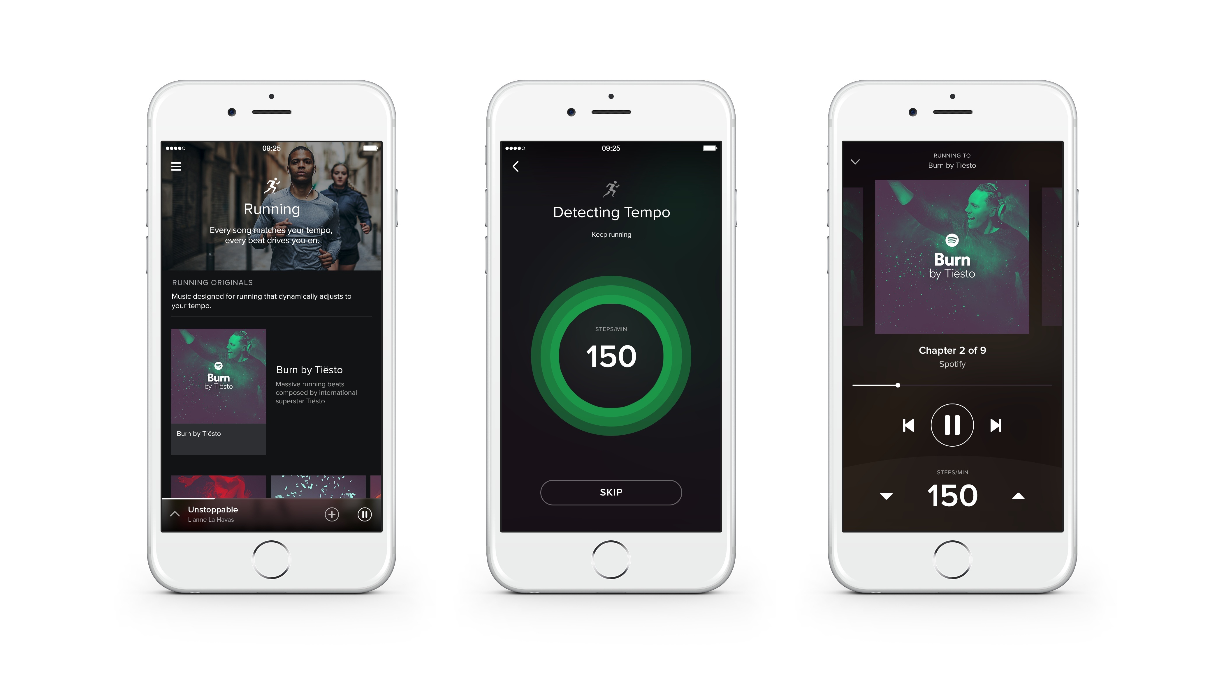
At a press event held earlier today, Spotify announced a series of initiatives to bring new media content to the service with audio and video shows, a new recommendation section, and Running, a feature to help runners listen to songs dynamically matched to their pace.
Connected: Nose Scrolling: I Do Not Condone This→
This week the Europeans are joined by Sam Soffes to follow up on Redacted for Mac, before discussing Federico’s thoughts on the Apple Watch.
If you’re curious to hear my first impressions about the Apple Watch after six days with the device, this week’s Connected is the episode you’re looking for. You can listen here.
Sponsored by:
- lynda.com: An easy and affordable way to help individuals and organizations learn. Free 10-day trial.
- PDFpen Scan+, from Smile: The app for mobile scanning and OCR.
- Igloo: An intranet you’ll actually like, free for up to 10 people.
Igloo: an Intranet You’ll Actually Like [Sponsor]

Why invest in the latest, sleekest devices if you are going to use them to stare at an intranet website that looks like it was built in the 90’s? With Igloo, you don’t have to be stuck at your desk to do your work. Your favourite Intranet is also mobile.
Not only can Igloo be customized to look exactly like your brand, but with its responsive design, it’s automatically optimized for almost any device you’re using, including the latest iPhone 6 or 6 Plus. And just like your favourite Apple devices, Igloo helps you do your best work.
Share files, coordinate calendars, provide status updates and manage projects. Igloo’s not just for your traditional intranet stuff like HR policies and expense forms. It also lets you work better together with your teams. And it keeps getting better.
Their latest upgrade, Viking, gives you more control over how you interact with documents, gather feedback and make changes. They’ve even added the ability to track who has read critical information (like read receipts in your email, but less annoying) to keep everyone on the same page. You can manage your task list from your laptop during a meeting, share status update from your phone as you are leaving the client’s site, and access the latest version of a file from home (and who doesn’t like to work in their pyjamas?).
Everything is now mobile – work should be too. Not convinced yet? Igloo understands love doesn’t happen overnight. Try Igloo for free for as long as you want with 10 of your favourite coworkers.
Our thanks to Igloo for sponsoring MacStories this week.
Apple Releases Watch OS 1.0.1
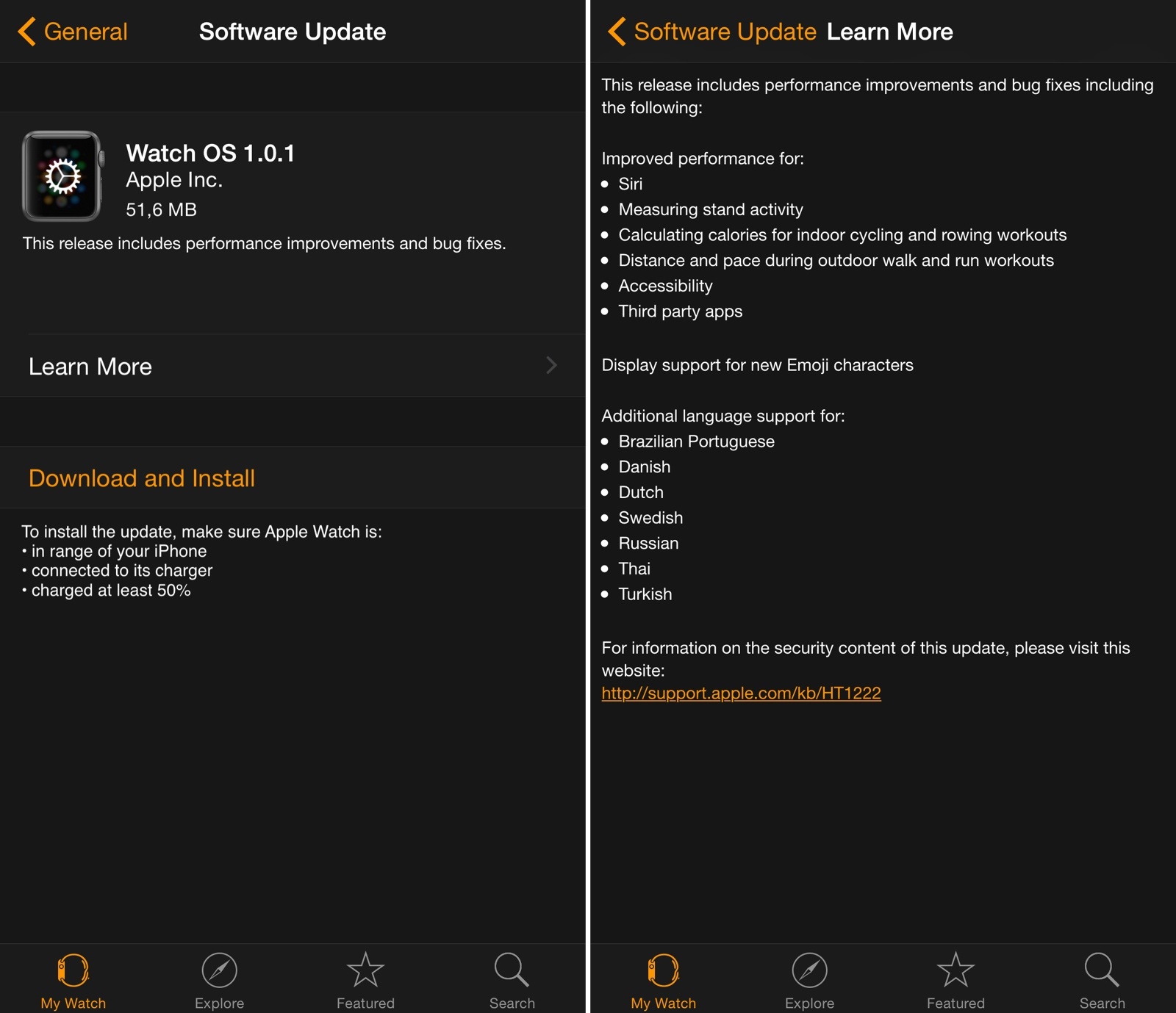
Apple has released the first update for Watch OS today, bringing a variety of improvements for Siri, third-party apps, and fitness features on Apple Watch.
In the first update since the device’s launch, Apple highlights improved performance for measuring stand activity and calculating calories for indoor cycling and rowing workouts, three of the Apple Watch’s fitness-oriented functionalities. The update also notes that Siri and third-party apps should have better performance now – notably, a number of initial reviews of the Apple Watch noted how apps (based on the WatchKit framework) were slow to load and prone to errors.
Watch OS 1.0.1 is available now in the Software Update section of the Apple Watch app for iPhone. You can find the full changelog in the screenshot above.
PCalc for Apple Watch
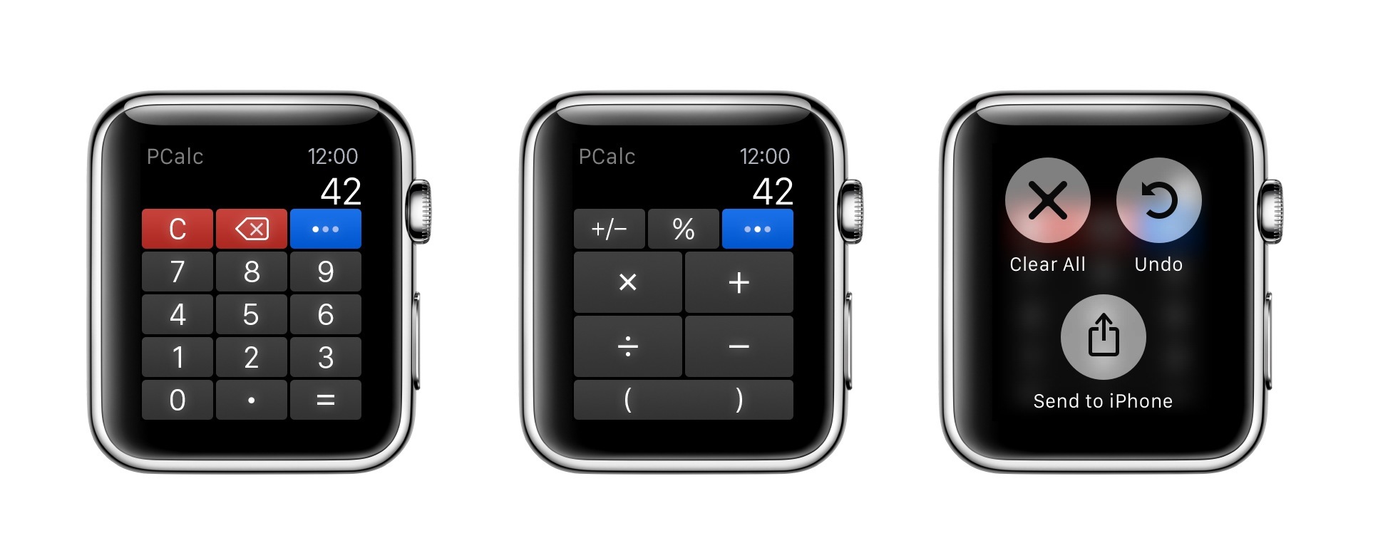
For a few months now, I’ve been using PCalc as my only calculator and currency converter on iOS. As I wrote last year after the release of the app’s iOS 8 update, the ability to customize layouts and have fast access from Notification Center lets me launch PCalc quickly from anywhere and come up with my own custom buttons for frequent calculations and conversions.
Virtual: I Don’t Know How to Play This Game Anymore→
This week Federico and Myke discuss Oculus Rift hardware requirements, Pokemon characters in Minecraft, the Volume level editor, Lifeline for iOS, and the Mario Kart 8 DLC.
Plenty of links in last week’s episode of Virtual. I’ll have more about the interesting Lifeline soon. You can listen here.
Sponsored by:
- Harry’s: An exceptional shave at a fraction of the price. Use code VIRTUAL for $5 off your first purchase
“For the Apple Watch, There’s No Place Like Home”→
Imagine trying to explain this to your grandmother: if you want to get back home, press this button, unless you’re reading an email or listening to a voicemail, in which case you should press the same button three times, but slowly. (But not so slowly that you accidentally launch Siri, which is triggered by pressing and holding the Digital Crown button.) My hunch is that most of the confusion navigating the Watch comes from Apple’s decision to overload the Digital Crown with too much functionality. You press it if you want to check the time, launch an app, re-orient the app view, or go back in a nested set of screens. Once you get the hang of it, there is some logic to each action on its own, but as a group it’s far too muddied. The side button, by contrast, is the very picture of consistency: no matter where you are in the Watch interface, if you press it you launch the “friends view” where you can call or text your favorite contacts.
Good piece by Steven Johnson on the somewhat confusing Digital Crown options available on Apple Watch.
I was initially confused by the behavior of double-clicks and zooming to launch apps, but I got the hang of it relatively quickly. It’s undeniable, though, that the combination of click and zoom input in a single knob can be tricky to explain.
Compare that with the beautiful simplicity of the side button: it always brings up the Friends UI, even in views such as Notification Center and Glances. When these types of modal views are shown on the iPhone, for instance, not even the Home button can immediately go back to the Home screen (it’ll dismiss Notification Center and Control Center, but it’ll remain in the foreground app, requiring another click).
This says a lot about the importance of communication features in Watch OS 1.0: the hardware and software of the Friends interface can supersede everything else with a single click.
The Discreet Watch→
Your Apple Watch becomes the most discreet way to stay connected when at fancy events, or anywhere really. My wife and I no longer need to check if the babysitter is trying to reach us — our Apple Watch will tap us if she is. There’s essentially no reason to use our iPhones, and no anxiety felt for fear of missing something “important”.
Ben Brooks (via Shawn Blanc) makes a good point about the discreet nature of Apple Watch. While I have a bunch of first impressions I want to let simmer before rushing to write a “review”, one thing is already clear to me: not pulling out my iPhone every few minutes helps me be less rude to people around me.
It’s not that I’m shutting off notifications completely; rather, I’m letting the important ones come to me on a device that doesn’t block me from the outside world.
Stephen Hackett on Apple Watch Faces→
I’ve been wearing my Apple Watch for a couple of weeks, and while I’m still churning on my review, I wanted to share my thoughts on the ten watch faces that come with the device. While having so many options is great, many of the faces have frustrating limitations in the ways they can be customized or used.
Stephen Hackett has a nice rundown of the watch faces included in Watch OS 1.0. I’m still experimenting with my Apple Watch Sport (which I received a few days ago) and playing around with watch faces and complications.
Here’s Stephen’s take on the Modular face:
On the face of it (sigh), Modular seems like a huge winner. Why take up space faking being a real timepiece when the watch is digital?
Pros: Big, easy-to-read text with lots of flexibility.
Cons: The time is locked to the upper-right corner; I’d love to have it be the biggest thing on the Watch face. Having three complications across the bottom is nice, but can feel a bit cramped.
While I can read an analog watch, it still takes me a second of parsing, and I don’t want that on a device I’m supposed to quickly look at every day. Even if small, the cognitive load required to understand time on an analog face adds up over time, and, more importantly, I need a watch to show me the precise time (down to the minute) for work purposes.
That said, I do wish that Apple offered more personalization for the position of complications on the Modular face. It’d be nice to have time in the middle of the watch face and a smaller calendar complication in the upper right corner.