Don Southard

56 posts on MacStories since September 2011

Former MacStories contributor.

This Week's Sponsor:

Kolide

Ensures that if a device isn’t secure it can’t access your apps.  It’s Device Trust for Okta.


Apple Contributes a Half Million Jobs to the U.S.

Apple Contributes a Half Million Jobs to the U.S.

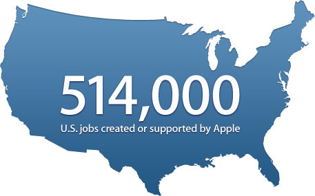
As reported by AllThingsD, Apple has a new webpage depicting its substantial contribution to the U.S. workforce. Apple claims that according to a recent study by Analysis Group, the company had created roughly  304,000 U.S. jobs in a variety of fields across the entire United States. Apple also estimates a total of 210,000 iOS related jobs generated from the flourishing economy surrounding the App Store. Other U.S. occupations highlighted were Apple’s primarily full-time retail sales-force as well as the U.S. based Customer Support call centers. Follow the link for even more details and statistics about Apple’s successful job creation efforts.

We’ve created or supported more than 500,000 jobs for U.S. workers: from the engineer who helped invent the iPad to the delivery person who brings it to your door.

[Apple via AllThingsD]

Permalink

Hazel 3.0 Adds Nested Rules, UI Improvements, and New Actions

I spend a lot of time refining my workflows with the naive intention of heightening my productivity, but it always has an adverse effect. I know this is not a new problem, and a lot of my Mac nerd friends also fall victim to the “tweak now and it will help me later” facade. What I have come to realize is – productivity is about having tools that you can trust and rely on to provide stability in times of hectic disarray. For my own personal workflow I have relied on Hazel for quite some time now (our own Federico Viticci previously wrote about it here). Hazel has become the backbone that provides stability to my trusted system: I have so many automated processes ranging from managing my monthly utility bills to just doing general cleanup that I could not easily accomplish without it.

Today Noodlesoft has released Hazel 3.0, and with it come some much needed interface improvements, a heap of new features, and under-the-hood changes for a completely redesigned engine for detecting file changes. Let’s take a closer look at some of the highlights added to this release.

The first thing I noticed when I launched Hazel 3.0 is that it looks a lot like the previous version. That is not a bad thing, but the changes were not completely obvious at first. Then I noticed the new little eyeball icon in the section to add folders. When clicked, this icon displays a quick dropdown preview of what files match the rules for the folder you have selected. So, at this point I am about three seconds into using the new version of Hazel, and I’m already in love with just one of the many new features. Those using the previous version of Hazel would probably agree that the old method of previewing rules felt buried in sub-menus, and it is great to see that moved to the forefront of the UI.

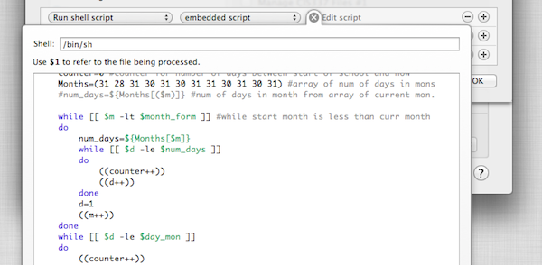
There have been some other general interface improvements you just do not notice until you start using the program. For example, when editing an embedded script you can now adjust the size of the editor window. This alone is a huge help for long scripts that previously would have been easier to write in an external text editor. Speaking of script editing, perhaps my favorite visual improvement is the new popover design for script editors and option windows when creating new rules. This solves one of my biggest peeves with the previous version: when too many options had been expanded, the old slide-down windows would extend right past the bottom of the screen. It was probably only an issue on smaller laptop-size screens, but it was frustrating nonetheless. The new popovers are a great solution, and they really make Hazel feel at home on Mac OS X Lion.

The list really does goes on and on with tweaks to improve usability. In fact, so much of what makes Hazel 3.0 great is how it gracefully solves quirks I experienced in previous versions of the app. For instance, another frustration (now solved) was the inability to reorder conditions for matching rules. It is hard to explain why you would need to do this until your start creating and editing rules, but just know that version 3.0 does this superbly. In fact, I worry that new users will not be able to fully appreciate the effort that went in to improving the new release – they will simply have to live in blissful ignorance I suppose.

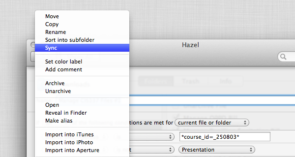
More interesting than the visual upgrades are the new features added to Hazel’s rules section. New features are always the cornerstone of any great software upgrade and Noodlesoft did not disappoint. Newly added actions include Import into Aperture and Sync. I don’t personally use Aperture but I am definitely excited to see the sync option. Unfortunately it is only a one-way sync action so it really only saves me the time of writing a script to run rsync. In fact, rsync is packaged into Hazel and that is how it accomplishes its own sync feature. Regardless, this is definitely a win for the average user.

Another feature I was pleasantly surprised to see was the option to specify custom conditions via scripts. This basically allows you to write a shell script or AppleScript and test the file in anyway you want, then just return the value 0 to indicate the file is a match. This is so neat because it really brings an entirely new level of flexibility to how people can use Hazel. The structured rules Hazel ships with are great for most situations but now I have the ability to write my own. A simple example: I can write a shell script to grep the contents of a file and look for some specific information with regular expressions or in a way more powerful than Hazel’s stock “contents contains” action. I can not wait to really sink my teeth into that feature.

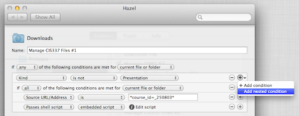
Hazel 3.0 doesn’t stop there, as rules can now be nested and/or grouped in any combination you see fit. This was probably the most requested feature and Noodlesoft did a fantastic job with the implementation. To add a nested rule you simply hold the Alt/Option key while clicking the (+) to add a rule condition; you can also simply click and hold down on the (+) to find the new add a nested rule option. Obviously, the potential uses for more complex conditions are limitless and I am sure many people will upgrade just for this addition.

One more thing worth highlighting is the new engine for detecting changes. Users should notice a decrease in time it takes Hazel to pick up on file changes, because, according to the developer, Hazel no longer needs to poll the disk as it relies on its new prediction engine to only wake when needed. This should result in less resources used and possibly even longer battery life for laptop users.

There are probably a hundred more changes I have not mentioned (i.e. scheduling rules) but you will have to download Hazel yourself to experience all it has to offer. Hazel 3.0 is an excellent upgrade and it is available as a single license for $25 or a family license for $45 directly from Noodlesoft’s website, and it is also available as a $10 upgrade fee for previously licensed users.


Interview: The Omni Group’s Ken Case

I had the pleasure of enjoying a casual talk with The Omni Group CEO Ken Case and took the opportunity to ask him some questions on their upcoming release, OmniPlan for iPad. We also had some time to talk about potential updates to other Omni products, as well as projects Ken would like to work on, given more time and resources.

Don: First off, what where some of the challenges you had porting the OmniPlan for Mac experience to the iPad?

Ken: One of the challenges we have had with all of our apps is that the Mac has more screen real-estate available, or at least the design we have used for our apps use a lot more screen real-estate than we have available on the iPad. We had already started noticing that some of our apps were starting to feel a bit squished on laptops – we have typically designed them to work with large desktop displays. When we watched people try to struggle through using some of our apps on the nice new MacBook Airs like the ones we’re starting to use here we found it just felt too cramped. So starting with OmniGraffle we had to re-picture what is the focus of the activity and how can we get rid of the physical controls without burying them so deep that they are no longer accessible. We faced this challenge even more so in OmniPlan for iPad because OmniPlan typically uses more screen real-estate due to its task outline on the left and the large visual GANTT chart timeline on the right. So we decided that the most relevant part of using OmniPlan is not the outline which may be of interest for structuring your plan data, but what people are most interested in is the GANTT chart timeline; so, for Omniplan for the iPad we just focused on that being the entire contents of the screen and working with that and trying to create the content in the visual timeline in ways we would normally rely on the outline for doing. If you wanted to have a task and break it down into subtasks, on the Mac we’d have you go over to the outline and create new rows and indent them underneaths as they were subtasks. If we’re only using the GANTT chart, we want to be adding subtasks – be able to show containment of subtasks under the parent task right there in that live timeline. I’m not saying we’re going to be giving up the outline, we’re not done yet, that’s the struggle we’re trying to work with and maybe the real ultimate answer is to flip back and forth between the two but there’s definitely not room to have both at the same time. Screen real-estate is a real challenge.

Don: Now when you guys released OmniFocus for the iPad, there were some things that a lot people thought the iPad did better than the Mac version. Is there anything in OmniPlan you guys feel is better suited for the iPad?

Ken: There is, but not quite as strongly as there was with OmniFocus. The biggest benefit of OmniPlan on the iPad is that it’s mobile, so you can bring it around with you and have it everywhere. But there isn’t – there aren’t any big features like the forecast and review modes we added to OmniFocus on the iPad where we could say “Oh no, now you can use the app in a whole other way that you couldn’t use it before”

Don: I read on your blog around the release of OmniOutliner for iPad that you wanted to offer 90% of the functionality that people wanted with about 10% of the effort. Do you think that also applies to OmniPlan, were you able to fit as much in without sacrificing the usability?

Ken: I think we were able to get a lot of the info in we wanted – it was a little bit harder, this was a specific challenge to OmniPlan – with OmniGraffle or OmniFocus it was easier to find parts of the application you could live without on the iPad on Day 1 or maybe forever, and just leave that out altogether and maybe bring back in later or maybe not, but you have a useable, cohesive, coherent application you can sit down and work with. With OmniPlan, you’re talking about an audience of project managers who really need to have all the same project details they’re used to typically. If we left out some piece, like, say, cost accounting, then people who are trying to do cost accounting will be stuck, and they can’t do it at all anymore. They can’t partially use it and then go up to their desktop later. If you have that then you probably want to bring all those details to a meeting that you are bringing your mobile device to. That was another challenge with OmniPlan – it was harder to find things we could cut out. We couldn’t cut out any of the data model, which we had done with all the other apps. With OmniFocus we left out time estimates altogether on the iPad – most people didn’t use it and it was more cluttered to try and fit in there. With OmniPlan we have all those fields, all those details, and the change tracking, mechanisms and so on. We did find some areas we could cut out and leave out, like printing. Our hope is, part of the reason you’re bringing this around with you on a mobile device is so you don’t have to bring paper around with you. Showing people the plan right there, live and making changes – you couldn’t do that with a printed document.

Don: So it sounds like it could be a great addition to the current OmniPlan for Mac product.

Ken: Yes, we really wanted it to be as complete as the Mac version and try to leave as little out as possible, but we did have to in some situations. For example, in version 1.0 we are not providing printing because we are not trying to make it do everything the Mac version can do. We do want it to be a standalone tool so if all you’re using is OmniPlan on the iPad, you’re still able to do the complete project management and planning you would’ve done on the Mac including collaborative editing. Plus, change-tracking is there, so you can review other people’s changes, accept and reject them and so on.

Don: Is there anything you can tell me about the tentative release or pricing for OmniPlan iPad app?

Ken: We haven’t announced pricing yet because we like to finish what we’re building, and then decide how much it costs, but if you look at our pricing to date it has been remarkably consistent. The iPad app – every single one – is half the price of the corresponding Mac app. Read more


Alfred 1.1 Released: Address Book, Filter Actions & More Improvements

Alfred 1.1 Released: Address Book, Filter Actions & More Improvements

This release brings some great feature improvements to Address Book, Hotkeys and Extensions:

  • In the Address Book contact viewer, take action on contacts’ details.
  • Select text in any app & open Alfred to take action on it with a hotkey
  • Set default actions on filter extensions, like uploading a file to Flickr automatically
  • Replace existing Powerpack extensions easily when updates are released
  • Many more improvements and tweaks to make your Alfred experience even better.

It is hard to have a case of the Mondays when your week starts off with a great update to Alfred. Users of the non-Mac App Store version can download version 1.1 and start enjoying many of Alfred’s enhancements to the PowerPack features: Address Book, Hotkeys, and Extensions. From my understanding, the next update to Alfred was going to be a maintenance release but with Address Book getting so much love, the developer decided to make it a more substantial release.

PowerPack users can now view Address Book contact notes, messaging information, as well as social information from within Alfred. Also added was the ability to assign a default action or pre-existing Extension to phone numbers and email addresses. A similar Action option was added to Filters as well. There is a new configurable hotkey for more advanced options when opening Alfred and you will find a whole lot more in the official change log. I am really interested to see how the Alfred scripting community is going to run with these changes. If you find a clever way to use these new default actions be sure to share it in the comments below.

Permalink

QuickCal 3.1 Released with Improved Recognition Engine, iCloud Reminders, Autocomplete Feature

I love the start of a new year because it is a great time to revamp your productivity workflow. You can re-evaluate what tools you use and even buy new apps completely free of guilt. It is no secret that the cornerstone of any good system is the calendar but it can be difficult to force yourself to create calendar events on a regular basis. Well, the folks behind QuickCal have just released a great update to get you back in the routine of managing your calendar.

One major improvement in QuickCal 3.1 is the re-written recognition engine that the app uses to understand natural language input. QuickCal has no structured syntax for adding events and reminders which actually makes adding items extremely flexible. When typing in the event you no longer have to start with the event title, you actually have the option of starting with a time, duration, location, or title and QuickCal will almost always get it right. I have also noticed a dramatic improvement in QuickCal’s ability to correctly parse out event locations which is something I have had trouble with in previous versions. Regardless of the order in which you type out the information, QuickCal does an excellent job figuring out the details for you. Adding events to your calendar without worrying about correct syntax is incredibly powerful. The only way QuickCal could get any faster at creating calendar events is if it actually finished sentences for you.

oh, wait…

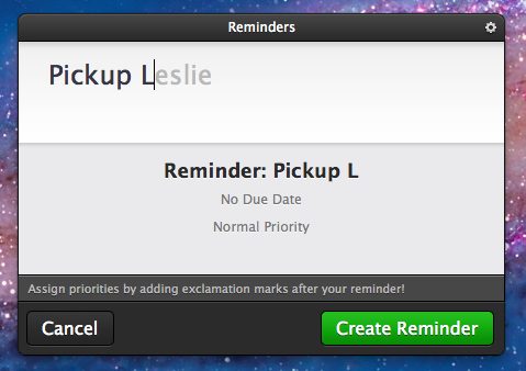
Have I mentioned their new autocomplete feature? Autocomplete does exactly what you expect it to do. As you are typing common words, QuickCal gives you suggestions of words it thinks you might be typing. To accept the autocompletion you can just hit the tab key and continue on typing. It will even pickup on your most frequently used words and auto-suggest them in the future. After only 3 or 4 reminders relating to my wife Leslie, QuickCal was finishing her name for me. It is awesome. In fact, I am finding it so useful that I am not sure how I had ever used QuickCal without this feature.

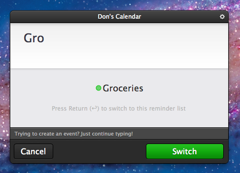
Perhaps the greatest improvement to QuickCal is its integration with iCloud Reminders. A reminder is now added to your default Reminders list and shows up in the iOS 5 Reminders app. If the reminder has a date or time then an alarm is also created. This alone is a neat feature but it wasn’t enough to pry me away from the Alfred extension I had created to quickly add simple iOS 5 Reminders. Although as I continued to use the new version of QuickCal, I realized that I could also add items to other lists by simply typing the name of the list. For example, my wife and I share a Groceries list. If I just start typing Gro… it suggests switching to my Groceries list so I can add an item to it. In true QuickCal fashion it does so very intuitively and without effort. It is a great feature that truly increases my dependency on QuickCal. The only drawback is still having to open iCal to trigger an iCloud sync. When CalDAV is supported and I no longer need that extra step, QuickCal will be my ideal iCal replacement.

Check out QuickCal 3.1 and all of its new features on the Mac App Store.


Screen Sharing For Alfred Brings VNC To Your Fingertips

Screen Sharing is a feature built into Mac OS X for remotely controlling another computer through the use of virtual network computing (VNC). Apple’s native screen sharing client is buried in the operating system making it nearly impossible to find the app when you actually need it. On top of that, it really lacks basic features like being able to store a connection for future use. Due to these shortcomings, most people turn to third party applications for managing their VNC connections. A quick search in the Mac App Store will turn up some pretty great options including Edovia’s Screens. Although apps like these work extremely well, not everyone wants to spend that much to easily connect to a remote computer. This is why I created the Screen Sharing for Alfred extension. I wanted Alfred to be able to function as my VNC client and really extend the functionality of the Apple’s native Screen Sharing app.

Screen Sharing for Alfred adds the ability to store information about VNC connections and quickly access them with a simple keyboard command. It is written in a beautiful fusion of shell scripting and AppleScript so it is fast, efficient, and capable of interacting with the user through AppleScript’s GUI prompts. It also incorporates David Ferguson’s genius Extension Updater system in case any new features are added in the future. For those unfamiliar with Updater, it is an extension for Alfred that allows developers to make bug fixes and add new features to released extensions – then when users run Updater, it will download the latest version of any extensions that have updates available. Read more


Skype 5.5 Beta Released with New Call UI, Call Answering and Quality Improvements

The folks over at Skype have been hard at work on the next version of Skype 5.5 Beta for Mac and today they have released a new version of the app that adds some very nice functionality. Among the new features you will find a tweaked call interface that provides quick and easy access to several new features.

The improved discoverability of Skype’s Call allows Mac users to easily mute their microphone, send video, share their screen, send files and even add more people during a call.

They have also added the ability to accept calls with or without video which will certainly be a welcomed addition to Mac app. Various optimizations including an increase in call quality and stabilization were also reported to have been improved in this release.

Skype 5.5 Beta for Mac is available for download on their website.


Evernote Releases Skitch for iPad

Skitch is a popular tool for annotating screenshots and images with the ability to quickly share them with others. It was purchased by Evernote back in August of this year and today they are proud to present Skitch for iPad.

Skitch is the amazingly fun and surprisingly powerful way to move your ideas and projects forward using fewer words. With Skitch, annotate and draw on just about anything that you see, whether it’s a new or existing photo, a webpage, screenshot, map, or a blank canvas. Then, share your work with friends, colleagues or save it all to Evernote. It couldn’t be simpler.

Skitch for iPad has a handful of useful features as well as some not so useful features, all of which are housed in the very common “home screen” style interface. I am not personally a fan of apps that lump their main features in to a grid of large square icons. I think it is a lazy approach to user experience on a touch screen device. The fonts, colors and images used for the layout elements makes the entire app feel like a cartoon. After all the featured icons are the thumbnails of the drawings you have added. To remove them you have to tap and hold like you would expect to do on a home screen except the icons don’t jiggle as an indication. Because of this, it feels like an unfinished implementation. When you are finished removing images you can’t just tap in an empty area of the screen like you would with an actual home screen, you have to find the tiny Done button on the bottom corner of the screen. These are certainly not a huge issues, just more like disappointments and it all goes back to the lack of thought that went in to the design of this app.

Read more


Siri Becomes Santa’s Little Helper in Latest TV Ad

Apple aired a cute Christmas themed TV ad just in time for the holidays. Santa Claus is the star of the commercial and he is using the iPhone 4S and its most popular feature, Siri, to manage his Christmas Eve deliveries. They found creative ways for Santa to demonstrate the many uses of Siri such as looking up directions, searching for emails (specifically one containing a “Naughty or Nice list”), and he even received a funny SMS message from Mrs. Claus which Siri read to him.

The video can be seen with the rest of Apple’s video ads on their website or just check out the video after the break.

Santa: How does the rest of my day look? Siri: You have 3.7 billion appointments

Read more