The problem with The Daily, the long anticipated iPad-only publication launched today in a joint effort of News Corp. and Apple, is that it’s three things in a single package: an app, a newspaper and a business model. Taking an early look at The Daily is difficult because of its intrinsic nature of newspaper that’s an app aimed at making Rupert Murdoch’s wallet larger.
I have been testing The Daily for a few hours now, I’ve read most of its content and played around with the social functionalities, and I still don’t know where the newspaper is going as a daily publication, or what’s the general guideline established at News Corp. After all, you can’t get to know a newspaper and its feeling after a single issue or, in our case, “refresh”. But I do have some impressions to share, some complaints to make about The Daily as an iPad application and thoughts on the potentialities of Murdoch’s promise to re-imagine newspapers in the tablet’s era.
As a newspaper, the initial reading sessions gave me the feeling of tabloid-like material with catchy headlines, great photography and overall “ironic” tone, even in the most serious articles. A story about Egypt’s crisis, for instance, ends with a funny mention of Twitter trending topics. Like I said it’s too early to judge The Daily as what it actually is, a newspaper, but today’s hands-on didn’t leave me completely disappointed. The team assembled by News Corp is top-notch, and the editorial guideline can only grow or get incredibly worse from here. I can’t say I didn’t like reading The Daily.
Where The Daily only needs to get a lot better, though, is the app part. Put simply, The Daily as an iPad application is quite terrible. Not the “terrible” you’d expect from a Vietnamese developer who sells manga apps in the App Store, but the terrible you don’t want to see from an app that’s being heavily promoted by Apple, and that has been in the works as a strict collaboration between News Corp and Cupertino for months. The Daily is slow: slow to launch, slow to navigate, slow at switching between portrait and landscape mode. This is funny, because The Daily itself invites users to change device orientation to see full-screen photos, or read stories. The Daily has an opening animation on each launch, which is nice and gives the feeling of mass media living inside your tablet. The “news anchor” option (a small embedded video player that sums up the top stories, and allows you to tap on links on the video to read them) builds on this feeling – but it needs to be enabled in the Settings.
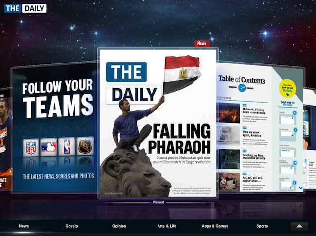
The Daily launches in a “carousel” view: a mix between Apple’s usual Cover Flow and a digital newsstand that presents stories to scroll with your fingers in a semi-circular view that also offers thumbnails and animations. The problem is, the Carousel is terribly slow, has poor scrolling performances and it’s definitely not optimized for the iPad. Some have guessed News Corp. might have tested the app during development on an iPad 2 with a faster processor: that sounds to me like a dumb guess considering that a) Apple doesn’t provide testing units of top-secret devices so easily and b) the engineers at News Corp. aren’t so stupid to optimize The Daily for an iPad that’s not even out. But, the same engineers and the managers above them took the wrong decisions: the way I see it, they aimed at recreating a futuristic approach at news browsing that doesn’t work well on the iPad and it’s based on awful user experience patterns. There’s a sensible lag between scrolling on the carousel and thumbnails moving on screen; the thumbnail previews of articles present fuzzy text (surprise: ads are laid out in high-definition) and almost unreadable headlines; there is no progress bar below the carousel to let you know how many stories are left on each side. There are some nice touches, though: each story has a colored tag associated with its section and a light indicator runs between sections as you scroll the carousel. There is an additional bar at the bottom with some (ugly) buttons to access the daily news anchor, audio transcriptions and a “shuffle” function that jumps randomly between unread stories. The Carousel isn’t a complete fail, I believe it can get better from this initial concept. But right now, the engine that powers it is, again, terrible. The carousel also leads to lots, lots of crashes.
Reading articles in The Daily is a better experience than the carousel menu. There are many things to do and look at: Twitter feeds embedded into stories, inline videos, advertising, 360 photography that you can control with your fingers. This stuff, however, has been around for a while in other fancy magazine apps for the iPad like Wired and Project. The Daily doesn’t reinvent anything. Rather, it is a glorious implementation of the “old media discovers interactive touch computer” trend we have seen in the past months. The Daily takes the best and worst things of the magazine apps and throws them together into a single package that should be, I want to remind this to you, a newspaper with daily updates. The result can be both amusing and confusing at the same time. While it’s ok for me to see Jay-Z sliding on screen while I’m reading about gossip, I’m not really sure about animations and eye-catching graphics when talking politics. The app is meant to be “highly interactive and engaging”, but sometimes it’s not clear where you have to tap to activate specific functions like highlights, which are a new term for popup menus. Once you do activate them though, they’re admittedly quite pretty. Luckily, unlike several Conde Nast applications like the aforementioned Wired, The Daily doesn’t come with weird horizontal and vertical scrolling. Most of the times you go to the next page by swiping, and when vertical scrolling is required the app displays huge arrows to help you with the gesture on screen. This is clever.
Two things I deeply dislike about The Daily: pages are actually images, and a poor sense of position is conveyed. Here, I have a question: why are we dealing with an app that doesn’t select you text, again? We’ve been there months ago with the Wired app. Sure, it’s not that I’m always selecting text and highlighting things in a real newspaper. But if your app is, guess what, based on “social interactions” with the possibility to share articles online, you might want to make sure people have something to share other than photos and titles. If The Daily has been built with the iPad in mind, why not make it a Cocoa Touch app, or an HTML5 one with selectable text and fluid layouts? To make up for development costs? When News Corp. didn’t have any problems handing out $30 million for this? Silly argument. Let me guess: it’s easier to develop and design like this. Still, the more I swipe and read, the more I can’t help but thinking about a version of The Daily where pages aren’t “images”, where everything is really interactive and text is what it is – text. Also: why the column layout? If you’re aiming for an “immersive experience”, doesn’t full-screen reading make more sense? Oh, wait: ads.
That brings me to my last point: The Daily as a business model for News Corp. The Daily screams for interstitial ads on screens, video commercials and all kinds of advertising systems. In the next months, we’re going to see lots of ads on The Daily, especially if the app takes off initially thanks to Apple’s promotion and eventually falls back in sales because people get tired. Sadly, that’s been the case with several magazine and newspaper apps for the iPad. Strategy: get advertisers on board while it’s still hot, rely on them when the sales figures decrease. I’m not one of those that spend hours on the Internet writing “Ads are bad! They’re destroying the Internet!”. No. Once again, I’m questioning The Daily’s decision of emulating what others have been doing for years.
The Daily is a “newspaper app”, and it will be difficult for News Corp. to find a compromise between reading, usability, sales. The Daily comes with many interesting ideas, and I believe its biggest selling point is the subscription system Apple put in place for this app. The fact that an app delivers new content every morning with automatic renewals in your iTunes account is just great. Again, the idea sounds more than perfect in theory. But the first version of the The Daily has problems. It’s got poor realization, it feels unresponsive and it’s slow. A newspaper doesn’t “feel slow”. So we’re back to the starting point: what is The Daily exactly, and how can its nature resolve the issues of old media landing on a new platform? We’ll see in the coming months.
The Daily’s main concept is great, and I have the feeling it will grow on me in the next weeks, especially if the “fresh content delivery system” really takes off. But I’d love to see a better app.