Dark Sky’s signature feature has always been its uncanny ability to predict when it was about to rain. The app has a reputation for working better in the US than other parts of the world, and in my experience, it’s not as good at predicting snowfall, but its ability to keep users from getting caught off guard by a sudden storm has garnered it a lot of fans.
Besides an app, Dark Sky is an API that other weather apps use to deliver their data. That means you can experience many of the benefits of Dark Sky by using other weather apps, which is what I’ve done for some time. Dark Sky was once my weather app of choice, but over time, I moved to other apps that used its API and presented weather data in ways I prefer.
Yesterday, Dark Sky’s app was updated with a redesign that addresses many of the shortcomings of earlier versions. The main Forecast view now features a higher density of information and visual cues that make it easier to understand predicted weather changes at a glance. It’s a marked improvement over previous versions of the app, but the new focus on a vertical timeline comes with drawbacks that won’t be to everyone’s taste.
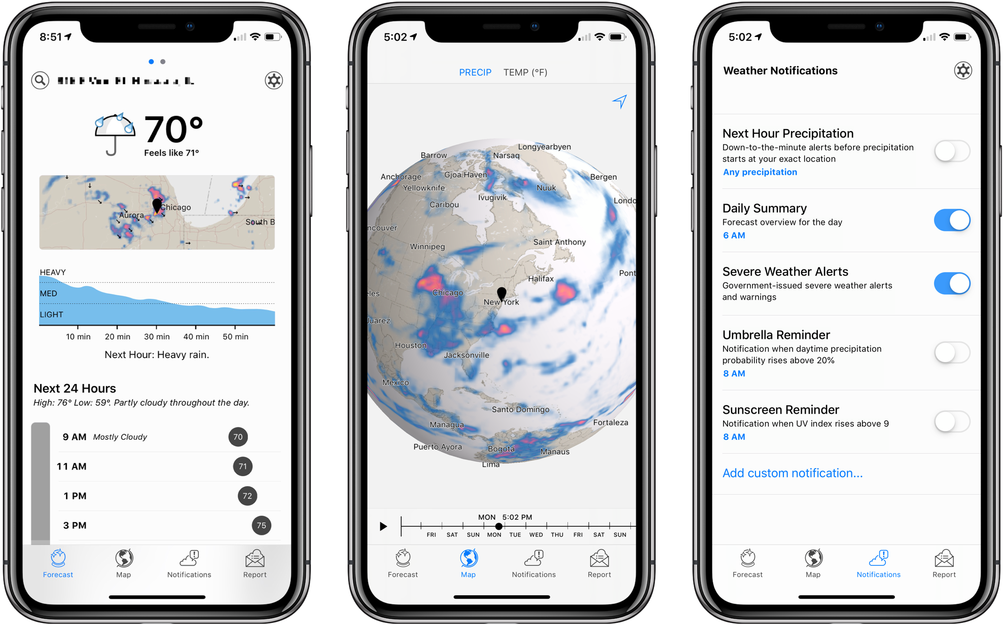
Dark Sky is now divided into four tabs, but most of the day-to-day functionality is found in the first two: Forecast and Map. The Forecast tab is a vertically oriented screen that starts with the current conditions at the top followed by a small radar thumbnail, an upcoming precipitation graph that only appears if there is something to report, hourly forecast, and finally, a 7-day forecast. On my iPhone X, the weather data takes up about 2.5 screens of space. Tap a day in the 7-day forecast, and it expands to show the hourly forecast for that day, extending the vertical space needed even further.

I like having a radar thumbnail near the top of the Forecast tab. It’s zoomed out far enough to see storms coming from hundreds of miles away, which is helpful, and when tapped, Dark Sky switches to its Map tab centered on the location displayed in the thumbnail.
Another new feature is in the section below the graph of the precipitation for the upcoming hour. As with the old version of Dark Sky, this section includes the familiar color-coded vertical bar to show precipitation predictions for the next 24 hours and notes regarding major changes in the weather. Now, however, Dark Sky includes a series of data points on the right-hand side of the screen that track any of nine different measurements. The data is displayed in circles positioned relative to each other horizontally to show how the measurements are predicted to change over time. It’s a clever addition that provides more information in the space available.
Although the new Dark Sky design is predominantly vertical, one place where the Forecast tab relies on horizontal navigation is at the bottom of the new hourly graph. Swiping left and right switches the graph of data points between the nine options available. As you swipe, the datasets smoothly transition from one to the other with a pleasant animation.
Dark Sky also supports horizontal swiping between forecasts for different locations, which can be set up in the app’s settings. Curiously though, the app doesn’t return to your last-viewed location when moving between the Forecast and Maps tabs. Instead, it returns to the location at the top of your saved locations list.
The 7-day forecast, which sits at the bottom of the Forecast tab’s view, is my favorite. It nicely balances the highlights of a day’s forecast, with an ability to drop into predicted hourly details with a single tap on a day.

Tapping the Map tab of Dark Sky opens a view of a globe centered on New York City. After a few seconds, the globe rotates to focus on your current location regardless of whether you were last viewing the weather for that location. It’s an odd behavior that seems to both ignore the location you were browsing in the Forecast tab and require the app to determine your location again each time the Map tab is opened. While it’s fun to idly spin the globe and zoom in and out browsing the weather in other parts of the world, the utility of the Map tab is limited.
The other significant addition to Dark Sky is custom notifications. Any of the metrics tracked by the app can trigger a notification when it’s predicted to rise or drop below a value during the day, night, or anytime. It’s a useful power-user feature, but one that would be even better if it supported multiple values so notifications could be triggered in situations like when temperatures are predicted to rise over 90 degrees Fahrenheit, with winds less than 5 mph, and humidity over 80%.
Overall, Dark Sky’s update is solid, despite a few rough edges. There’s more data presented more compactly in one screen, making it easy to access quickly. I’m not entirely sold on the unified vertical timeline though. It requires more scrolling than other weather apps, and everything feels a little crowded.
A good contrast to this approach is Hello Weather. It adopts the chunky headers of Apple Music, Maps, News, and other stock apps, which take up more vertical space, but Hello Weather relies on horizontally swipeable panels in each section to present the same information in less vertical area. It’s an approach I prefer aesthetically that also feels more modern given recent iOS design trends.
Weather apps are a challenging exercise in cramming a lot of data into a relatively small space, which lends itself to a wide variety of approaches. Although I’m not personally a fan of Dark Sky’s predominantly vertical layout, the redesign is undeniably an improvement over prior versions, and the customization options for notifications make this update worthy of another look if you haven’t tried Dark Sky in a while.
Dark Sky is available on the App Store for $3.99.