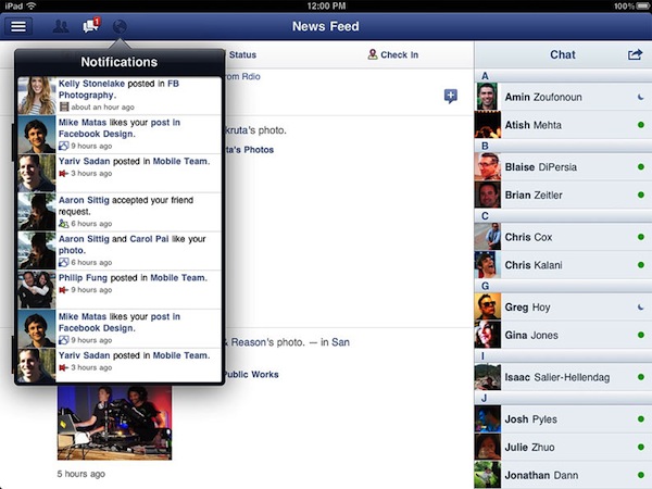
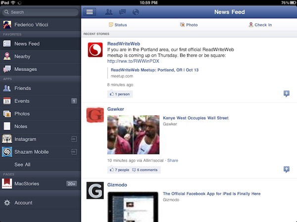
After months of speculation, Facebook released today the first version of its official iPad application, available for free on the App Store. The version available today looks fairly similar to the leaked app posted by TechCrunch earlier this year: there is a navigation sidebar on the left side of the screen to search, open your Facebook profile, check out the News Feed, Messages, Events, Friends and more. An upper toolbar gives you access to friend requests, messages and notifications, whilst Chat has been integrated in a right hand vertical panel. Judging from a first test, it appears what we wrote back in July still holds true for the final Facebook iPad app:
Facebook for iPad uses a concept not too dissimilar from Twitter’s iPad app — rather than displaying all content vertically, the app heavily relies on horizontal navigation to access various Facebook sections, the news feed, chats, liked posts, and so forth. For instance, a sidebar on the left contains tabs below your main profile to open your News Feed, Messages, Events, Places, Friends, and Photos. In the same sidebar, there are links to jump to the groups you’re subscribed to — it almost appears as Facebook wants to put the focus on Groups as much as Google gave Circles, its friend-organization tool, a huge role in Google+. There are two top bars in the middle panel: one has buttons to upload photos from your iPad’s camera and library, the other two are associated with a regular status update and check-ins. In the blue toolbar, the app has a series of additional icons to open the friend requests panel, messages, and notifications — this looks very similar to Facebook on the desktop, and the design is very distant from Facebook’s implementation on the iPhone. There is also a search function in the app, though it’s been placed at the top of the sidebar, rather than the toolbar.
We’ll have a more detailed look at Facebook’s iPad client as we get to play with it in the next few hours. Another prominent feature of today’s Facebook’s releases is app discovery and integration with mobile browsers – basically what used to be called Project Spartan in the weeks leading up to the iPad app’s release. The Facebook app now allows users to tap on links shared on the News Feed by specific apps, like Words with Friends, and if the app is already installed on the device and recognized by Facebook, it’ll launch it. If the app isn’t installed but available on the App Store, Facebook will forward the link to the App Store; if no App Store version is available, Facebook will try to load a new HTML5 version as part of a partnership with several developers to bring Facebook apps to mobile browsers. Previously, many Facebook apps had to be written in Flash to run on Facebook’s website, and this limitation made them incompatible with Apple’s devices and Safari browser, which don’t support Flash. AllThingsD shares more information on this new web initiative from Facebook:
The combined native and Web app experience is only available on iOS for now. On Android and other phones with Web browsers, users will default to the Web experience. Facebook CTO Bret Taylor told AllThingsD today that Facebook is also working on an update to its native Android application.
On the downside, there’s one place Facebook wasn’t able to negotiate a consistent experience for users: payments. This was a major sticking point in ongoing discussions with Apple, as I’d written last week. Facebook Credits can’t be used to pay for virtual goods within in native iOS apps or mobile Web apps running within a Facebook app on iOS. Instead, users will have to buy separate in-app currency through Apple’s own in-app payment system.
Facebook notes that there are some missing features from its iPad client such as the ticker, a recently launched interface to access your friends’ recent activity from a sidebar on Facebook’s website. Facebook says the ticker couldn’t be implemented on the iPad due to time constraints and limited real screen estate. For this first release, Facebook is putting the focus on photos, available in high-res thanks to the iPad’s screen, games and simplified navigation, which allows you to switch between posts, friends updates and messages with a few taps through the iPad’s interface.
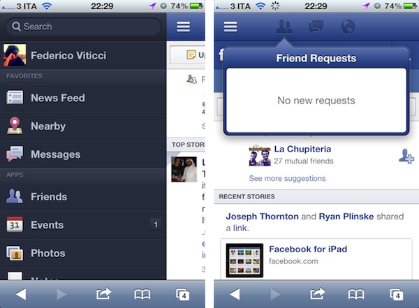
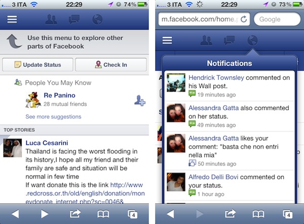
The new Facebook mobile interface is also live through Safari on iOS; the mobile website has received several updates detailed in this blog post, and it borrows heavily from UI elements of the iPad app released today, with a toolbar for friend requests, messages and notifications, and “bookmarks” on the left to search, open your profile, pages, News Feed, and so forth.
With the new Requests dialog for mobile, users can invite their friends to your app. Friends can receive requests anywhere that your app is supported. For example, if a user plays a move in a game on Facebook.com, their friend can respond from her iPhone. As with bookmarks, users will tap the notification and land directly on the mobile version of your app, whether it is a native iOS app or a mobile web app.
Navigation on the new mobile website has been dramatically improved with this update – switching between sections doesn’t reload the entire webpage and it makes for a faster, more pleasant mobile browsing experience. An obvious advantage of the native Facebook apps remains camera access and chat, which the mobile web version still can’t provide through Safari and other mobile browsers.
You can find Facebook for iPad here, and check out Facebook’s new mobile web view at m.facebook.com.
Update: I’ve been playing with the Facebook iPad app, and I’m fairly impressed with how the final version turned out to be – clearly, the app that leaked this summer was a development build that wasn’t ready for primetime. The News Feed design is clean and simple, but unfortunately it’s also the only section that lagged a bit in performances on my iPad 2 with iOS 5: the News Feed’s scrolling isn’t terribly smooth, certainly not as fluid as scrolling through a user’s profile, the Messages window or a Facebook page. I assume Facebook will make changes in the next few weeks to make the News Feed as smooth as possible. Another thing I didn’t particularly like is the Settings window, which isn’t iPad optimized and looks strange on the big screen.
But everything else is quite impressive in this first iPad app. You can have chat conversations with multiple contacts as you’d normally do, and keep the conversations going either by using the Chat sidebar or the unified Messages view. When a contact pings you in Chat, Facebook brings him/her at the top of the list so you can easily respond; unlike Facebook.com, chats aren’t displayed as open “tabs” along the bottom – they’re listed at the top of the Chat sidebar and you can go back and forth between them by tapping on them.
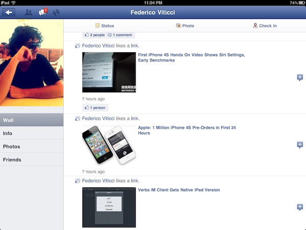
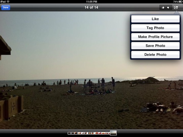
It appears Facebook has given much importance to gestures in this iPad release: you can swipe to open the left sidebar (the one that displays Search, Favorites, Apps and Pages) and swipe to navigate back to previous screens. For instance, you can open your profile from the News Feed, check out something on your profile, then swipe back to the News Feed. Animations are quite fast and responsive. Profiles’ design is extremely simple, with tabs on the left to access the Wall, Info screen, Photos and Friends. These last two items are presented with a typical iPad grid interface, and you can pinch to open photos (or swipe to navigate between them in full-screen). You can add a new friend from the Profile view or, if you’re already friends with someone, tap on the action button in the upper right corner to Send a Message, Chat, Poke and Unfriend. While on a friend’s profile, you can obviously like and comment on posts too, and the buttons to perform such actions have been moved into a single + icon next to each post.
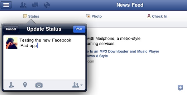
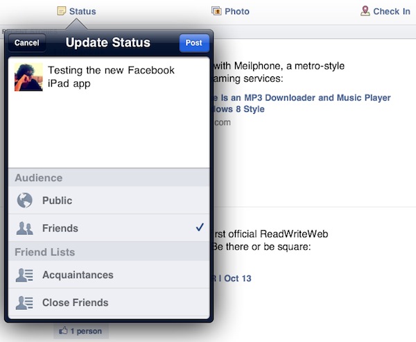
The most visible interface elements of the new Facebook app are the sidebar and toolbar. The upper toolbar, just like Facebook’s website, contains buttons to see Friend requests, messages and notifications. While the updated Facebook mobile website had to recreate Apple’s popover menus inside Mobile Safari, Facebook for iPad features native popover menus to check out requests and notifications; Facebook developers went as far as adding popover-based interaction for posting a new status update (with options to tag friends, insert location, attach a photo or video, and control privacy settings). Popovers work nicely in offering a quick glance at what’s new in your Facebook account, and a little red badge will sit next to them for a missed notification or friend request. When you tap on a notification for someone that liked or commented on a post of yours, Facebook won’t take you to a single page for that comment thread – it’ll open a sidebar allowing you to comment back. Messages, too, when accessed from the upper toolbar won’t launch a dedicated page – they’ll enable you to reply from within the popover itself. It’s a nice touch that simplifies navigation by eliminating the need of constantly swiping through pages, and a huge advantage over the mobile website (which, as you can guess, doesn’t let you reply inside popovers like the iPad app – it’ll quickly reload a new page). Another nice addition to the Messages’ popover menu is the action button that lets you open a thread in the full Messages view, archive it, mark it as spam or unread. The main sidebar on the left, too, provides quick access to often-used Facebook sections with a few taps. Your friends, News Feed, Messages and Nearby check-ins will be listed here if you want to check them out. But the new addition in this 4.0 release is the aforementioned app discovery: apps that have been connected with your Facebook account will show up as entries in the Apps section of the sidebar. Tapping on these apps will launch them if already installed on the device, or open the App Store. Which brings me to the also-updated Facebook app for iPhone.
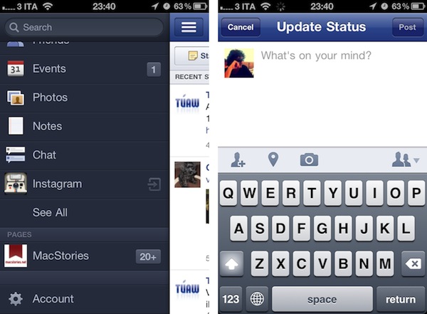
Facebook for iPhone has received a massive overhaul that makes the app look a bit like the iPad version and new mobile website (screenshots below). Unlike the mobile website, however, items in the top toolbar won’t open in popover menus: Facebook for iPhone loads new full-screen windows for them, and I assume it’s because popovers are native to the iPad’s SDK, not the iPhone’s. The fact that Facebook was able to implement popovers on the iPhone’s web UI clearly shows the different kind of control the web gives Facebook. However, small technical differences aside, Facebook 4.0 on the iPhone looks very similar to its web counterpart. The sidebar is the same, basic navigation concepts are the same, and apps are listed in the sidebar. And because on my iPhone I have some third-party apps that are connected to Facebook, I was able to launch them directly from the iPhone app’s new sidebar. I tapped on Instagram and Shazam, and Facebook for iPhone launched them directly. Other apps that weren’t installed forced Facebook to open the App Store link instead.
Overall, I have the feeling Facebook did something very good this time. The technologies used in the mobile website make for a better experience and unify the Facebook user interface across devices; the new iOS app is more polished, faster to navigate, and it’s got the same obvious perks like chat and camera access. The iPad app is especially easy to use thanks to gestures and the bigger screen, which makes everything more readable and “organized”. The iOS app could still use some tweaks (especially in scrolling the News Feed), but I believe version 4.0 is a huge step forward for Facebook, and the mobile interface is a platform we should keep an eye on in the next months.
Find a gallery of screenshots below.
Facebook mobile website:
Facebook app for iPhone:
Facebook for iPad:


