As rumors suggested earlier this month, Apple has launched a new Fitness+ feature called ‘Time to Walk,’ which the company’s press release describes as “an inspiring new audio walking experience on Apple Watch for Fitness+ subscribers.”
Jay Blahnik, Apple’s senior director of Fitness Technologies, explains that:
“Walking is the most popular physical activity in the world, and one of the healthiest things we can do for our bodies. A walk can often be more than just exercise: It can help clear the mind, solve a problem, or welcome a new perspective. Even throughout this challenging period of time, one activity that has remained available to many is walking. With Time to Walk, we’re bringing weekly original content to Apple Watch in Fitness+ that includes some of the most diverse, fascinating, and celebrated guests offering inspiration and entertainment to help our users keep moving through the power of walking.”
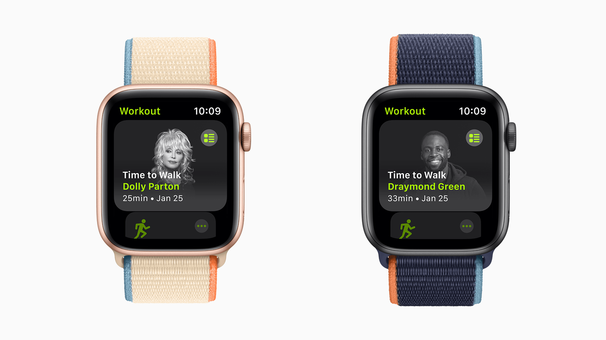
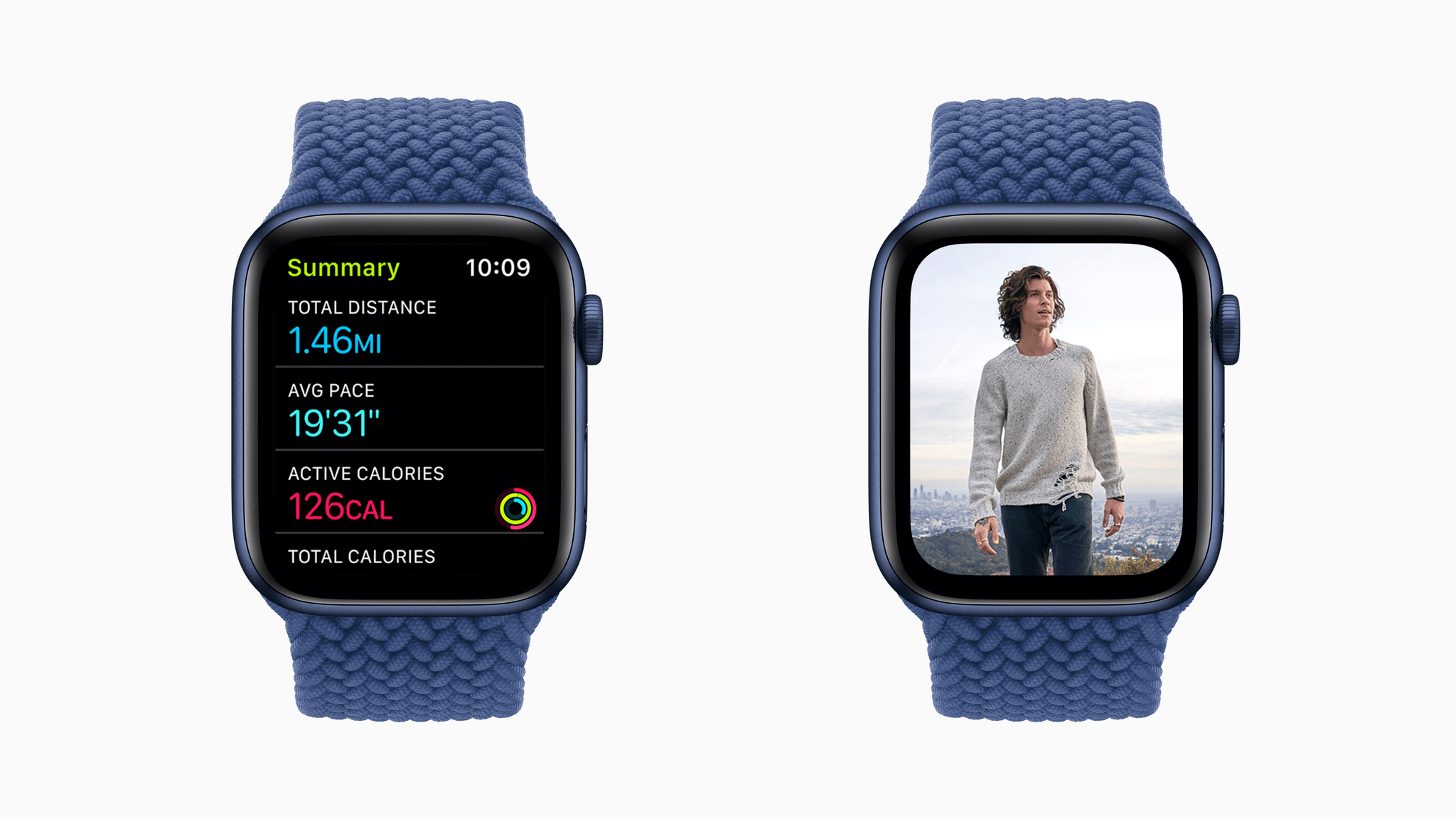
The workouts will be downloaded automatically to your Apple Watch and can be accessed there and from the Fitness+ tab of the iPhone’s Fitness app. Each workout is around 25-40 minutes long and includes stories told by well-known guests who tell inspirational and entertaining stories about their lives. The stories, which were recorded while the guests walked, are coupled with images that automatically play on the Apple Watch and a short playlist of songs at the end of each story that is meaningful to the guest. Also, as soon as you start playing a Time to Walk story, your Watch will begin a walking workout. If you use a wheelchair, Time to Walk changes to Time to Push and starts a Wheelchair Walk Pace workout.
Apple says new guest stories will be introduced each Monday through April. The first four episodes include singer/songwriter Shawn Mendes, country music star Dolly Parton, NBA player Draymond Green of the Golden State Warriors, and actor Uzo Aduba who starred in the Netflix series Orange Is the New Black.
Walking is a great time to listen to audio. I look forward to trying Time to Walk, which have not yet appeared on my Apple Watch or iPhone. The integration with Fitness+ and the Workout app is nice, reducing the number of apps you need to visit before starting a walk while listening to something. I don’t expect Time to Walk will replace my music and podcast listening when I go for a walk, but the chance to hear interesting stories from well-known guests is a welcome alternative to those other mainstays of my workout routine.
Time to Walk should be available soon and is part of a Fitness+ subscription.