System-Level Changes
Design
The design section of this review is going to be significantly shorter than that of any other OS review this year because despite the fact that visionOS partially inspired this year’s Liquid Glass redesign on iOS, iPadOS, macOS, watchOS, and tvOS, the platform itself didn’t get the Liquid Glass treatment aside from some updated icons on the Home View. Instead, window chrome continues to employ a frosted glass look with navigation and toolbars remaining static rather than shrinking and growing as needed.
Being such a young platform, it makes sense that visionOS isn’t quite due for a redesign, but this decision does leave some elements of the UI out of step with Apple’s other OSes. For example, context menus on visionOS now look outdated with their lower information density and placement of icons on the right side instead of the left. The circular cursor, which was borrowed from iPadOS, hasn’t been updated to the triangular one that’s debuting in iPadOS 26. Wasn’t a more cohesive experience across devices part of the purpose of Liquid Glass?
There are traces of Liquid Glass in iPad apps on visionOS, such as the transparent Now Playing bar in Podcasts. This mishmash of designs is a bit confusing and accentuates the fact that – as was previously mentioned – many of the system apps on visionOS aren’t native to the platform. I’d like to see Liquid Glass come to visionOS in time, but the need for more native system apps on the platform is an even more pressing concern.
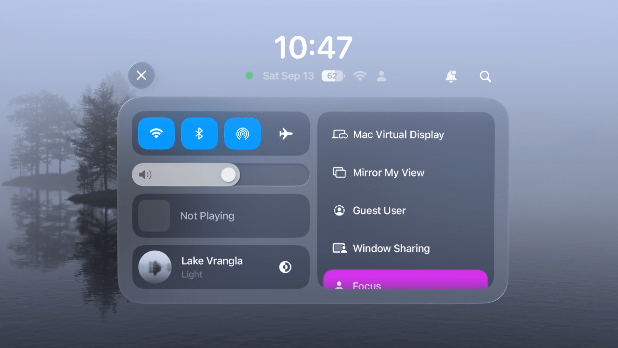
One area of the system that has gotten a redesign this year is Control Center. It’s been simultaneously simplified and expanded to make the most commonly used settings and controls easy to access. Gone is the miniature version of Control Center that used to appear when you pinched on the status widget. Instead, you’re immediately presented with the full version of the panel from the get-go, which I think is the right approach. The previous version put Control Center three layers deep, and I could never remember what all the symbols meant along the way to getting there.
The redesigned Control Center includes all the same controls as before, but now in a simple unified layout. Above the box full of controls, you can see the time, date, battery status, network status, and current Focus mode, with shortcuts to Notification Center and Spotlight off to the right. Along the top-left side are controls for Wi-Fi, Bluetooth, AirDrop, and AirPlane Mode. Beneath those are the system volume slider and the Now Playing widget, which can be expanded with a pinch. Finally on the left side, you’ve got your immersive environment control, which can also be expanded to show options to adjust the immersion level and volume.
The right side of Control Center is a scrolling list of controls to activate a variety of features, including Mac Virtual Display, screen mirroring, Guest User, Window Sharing, Focus, Travel Mode, and Screen Recording. In the Settings app, you can optionally add other controls to this list like Accessibility Shortcuts, Guided Access, Hearing, Print Center, Sound Recognition, and Text Size.
I love the look of the new Control Center. It accomplishes everything it needs to in a UI that’s familiar yet unique to visionOS. While there’s been a lot of change to the way Control Center looks and is accessed over the past year and a half, I think the current design is a winner and one that’s worth sticking with for the long haul – unless Apple wants to bring full customizability and third-party controls over from its other platforms, of course.
Quality-of-Life Improvements
After major changes to the way visionOS is controlled via gestures last year, this year’s update includes a smaller collection of quality-of-life improvements, but they are nonetheless impactful.
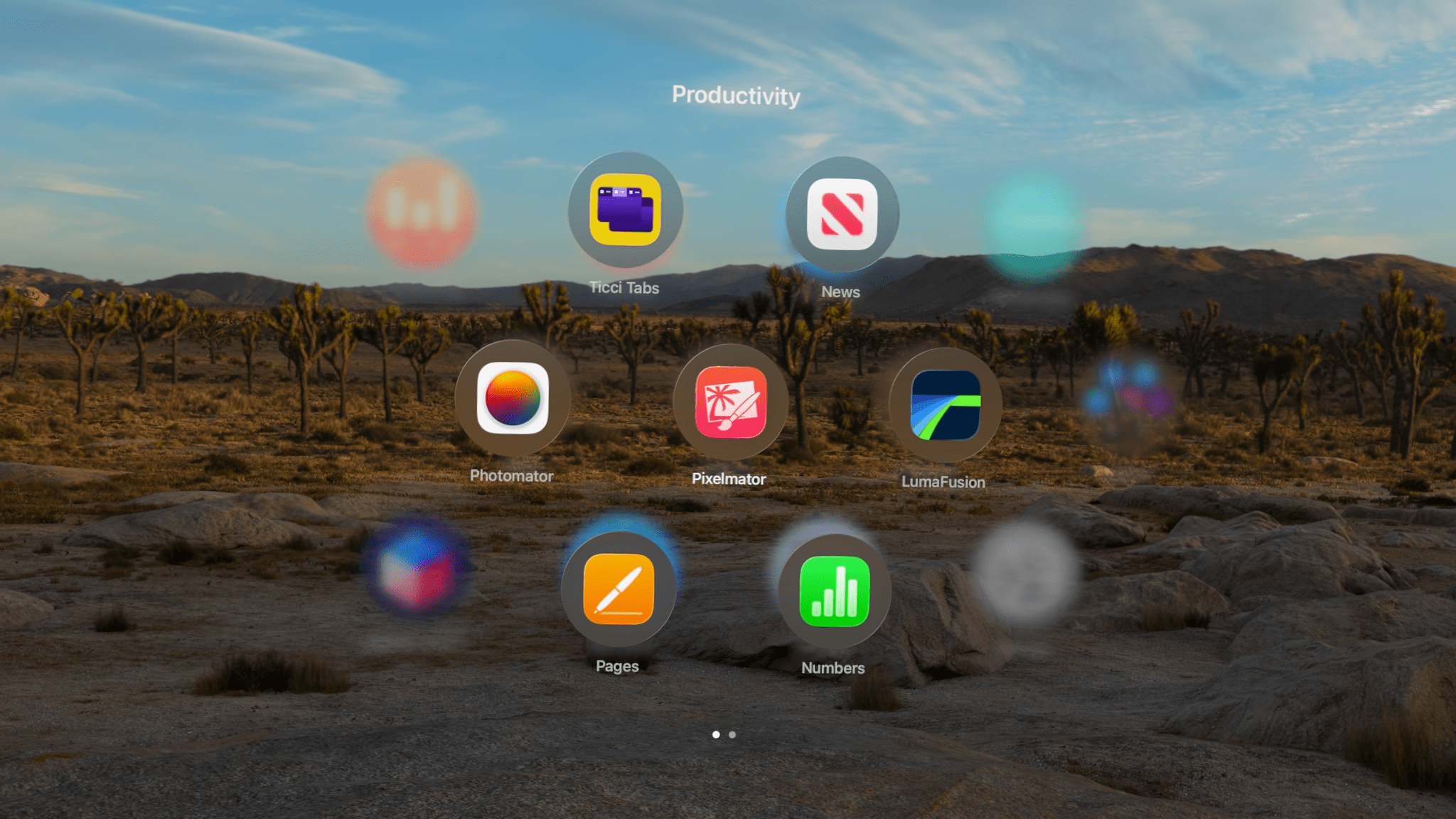
Home View customization continues to expand, this time with the option to create custom folders. Until now, the only folder available was the Compatible Apps folder that iPad apps were stashed away in. Now, every app is added directly to the Home View when downloaded and can be organized any way you like.
The process is very similar to creating folders of apps on the iPhone’s Home Screen. You start by pinching and holding on an app icon and then dragging it on top of another icon to create a new folder containing both apps. Then, you can drag as many apps as you like into the folder. Folders can contain multiple pages of up to seven apps, which appear in a fun hexagonal honeycomb shape. You can mix and match visionOS and iPad apps within folders and rename a folder by opening it, entering jiggle mode, and pinching on its name.
This is a nice development for the Home View after visionOS 2 gave us the ability to rearrange apps last year. It’s helped me reign in the chaos that I had allowed to reign beyond the second page of my Home View and group apps by category, like Games, Video, and Productivity. Creating folders is easy and satisfying, though I do sometimes run into the classic issue where I’m trying to add an app to a folder only for the folder to move out from underneath my app icon at the last second. It takes some precision to get the dropping gesture just right.
As much as I appreciate this new way of organizing apps in the Home View, I can’t help but feel like I’m just manually replicating a solution that’s already available on iOS and iPadOS: the App Library. For years, I haven’t had to worry about where I’m going to place an app icon after downloading it to my phone because the system takes care of organizing it for me unless I explicitly decide to add it to a Home Screen. I’d like that same flexibly on my Vision Pro because I’m happy accessing most of my apps via Siri or Spotlight, but I don’t like the idea of leaving a disorganized mess at the end of my Home View all the time. My fingers are crossed for the Home View to take the next logical step – incorporating the App Library – next year.
Scrolling an article hands-free thanks to Look to Scroll.Replay
Look to Scroll is a new system-wide feature that allows you to scroll the content of apps without lifting your hands. Simply direct your eyes towards the edge of the screen – top, bottom, left or right – and the app will automatically scroll its contents in the corresponding direction. This is meant to eliminate the need for a constant flicking motion, especially when reading longer articles.
I will say that when I’m reading, Look to Scroll feels like magic. It’s so natural that I mostly just forget about it. I can read at whatever pace I like, and when I get close to the bottom of the page, it starts to show new content, but at a gentle enough speed that I never have to stop reading. The experience is smooth and seamless, and my hands definitely appreciate the break.
In a nice touch, Look to Scroll deactivates when you’re editing a document. I appreciate this consideration because as much as I enjoy the feature, I definitely don’t want text moving around without my input when I’m working on show notes for Magic Rays of Light. And if Look to Scroll moves too quickly or slowly for your taste, you can adjust its speed in Settings.
The feature is available for visionOS developers to implement in their own apps, too. So far, I’ve used it the most in Safari (especially when spatial browsing) and Notes, but I look forward to being able to use it across more of my workflows soon. The app where I miss Look to Scroll most is Books, which is a iPad app and thus doesn’t incorporate the feature. Switching back and forth between manual scrolling and Look to Scroll isn’t too jarring, though, because I’m naturally inclined to scroll with my hand if the page doesn’t start to move for me. Maybe someday, scrolling on visionOS will be a thing of the past, but for now, I’ll take Look to Scroll wherever I can access it.
Locking a window to the wall.Replay
Window locking is a new option in visionOS 26 that allows you to pin a window to a vertical surface (or a volume to a horizontal one). You lock a window in place by pushing it up against the surface you’d like it to adhere to and waiting for the lock animation to appear. Locked windows do not display the grabber bar for relocation, and they do not recenter in view alongside other windows when you press and hold the Digital Crown.
Most windows on my Vision Pro are temporary. I open them, do what I need to do with them, and then close them when I’m done so my workplace stays tidy. But there are times when I want a window to stick around out of the way so I can reference it or keep an eye on a particular message thread. This is when window locking comes in handy, and it’s as rock solid as widget placement in my experience.
Like widgets, locked windows are tied to the room they’re placed in, so they disappear when you leave the room and reappear when you return. I’d honestly prefer it if regular windows behaved the same way rather than appearing as outlines through walls, but that’s one of the differentiators between regular and locked windows. When you’re ready to move or close a locked window, you can grab its lock icon and pull it away from its surface to turn it back into a normal window.
Low-light performance continues to improve in visionOS 26. If you’re working under circumstances where you can’t see your hands, the system will now replicate them onscreen faintly with a white, ethereal, semi-transparent glow. It’s a nice way of helping you see where your hands are in space without distracting you from your content. I use this feature nearly every night when I’m in bed writing and need to orient my hands in relation to my keyboard. As someone who’s become a night owl and doesn’t want to disturb his family, I appreciate any improvements to using Vision Pro in dark spaces, and this is a nice addition.
Jupiter Environment
The Jupiter environment is the first to include interactive time controls.Replay
One of the most mesmerizing and impactful applications of the Vision Pro’s technology is its immersive environments. With the push of a button, you can be transported from your office or living room to a beautiful beach, to the top of a mountain, or even to space. Whether you’re looking to focus or relax, immersive environments surround you with realistic, high-resolution visuals, movement, and sound that make you feel like you’re somewhere else entirely.
Third-party apps can and do offer these immersive environments, and of course, they’re coming to the web this year. But Apple offers a set of first-party environments that can be invoked from the Home View and viewed while working in any app or multiple apps, unlike other environments that are limited to particular apps. So when Apple adds an environment, it’s a big deal; it doesn’t happen very often.
visionOS 26 brings the new Jupiter environment, and it’s unique in many ways. Whereas Apple’s other environments mostly leave the space in front of you open to leave room for windows, with elements like water, sand, and clouds that fade as they get further away, Jupiter does the opposite. Right at the center of view is the massive orange planet itself, being viewed from one of its moons, Amalthea. Rather than fade away, this environment draws your attention from the very start.
There’s plenty more to look at in this environment, too. From the ice on the ground around you to the stars and other moons floating around in space as you turn around the 360-degree view, the entire thing is just so expansive and fascinating. It’s a view none of us have ever had a chance to see firsthand before, and it leaves quite an impression.
But that’s not all Jupiter has to offer, because it’s also Apple’s first interactive immersive environment. Other environments come in light and dark versions that you can toggle manually or set to alternate automatically based on the time of day. Jupiter is a constantly shifting environment, with the sun slowly washing the planet in light, revealing swirls of movement as storms migrate across the planet’s surface. Then, the sun fades, and the entire environment goes dark as Jupiter enters night.
You can control the playback of Jupiter’s day by opening Control Center and choosing the new Explore button within the environment’s tile. This will open up a small window that includes a few details about the environment, a slider to manually fast forward and rewind the timeline, and buttons to jump to different points during Jupiter’s day. In the top-left corner of the window, there’s a menu to control the speed of the environment with three options: Pause, Regular, and Faster.
After playing around with the controls for a little bit, I ended up leaving the Jupiter environment running in Faster mode as I was working on this review. The movement behind my windows, along with the shifting light on the moon around me as the day passed, offered the perfect amount of novelty and motion without being too distracting. It felt like having an animated wallpaper running, except it was all around me instead of just on a computer monitor. Even though there was motion on all sides, I actually found it soothing and helpful for my focus.
The Jupiter environment is downright impressive, and I’m happy that I have the chance to work and hang out there as often as I like. Its dynamic nature is so refreshing and fun, and I hope to see Apple bring the concept of customization to more of the built-in environments. Hopefully, Jupiter is a preview of what we can expect from more epic environments to come.