Spotify for iPad, released this morning, is a beautiful app. It’s solid, providing fast and reliable access to Spotify’s huge catalogue of songs and artists, and it presents content inside a great-looking package that, as I’ve already written, reminds me of Reeder’s sepia tones.
What follows is a brief examination of the app’s interface and functionalities. I have been using Rdio to completely fill my music listening needs for the past six months, but I was looking forward to trying Spotify for iPad to give it a fair shot.
Panels
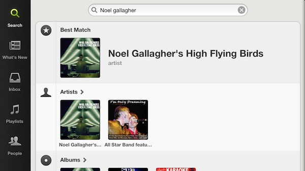
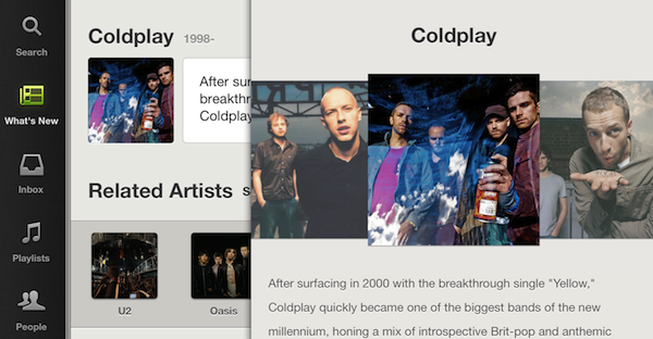
Spotify for iPad uses a Twitter-like stacked panel navigation to let users move around the various sections of the app: from a narrow sidebar on the left, you can hit Search, What’s New, Inbox, Playlists, and People to open a dedicated view on the right. From the sidebar, the only element that opens inside a popover, and not a panel, is the Settings screen. Unlike Loren Brichter’s Twitter for iPad, the panels used in Spotify don’t “lose” context and position as you switch between them: in Twitter for iPad, for instance, you can open a link alongside the main timeline while continuing to scroll, but switching to the Mentions tab will automatically close the webpage open in the Timeline.
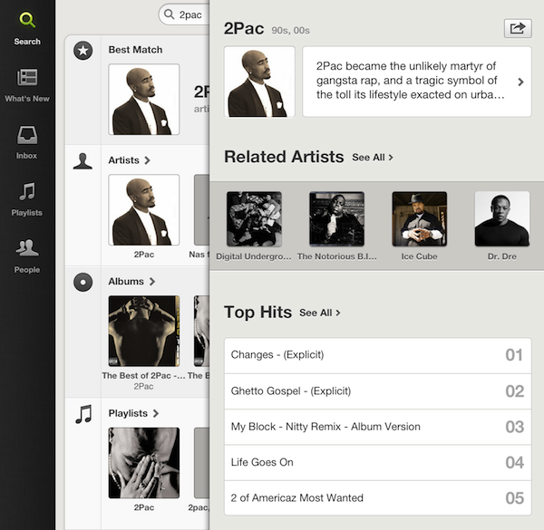
Spotify for iPad tries to solve this “problem” with a persistent stacked navigation approach that maintains the position you gained drilling down “levels” as you move between tabs. In the first section, Search, you can get real-time, instant unified results for artists, albums, “best matches”, playlists, and tracks matching your criteria. Tapping on an artist within the search view will open a new panel containing Related Artists, Top Hits, Albums, Tracks, and “Appears On” features. Surprisingly, tapping on an album result won’t fetch “more from this artist” content like Rdio does in order to foster discovery between albums – albums loaded inside panels only display that album’s content.
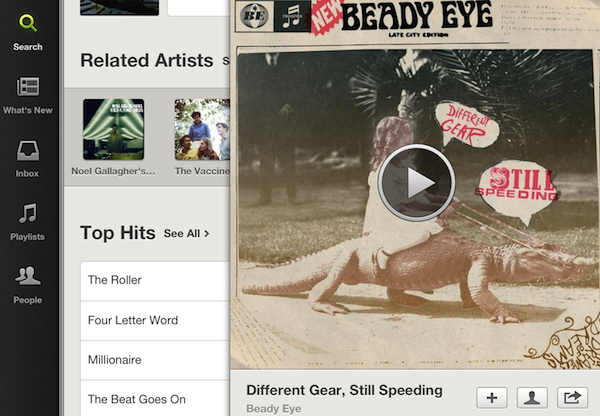
By selecting the richer Artist or Best Match view from a search, the second panel allows you to drill down additional content using more panels. This feels very familiar if you’re coming from Twitter for iPad: you can for instance enter a “loop” of panels by continuously tapping on two related artists.
The problem with panels is that, from a design standpoint, it’s easy to forget to properly show the various levels of navigation a user previously opened. In standard apps like Mail, for example, Apple uses a combination of back button and title bar to indicate the previous and current view, respectively (e.g. back: Mailboxes, current: iCloud account). With a panel-based UI like Spotify’s, with various layers stacking on top of each other, it’s not always clear what a “previous level” may stand for. To obviate the issue with confusion in regards to what’s been loaded and what’s before it, Spotify chose some quite clever implementation techniques. For one, users can swipe between panels to take a “quick peek” at previous/next items without fully bringing them into view.
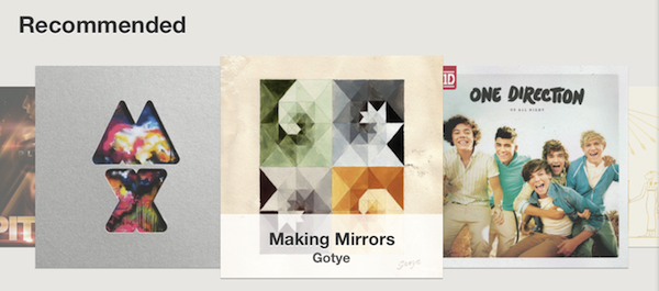
This, obviously, has a consequence: when the panels become two, the standard swiping gesture for the carousel (What’s New > Recommended) turns into a navigation gesture to move panels.
Try it: open the carousel menu, swipe on it, then tap an album and swipe again. I assume this is the reason why, in the Related Artists section of an artist, the “See All” option is a link, and not another carousel…and I say “assume” as the behavior of the app is again entirely different in another section. In the Artists bio page, which naturally opens inside a panel, the swipe gesture works both for the carousel view and panel. It is quite confusing: if the Bio page is the rightmost one, swiping precisely on the thumbnails will advance the carousel, and swiping below them will move the panel. But if there’s one more panel to the right – say, because you tapped a link in the bio – swiping on the carousel will randomly trigger the panel animation.
I know I am nitpicking UI details, but these are the experience and interaction details that make great software actually great. While I am a big fan of panels – especially on the iPad – I recognize that often developers have to deal with extra issues when implementing them due to a possible lack of standard UI controls like toolbars and buttons.
Subtle skeuomorphism can usually come in handy, and Spotify for iPad does indeed apply some lightweight real-life metaphors in helping users understand the “levels” of content they opened. Multiple pages stack on top of each other like a book, and whilst technically impressive (the app never crashed on me even with 20 panels open), the UI only displays three levels of pages to show there’s content before the visible panel. If you’re in the middle of 10 panels, though, there is no way to know there are more pages to the right.
Overall, the implementation of panels is solid, and even intuitive for the most part, with the exception of some arguable decisions that, however, are more imputable to Spotify’s own philosophy for browsing content, rather than engineering issues.
Also: you can scroll two panels separately at once, and you can quickly go back to the “root” of any tab by tapping it. Doing this will erase all your previously open panels.
Now Playing
Before I get to the app’s features and the practical differences between Rdio and Spotify, I’d like to focus on the other big interface element that Spotify baked into the first release of its iPad client: the now playing bar and associated cover art view. Once you understand how panels work, in fact, the other interaction to quickly get accustomed to is the playing bar at the bottom, how it opens a full-screen cover art, and the ways to get songs into the playing bar.
The basic gist is that tapping on a song won’t open a full-screen now playing view, but it will slide up a control bar from the bottom without interrupting your browsing session. The now playing bar displays the song’s information and length, lets you manually advance through a song, but it doesn’t feature volume controls. There are three buttons on the right, and a full-screen controller on the left lets you switch to a bigger now playing view with larger album and controls. If you tap on the small album art item in the control bar, you are given access to a popup menu to star, add to a playlist, share, open the artist’s page, shuffle, and repeat.
The controls are the same, but laid out differently, when you enter the standalone now playing UI. In here, buttons are big and displayed at the side (or bottom) of an album, and two toolbars to go back/hide and share disappear upon tap. In this view, you can swipe on album covers to move between songs (from whatever list or playlist they are being fetched from), but you can’t pinch-out to close and return to the browsing UI. In the full-screen view, I find the lack of on-screen volume controls frustrating; I’d also like to see the app subtly hinting at what’s next when I’m swiping on an album. Right now, swiping between albums only lets you peek at photos, and not a song’s name.
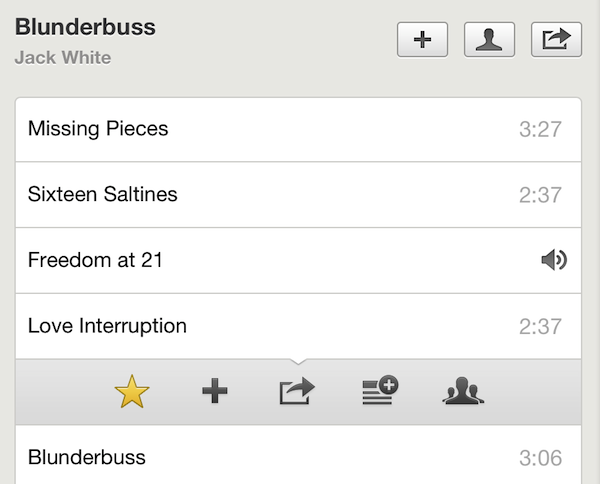
Songs can be added to the now playing section from the standard browsing interface as well. You can tap & hold on a song to reveal a dropdown action bar with the same options seen in the now playing bar, only with one more button to send a song to your queue. Too bad the app doesn’t have a dedicated Queue tab, and the only way to know what’s next is by swiping on cover images…which doesn’t display song names.
Features & Differences
Coming from Rdio’s experience, heavily focused on discovery and library management, Spotify for iPad is disappointing. You can’t build your own “collection” of songs and albums; you can’t access your recent listening history; the What’s New screen is a weird cocktail of trending playlists, “top” tracks and “new releases” seemingly picked with obscure criteria that aren’t explained to the user. On the contrary, Rdio puts great emphasis on organizing new releases (every Tuesday) by week, last week, and two weeks ago; stuff that ends up in Heavy Rotation is associated with the user you are following that put it there; you can build you own iTunes-like collection with various sorting and display option, access your queue, and see what you listened to recently.
When it comes to discovering and managing your music, there is simply no comparison: Rdio is better. Whereas Rdio looks and works like a service that wants to help you build and discover a music library in the cloud, Spotify keeps on being a service focused on playlist creation and search. Look for a song, tap on it, and listen. Perhaps check out some related artists and star songs. Having tried both for several months (I was a Spotify user for years, and recently renewed my subscription when I heard the iPad app was coming), I can see how Rdio has convinced many music aficionados’ to switch thanks to its rich and constantly updated discovery options and social features. On the flip side, Spotify is looking more and more like an on-demand radio, with non-existent library management functionalities and poorly explained “what’s new” and “recommended” sections.
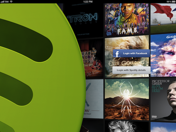
There are some other things I like about Spotify for iPad. Sync and Stream settings, for instance, let you choose between 94, 160, and 320 kbit/s options that, for some reason, Rdio isn’t disclosing openly on its site and support pages. There is a welcome option to hide unplayable tracks, and gapless playback has been implemented alongside adjustable crossfade. The login screen looks gorgeous, and the sharing options are decent.
To The Cloud
If you’re a Spotify user and have been waiting for the iPad app, go get it. It’s a beautiful first release that doesn’t revolutionize the Spotify experience you presumably like, and it adds a fun and engaging native iPad interface. If you, however, have been experimenting with various music streaming services like I did and happen to appreciate Rdio-like music management options, I suggest you carefully consider switching only because Spotify for iPad is new. If you want to satisfy your curiosity, you should give Spotify for iPad a try, but if you depend on serious management and discovery features for your music, stick with something else.


