Design
Here’s the thing: I always struggle to write about design. I think I’m a better writer – who can produce better, more useful output – when I write about using apps rather than what they look like. But there’s no way around the fact that Liquid Glass, Apple’s new cross-platform design language for the 26 series of OSes, has been and continues to be the narrative in the Apple community this year.
For nearly three months this summer, I couldn’t bring myself to write about Liquid Glass, for a variety of reasons. For starters, it was a work in progress: as we’ve seen on social media since WWDC, Apple spent over two months tweaking and fine-tuning the appearance of Liquid Glass until they pretty much landed on today’s shipping version in August. Second, I struggled with Liquid Glass because I didn’t have enough third-party apps to use as examples and evaluate the impact of Apple’s updated design language on my workflow. That goes in tandem with my third point: the more I rely on web apps – especially on my iPad Pro – because of their AI features, the less I find myself being exposed to Apple’s native apps and, therefore, their Liquid Glass appearance.
While my reliance on modern web apps and services in lieu of Apple’s own apps for productivity hasn’t changed, all the other points have been addressed in recent weeks. Apple has finalized the debut version of Liquid Glass, and I’ve been able to test nearly 70 third-party apps with Liquid Glass, many of which you’ll find mentioned in this review and covered over the next few weeks on MacStories.
In short, I’m ready to analyze and talk about Liquid Glass now. And the first thing I’ll say is that, beyond its (gorgeous) bells and whistles, Liquid Glass doesn’t dramatically alter the look of our phones the same way iOS 7 did 12 years ago. If you were looking for a sweeping, ground-up redesign of the iOS experience, Liquid Glass is not it.
That’s not necessarily a bad thing, and it’s consistent with the design strategy we’ve observed in Tim Cook’s Apple for the past decade. Here’s what I wrote in the Design chapter of my iOS 13 review, when – in a pre-pandemic world – Apple introduced dark mode and iPadOS:
Today, I believe Apple feels a responsibility to foster their ecosystem without disrupting it again. If that’s the case, the cost of a sweeping redesign may be too high to justify: user patience, goodwill, and loyalty – key components of a service-oriented business – are too precious a resource to jeopardize every few years. Plus, what if most users – those who make up the “billion pockets” – don’t actually like having to learn a radical new design every few years?
I may be wrong, but in considering how judiciously Apple has iterated iOS design in recent years, I think their trajectory fits this different mindset. iOS 7 was, in many ways, a bitter medicine that set Apple up for the next several years, but it overshot some design principles in the name of aesthetic purity. As a result, Apple has used the last five major releases of iOS to refine what worked in iOS 7 and rethink what didn’t. iOS 13 follows the same playbook: the string of refinements continues throughout the OS with changes aimed at taking advantage of OLED displays, making UI elements more intuitive or ergonomic, and extending the functionality of menus and share sheets. But it doesn’t fundamentally disrupt the experience.
That is as true today for Liquid Glass as it was six years ago, and it’s where I want to begin this chapter before diving into the specifics of Apple’s new material.
I’ve long maintained that, as long as Apple continues to be a massively successful company with 2.35 billion active devices, we’re never going to have another “iOS 7 moment” where, ostensibly overnight, someone’s mobile operating system changes to the point of being unrecognizable and hard to use. The scaling laws of Apple’s user base simply don’t allow that; some may argue that Tim Cook’s conservative approach to product evolution won’t allow that, but I digress. Apple is simply too big to potentially confuse a lot of people with design changes right now – especially when a large chunk of Apple’s revenue originates from services predicated upon the idea of users remaining loyal customers over time.
But there’s a fine line between feeling the responsibility of design consistency and falling into the trap of thinking that you can never innovate again because your customers are used to things being a certain way.
The way I see it, Liquid Glass is that kind of fine line. It’s new, but it’s not sweeping; it’s familiar with iOS’ visual legacy, but it also repositions and redesigns UI elements to feel distinct enough from what came before. And given the scale at which Apple operates now, and the complexity that iOS has reached, Liquid Glass introduces new problems that were perhaps impossible to avoid unless…well, you don’t ship anything new, ever again.
At the same time, Liquid Glass also serves as a great reset for Apple’s design language, and it’s being pitched as a multi-platform design architecture that – theoretically – should bring more consistency across different Apple experiences on different devices. The results, as my colleagues John, Devon, and Jonathan will outline in their respective macOS, visionOS, and watchOS reviews, will highly vary.
I’m sure you’ve seen your fair share of Apple observers this summer who either claim that Liquid Glass is an unabashed disaster and Apple should have a “Snow Leopard year again” (boy, do they love that particular expression) or that Liquid Glass “changes everything” about how you use your iPhone or iPad.
In this review, my goal is to explain why neither is true, what Liquid Glass actually is and does to your favorite apps, and how it positions Apple for the future.
What Is Liquid Glass?
I can’t stress this enough: the first thing you need to understand about Liquid Glass is that it’s not a drastic, groundbreaking redesign that changes the look of your iPhone overnight, like iOS 7 did for millions of people in 2013.
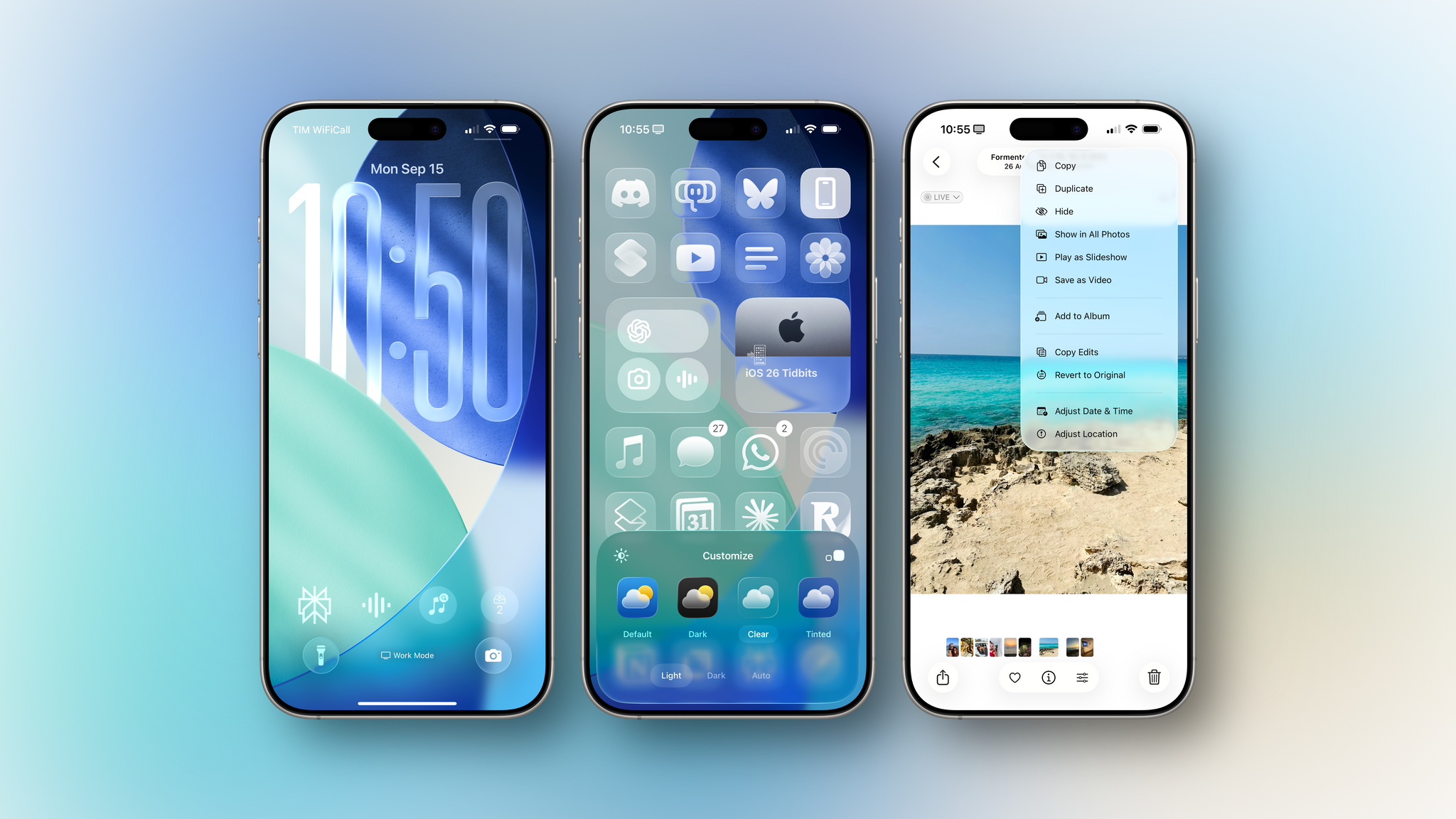
Liquid Glass is a new “material” that Apple designed for all its platforms, which has been implemented in nearly all interface elements of iOS and iPadOS – from toolbars and buttons to sliders, menus, and even icons. For developers, implementing Liquid Glass is based on new design principles that have resulted in an updated overall aesthetic for their apps. For this reason, it’s fair to think of Liquid Glass as a new material and design refresh rather than a massive redesign of the look of Apple’s OSes. Liquid Glass is more subtle than that, and trickier to explain because of it.
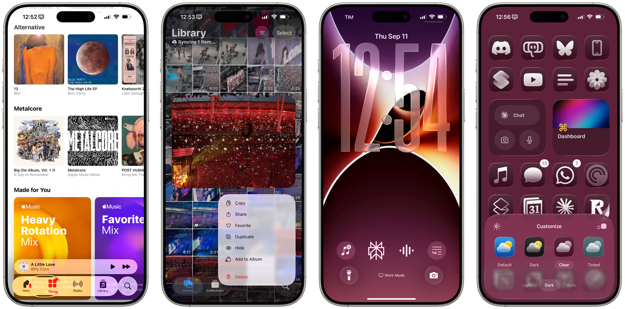
Let’s start from Apple’s material breakthrough. Liquid Glass is a material that combines the optical properties of glass with fluid dynamics. Think of it as a mix of visionOS’ “glassy” UI (which, per Apple, did inspire the company to create Liquid Glass) and the Dynamic Island’s fluid, almost organic UI. Since it’s rooted in real-world physics and the actual properties of glass and fluids, Liquid Glass is more akin to a rendering system – almost like a videogame engine – than a simple “style layer” in Figma or Sketch. Liquid Glass can simulate glass to blur and refract content behind it in real-time; it can reflect colors and light around it; it responds to a device’s movement via the gyroscope and accelerometer; it also responds to the user’s touches and clicks with fluid, morphing animations for menus and buttons. All of this happens in real time on a wide range of devices that can be updated to iOS and iPadOS 26 today. After three months with Liquid Glass, my impression is that Apple wanted to build a new kind of UI that could be both more consistent and contextual while also, frankly, just being cool to look at.
The way Apple pitched it at WWDC, Liquid Glass is a product of the times we’re living in with the Apple ecosystem. Let me explain. In 2013, Retina displays and their ultra-sharp definition were the inspiration behind iOS 7 and its flat, precise UI. Setting aside the fact that all user interface is fashion and styles simply come and go over time, it’s undeniable that Retina displays were a good match for a design language that emphasized sharp lines, plain text, and simple iconography. As we’ve seen in my annual reviews, Apple spent several years walking back some of the most extreme choices of iOS 7 and progressively re-adding elements such as drop shadows, translucencies, and rounder menus, but the core of iOS 7’s aesthetic always remained.
Apple’s realization with Liquid Glass (again, according to their pitch) is that we’re living in the Apple silicon era, and the chips in our phones are capable of doing so much more with a rendering system than iOS 7’s flat and rigid user interface. We’ve seen Apple get more comfortable over the years with this idea of increasing the computational cost of its UI rendering system without sacrificing performance and user experience. From the iPhone X’s fluid interface locked at 60 fps to the Apple Pencil’s smooth ink on the iPad Pro and, again, the Dynamic Island’s own take on mini multitasking, modern Apple hasn’t been afraid to flex what its own chips can deliver in real time thanks to their massive performance headroom.
Whether you like it or not, Liquid Glass is the ultimate flex: only Apple is in a position today to build a real-time rendering system that combines the laws of physics of two real-world materials, make it look cool, and deliver it at scale across six operating systems and billions of devices at once. In the 12 years since iOS 7 (when Apple was only making two operating systems!), the company has put itself in a position to be able to deliver something like Liquid Glass today. I’m not saying that it’s perfect; I’m saying that the effort and scale behind it is unprecedented in the tech industry.
Beyond the material itself, though, there is also a style – an aesthetic – that Liquid Glass carries, which you’ll find implemented with varying degrees of success and consistency across iOS and iPadOS. And there are some recurring themes in the adoption of Liquid Glass that I’ll try my best to highlight in this review by looking at Apple’s apps as well as third-party examples.
At a high level, everything in iOS 26 is a bit chunkier, more spaced out, and rounder than before. The last part is extremely important: Apple seems to be very proud of and excited about this idea of “concentricity” in its refreshed UI, with circular and rounded elements that match (whenever possible) the corner radii of iPhones’ and iPads’ bezels, and which tend to be inset from the display. Apple has been so persistent about this idea of concentric UI this summer, it has raised a few eyebrows from those who believe it may hint at something else down the road when it comes to displays and their bezels, or a lack thereof.
But enough about the theory behind Liquid Glass. Let’s get into the real stuff now.
The Lensing Effect and Floating UI
The only way we can begin talking about the practicality of Liquid Glass is by examining its two key characteristics, one of which appears “useless” at a surface level and another that is more pragmatic.
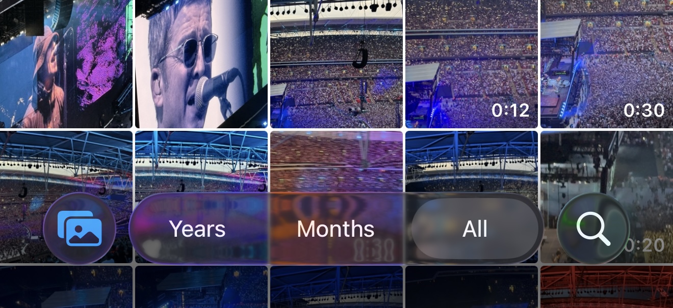
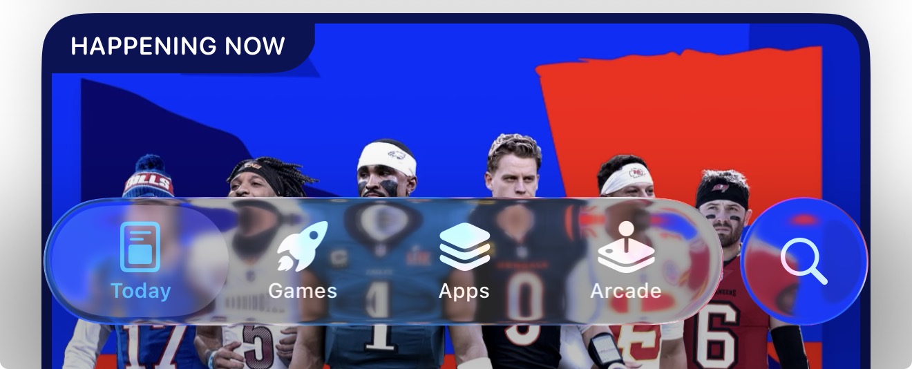
Liquid Glass is predicated upon the lensing effect of real-world glass, and all UI elements built with Liquid Glass in iOS 26 float on the topmost layer of the interface. These are the basic facts you have to understand about Liquid Glass: it reflects and refracts (i.e., bends) light, and it floats above everything else. There are exceptions for lensing (depending on the intensity of the Liquid Glass material used by an app and other factors), but you’ll always find Liquid Glass components floating above something else. In iOS and iPadOS 26, tab bars, sidebars, and toolbars are always displayed as Liquid Glass floating elements.
Lensing has been the most contentious aspect of Liquid Glass this summer, heavily criticized by people (including myself) as it related to the legibility of text and general accessibility of the iOS UI. If you’ve heard folks use expressions such as, “Apple has toned down the Liquid Glass in this beta”, or, “Legibility is worse with Liquid Glass”, it generally all comes down to the material and its lensing effect.
puts on non-existent physics professor hat
Lensing is a phenomenon that occurs in the real world when light travels through a glass lens. It has several consequences that can be observed in Alan Dye’s introductory video on Liquid Glass – where Apple design team members are physically holding glass objects on top of screens and printed text – as well as in Liquid Glass’ digital rendition in software.
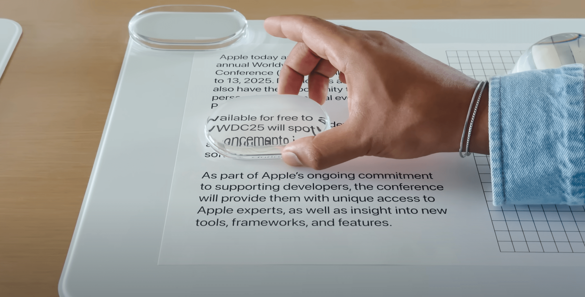
Obviously, glass is transparent, so – again, depending on whether an app is using the “clear” or “frosted” look of Liquid Glass – you’ll always see something underneath. When Liquid Glass is in its most pure, clear rendering mode, it simulates real-world optics and the physics of glass:
- Light refraction means that “light” (in our case, pixels from the display) traveling through Liquid Glass bends in different directions based on the curvature of the glass object. This is why you’ll see text often get “distorted” when passing through Liquid Glass. You can witness this when selecting text with the new magnification loupe or by slowly swiping across an iOS 26 tab bar and looking at the “selection bubble”.
- Spherical aberration makes content that is farther away from the center of the “lens” (i.e., the glass object) out of focus and blurred. It’s not very pronounced, but since Apple seems to be using a convex shape for Liquid Glass elements rather than a concave one (as also seen with Alan Dye’s glass toys), it is noticeable. Convex shapes are very subtle in iOS 26, but they’re often reinforced by specular highlights.
- Chromatic aberration bends different wavelengths of colors by different amounts, causing colors to “fringe”. You can see this when slowly swiping down to reveal Notification Center at the edges of the glass panel or when slowly moving from one selected tab to another by looking at the edges of the bubble. (Technically, Apple calls this “spherochromatism”.)
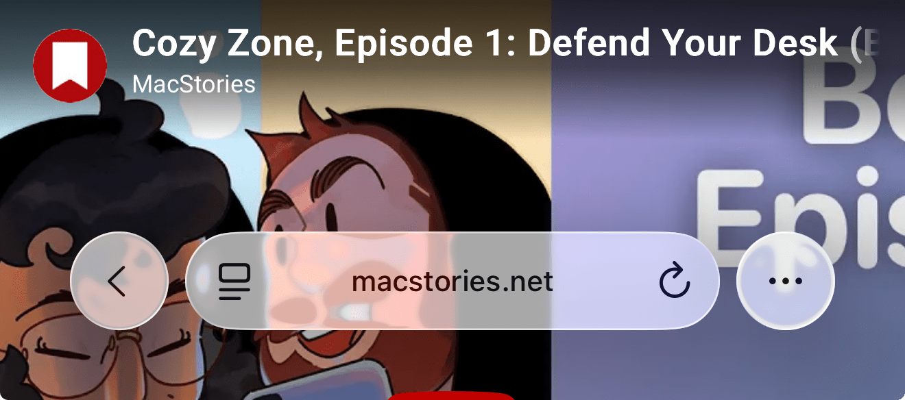
Without getting farther into the weeds here, if you’ve run the iOS 26 beta this summer, I’m sure you’ve seen the effects of lensing in elements such as the tab bar in the Music and App Store apps, the Safari address bar, and any button that adopts Liquid Glass’ “one true” clear look. When they pass over content, items below them get distorted and blurred.
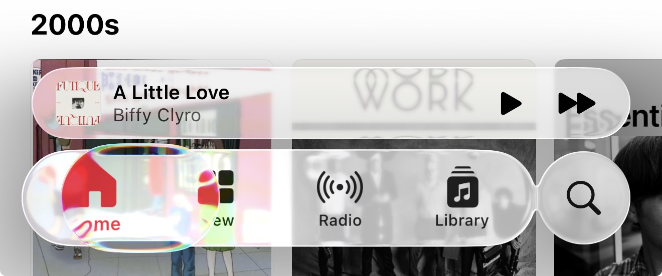
A Liquid Glass tab bar in the Sequel app.Replay
Now, on one hand, this is part of the graphical fidelity flex from Apple’s part I mentioned above: this stuff looks great in motion. All of these optical properties of glass are rendered in real time at 120 Hz on modern Liquid Retina displays, with the kind of buttery smooth performance that we expect from a design-first company such as Apple. The moment you install iOS 26 and look at how the magnification loupe distorts text around its capsule, or how the bubble above a selected item in a tab bar deforms the icon and text underneath…you’d be hard-pressed to not crack an initial smile, at the very least. Liquid Glass looks cool, animates nicely, and – importantly – feels new. There is no denying that the engine behind it and the cross-platform rollout is quite the achievement.
The problem of glass and lensing is when the physical simulation meets the reality of digital content. Put simply, the applied version of Liquid Glass is not equivalent to Alan Dye holding a clear glass capsule on top of a giant Photos icon. Liquid Glass elements often contain glyphs or text (or both!) that need to pass over other text, glyphs, and colors that Apple cannot closely control. When that happens, despite Apple’s best efforts to dynamically control iOS’ rendering pipeline and glass intensity, there are still moments when legibility suffers because of Liquid Glass.
You’ve probably seen the shots of this problem in action, usually within the Safari address bar or Music’s tab bar and tab accessory (more on this later) when scrolling on top of text or images. With a transparent material that slightly blurs and bends content underneath, along with content contained within the glass itself, text can often be hard to read. There’s only so much contrast you can apply to, say, notifications if the material being used is the clear version of Liquid Glass and you have a complex wallpaper (like a photo or geometric pattern) in the background. When Music’s pink accent color in the tab bar is overlaid on top of album covers that are also red or pink, there’s not enough blur in the world to save you from a transparent material that takes on the color of whatever’s underneath it. It’s going to be pink on red, and it’s not going to look great.
The list of examples could go on and on. The issue of Liquid Glass being problematic for legibility and contrast is inherent to the material itself. It cannot be entirely solved unless a transparent, glass-like material that needs to have the optical qualities of glass is replaced with something else. If glass has to stay, and if we’re modeling UIs after the physics of glass, then we’ll have to accept refracted light with warped text under regular text, chromatic aberrations, and other byproducts of glass.
It is undeniable that some legibility issues exist with Liquid Glass today.
But here’s where, after three months of using Liquid Glass on my iPhone and iPad, I believe I disagree with some of my peers in the Apple community. I do not think the version of Liquid Glass shipping today is a disaster that will end up having catastrophic consequences for Apple (a common refrain on Mastodon). Fundamentally, I think that the intrinsic issues of Liquid Glass are counterbalanced by a UI that looks great, animates even better, and, overall, makes iOS easier to use for all the reasons I’ll elaborate on in subsequent sections. I find it hard to look at iOS 26 in motion with elements like tab bars and not think that it’s one of the coolest pieces of motion design I’ve ever seen on a phone.
Refractions in an iOS 26 tab bar.Replay
If you only consider very specific screenshots of Liquid Glass looking “bad”, and if you extrapolate your conclusions from those isolated instances of low legibility, I think you’ll be missing the forest for the trees of this design language. I am not saying that Liquid Glass is an unassailable masterpiece without defects. I’m saying that in everyday life, despite its issues, this UI works well and looks stunning. It’s not just eye candy.
Liquid Glass’ focus on “morphing” interface elements that occupy less screen real estate is, in my opinion, the design principle we’ll see Apple refine over the next several years. You have to look beyond the shimmering surface of Liquid Glass to understand what Apple is doing: even if the glass part of Liquid Glass is dialed back or joined by another material (Liquid Frost? Liquid Metal? Oh.), I’m willing to bet that the focus on morphing, compact UI will stay for years (and future devices) to come.
But back to the present for now. Before moving on to the specifics of different Liquid Glass elements in the iOS and iPadOS interface, I want to stress the importance of two traits of this material. The first one, which I mentioned before, is the adaptability of Liquid Glass. As you’ll see in screenshots and videos in this story, Apple is doing a lot of work behind the scenes with different levels of “glassiness”, plus an algorithm that calculates light and dark colors, shadows, and blur in real time. I’m convinced that this aspect will continue to be tweaked over the iOS 26 release cycle as Apple gathers feedback and fine-tunes for the edge cases of third-party app content.
The second aspect of Liquid Glass, which affects all the elements I’ll cover below, is that it floats above everything else. In using Liquid Glass, you’ll have to undo years of visual memory for tab bars that blend in with an app’s navigation or buttons that appear on the same Z-index as an app’s main content. From this perspective, I think it’s kind of funny to consider how Liquid Glass is the least “flat” the iOS interface has been in over a decade. There is a sense of depth – and, dare I say, skeuomorphism – to Liquid Glass that doesn’t require Corinthian leather or other realistic textures to be effective.
The most basic test to get a sense of all these ideas together is a simple one: logging into a webpage in Safari. Compare and contrast the same action between iOS 18 and 26:
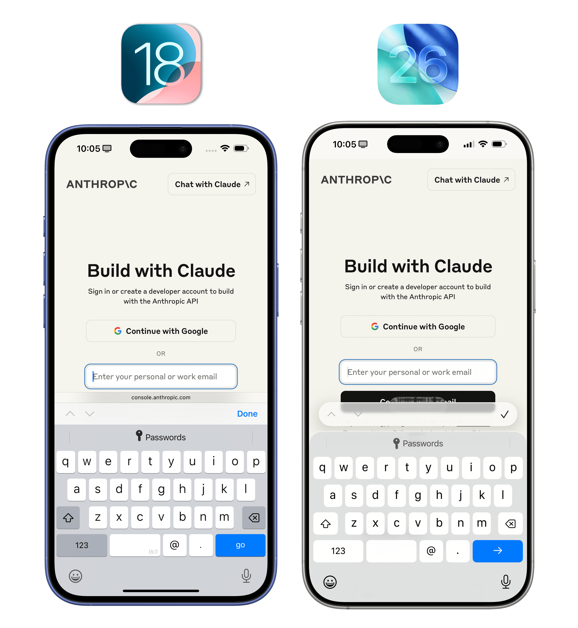
This action is representative of several of the underlying principles of Liquid Glass. In iOS 18, despite it being 11 years removed from iOS 7, everything is flat and stuck together, with three separate, full-width bars stacked on top of the system keyboard. In iOS 26, it’s the opposite. The material features different levels of transparencies; every element is distinct and floating on top of the content, with clear boundaries; the keyboard’s panel and the predictive suggestion bar are rounded and inset, yielding a pleasing, more consistent effect with the iPhone’s nearby rounded display corners; and despite these changes, the UI is more compact overall, displaying more content from the original webpage.
This simple screenshot covers all the basics of the specific areas I’ll explore in depth below. The big picture is clear (no pun intended): with Liquid Glass, Apple is going all-in on smaller UI elements that float around content (and look cool in the process).