The New Control Center
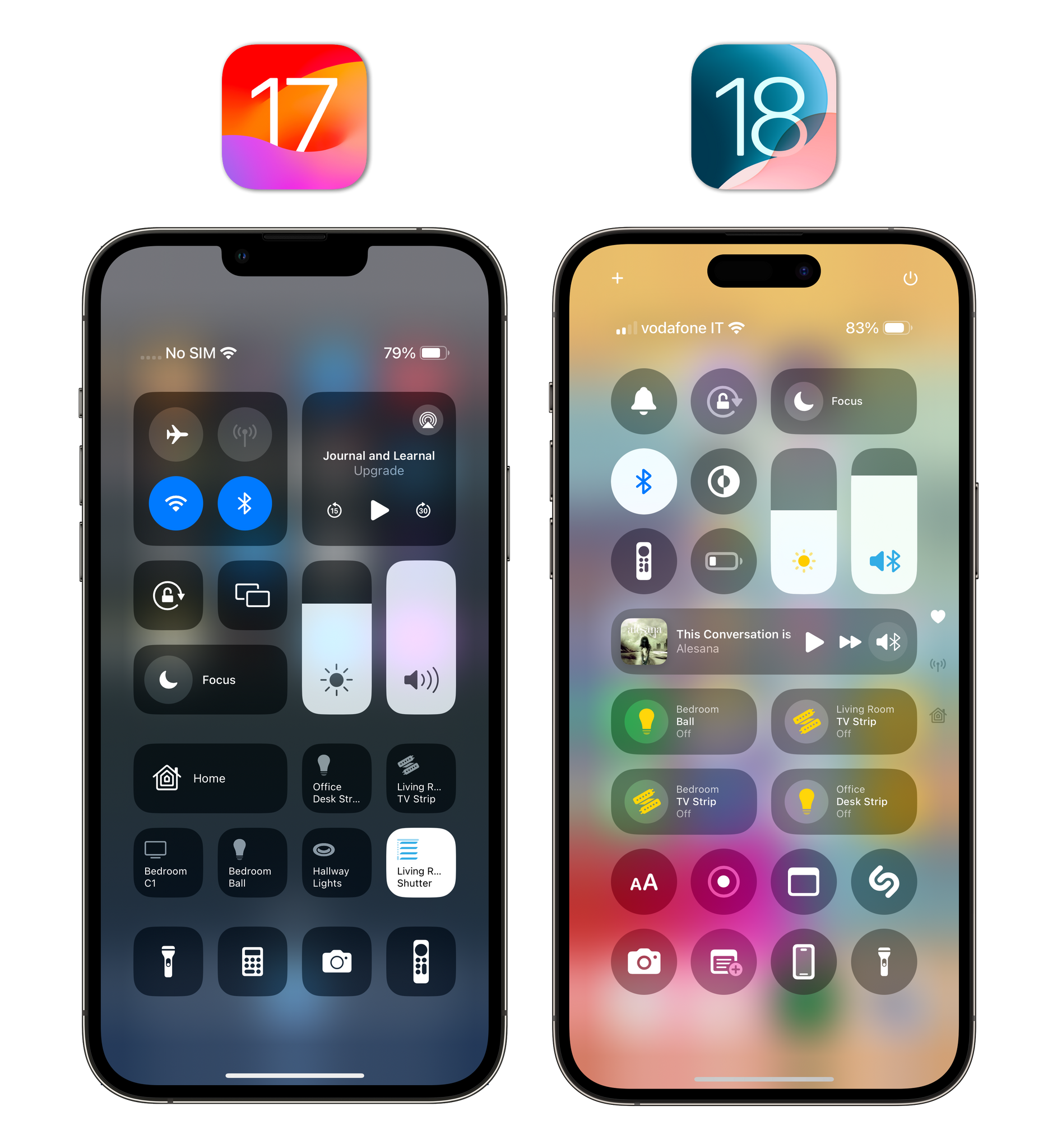
Alongside icon placement and colors, the completely reimagined Control Center is the only other marquee feature of this initial release of iOS 18. Or, let me put it another way: this is the other feature you’re going to show off to friends and family who ask about iOS 18.
I’ll cut to the chase. Although rearranging items in the new Control Center drives me insane, I love the feature and the developer story behind it.
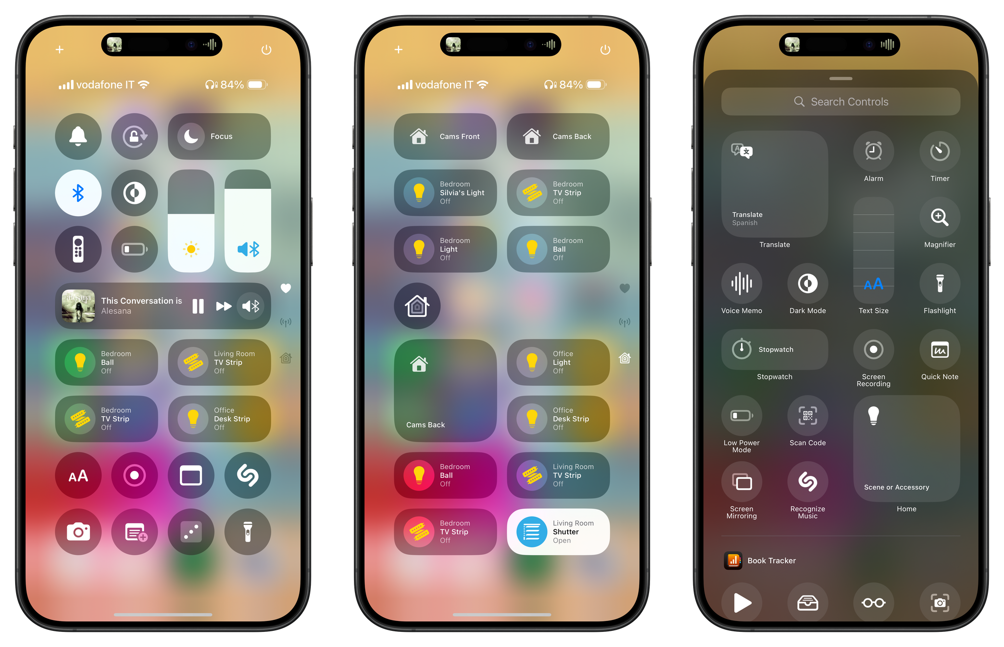
Before we talk specifics, let me give you a high-level overview of the new Control Center and the system Apple built for it. The new Control Center is always accessible from the same spot as before, but it’s now customizable, it supports third-party apps, and its controls can live across multiple pages. By default, iOS 18 creates pages for your favorite controls, music, HomeKit, and wireless radios, but you can customize them, delete them, and even create more pages. The controls that live in Control Center can now be rearranged and resized, just like widgets on the Home Screen. In fact, the new Controls API for developers is based on the same technology that powers widgets: WidgetKit.
For this reason, just like there’s a widget gallery to customize the Home and Lock Screens, so there is a controls gallery now that, in addition to Apple-created controls, also lists controls from your installed third-party apps. Expect to see some similarities between widgets, Shortcuts actions, and controls. Deep down, they all perform actions using one common source of truth, which will also power Apple Intelligence for apps next year: App Intents.
Given their miniaturized scope, the functionality of controls for third-party apps is more simplified than widgets and Shortcuts. Controls for third-party apps can act as buttons to perform an action, toggle a state, or deep-link into a specific part of an app. They support configuration for specific parameters just like widgets, but visually speaking, all they can show is a symbol, title, and – in larger sizes – an additional text string.
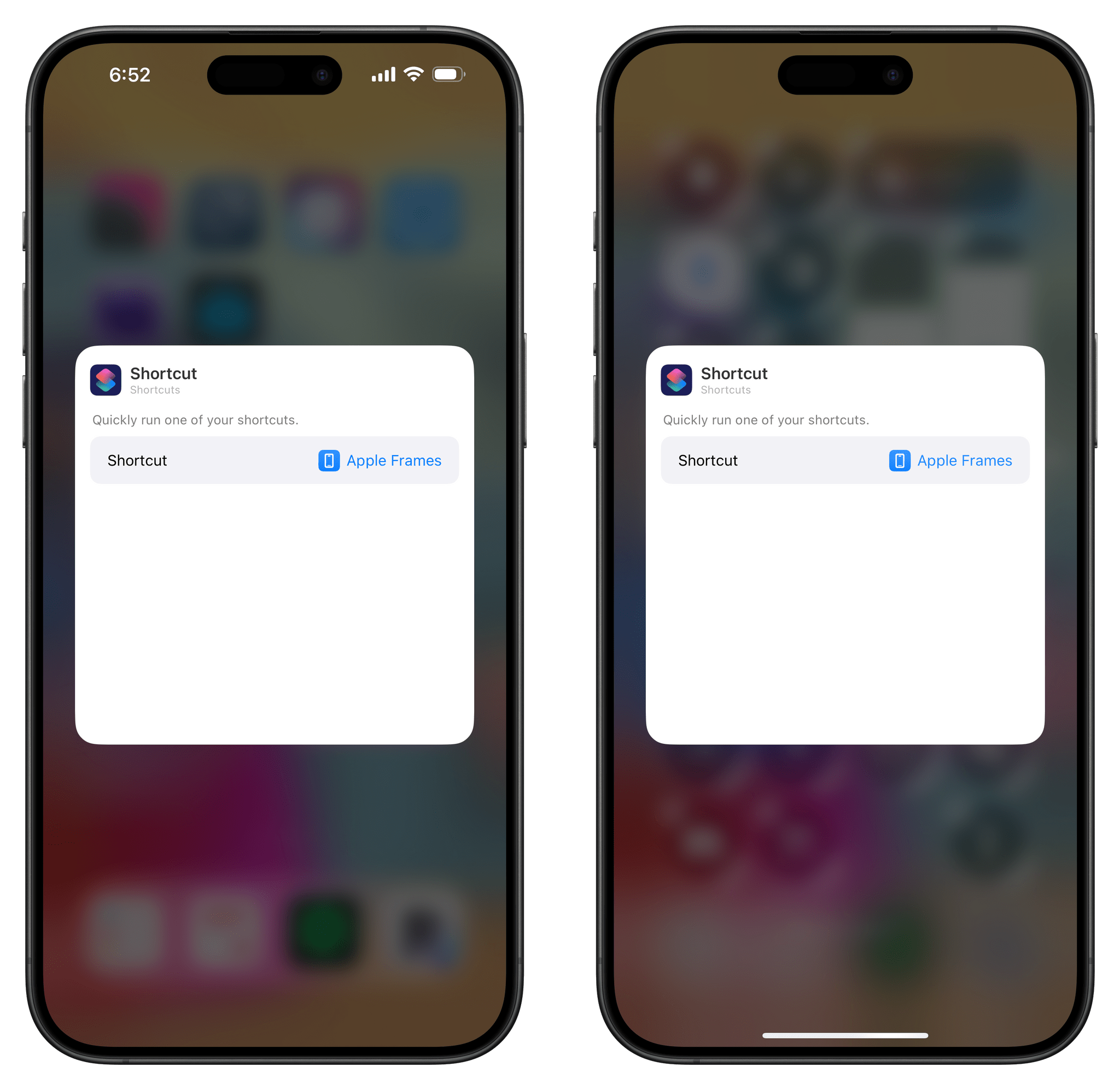
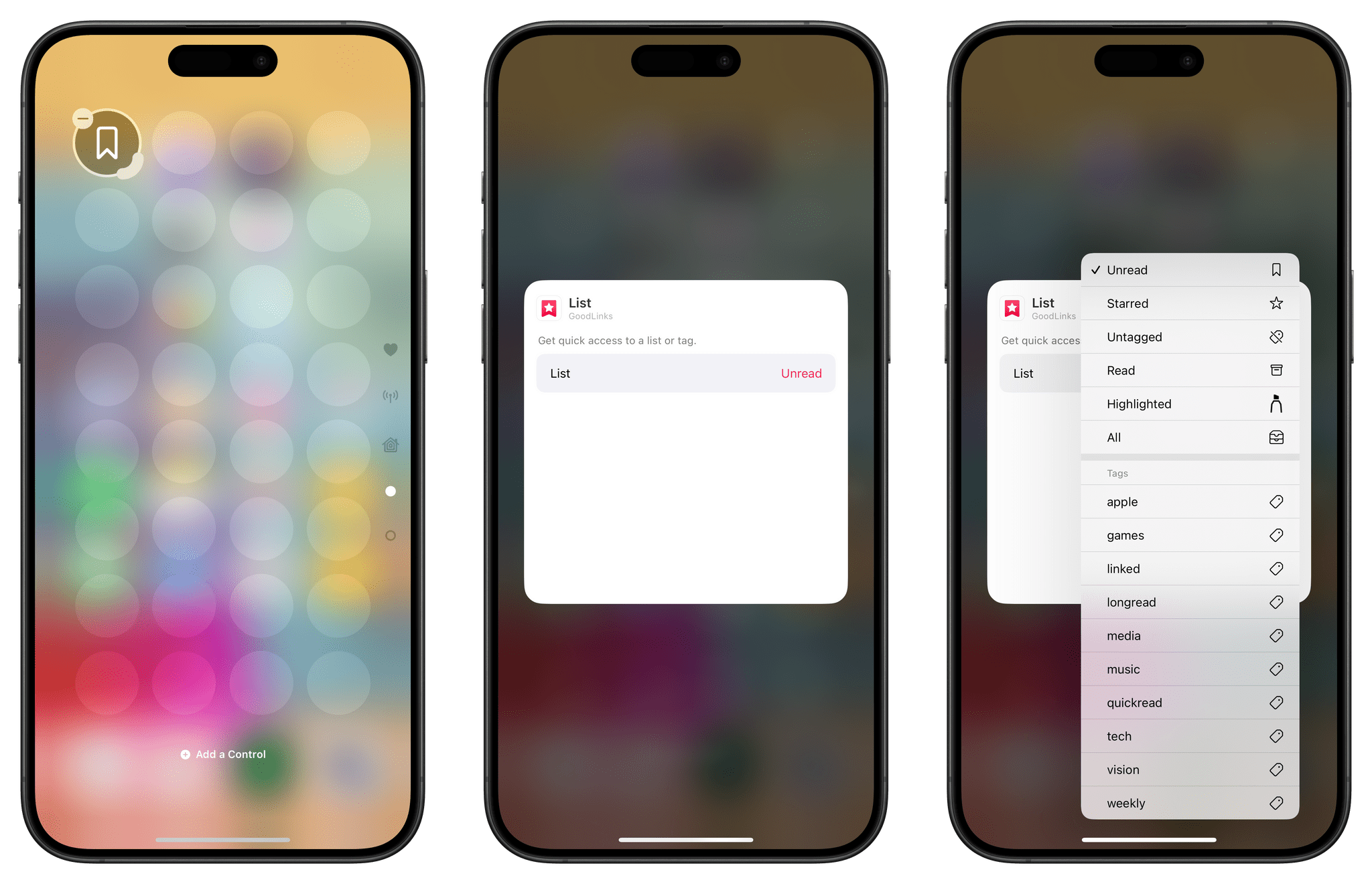
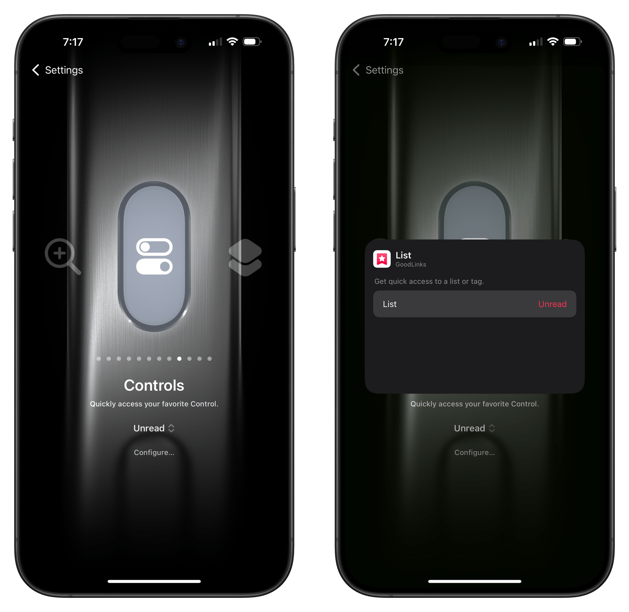
Configuring a Home Screen widget (left) and a control in Control Center. Yep, they’re the same thing.
That’s the conceptual overview of the new Control Center: it’s been turned into a Home Screen-like space where you can rearrange controls with drag and drop, make them bigger and smaller, organize them across multiple pages, and even add controls from your favorite apps. To make this happen, Apple adapted existing technologies – WidgetKit and App Intents – which is a strategy that should ensure rapid and widespread adoption from developers.
Essentially, the new Control Center is a slimmed-down, monochrome Home Screen. And I love every part of it…minus the rearranging of those controls.
The Return of Multi-Page Controls
*puts on history professor’s hat*
Let me tell you, kids, about that one time Apple tried to split Control Center across multiple pages…and people hated it.
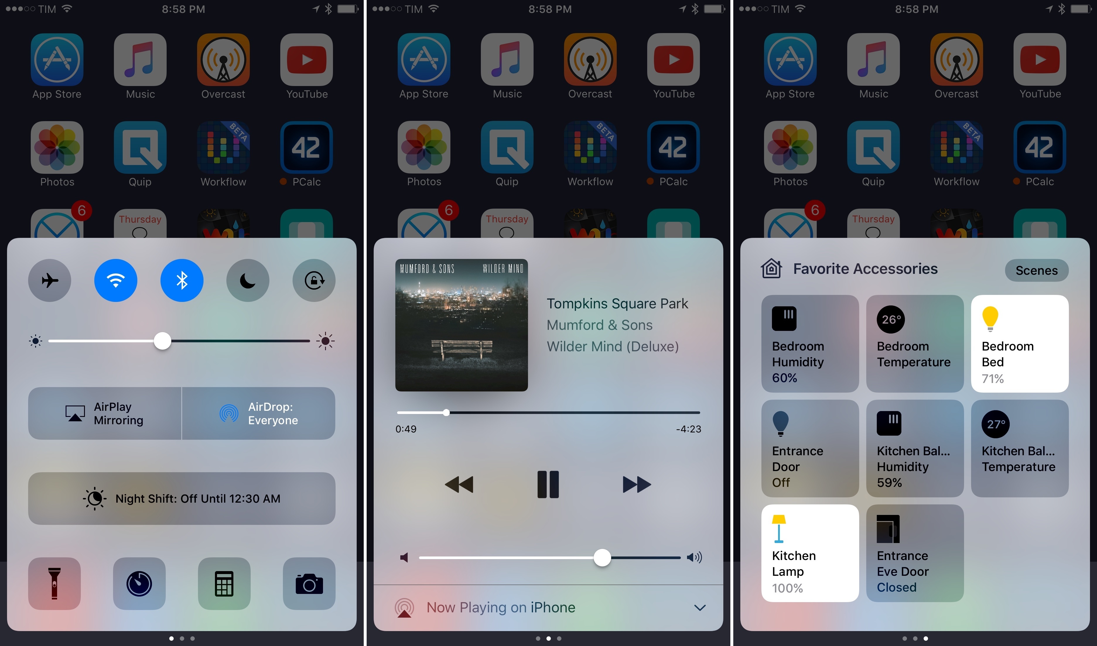
Back in the iPhone 7 days (when there was still a Home button on the iPhone), you could activate Control Center by swiping up from the bottom edge of the screen. In iOS 10, given the growing number of controls available on the iPhone, Apple had the idea of splitting Control Center across multiple pages that you could swipe between horizontally. And guess what those pages were? That’s right: favorite controls, music, and HomeKit.
Personally, I liked the feature, as I wrote in my review at the time:
After three years of Control Center, the new version in iOS 10 feels lively and friendly; perhaps even more fun. On the other hand, pagination and bigger controls raise a question: has simplicity come at the expense of efficiency in Control Center?
That closing question was a harbinger of things to come: the paginated Control Center was so poorly received by people who lamented how slow and tedious it was to use, Apple reverted the design immediately with iOS 11, coinciding with the launch of the iPhone X and its gesture-driven UI. Gone was the multi-page layout and activation from the bottom edge of the screen; Control Center became a single page (which you could activate by swiping down from the upper-right corner of the display), full of tile-based controls that you could expand with a long-press.
The iPhone X’s version of Control Center is the one that’s stayed with us for the past seven years. For context, before Apple tried to redesign Control Center in iOS 10, the feature had only existed for three years.
All this is to say: what makes Apple think that, this time around, a Control Center redesign based on exactly the same types of multiple pages will be successful?
Having used iOS 18 every day for the past three months, I think it will be, for a variety of reasons:
Apps have become more modular over the past few years. Compared to the days of iOS 10, we’ve gotten more accustomed to the idea of app functionalities extending beyond the app silo and its Home Screen icon. This idea started with iOS 8’s extensions and iOS 10’s initial SiriKit domains, and progressively expanded to include Shortcuts actions, two versions of widgets, and now controls. I’d argue that users now expect to be able to trigger certain app functionalities from anywhere on iOS; Control Center is a natural fit as a place to accomodate several controls across multiple pages.
People are now familiar with iOS customization and widgets. If there’s one thing we’ve learned since 2020, it’s that people love customization and personalizing their devices. iOS 18’s Control Center provides a solid number of default options, but if you don’t like them, customizing it with a UI reminiscent of the Home Screen sounds like a good plan to me.
There are more ways than ever to trigger specific commands on iOS. The problem with iOS 10’s Control Center was that Apple wanted to infuse it with more controls, but there were too many to fit into its bottom-panel design, so they split it across multiple pages. In making that change without customization, however, they frustrated users who wanted to have, say, music controls on the first page rather than the second one. Today, I believe there is less hunger for “must-have” controls in Control Center because there are multiple (and even faster) ways to trigger the same commands on iOS. Between Lock Screen and Home Screen widgets, custom shortcuts, improved Siri, and the Action button, you’re not limited to Control Center to quickly toggle something. This relieves the pressure for Control Center to be “the one place” for everything all the time, opening up some fascinating customization possibilities.
Most importantly, I think the new Control Center has a better activation gesture for multiple pages than iOS 10, and I appreciate that you don’t have to use multiple pages if you don’t want to.
In the new Control Center, pages are arranged vertically on the right edge of the screen. By default, you can open Control Center with a swipe, then tap on a page icon to open it.
A great hidden feature of Control Center in iOS 18, however, is that, unlike iOS 10, you can keep swiping after activating Control Center with one seamless, continuous gesture to instantly highlight one of the sub-pages, then lift your finger to open it. Here, let me show you what I mean:
Opening Control Center’s subpages with a single gesture.Replay
iOS 10’s Control Center was clunky because it forced you to swipe vertically, then horizontally, to move between pages. iOS 18’s Control Center lets you swipe only once in the same direction to open the page you want.
Furthermore, since customization is key here, you don’t have to use Apple’s multiple pages; you can always place any of their default controls on another page. And those pre-built pages? You can also customize them to have different controls than the default ones.
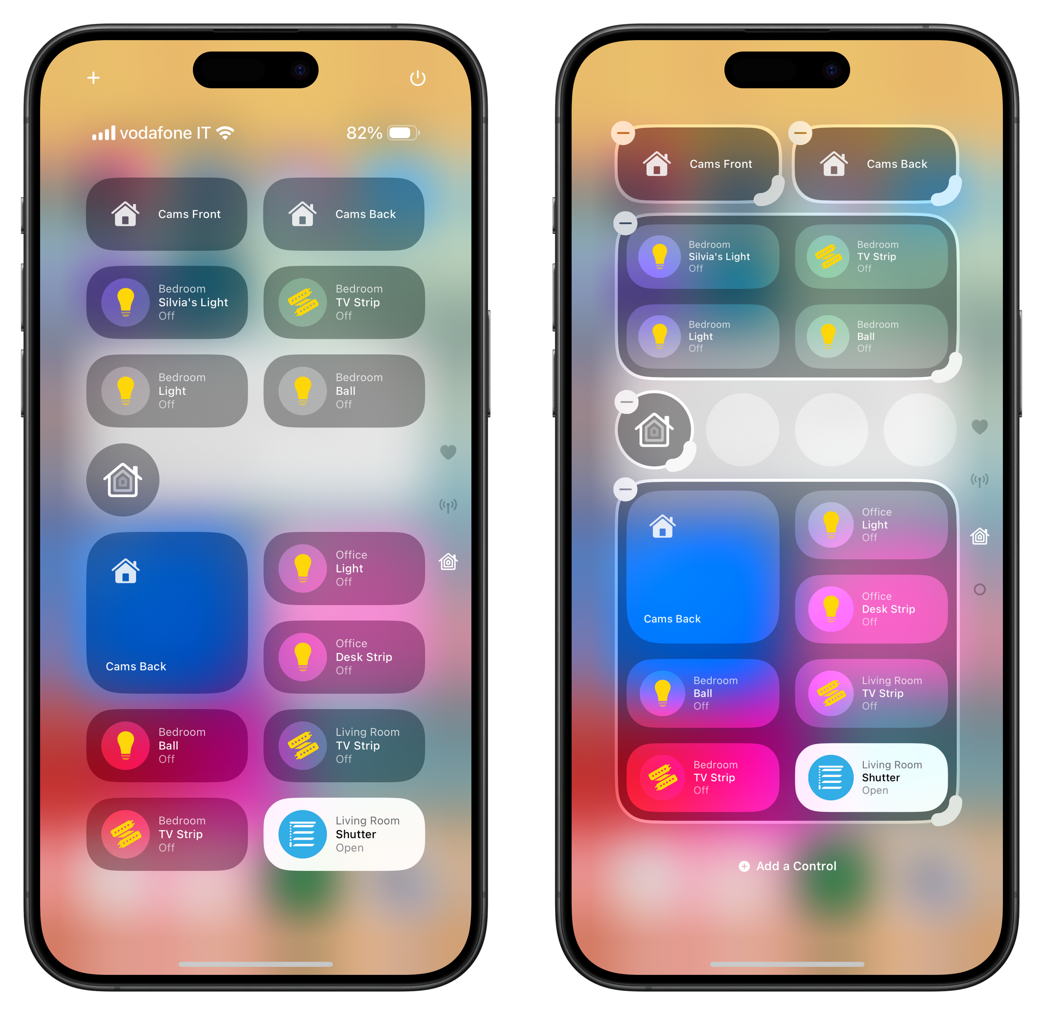
Let me give you two examples. I didn’t feel like I needed a dedicated page for Now Playing controls; I wanted to have a smaller playback control in the first page of Control Center instead. So I entered Control Center’s own jiggle mode (you can get there by long-pressing at the bottom of Control Center or tapping the ‘+’ button in the upper left corner), opened the Music page, and deleted the giant music control there. Then, I went to the first page, searched for the ‘Now Playing’ control again, added it, and resized it with the drag handles to a smaller size.
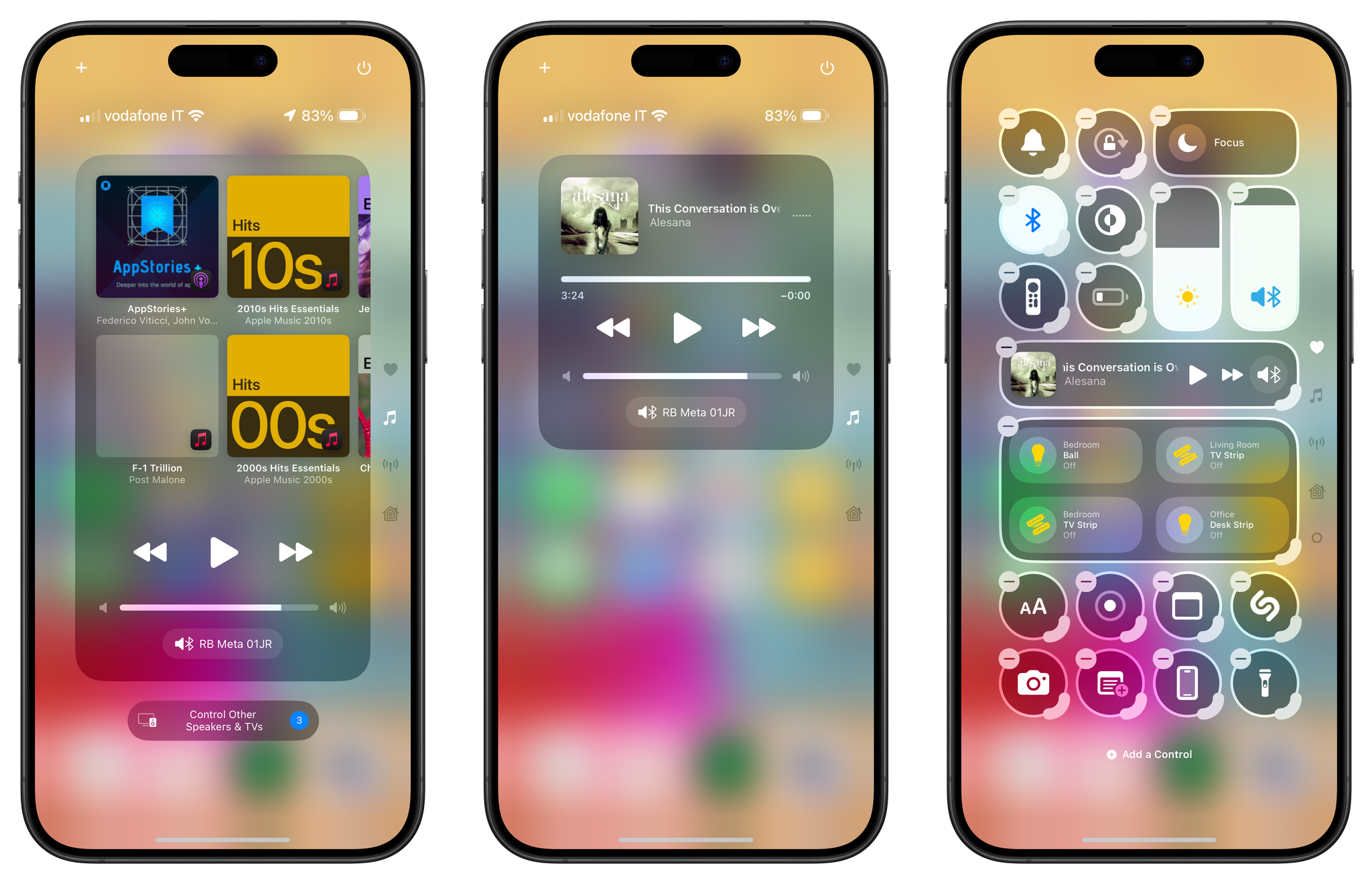
By default, there is a dedicated music page in Control Center with a large Now Playing control (left). It can be resized to different sizes, and I chose a compact one for my main page (right).
That’s it! I can still expand the small playback control by long-pressing it (an old Control Center feature that has carried over from iOS 17), but I don’t have to use a dedicated page for it.
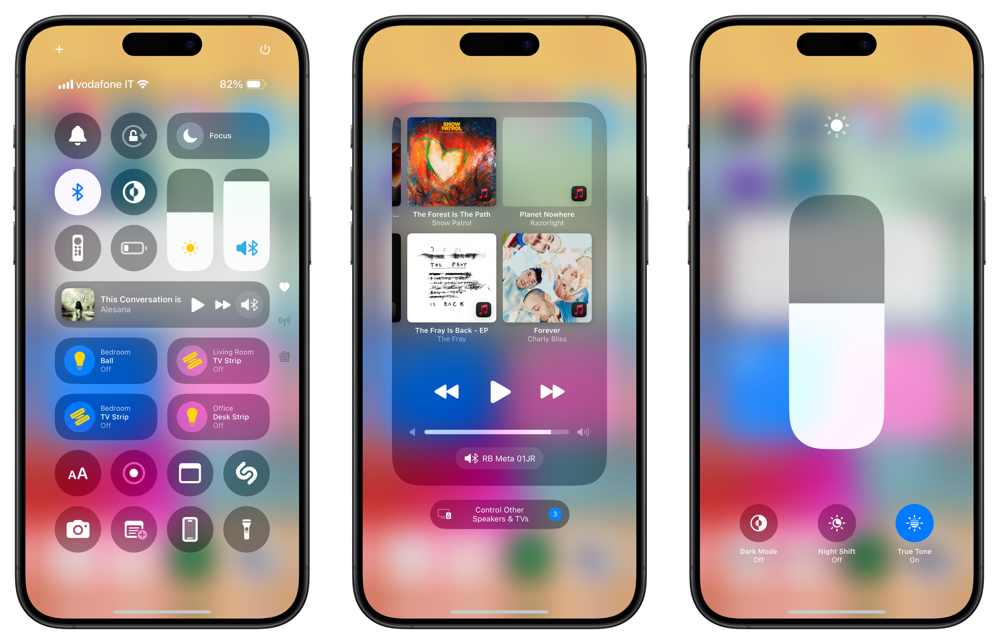
You can still long-press default controls like Now Playing (center) or brightness (right) to expand them.
I also thought the HomeKit page was a bit of a waste with just a large control for recommended accessories, so I modified it with accessory controls I picked manually, as well as a control to launch the main Home app. The page is still branded with a HomeKit icon since it only contains Home controls, but it’s different from the default layout provided by Apple:
This is why I’m a fan of the new Control Center: multiple pages are easier to open than before, and I can choose what goes where. The concepts of visual and functional customization have found their perfect match in iOS 18’s Control Center – a Home Screen-like area that users can rearrange however they see fit, with controls from the apps they already use.
I’m pretty confident this version of Control Center will stick around longer than a year.
Controls Everywhere, for Everything
Thanks to the nature of the new Control Center and how controls are built under the hood, Apple can already offer a large collection of native controls. Not only is the company matching the same suite of controls previously available in iOS 17, but those controls are also resizable, and they’re joined by dozens of new ones. How is this possible? Simple: Apple had already done the work of creating these toggles and buttons for Shortcuts actions, which have been repurposed in the form of controls for Control Center.
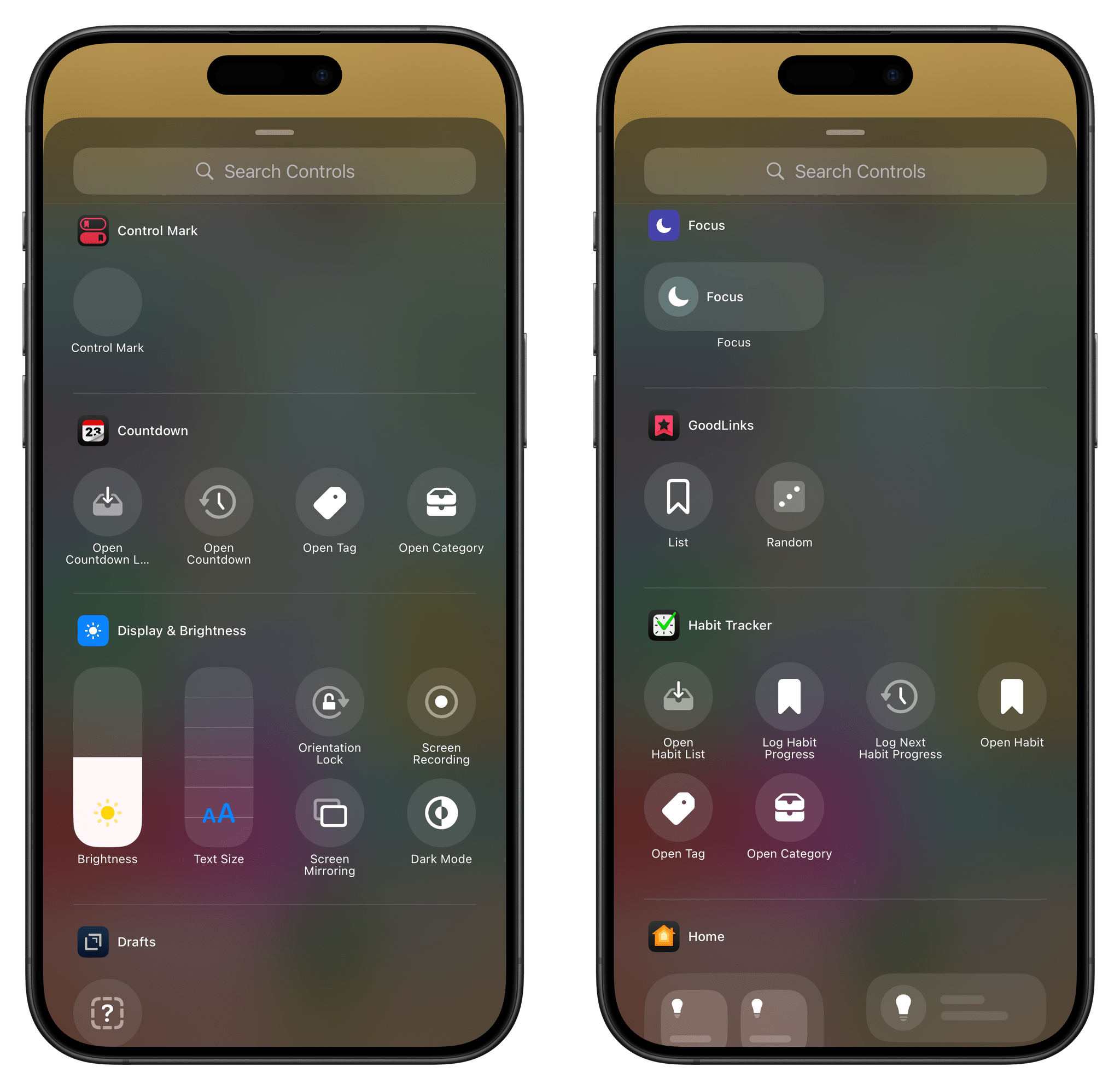
Open the new Controls Gallery, and you’ll find some familiar faces in there: a plethora of Accessibility and Settings toggles (these were all Shortcuts before), buttons to open Notes or add a new quick note, and of course, the ability to run any shortcut you want from the Shortcuts app. Most of these actions were already available as App Shortcuts or Action button commands; if you were Apple, wouldn’t you also recycle them for a different cause?
For the same reason, you should expect to see several controls from your favorite apps in the near future. Developers who have already done the work to support WidgetKit and App Shortcuts should find no challenge in bringing them over to Control Center. GoodLinks, my favorite read-later app, offers controls to open a random article or a specific list. The latter control, just like a widget, can be configured by pressing it while jiggle mode is active in Control Center.
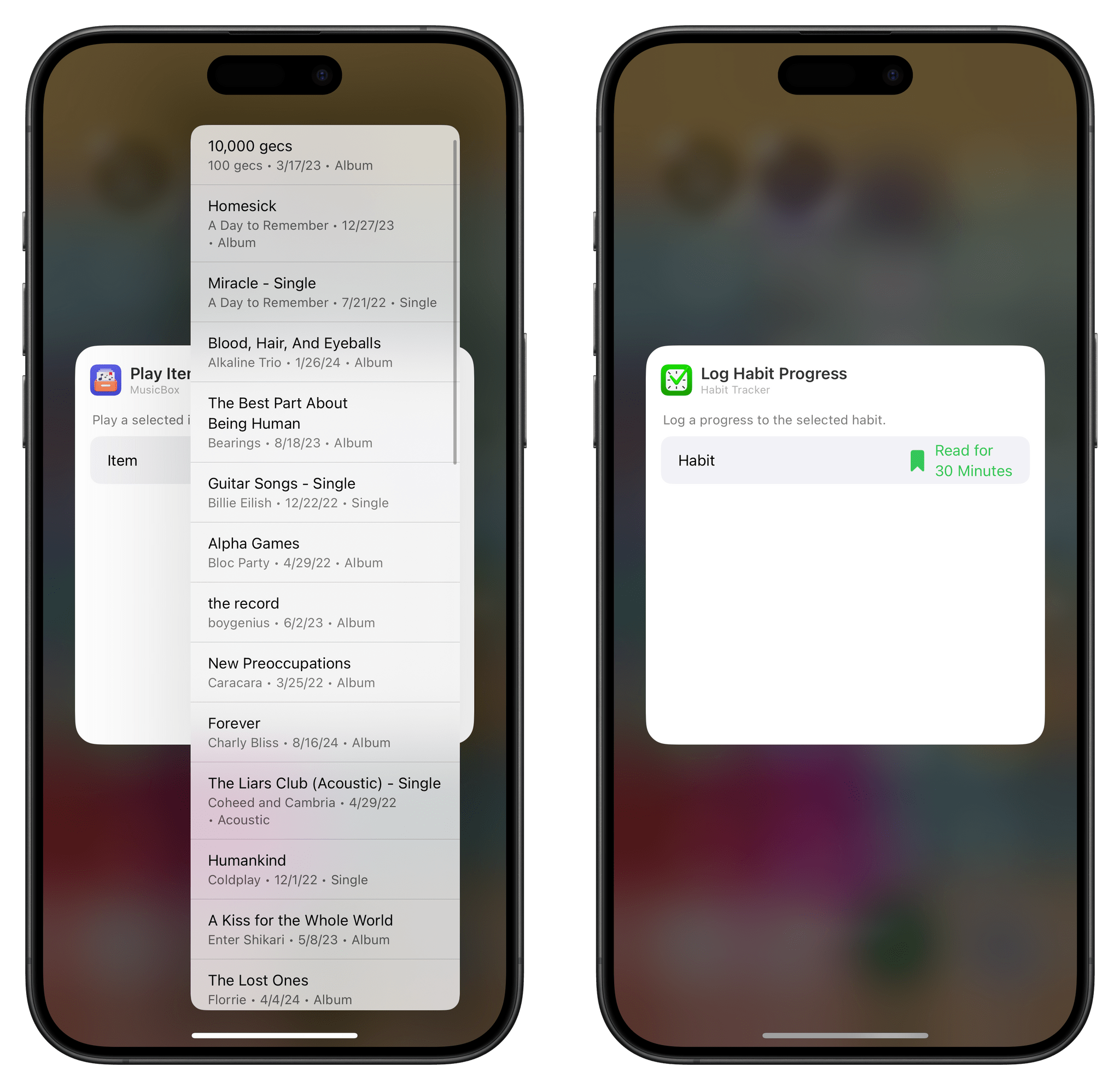
MusicBox, the excellent utility to save music for later, lets you open the app, play an item, or play a random album with controls. You can launch the Obscura camera app from Control Center, too. (More on this below.) And Habit Tracker lets you open a specific list, tag, or category in the app directly from Control Center.
For developers, iOS 18 is not a particularly exciting year. Effectively, the only new feature they can productize into their apps is Control Center integration, and, as we’ve seen, it’s largely based on existing technologies. Control Center may have changed for users; for developers, supporting it is largely old news. This is a common theme I’ve heard all summer: there’s nothing else for developers to support in iOS 18 other than custom icons and controls. For users, however, I think it’s going to be especially fun to mix and match different controls in Control Center – or, at least, I know it’s been for me.
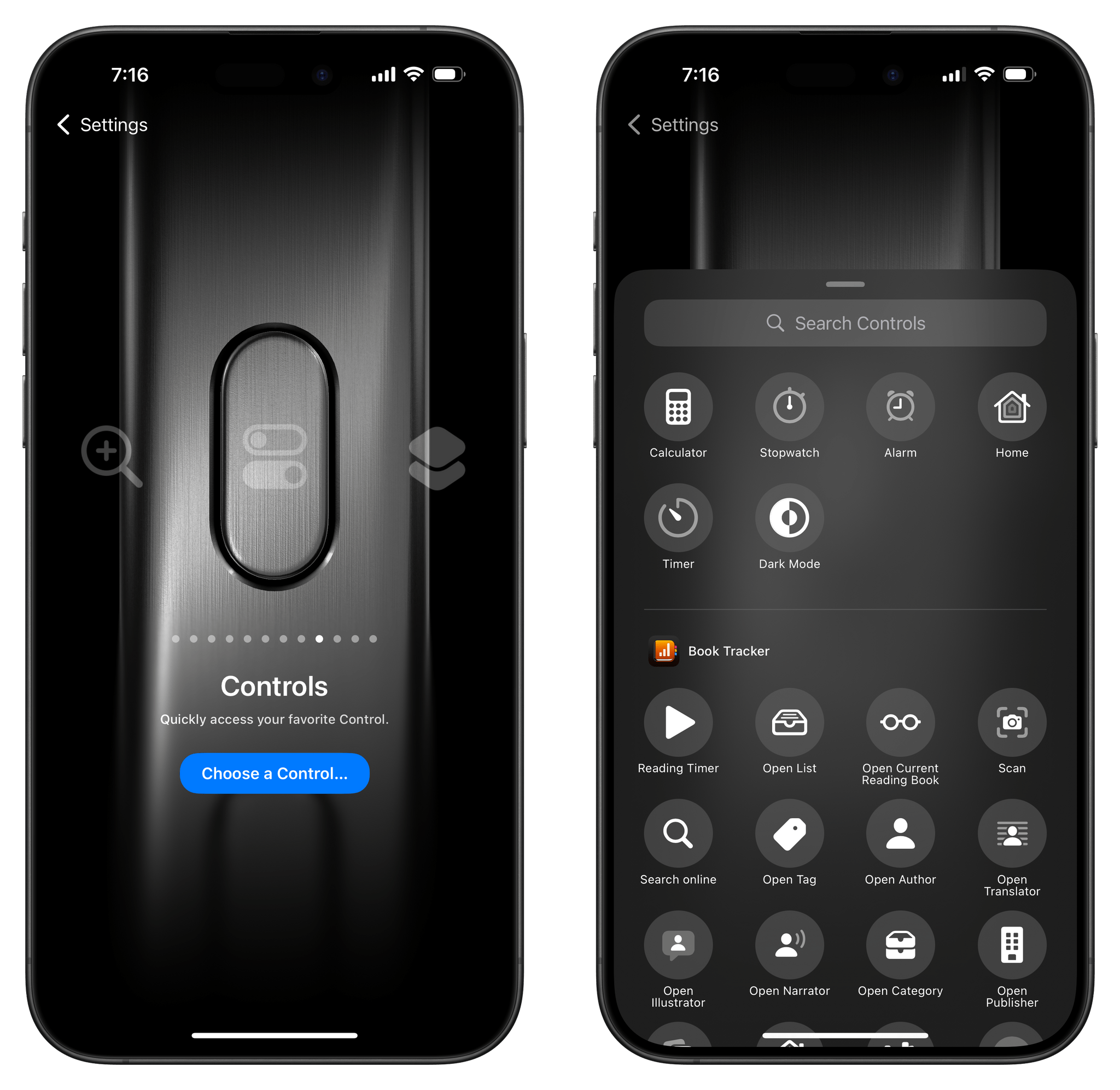
The icing on the cake here is that, Apple being Apple, they were able to immediately re-use controls in other places. In iOS 18, you can now tie a specific control to the Action button. The same Controls Gallery also lives in the Settings app, allowing you to configure a control that can be triggered as soon as you press and hold the button.
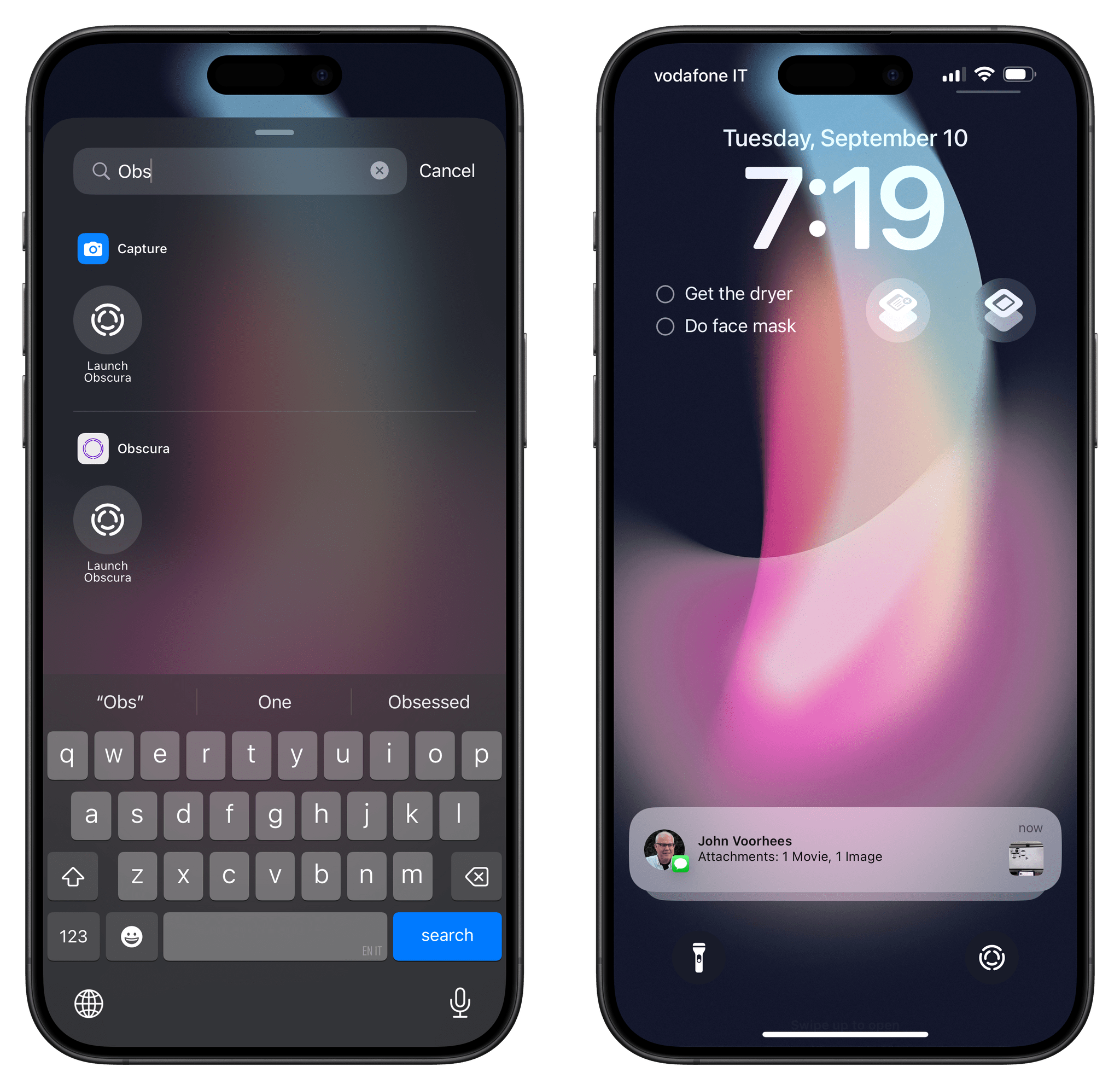
But I saved the best for last: you know those camera and flashlight buttons at the bottom of the Lock Screen? With iOS 18, Apple also turned them into controls that (you guessed it!) you can finally customize to your liking.
Want to swap the flashlight for, say, a control from the Things app? You can. How about placing a quick note control on the Lock Screen? That’s also possible. And I know what you’re thinking: does this mean you can also replace the camera button with a control from a third-party camera app? The answer is a resounding “yes.”
Thanks to the new API for Lock Screen camera capture, third-party camera apps such as the powerful Obscura can now be triggered from the Lock Screen just by pressing a control.5 Even better, you’ll be able to launch camera apps that support the new Lock Screen extension without having to authenticate with Face/Touch ID – just like Apple’s Camera app.
Impressively, controls on the Lock Screen can also start Live Activities in the background, without launching their main app. AirScrobble, my favorite Last.fm (yes, that service) companion utility on iOS, recently added support for iOS 18 with a new control. When pressed on the Lock Screen, this control can kick off the app’s listening mode to match songs in the background.
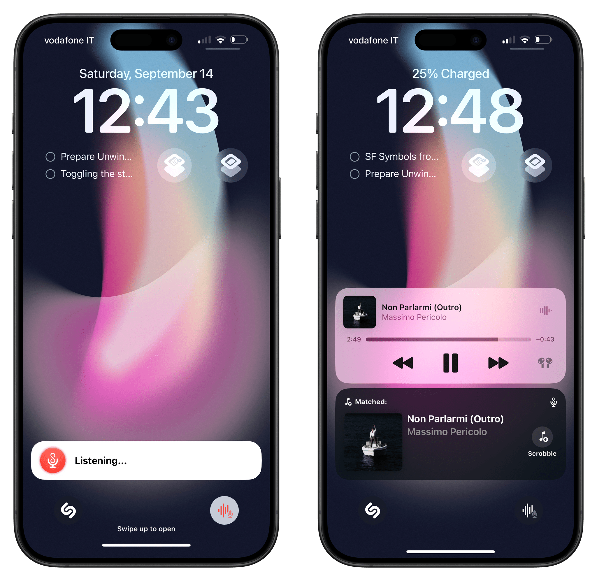
The AirScrobble control (bottom right on the Lock Screen) can start the app’s Live Activity in the background.
I’ve also seen this sort of integration in Structured, a daily planner app, which can now start a focus timer with a Live Activity when a control is pressed from Control Center or the Lock Screen. The ability to start Live Activities from the Lock Screen via controls is the closest third-party developers have come to replicating Apple-only features such as the Shortcuts widget, which can overlay UIs anywhere on iOS and iPadOS. I’m going to keep an eye on this technology since I have a feeling more developers will come up with fascinating implementations soon enough.
As we discussed on episode 400 of AppStories, it’s apparent that the future of apps on Apple platforms will be characterized by modularized components that are orchestrated into a series of actions you can trigger from anywhere.
The new Control Center is part of this narrative, and it’s been the highlight of iOS 18 for me.
