I love running with my Apple Watch, but I’m not a fan of most running apps; too many want to update me constantly about my progress while running. Other apps want me to share my runs on social networks. That’s not for me. I’d rather have an app parse the data collected after I’m home and can spend some time with it, which is precisely why I’ve enjoyed using Tempo.
Don’t get me wrong; I like collecting data about my runs. I used a GPS watch for years even when it required me to stand at the end of my driveway in the cold for several minutes while it tried to lock onto the GPS satellites. At the same time, however, I’m not particularly interested in monitoring data while I’m running. I’m not trying to break any records, and constantly-updating statistics can be a distraction. I prefer to pace myself based on how I feel and compare that to the data later.
As a result, I use David Smith’s Workouts++, which I’ve written about before, because it lets me customize my Apple Watch’s interface with just a few simple real-time statistics. The trouble is that when I’m finished running, Apple’s Health app isn’t an ideal way to view the data I’ve collected. The Health app is designed to work with dozens of types of health data but it isn’t well-suited to runners. Tempo fixes that by presenting your run data in a beautifully designed interface tailored specifically to runners.
Tempo is a running log, not a run tracking app.1 The distinction is that Tempo isn’t an app that you use while you’re exercising. Instead, it generates a running log using the data other apps collect and store in Apple’s Health app.
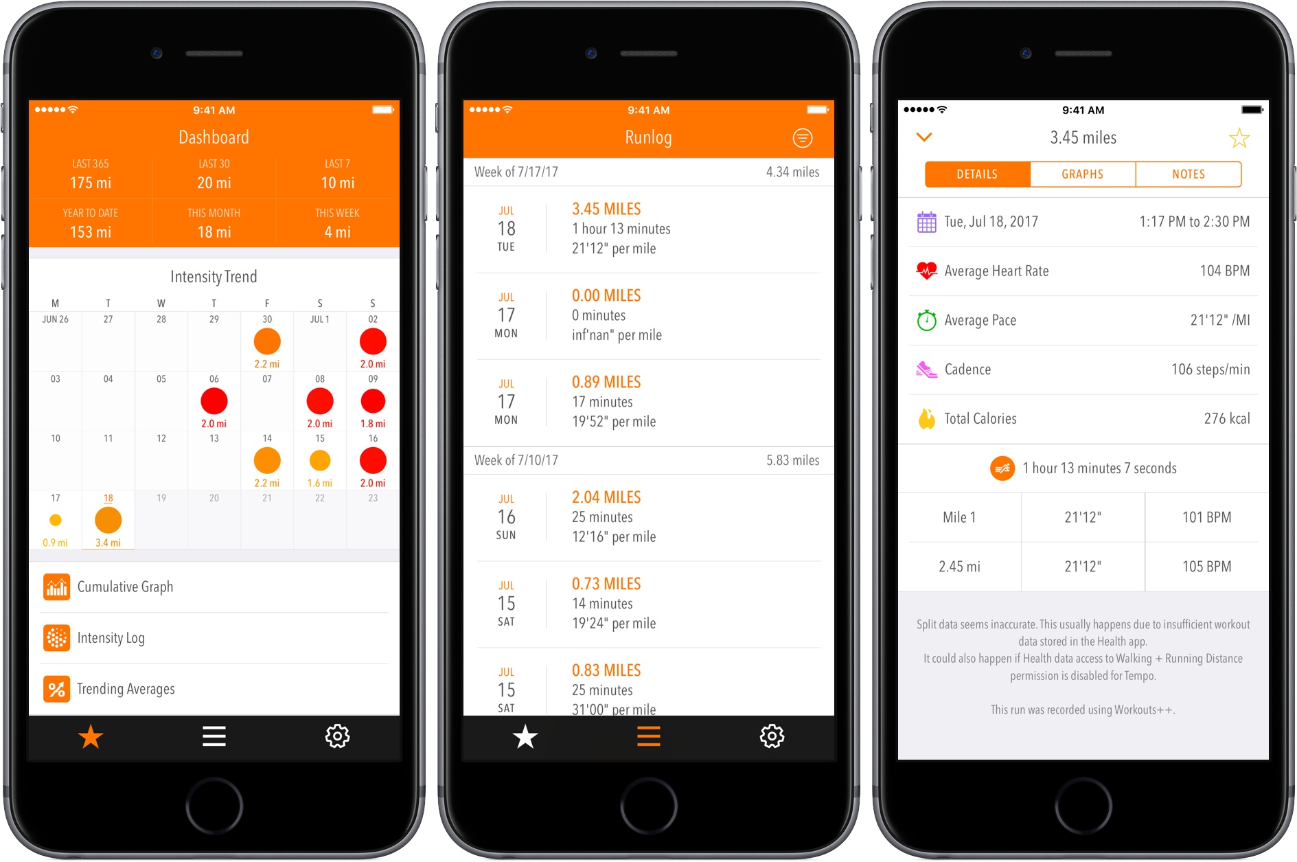
The primary view in Tempo is its Dashboard, which gives you a quick overview of your runs. The top section provides distance information for the last 365 days, 30 days, and 7 days, followed by year-to-date, this month’s, and this week’s totals.
The next section, called Intensity Trend, is one of my favorite parts of Tempo. Using circles of varying sizes and shades of orange and red, the Intensity Trend provides a sense of how hard you’ve been working out over the past four weeks. For example, when I looked at my data for July, it was immediately clear that most of my quality runs occur on the weekend.
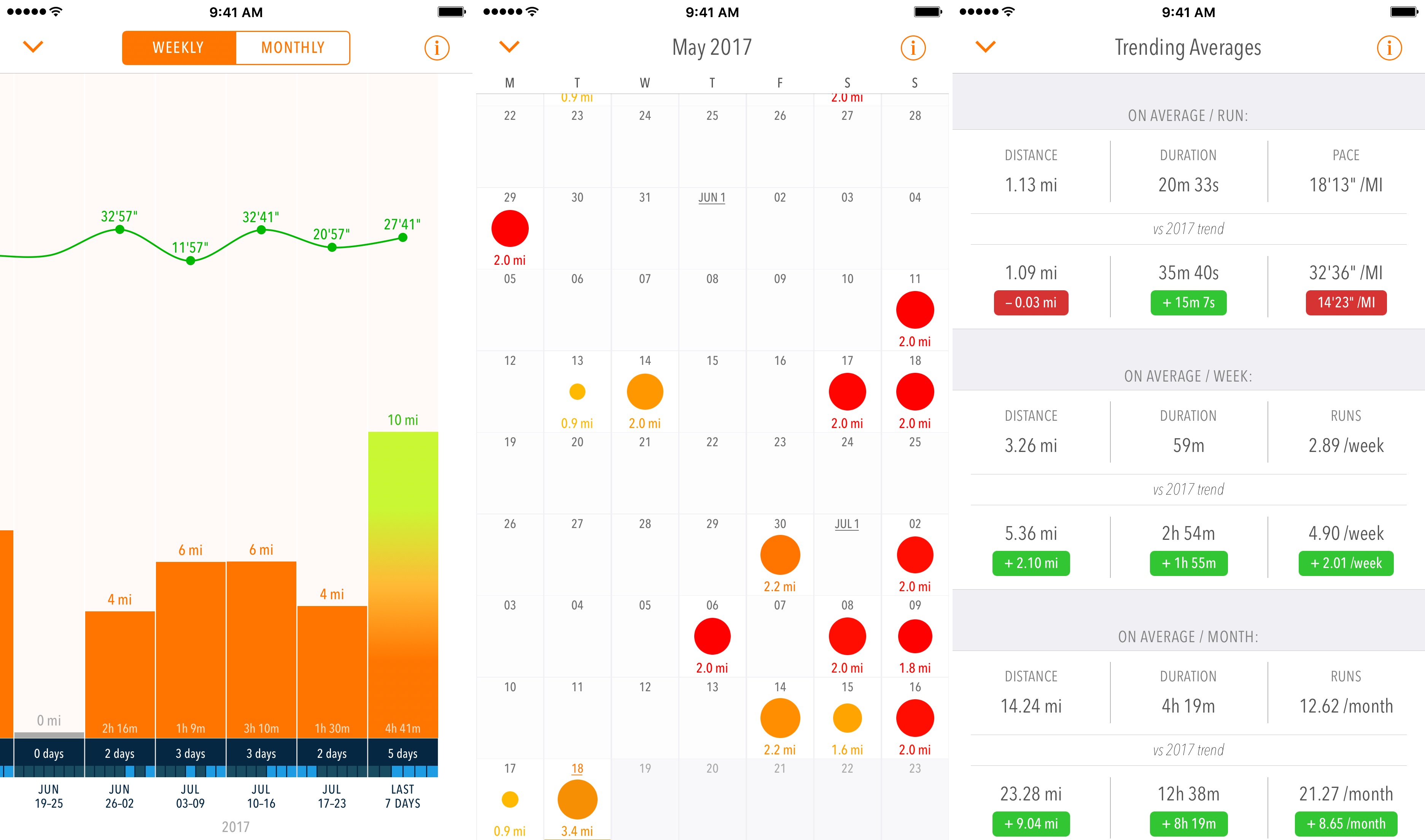
The bottom part of the Dashboard has three buttons. The first button links to weekly and monthly graphs that display average pace, total distance, and the number of days run for each period. The second button accesses the Intensity Log that is like the Intensity Trend view on the Dashboard but can be scrolled to display previous days. Studying the Intensity Log can lead to interesting insights like this from Tempo’s developer, Rahul Matta, who explains:
I discovered why I might have crashed so badly during my last marathon. There was an obvious training strain pattern during the last few weeks leading up to the race. Those weeks are meant for recovering/tapering to peak for race performance and not running hard to risk race performance. It was an aha and why did I do that moment - I had already run my race during those weeks of training. Now more aware, I will be able to monitor it easily with Tempo’s new Intensity Log.
The final button links to a Trending Averages screen with distance, duration, pace, and other averages organized by run and over different time periods.
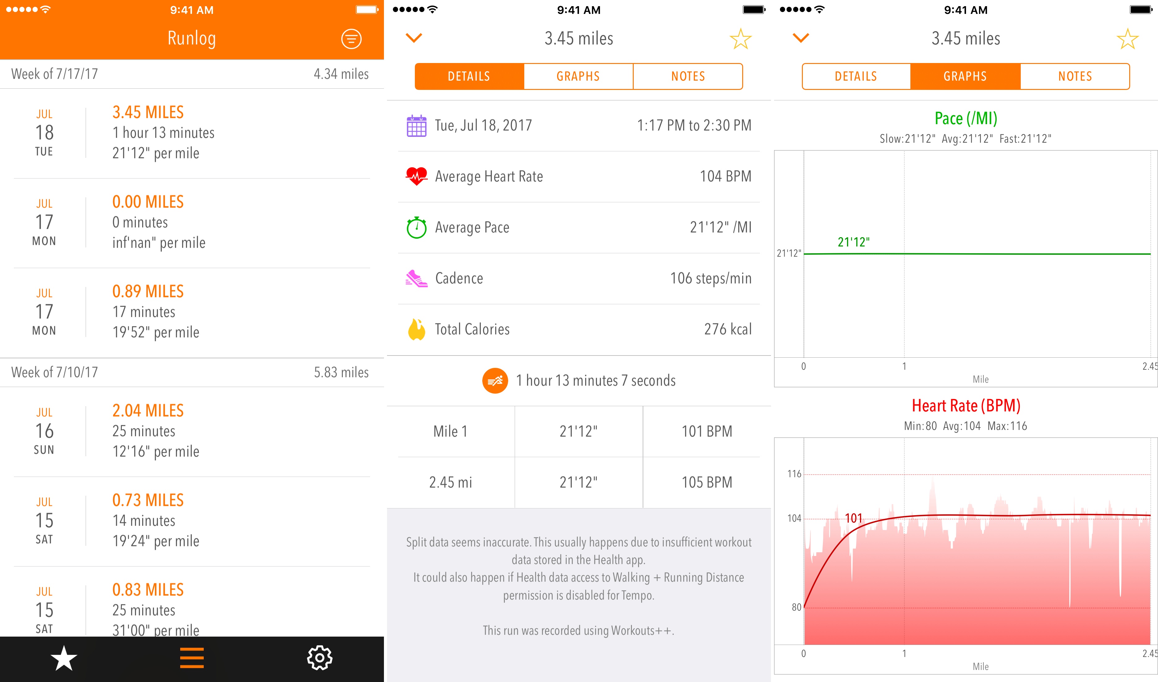
The other big component of Tempo is the running log itself. Each chronologically-ordered entry includes distance, time, and pace information along with weekly mileage totals. Tapping any entry accesses three additional screens of data. The first, called ‘Details’ includes statistics like heart rate, cadence, calories burned, weather, and more. The second view has pace and heart rate graphs. The final view provides a place to take notes on your run and add tags. When you return to the summary view, the tags can be used to filter your log entries.
Most days, I’m content to use Tempo’s Dashboard. At a glance, it gives me a sense of how often I’ve exercised over the past few weeks and how hard I worked out. That combined with the mileage totals and basic log data give me a good idea of whether I’m on track. When I have a little more time though, it can be enlightening to go through the Intensity Log and graphs, which has helped me spot trends and plan my training. Trying to fill up the the Intensity Log with at least some exercise most days has also helped motivate me.
The features of Tempo that I use most days are free. That makes it a no-risk proposition to get started with the app. It also provides users with a good sense of the app before deciding to pay. After you’ve used Tempo for a while though, the annual $6.99 subscription makes a lot of sense because it adds cumulative and individual run graphs, the Intensity Log, trending averages, notes, and tags. Those are all features that work best with a larger set of data, which you can collect while you test the app for free. The premium features also provide a deeper level of insight into your runs that, if you’re a geeky, stats-driven runner like me, should appeal to you.
Tempo is available on the App Store as a free download with certain features available only to annual subscribers.
- Tempo can track walks too, which I’ve been doing. ↩