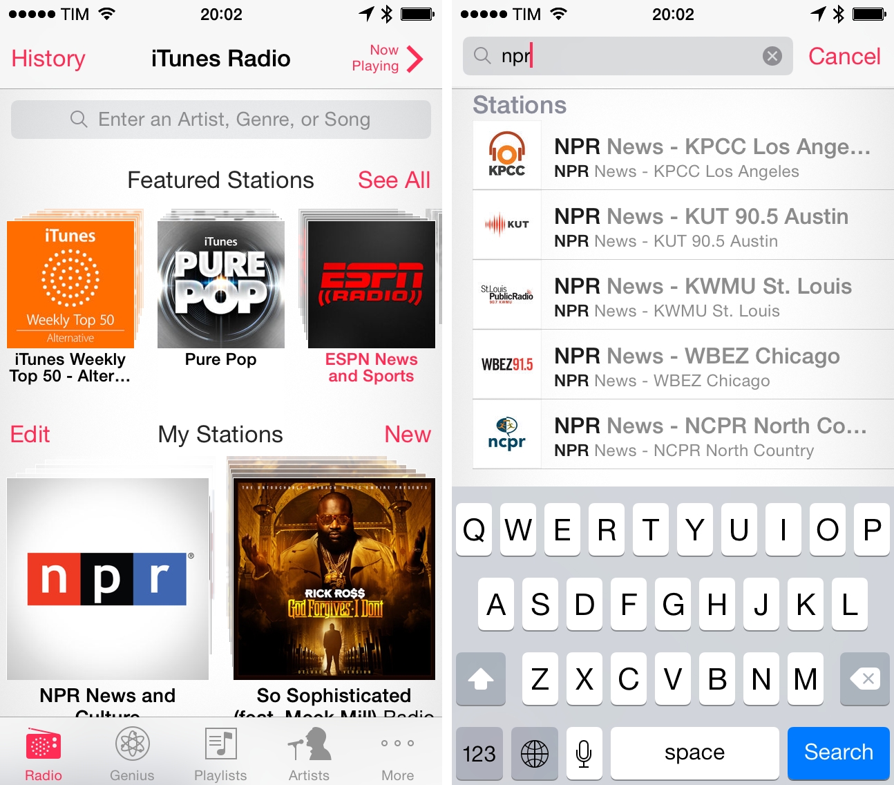
iOS 7 and Enterprise Improvements

Ryan Faas has published a good overview of the changes Apple made for enterprise distribution and MDM in iOS 7. A key aspect:

From an administrator’s perspective, the new model works very similar to what’s been around for decades - single source software licensing coupled with network-based deployment tools. From a user perspective, it’s extremely similar to the consumer App Store system.

Read the article here.

Permalink

Shazam for iOS 7

Much like Twitterrific’s update for iOS 7, Shazam has spruced up their app with flattened, descriptive wiry icons and simple color palettes that make the app feel at home on Apple’s new OS. Perhaps the only noticeable difference is that Shazam asks for Microphone access, a new requirement as of iOS 7, so that it can listen to what’s playing in the background to identify songs. It’s visually a nice update, but much of it is the same as before. It’s cleaner and more focused, with nice looking fades and animations as you switch between tabs.

The features added to iOS 7 revolve around social maps and Facebook. Eh. I don’t know how Shazam feels about people like me, but I’m not so intent on sharing songs with friends and seeing what people are listening to around me. I said the same thing when I took a look at the revamped iPad app earlier in the year, and I feel somewhat alienated since the only thing I really want to use Shazam for is ID’ing tracks playing at over loudspeakers, on the radio, or when some remixed version of a song pops up on a livestream somewhere. The social stuff… I don’t want any part of it. It’s cool. It’s just not for me.

Shazam currently sells a free version of Shazam, complete with advertisements that you can remove with an in-app purchase. For a few bucks you can straight up buy a version of Shazam with a darker blue icon free of ads. And then there’s a product RED version of the app that looks cool, and also removes ads. I’d rather see a single version of Shazam that’s free, with Lifetime (or Encore) as an IAP and RED as an optional theme, which you could also pay for. It’d remove a lot of the confusion about which version is which on the App Store. Regardless, if you’d like to give Shazam a try (the ID stuff is amazing — why don’t you have it?), you can download one of the following variants from the App Store:


Rdio Brings Recommendations Back

From the Rdio blog:

Hot on the heels of our Stations launch, we’ve built Recommendations as another great means of effortless music discovery. Powered by technology from The Echo Nest, the new feature provides a steady stream of new music recommendations — including albums, stations, and playlists — based on what you listen to most and who you’re following.

I’ve long wished for Rdio Recommendations to come back, as I think they used to a great way to find new music in the Rdio 1.0 days. Rdio has changed in the past two years, and the need for Recommendations was partially obviated by Your FM and stations. However, I’m looking forward to seeing if the dedicated section will be as good as the original one used to be – particularly in how it should recommend entire albums and stations.

According to Rdio, Recommendations will be added to the iOS app “soon” – hopefully alongside an update for iOS 7.

Permalink

Logacal: A Smarter Visualization Of Calendar Events

Logacal

Logacal

In the past few months, I’ve been obsessed with finding the best Calendar and Reminders clients for my iPhone and iPad. While I wouldn’t call myself a calendar power user, I do rely on iCloud Calendar to organize my daily appointments and events that require my complete attention, and I’ve been lured by the simplicity and immediacy of Reminders. As I noted in my article on living with iOS 7, I’ve also been liking the OS’ new Today view in Notification Center, which gives me a summary of all the things – events or reminders – I have to do today.

I don’t like calendar apps that are limited by old rules defined by physical calendars. For instance, what’s the point of showing a full month with past events when our devices know what the current day is? Why showing empty days in views that should list upcoming events? Our devices have a little, powerful silicon brain inside them, and yet so many calendar apps – supposedly, digital assistants for the modern age – are still stuck with concepts and metaphors of two decades ago. This is a topic that other smart people have also touched upon in the past, and I recommend reading this piece by Jason Snell.

Earlier this week I was browsing the App Store and I came across Logacal, a $2.99 iPhone app developed by Czech developer Pavel Doležal. I was intrigued by the app’s clean iOS 7 design and description:

Unlike traditional month, week or day-based calendars, Logacal doesn’t split time equally, but instead depending on how far in the future it is.

And:

Its design is vastly inspired by logarithmic scale that enables you to see and manage your calendar in a very natural and intuitive way.

Now, I’m no expert of logarithmic scales and other high level mathematical theories, but I’m good enough at clicking the Buy button in iTunes and doing some reading on Wikipedia. Apparently, some of our senses operate in a logarithmic fashion, and Pavel’s idea was to represent future days, weeks, months, and years on a scale that gets less granular as you move further in time. Read more


Steve Streza On Discounted App Upgrades

But people have no right to complain about an update that costs 99 cents/$2/$3/etc. when their iPhone cost hundreds of dollars!

This privileged point of view comes from people who love supporting developers and who have spare money. And while it’s noble, it doesn’t reflect how most customers think about apps. The toothpaste isn’t going back in the tube here; people are now used to free and cheap apps with updates. Your app isn’t why they bought an iPhone; it’s an accessory, one that can be discarded as easily as an iPhone bumper.

Steve Streza makes a compelling argument against the theory that Apple should allow paid upgrades on the App Store. The reality that Steve describes – apps as cheap, replaceable accessories – is sad and harsh, but true. None of my friends “care” about particular apps or developers – they just want their problems solved and their entertainment taken care of.

That said, paid upgrades or not, I hope that developers of fine, well-crafted apps will continue to find ways to stay in the business – perhaps by catering to a smaller audience that doesn’t mind paying more and more often.

Permalink

Evernote Essentials 4.0

Speaking of Evernote news, my friend Brett Kelly released version 4.0 of his Evernote Essentials eBook today. Brett’s book provides, in my opinion, the best introduction to Evernote for anyone who’s always been curious to try it as it covers all the basic and advanced features of the service.

In version 4.0, Brett also added a chapter called “How I Use Evernote” that includes practical examples of how he relies on Evernote to organize his life, and I can’t wait to read it. I’m also looking forward to the next update to the book, which should cover the major redesign of Evernote for iOS released last week.

Get the book on the iBookstore.

Permalink

Evernote Market

Besides Skitch 3, the big news from today’s Evernote Conference is the company’s entrance in selling physical, lifestyle goods in the new Evernote Market. From their blog:

We want Evernote to make you smarter. To let you elegantly move through the giant flood of information that’s always coming at you in your personal and professional life. We want Evernote to appeal to the types of people who have a life’s work, and we want to create products that make your life’s work better.

Today, we’re launching a series of “Evernote Editions”— beautiful technology and lifestyle products made through partnerships with some of the most creative companies and designers in the world. These partners have been inspiring us for years and it’s an honor to work with them to make something truly great.

It’ll be interesting to see how this will play out for Evernote. The company has clearly cut deals for revenue sharing on branded goods, and some of them, such as the Adonit stylus or the ScanSnap, will directly influcence and integrate with Evernote software. Aside from socks, water bottles, and wallets, will products that directly enhance Evernote apps convince people to buy them? Personally, I am very satisfied with my Evernote Moleskine and I would love to try out the ScanSnap. The looks and functionality of the new products and services are promising.

The Verge also has a feature story on Evernote Market with an interview with CEO Phil Libin.

Permalink

Twitterrific Revisited for iOS 7

Twitterrific, for a long time, was my mainstay Twitter app. It’s beautiful, functional, and extremely fast, but I’ve found myself gravitating away towards Tweetbot and Twitter’s own app. It’s not that I don’t like Twitterrific, but I needed a change of scenery, and Twitter’s own Connect tab has spoiled me with a wealth of information such as follows, RTs, and yellow stars intermingled with mentions — things I swore I never cared about. I think the biggest killer for me has been the prolonged wait for an updated Twitterrific on the Mac, which feels outdated in comparison to its iOS counterpart.

The neat thing about Twitterrific was that it was practically already ready for iOS 7. At least visually, Twitterrific had already adopted thin fonts, bright neon colors that go great with the iPhone 5c, and a sleek barebones interface. This doesn’t even account for Twitterrific’s unique layout; much of the app doesn’t really conform to traditional iOS conventions anyway (consider the tab bar at the top of the screen rather than the bottom). With iOS 7 the visual updates are relatively minor, with wire-thin icons and small visual updates prevalent throughout. Not even Ollie changed too much in Twitterific’s new stark white icon.

Twitterrific’s biggest notable update is background refreshing (The Iconfactory calls it “fetching”). Streaming isn’t something Twitterrific has been known for, but as long as the app is kept in the background, it will load new tweets in so they’ll be ready to read when you open the app. That to me makes Twitterrific much more viable as a daily Twitter app.[1]

There’s lots of minor updates. You can tweet links directly from the in-app browser (great feature) and you can additionally opt to open links in Chrome. Various links are now tappable in bios. They’re all things that continue to make Twitterrific super friendly.

In fact, of all the current Twitter apps, I’d say Twitterrific is still the most friendly. Gestures are broad, sensible, and fast to execute. Twitterrific’s blazing performance continues to be stellar: tweets load unbelievably quickly as you swipe to view conversations. The core experience is about messages, whereas Twitter’s official app feels like it teeters on personal branding and brand engagement, while Tweetbot is dense with features but a little slower and not yet updated for iOS 7.

Twitterrific for iOS 7 is largely the same as its predecessors, but it continues to get faster in every iteration. I don’t know how much more performance The Iconfactory can wring out of their app before Twitterrific flies off the face of the phone. With refreshed graphics, speedy improvements, and gesture updates that better let Twitterrific mingle with iOS 7’s native gestures, you might want to consider taking another look at the blue bird if you haven’t already.

Twitterrific can be downloaded from the App Store for $2.99 for a limited time, 50% off the regular price.


  1. In fact, I almost don’t like Apple’s new multitasking interface for this reason. It encourages people to close apps, but if you do, those apps can’t perform background tasks. The new multitasking interface is perhaps misleading and counterintuitive for this reason. ↩︎