
When I think about what makes a great app, I don’t think it needs to be packed full of every imaginable feature. It doesn’t need to be as precisely and extensively engineered as Editorial or Tweetbot. A great app can just as easily be an app like Pedometer++ or Blink, apps which enable users to accomplish a specific task in a way that is delightful and useful. Which brings me to Gestimer, a Mac App that launched in late June.
Gestimer: Effortlessly Set Timers on a Mac
Keyboard Maestro 7.0→
When I used to work from a Mac every day, Keyboard Maestro was one of my most used apps. Nowadays, my automation needs are satisfied by a combination of Workflow, Editorial, and Pythonista on iOS, but I still have a deep appreciation for the power and versatility of Keyboard Maestro on OS X.
Keyboard Maestro 7.0 has been released today with over 100 new features and improvements. My friend Gabe has a good first look at the new version and the Keyboard Maestro website explains in detail the new options for contextual menus for actions, new triggers, themed palette styles (nice), and more.
If you need to automate tasks on a Mac, you can’t go wrong with Keyboard Maestro. You can download the new version and check out the upgrade options here.
Prototyping with iAd Producer→
Former Apple designer Linda Dong has a fascinating post on how iAd Producer can also be used to prototype iOS apps:
iAd Producer is a favorite of mine (I actually worked on its design for awhile at Apple) it’s a little-known but extremely powerful tool from Apple. Think of it as “advanced Keynote”, or “actually accessible Interface Builder”. Alas the app is meant for not-so-popular content like iAds and iBooks widgets, but it can easily be repurposed to prototype iOS and Mac apps. It handles UI elements, screen flow, and animation really well. Better yet, an iAd project is based in HTML5, CSS3, and javascript which a lot of designers are already familiar with.
Interesting use case for an app that’s advertised as an iAd content creation tool.
Apple Prevents App Store Reviews From Users on iOS 9 Betas
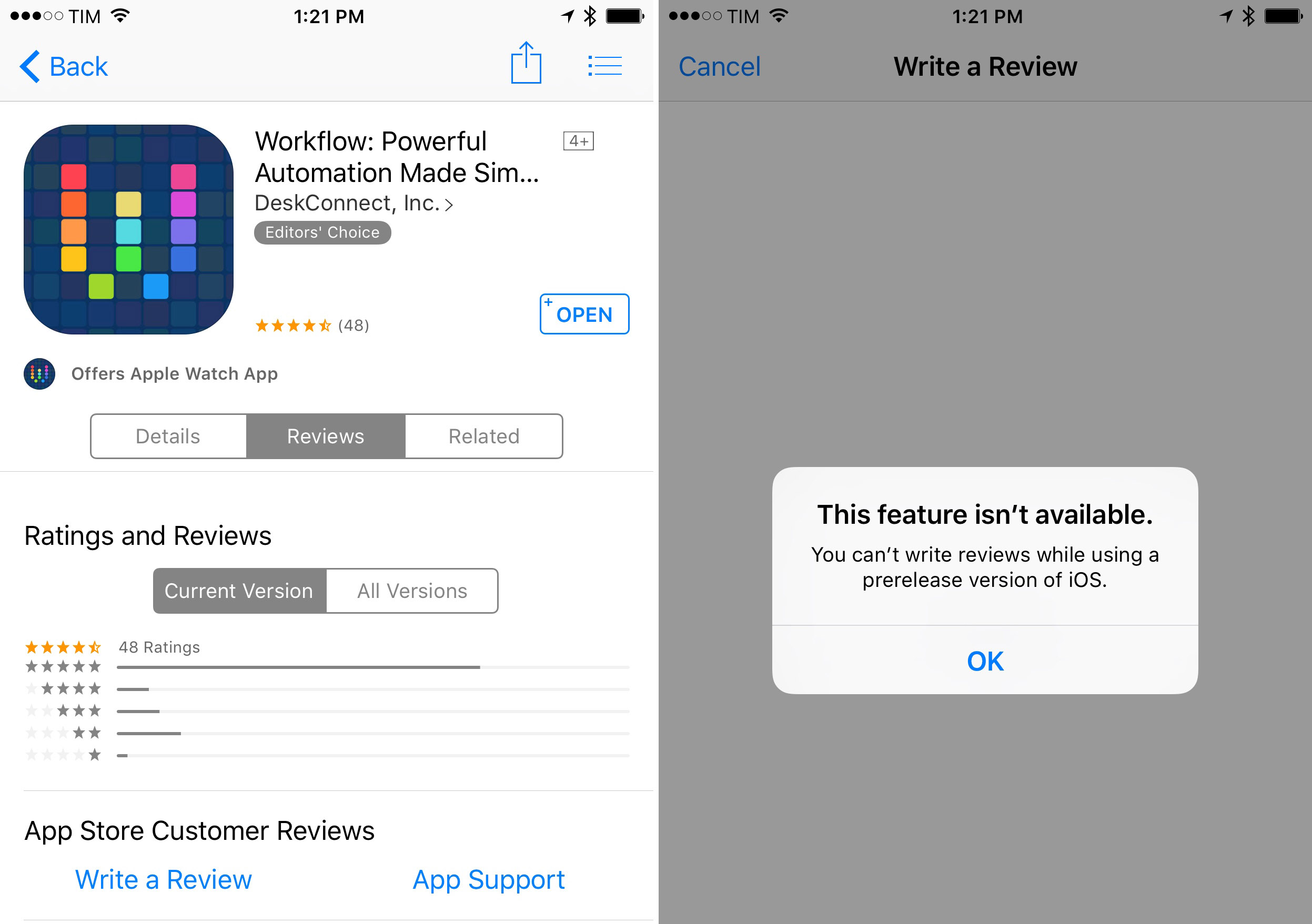
Within the last 12 hours Apple has modified the App Store to prevent users running “prerelease” software from leaving app reviews on the App Store. Now when a user running a beta version of iOS 9 tries to leave an app review, they will get the following error message:
This feature isn’t available.
You can’t write reviews while using a pre-release version of iOS.
However it appears that the change only applies to iOS 9, because users running OS X El Capitan can still post reviews on the Mac App Store.
The change should help end the annual frustration experienced by app developers when users running beta versions of iOS discovered a third party app wasn’t compatible with the beta software and then left a 1-star rating on the App Store. Poor reviews on the App Store can hurt sales, and developers often can’t do anything to fix the problem because they can’t submit software built for the new versions of iOS whilst it remains in beta, and the bug could be one for Apple to fix, not the developer.
As Federico wrote earlier this month:
In this day and age of high competition and over 1.5 million apps available, having negative reviews displayed on the app’s product page is a problem for developers. But it gets worse when those negative reviews cite problems that developers can’t fix yet. At that point, developers feel that it’s not fair to receive a negative review for something that’s completely out of their control. And when the livelihood of independent app markers is at stake, it’s hard to argue aganst their sentiment of frustration and disappointment. There’s nothing they can do to fix their app issues on betas of iOS and OS X and they can’t respond directly to reviews on the App Store – and yet they’re taking all the blame. This, every year, repeatedly for every beta of iOS and OS X, and it’s possibly becoming more of a problem now that Apple has two public betas.
The problem of permitting app reviews from users on beta software was always a problem, but it risked being a much bigger issue this year because it is the first year that Apple has begun offering public betas of a major iOS release.
Apple Q3 2015: Tim Cook on iPad→
From Jason Snell’s transcript of Tim Cook during the company’s Q3 2015 earnings call:
I am still bullish on iPad, with iOS 9 there’s some incredible productivity enhancements coming in with Split View and Slide Over and Picture in Picture, these things are incredible features. The enterprise business is picking up and more and more companies are either contracting for or writing apps themselves.
And I believe that the iPad consumer upgrade cycle will eventually occur, because as we look at the usage statistics on iPad, it remains unbelievably great. I mean, the next closest usage of the next competitor, we’re six times greater. And so these are extraordinary numbers. It’s not like people have forgotten iPad or anything, it’s a fantastic product.
I’ve said it right after the first beta of iOS 9 and I can only reiterate this after four betas and now that I’m playing with some iPad apps with new features: iOS 9 is a game changer on the iPad. There are several touches on iOS 9 for iPad that feel like Apple is truly optimizing for this device now. It’ll be interesting to see the effect of new iPad software and hardware on sales next year.
Apple Q3 2015 Results: $49.6 Billion Revenue, 47.5 Million iPhones, 10.9 Million iPads Sold

Apple has published their Q3 2015 financial results for the quarter that spanned from April to June 2015. The company posted revenue of $49.6 billion. The company sold 10.9 million iPads, 47.5 million iPhones, and 4.8 million Macs, earning a quarterly net profit of $10.7 billion.
“We had an amazing quarter, with iPhone revenue up 59 percent over last year, strong sales of Mac, all-time record revenue from services, driven by the App Store, and a great start for Apple Watch,” said Tim Cook, Apple’s CEO. “The excitement for Apple Music has been incredible, and we’re looking forward to releasing iOS 9, OS X El Capitan and watchOS 2 to customers in the fall.”
Threes’ Free Version Doubles Developers’ Profits→
The free version of popular puzzle game Threes has doubled its developers’ profits, as reported by Eurogamer and as Threes developer Asher Vollmer shared in a series of tweets (full collection here).
We released a free version of @ThreesGame one month ago and here’s how it’s doing: It has doubled our daily income. Thanks for playing :)
— Asher Vollmer (@AsherVo) July 20, 2015
It was not a very glamorous game release, but it was a good business decision. Excited to make bigger games now!
— Asher Vollmer (@AsherVo) July 20, 2015
Graphs (with matching y-axises)! On the left: paid profits On the right: ad profits pic.twitter.com/hLv1n1vCo8
— Asher Vollmer (@AsherVo) July 20, 2015
.@NimbleDave a bunch! pic.twitter.com/Q8okZPIG1b
— Asher Vollmer (@AsherVo) July 20, 2015
@danielben Roughly the same actually! So our total profits doubled.
— Asher Vollmer (@AsherVo) July 20, 2015
It’s interesting to look at the stats for the platform split of iOS vs. Android. The majority of free users also comes from iOS.
Making a free version of a paid game with ads may not be the most elegant decision, but it’s a practical one when you want to attract an audience that doesn’t have disposable income to spend on games.
Podcast Listening and iOS→
According to a research report by Clammr (via RAIN News), podcasting is an increasingly mobile phenomenon with 82% of mobile listening happening on iOS. According to the report, Apple’s Podcasts app is also, by far, the most popular choice among users:
That means that of every 100 mobile podcast plays, 82 are on Apple devices, and 64 are in the Podcasts app, which is a carve-out of the Podcasts section in iTunes.
While I don’t doubt the overall accuracy of the report – by virtue of being a default choice on iOS, Apple’s Podcasts app is more than enough for most people – keep in mind that this report is based on a sample of RawVoice clients. These numbers are not, I assume, entirely representative of independent realities like Relay FM or shows such as The Talk Show and ATP, where the choice of clients tends to be more skewed towards alternatives such as Overcast.
Still, it makes sense for mobile podcast listening to be closely tied to iOS – Apple’s dominance with the iTunes directory and pre-installed Podcasts app must be playing a big role in that.
Beats 1 to Exclusively Announce MTV VMA Nominees Tomorrow→
Apple is continuing to put a big focus on Beats 1 as a platform to connect music fans and artists. Today, the company announced Beats 1 will exclusively announce the MTV VMA nominees tomorrow. Jordan Kahn writes at 9to5Mac:
The proof of that comes in the form of an announcement today that the station will exclusively reveal nominees for the upcoming Video Music Awards. Clearly Apple has partnered with MTV in order to be first to make the announcements, and it’s obvious from the effort that Apple hopes Beats 1 won’t just be the venue for new music, but also a source for music fans when it comes to news and other industry related events.
And on Twitter:
2015 #VMA nominations will be revealed at 10 AM EST on @Beats1 Chart Show on @AppleMusic. 19 hours left. pic.twitter.com/eoKkaPyQ4X
— MTV (@MTV) July 20, 2015
Let the countdown begin! The 2015 @MTV #VMA nominees will be announced exclusively on #Beats1. Tuesday 7AM PT/10AM ET pic.twitter.com/EwcvIYe30E
— Beats 1 (@Beats1) July 20, 2015
Just two weeks ago, we were talking about Apple Music as the new MTV. Pretty close as a start.