CARROT Weather Adds New CARROT Voices, Weather Underground Improvements, and More

Within a matter of a few months, CARROT Weather has launched a major new version, then followed up with a fun AR mode, and now with version 4.2, it’s adding several key refinements to improve the overall experience.

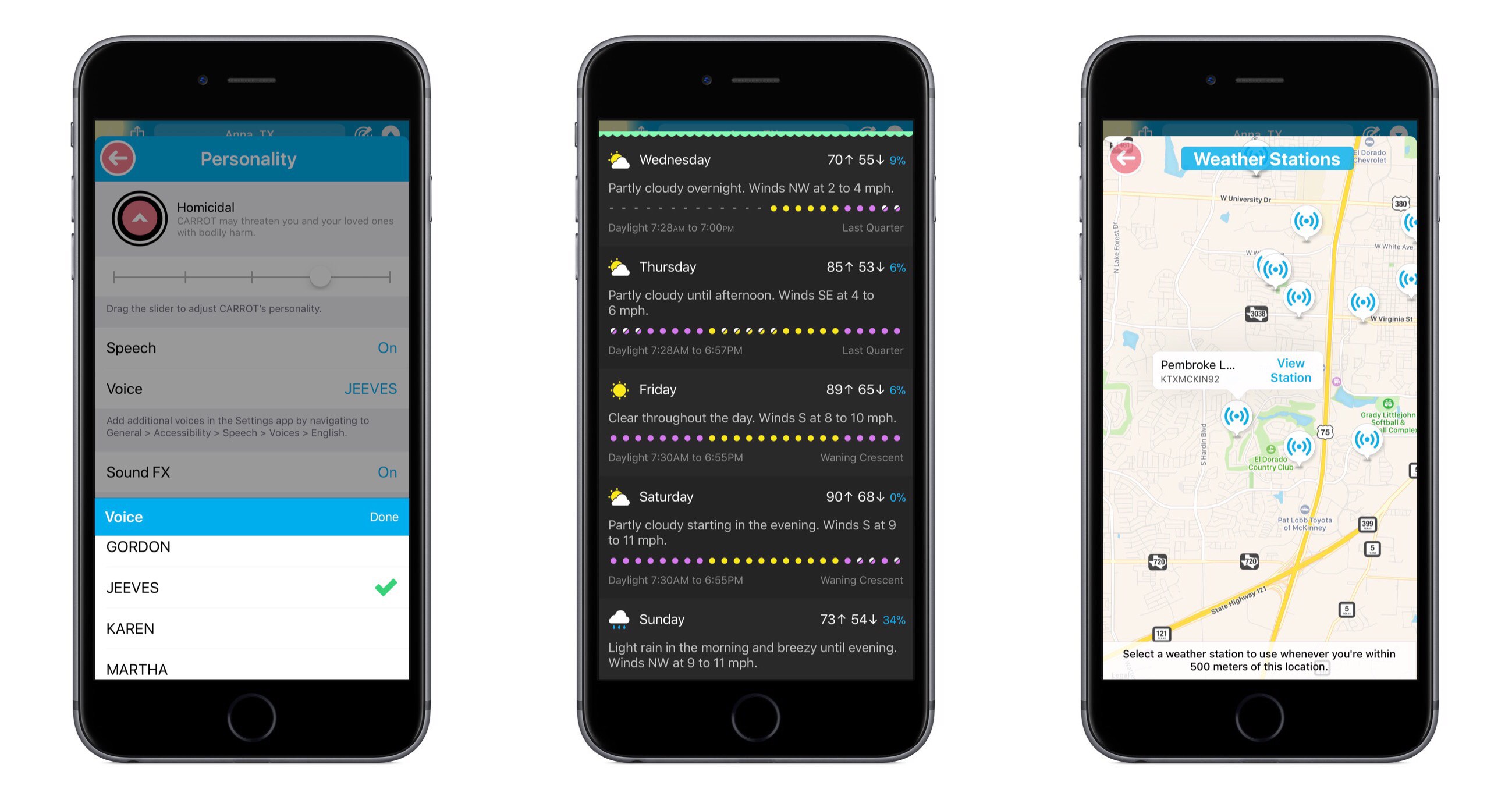
CARROT’s snarky personality is the defining characteristic of the app, yet recent updates have seen that personality gain customization options – both for users wanting more snark, and those begging for less. With today’s update, CARROT goes through perhaps an even more drastic transformation. From the Personality screen in Settings, there are now a variety of new voices that can be set for CARROT, including both female and male options. Among these is FRED, the voice used for the original Mac. My personal favorite is JEEVES, whose smug butler tone makes me feel inferior in a way I thought only the original CARROT could.

Users of CARROT Weather’s alternative data source, Weather Underground, get a couple nice updates in this release. Now, available weather stations can be seen and selected from a map view, making it much easier to get the absolute most accurate data for your current location. Also, severe weather alerts are now available for all of Europe so you’ll be kept in the know regarding official hazards.

If you prefer your weather app to provide a little more business, a little less party, CARROT’s Professional mode has been enhanced in a couple ways. Not only will the maniacal A.I. be de-snarked when set to Professional, but now the little characters and animals in illustrations will be hidden by default as well, AR mode will present a more civilized CARROT, and secret locations can now be turned on.

Premium subscribers have a new vertical view option for daily weather info, which can be accessed from Settings ⇾ iPhone/iPad ⇾ Daily ⇾ Details. I’ve found that I prefer the vertical view over the default horizontal, and I enjoy how it still fits right in with the setting of a landscape – when details slide up from the bottom, it feels like you’re simply delving deeper below the surface.


CARROT Weather keeps getting better. The additions in version 4.2 aren’t blockbuster features, but they make for an overall more complete package. Now users with all kinds of weather and personality preferences can benefit from this top-notch app and customize it to their liking. Without losing its distinct sense of flare, CARROT Weather is quickly becoming a weather app for everyone.

CARROT Weather is available on the App Store.


Connected, Episode 163: U2 Red

Stephen’s keyboard is disintegrating as Federico explains AirPlay 2, and Sonos and Google have new products out for the holiday season.

On this week’s Connected, we also consider some of the potential problems for Sonos’ third-party integrations and take a look at the Pixel 2. You can listen here.

Sponsored by:

  • Blue Apron: A better way to cook. Get 3 meals free with your first purchase, and free shipping!
  • Bombfell: Find the right clothes for you. Get $25 off your first purchase.
  • Mack Weldon: Smart underwear for smart guys. Get 20% off with the code CONNECTED.
Permalink

Spark Adds Key Email Productivity Features: Send Later and Follow-Up Reminders

In updates to Readdle’s Spark app for iOS and macOS released today, the email client gained two key power user features: send later and follow-up reminders.

Send later works exactly as you would expect. When composing an email, hitting the send later button in the compose bar will present several default options for when you’d like the message sent: Later Today, This Evening, and Tomorrow. Perhaps the most common use case will be responding to emails late at night and wanting them to send as soon as the next work day kicks off, which the Tomorrow option is perfect for. Thankfully, you can also set a custom date and time. Once you schedule the delivery time, Spark will take care of the rest.

With follow-up reminders, there are five default options joining the custom date picker: Later Today, This Evening, Tomorrow, Weekend, and Next Week. This feature serves to stifle a key pain point I’ve regularly encountered in email management: reminding me to follow up on an email when I don’t receive a response.

In the past I’ve tackled this problem by pairing my email client with a task manager, such that after sending an important, time-sensitive message, I would assign myself a task to follow up with a second email on a certain date in the future. The problem with this approach is that it requires two apps, and that my task manager has no way of communicating with my email inbox – it doesn’t know if I received a response to the message or not, meaning I may end up with an unnecessary task on my list. Integrating this function within an email client is exactly the right move, and Spark does it well. When your set follow-up point arrives, if you haven’t received a response yet, the sent message reappears at the top of your inbox with an icon denoting it’s a reminder. It’s easy from there to open the original email and send a quick follow-up.

The team at Readdle continues adding functionality into Spark that sets it apart as a true productivity-focused email client. With third-party integrations, snoozing, deep customization options, and now the ability to send later and receive follow-up cues, Spark is growing into an email powerhouse that every power user should give a serious look.


AppStories, Episode 26 – Tips for Travelers

On this week’s episode of AppStories, with Federico’s trip to the United States for the Release Notes conference just around the corner, we talk about the travel apps we use, from planning a trip, to getting around an unfamiliar city.

Sponsored by:

  • Bear - A beautiful app for crafting notes and prose.
  • 1Blocker – Make Safari browsing fast, safe, and productive.
AppStories+ Deeper into the world of apps

AppStories Episode 26 - Tips for Travelers

0:00
32:27

AppStories+ Deeper into the world of apps

Permalink

Pixelmator for iOS Adds Drag and Drop Support and HEIF Compatibility

Following just a few days behind Pixelmator for Mac, which recently received support for HEIF and editing files stored in Apple Photos, Pixelmator for iOS was updated today with the aforementioned HEIF support – Apple’s new file format for images in iOS 11 – as well as drag and drop support on iPad.

Drag and drop enables, as you might expect, moving images and graphics out of or into Pixelmator. Dropping images into a work in progress will import them all as new layers. Depending on the size and number of images you’re dropping, there may be a brief delay before they appear in your working document, but overall this action works well. When it comes to dragging content out of Pixelmator, you’ll need to do it with a single layer at a time – once you’ve lifted a layer, you can’t use drag and drop to pick up any additional layers. In a document containing many different layers, this can be fairly limiting, but there is a type of workaround: you can merge layers together in the sidebar to then drag the newly merged layer out of the app as a single image. Unfortunately, this only solves the problem if you want both layers permanently combined into one when dropping them elsewhere.

This layer merge technique is the only way I’ve discovered to drag a final image, containing multiple layers, out of Pixelmator and into another app – if you don’t want to first merge all layers together, you’ll have to use a more traditional data transfer technique like the share sheet. I would have liked to see drag and drop enabled within Pixelmator’s main image browser for moving a completed image out of the app, or for importing photos into the app to edit later. Currently, long-pressing an item from the image browser simply engages rearrange mode.

One nice side effect of drag and drop support is that when dealing with layers that don’t fit inside your canvas – such as an image you’ve dragged in that’s larger than the canvas itself – previously it was difficult to easily determine how large the full layer was. But now, grabbing the layer and watching it lift from the screen will provide a view of the full image, regardless of canvas size. Once you start dragging the layer away, it will shrink into a smaller drag preview, but until that move is engaged, the lifted image will be shown in full.

Despite its limitations, drag and drop support in Pixelmator is definitely great to have; before today I have tried several times to drag images into the app only to remember I couldn’t do that yet. Perhaps when the upcoming Pixelmator Pro arrives on the iPad, it will include a richer implementation of drag and drop. Until then, I’m grateful to have one less app limiting my iPad drag and drop experience.


Twitterrific for macOS Review

For years, Twitterrific for iOS and macOS were developed side-by-side, each matching the other feature for feature. But around 2013, development of the macOS version of Twitterrific slowed, while the iOS version continued to push forward with innovative features like Center Stage, the app’s media browser. Sticking with Twitterrific for macOS meant forgoing features supported by competing Twitter clients and Twitterrific’s iOS version.

With the relaunch of Twitterrific for macOS today, The Iconfactory has begun to change that. Funded by Kickstarter and codenamed Project Phoenix, the relaunched app is a solid 1.0 release that brings Twitterrific as close to parity with its iOS sibling as the two apps have been in years. There are still features that the iOS version of Twitterrific has that the macOS version doesn’t and that I’d like to see added, but for many people who move between Mac and iOS devices each day, today’s release makes Twitterrific a viable option for the first time in a while.

Read more


Supertop Seeks to Start a Conversation About Drag and Drop Best Practices

With the goal of encouraging a dialogue among developers, Supertop, the maker of Castro, has published a series of suggested best practices for implementing drag and drop on iOS. As Oisin Prendiville explains:

Ideally, experiences that users have in one app should stand to benefit them in others. As a community of developers and designers we should be looking to agree upon shared best practices to provide a consistent user experience. There’s an opportunity here to help users understand and embrace drag and drop as a powerful way to interact with touch devices, just as they have on the desktop for years.

The post considers five implementation aspects of drag and drop complete with animated GIF examples of ‘dos and don’ts.’

As we’ve discussed on AppStories, Castro’s execution of drag and drop is one of the best we’ve seen since iOS 11’s introduction. That makes the app an excellent jumping off point to frame the conversation among the broader iOS development community. I hope others take Supertop up on its offer to discuss these topics further because users could stand to benefit a lot from a set of canonical approaches to drag and drop.

Permalink

Bobby: Subscription Tracking Made Easy

We live in a world where media and apps are increasingly available only through recurring subscriptions. Besides the common Netflix or Spotify subscriptions, we may have subscriptions for our favorite apps, for iCloud Drive storage, for news publications, and more.

Last year Bobby launched on the App Store as an easy way to keep track of this growing mess of subscriptions, but in version 1.0 the lack of a few key features – such as iCloud sync – hindered the app’s overall value. The recently released Bobby 2 remedies those few initial drawbacks, and presents one of the best App Store options for keeping on top of where your money goes each month.

Read more


The Limitations of watchOS Development

Benjamin Mayo recently built his first watchOS app, a companion to his iOS app for scanning and creating QR codes, Visual Codes. On his blog he outlines his experiences developing for the Apple Watch, focusing particularly on how limited third-party developers are with their apps.

Apple engineers are using a completely different technology stack to create the system apps. They get to real write real iOS apps with a watchOS appearance theme, essentially. Third-party developers have to use WatchKit — a completely separate abstracted framework that exposes only high-level interface objects (whilst creating UIKit components under the covers).

The current WatchKit API leaves no room for invention. iOS innovations like pull-to-refresh came about because the iPhone OS UI frameworks were flexible enough to let developers and designers run wild with their own ideas, if they wanted to. Some of these custom controls worked so well Apple later incorporated them as standard components in UIKit. That free reign creativity simply can’t happen on the watch at the moment. Apple defines what is possible.

Apple has clearly invested a lot into advancing the Apple Watch from a hardware perspective, and even in the native OS experience – both key areas to grow. But Mayo puts the spotlight on an area that’s clearly lagging behind.

In past years the lack of tools available to make third-party watchOS apps was less important, as the Watch itself still bore several key limitations – slow hardware, a confused OS, and being tethered to the iPhone. Few developers cared about being creative with Watch apps because everyone knew the Watch could barely handle the vanilla apps of the time anyways. It’s a testament to the recent evolution of the Watch as a product that WatchKit’s shortcomings now appear so disappointing.

Permalink