This Week's Sponsor:

Copilot Money

The Apple Editor’s Choice Award App for Tracking Your Money. Start Your Free Trial Today


Pixelmator for iOS Adds Drag and Drop Support and HEIF Compatibility

Following just a few days behind Pixelmator for Mac, which recently received support for HEIF and editing files stored in Apple Photos, Pixelmator for iOS was updated today with the aforementioned HEIF support – Apple’s new file format for images in iOS 11 – as well as drag and drop support on iPad.

Drag and drop enables, as you might expect, moving images and graphics out of or into Pixelmator. Dropping images into a work in progress will import them all as new layers. Depending on the size and number of images you’re dropping, there may be a brief delay before they appear in your working document, but overall this action works well. When it comes to dragging content out of Pixelmator, you’ll need to do it with a single layer at a time – once you’ve lifted a layer, you can’t use drag and drop to pick up any additional layers. In a document containing many different layers, this can be fairly limiting, but there is a type of workaround: you can merge layers together in the sidebar to then drag the newly merged layer out of the app as a single image. Unfortunately, this only solves the problem if you want both layers permanently combined into one when dropping them elsewhere.

This layer merge technique is the only way I’ve discovered to drag a final image, containing multiple layers, out of Pixelmator and into another app – if you don’t want to first merge all layers together, you’ll have to use a more traditional data transfer technique like the share sheet. I would have liked to see drag and drop enabled within Pixelmator’s main image browser for moving a completed image out of the app, or for importing photos into the app to edit later. Currently, long-pressing an item from the image browser simply engages rearrange mode.

One nice side effect of drag and drop support is that when dealing with layers that don’t fit inside your canvas – such as an image you’ve dragged in that’s larger than the canvas itself – previously it was difficult to easily determine how large the full layer was. But now, grabbing the layer and watching it lift from the screen will provide a view of the full image, regardless of canvas size. Once you start dragging the layer away, it will shrink into a smaller drag preview, but until that move is engaged, the lifted image will be shown in full.

Despite its limitations, drag and drop support in Pixelmator is definitely great to have; before today I have tried several times to drag images into the app only to remember I couldn’t do that yet. Perhaps when the upcoming Pixelmator Pro arrives on the iPad, it will include a richer implementation of drag and drop. Until then, I’m grateful to have one less app limiting my iPad drag and drop experience.


Twitterrific for macOS Review

For years, Twitterrific for iOS and macOS were developed side-by-side, each matching the other feature for feature. But around 2013, development of the macOS version of Twitterrific slowed, while the iOS version continued to push forward with innovative features like Center Stage, the app’s media browser. Sticking with Twitterrific for macOS meant forgoing features supported by competing Twitter clients and Twitterrific’s iOS version.

With the relaunch of Twitterrific for macOS today, The Iconfactory has begun to change that. Funded by Kickstarter and codenamed Project Phoenix, the relaunched app is a solid 1.0 release that brings Twitterrific as close to parity with its iOS sibling as the two apps have been in years. There are still features that the iOS version of Twitterrific has that the macOS version doesn’t and that I’d like to see added, but for many people who move between Mac and iOS devices each day, today’s release makes Twitterrific a viable option for the first time in a while.

Read more


Supertop Seeks to Start a Conversation About Drag and Drop Best Practices

With the goal of encouraging a dialogue among developers, Supertop, the maker of Castro, has published a series of suggested best practices for implementing drag and drop on iOS. As Oisin Prendiville explains:

Ideally, experiences that users have in one app should stand to benefit them in others. As a community of developers and designers we should be looking to agree upon shared best practices to provide a consistent user experience. There’s an opportunity here to help users understand and embrace drag and drop as a powerful way to interact with touch devices, just as they have on the desktop for years.

The post considers five implementation aspects of drag and drop complete with animated GIF examples of ‘dos and don’ts.’

As we’ve discussed on AppStories, Castro’s execution of drag and drop is one of the best we’ve seen since iOS 11’s introduction. That makes the app an excellent jumping off point to frame the conversation among the broader iOS development community. I hope others take Supertop up on its offer to discuss these topics further because users could stand to benefit a lot from a set of canonical approaches to drag and drop.

Permalink

Bobby: Subscription Tracking Made Easy

We live in a world where media and apps are increasingly available only through recurring subscriptions. Besides the common Netflix or Spotify subscriptions, we may have subscriptions for our favorite apps, for iCloud Drive storage, for news publications, and more.

Last year Bobby launched on the App Store as an easy way to keep track of this growing mess of subscriptions, but in version 1.0 the lack of a few key features – such as iCloud sync – hindered the app’s overall value. The recently released Bobby 2 remedies those few initial drawbacks, and presents one of the best App Store options for keeping on top of where your money goes each month.

Read more


The Limitations of watchOS Development

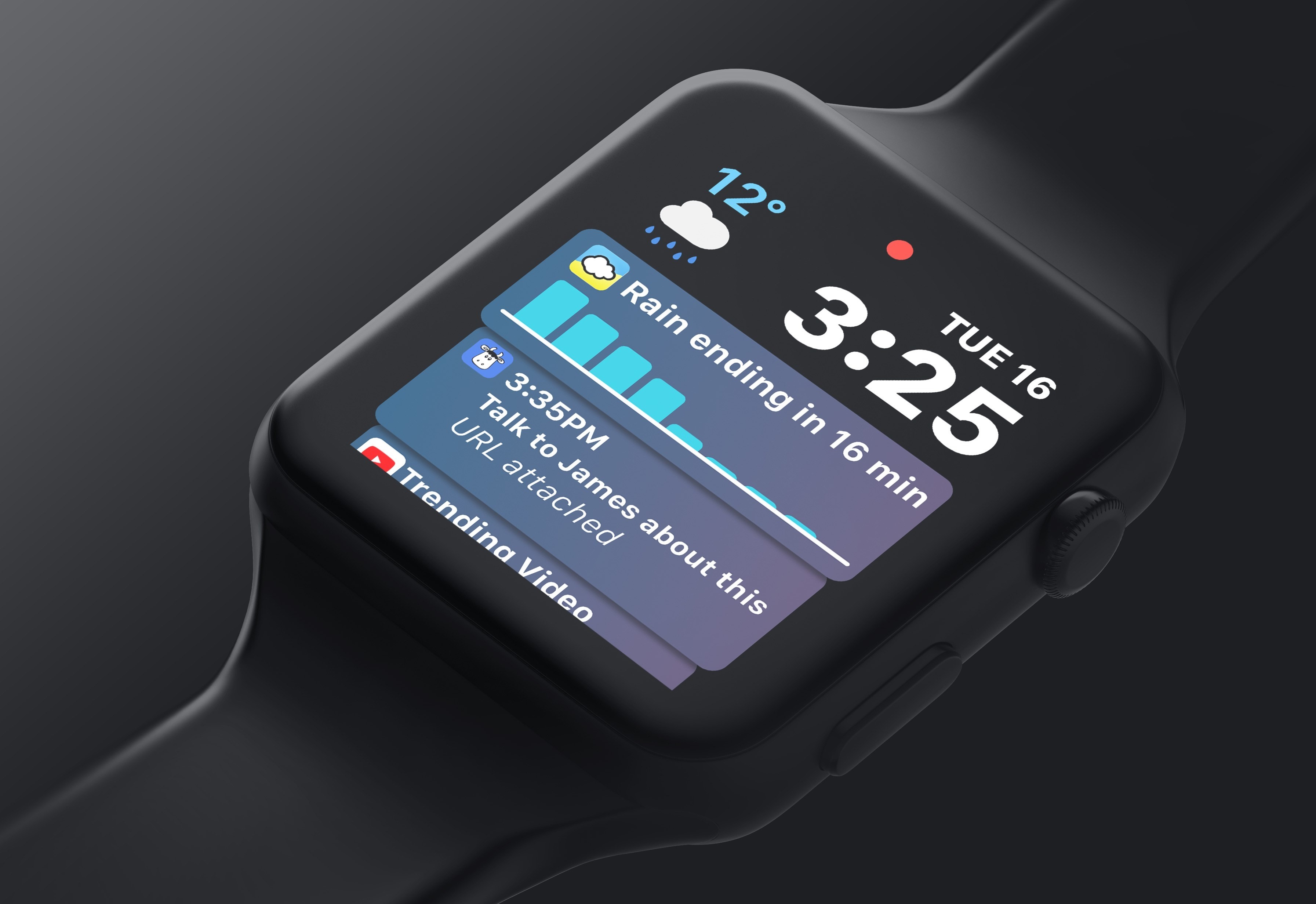
Benjamin Mayo recently built his first watchOS app, a companion to his iOS app for scanning and creating QR codes, Visual Codes. On his blog he outlines his experiences developing for the Apple Watch, focusing particularly on how limited third-party developers are with their apps.

Apple engineers are using a completely different technology stack to create the system apps. They get to real write real iOS apps with a watchOS appearance theme, essentially. Third-party developers have to use WatchKit — a completely separate abstracted framework that exposes only high-level interface objects (whilst creating UIKit components under the covers).

The current WatchKit API leaves no room for invention. iOS innovations like pull-to-refresh came about because the iPhone OS UI frameworks were flexible enough to let developers and designers run wild with their own ideas, if they wanted to. Some of these custom controls worked so well Apple later incorporated them as standard components in UIKit. That free reign creativity simply can’t happen on the watch at the moment. Apple defines what is possible.

Apple has clearly invested a lot into advancing the Apple Watch from a hardware perspective, and even in the native OS experience – both key areas to grow. But Mayo puts the spotlight on an area that’s clearly lagging behind.

In past years the lack of tools available to make third-party watchOS apps was less important, as the Watch itself still bore several key limitations – slow hardware, a confused OS, and being tethered to the iPhone. Few developers cared about being creative with Watch apps because everyone knew the Watch could barely handle the vanilla apps of the time anyways. It’s a testament to the recent evolution of the Watch as a product that WatchKit’s shortcomings now appear so disappointing.

Permalink

GoodNotes Adds Drag and Drop Flexibility

Drag and drop is a natural fit for a note taking app like GoodNotes. The app excels as a way to capture handwritten or typed notes, but one of its greatest strengths is the ability to combine notes with other media, which drag and drop makes easier than ever.

GoodNotes has one of the best ink engines of any note taking app I’ve used. You can choose from a preset selection of ink colors and line widths or customize them to suit your taste. There’s a highlighter tool for marking up your notes or other documents too. The lasso tool lets you select notes and other on-screen elements to move them on the page or, in the case of handwritten notes, convert them to text.

Read more


Bear: A Beautiful App for Crafting Notes and Prose [Sponsor]

Bear is a beautiful, award-winning app for crafting notes and prose. It’s simple yet powerful, and flexible enough to be a personal journal, scratchpad, and webpage clippper. You can write a book with Bear, or just keep all those little snippets and files that don’t fit elsewhere. Bear works on iPad, iPhone, Mac and, soon, Apple Watch.

There are a lot of great perks and smart polish in Bear. It fully supports Markdown, uses #tags and nested tags for organization, stores all notes in plain text, has incredibly powerful search operators, and it can handle anything—text, photos, links, tasks, and even files. Bear syntax highlights over 20 coding languages, and exports notes to a variety of formats including PDF, HTML, RTF, and even JPG for sharing on social media.

Bear is free to use. To enable sync across all devices, pick from a wide variety of themes, use all export options, and support future awesomeness coming to Bear, subscribe to Bear Pro. It’s just $1.49 a month, or $14.99 a year (about 15 percent off), and all existing and future Bear Pro features will be unlocked.

Check out the Bear Blog and FAQs with tips and guides on how to get the most out of Bear.

Our thanks to Bear for sponsoring MacStories this week.


Design Like the Notch Isn’t There

After revealing the iPhone X to the world on September 12th, Apple updated its Human Interface Guidelines and introduced a series of developer videos to address, among other topics, designing iOS apps with the iPhone X’s notch in mind. Designer Max Rudberg provides a comprehensive overview of Apple’s treatment of the notch. As Rudberg explains:

Apple is choosing to highlight the fact that the screen reaches the top left and right corner of the device. So the recommendation is clear. As a good platform citizen, one should follow their lead. By doing so, you likely have better chances to be highlighted by Apple in the App Store, or even win an Apple Design Award.

Eventually, they will get rid of the notch. It could be 2, 5, or even 10 years, but it’s a stop gap, not a permanent design solution. In the meantime, treat it like the elephant in the room. We all know it’s there, but for the most part, you should design as if it’s not.

Rudberg illustrates his article with screenshots of each point he covers and the dimensions of each screen elements adjacent to the notch. It’s not a substitute for reading the Human Interface Guidelines and watching Apple’s videos, but Rudberg’s article is a great place for developers to start when considering how to design for the iPhone X.

Permalink