On this week’s episode of AppStories, we talk about the Apple Watch apps we use and how our use of the Watch has changed as the product has evolved.
Sponsored by:
- Spark – The Future of Email


Professional Email Marketing Built Just for Mac Users
On this week’s episode of AppStories, we talk about the Apple Watch apps we use and how our use of the Watch has changed as the product has evolved.
Sponsored by:
Feral Interactive has brought Codemasters’ GRID Autosport to iOS, and it’s gorgeous. Codemasters is no stranger to racing games. The developer’s F1 2016 game was featured during Apple’s iPhone 7 keynote in 2016 and set a new standard for racing games on iOS when it debuted in November that year. Just over one year later, GRID Autosport is pushing those boundaries again.
Apple has posted four videos highlighting exclusive iPhone X features. Three of the videos focus on Face ID and Apple Pay, while the fourth spotlights Animoji.
One Face ID video is a broad introduction to the iPhone X, Face ID, and using Apple Pay with Face ID. The other two Face ID videos have a narrower focus. One demonstrates that Face ID works even if you change your look. The spot features a woman with different hair styles, jewelry, glasses, makeup, and clothing unlocking her iPhone X with each new look. The other Face ID video shows that the feature works in complete darkness.
The final spot embraces the Animoji karaoke phenomenon. As a woman sings All Night by Big Boi, a series of Animoji sing along with her just like the many Animoji karaoke videos that have been posted to Twitter and elsewhere.
The four short videos, which you can view after the break below, are available on YouTube and will likely begin showing up on television soon.
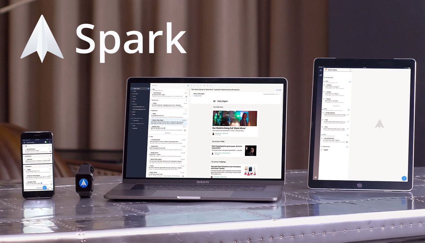
Email steals precious time from everyone. Spark recovers those lost moments by identifying what’s important and organizing it all for you neatly and automatically.
Spark’s smarts start with its Smart Inbox. Messages are categorized as Personal, Notifications, and Newsletters making it easy to focus your efforts on what’s important and save the rest for later.
Powerful search makes it simple to find messages no matter where you may have filed them. Spark’s natural language search thinks like you do. Just search for messages the way you would if you were asking a friend.
Notifications can spin out of control quickly with email too, sending you alerts about everything. Spark filters out the junk with Smart Notifications that only notify you of what you need to know now.
In addition, Spark features beautifully designed card-style calendar invitations that can be accepted with just one tap, the ability to send later and set up reminders for messages that don’t receive a reply, message snoozing, and Quick Replies that let you acknowledge a message with a single tap. Spark also has customizable gesture actions and works with Dropbox, Box, iCloud Drive, and more. Spark looks great too with a beautifully threaded design that makes following a conversation simple.
As if that weren’t enough, in just a few short months, Spark 2.0 will introduce Spark for Teams, which will change the way teams collaborate.
The future is now. Download Spark today for free and take control of your inbox.
Thanks to Spark for sponsoring MacStories this week.
In this episode, we wrap up our look at long-form editors with a look at the honourable mentions for other interesting apps on iOS.
In the final episode of our long-form writing mini-series on Canvas, we take a look at Editorial, 1Writer, Pages, and more. You can listen here.
Sponsored by:
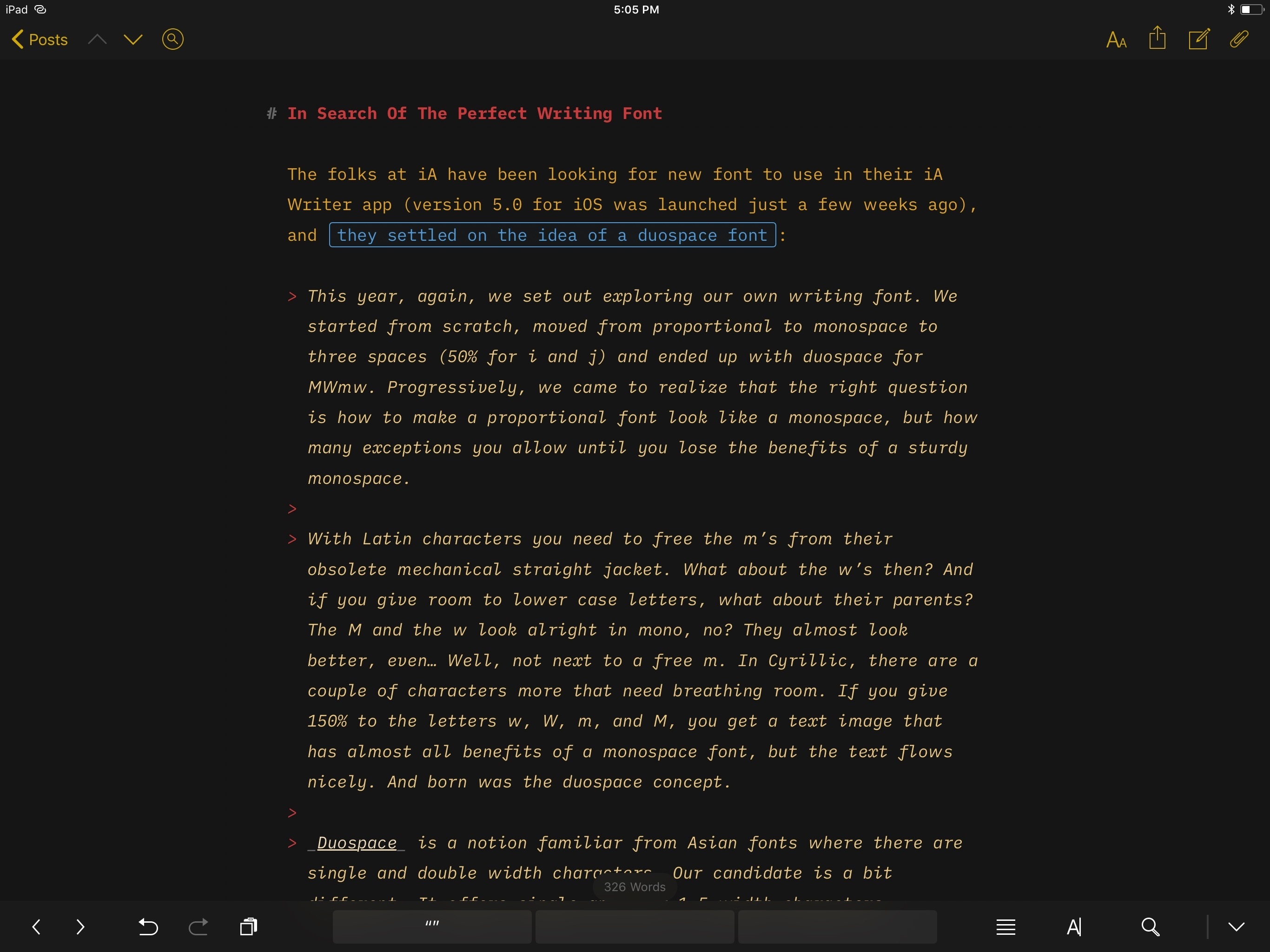
The folks at iA have been looking for new font to use in their iA Writer app (version 5.0 for iOS was launched just a couple of weeks ago), and they settled on the idea of a duospace font:
This year, again, we set out exploring our own writing font. We started from scratch, moved from proportional to monospace to three spaces (50% for i and j) and ended up with duospace for MWmw. Progressively, we came to realize that the right question is how to make a proportional font look like a monospace, but how many exceptions you allow until you lose the benefits of a sturdy monospace.
With Latin characters you need to free the m’s from their obsolete mechanical straight jacket. What about the w’s then? And if you give room to lower case letters, what about their parents? The M and the w look alright in mono, no? They almost look better, even… Well, not next to a free m. In Cyrillic, there are a couple of characters more that need breathing room. If you give 150% to the letters w, W, m, and M, you get a text image that has almost all benefits of a monospace font, but the text flows nicely. And born was the duospace concept.
Duospace is a notion familiar from Asian fonts where there are single and double width characters. Our candidate is a bit different. It offers single and four 1.5 width characters.
I’ve always loved the thought and care that goes into iA Writer’s typography. In fact, I like iA Writer’s approach so much, I bought the Nitti family last year and have been using it as my writing font in Ulysses since. Standard Nitti looks terrific in Ulysses, but the new iA Writer Duospace (which is based off the recently released IBM Plex) is gorgeous as well. I mean, just take a look at this.
I’m going to experiment with iA Writer Duospace as my writing font in Ulysses for a few weeks. Installing custom fonts in Ulysses for iOS is easy: go to the GitHub page, download each one, and open them in Ulysses (with the share sheet) to install them. Alternatively, I recommend using AnyFont to make custom fonts available system-wide in any native font picker for iOS.
Dan Provost of Studio Neat (makers of the excellent Glif) ran some tests to analyze the low-light performance of the iPhone X’s telephoto lens:
Last year, when the iPhone 7 Plus was released, Glenn Fleishman wrote a terrific piece for Macworld about how the dual lens camera system works. In short, when you zoom-in to 2X, the camera does not always switch to the telephoto lens. In some cases (typically in low light scenarios), you will be presented with a cropped image from the wide angle lens instead. This was sacrilege to camera nerds, but Apple would argue that if the cropped image looks better in those low light situations, then that is the correct approach.
Results are impressive:
As you can see, the iPhone X required very little light before it decided to use the telephoto lens. The iPhone 7 Plus required quite a bit more. I used the app Light Meter to measure the light at each interval, which I denote in the video. The app measures the lux, which is a measure of illuminance equal to one lumen per square meter. (I measured from both devices and averaged the results, as the readings were slightly different. I wouldn’t expect an app to function as well as a true light meter, but this probably gets us in the ball park).
Make sure to check out the video to see the lens switching in action. The difference between the iPhone 7 Plus and the X is substantial when it comes to the amount of light required for the system to pick the telephoto lens.
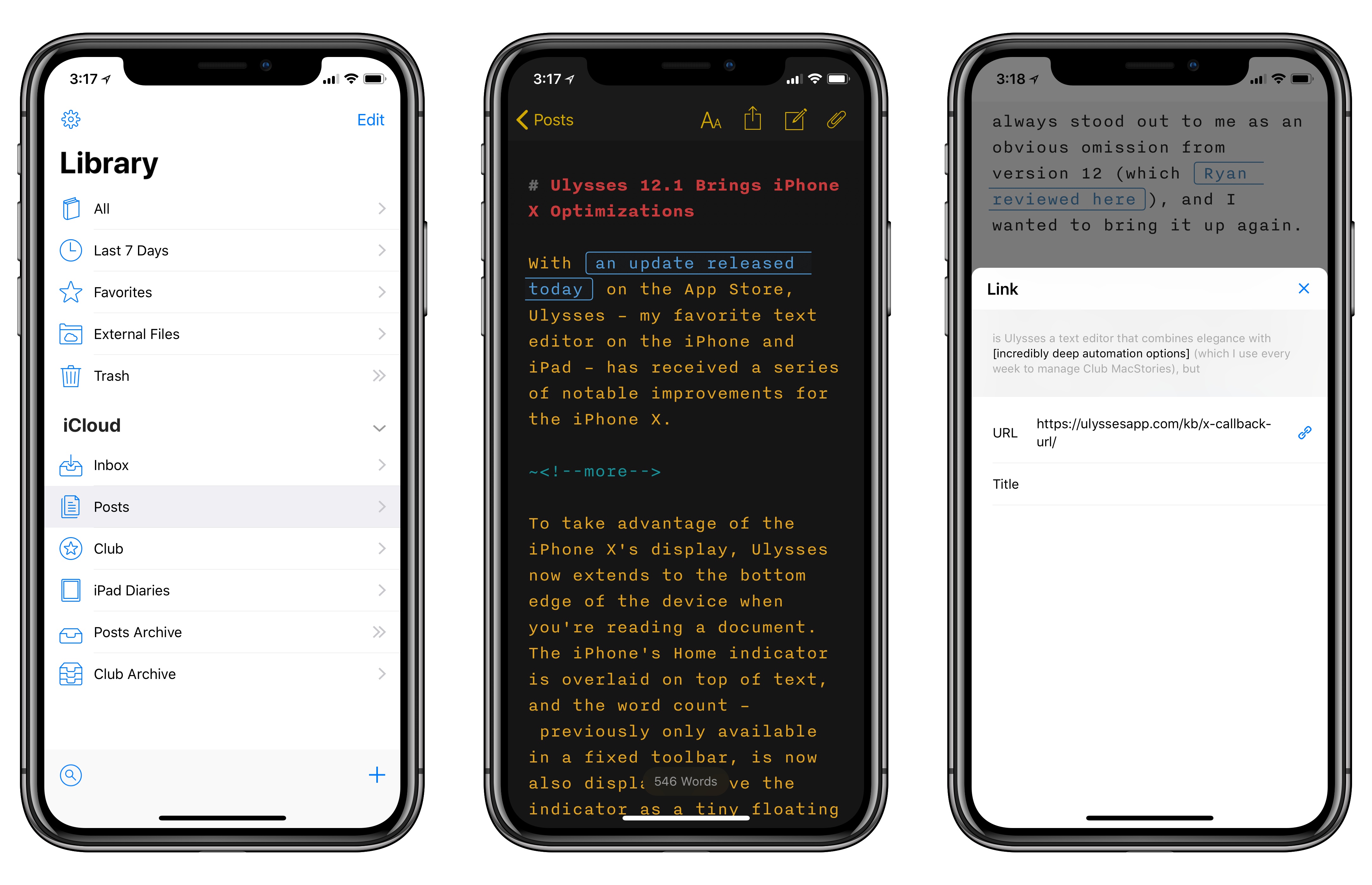
With an update released today on the App Store, Ulysses – my favorite text editor on the iPhone and iPad – has received a series of notable improvements for the iPhone X.

