This Week's Sponsor:

Copilot Money

The Apple Editor’s Choice Award App for Tracking Your Money. Start Your Free Trial Today


Behind The App: MoneyWiz

Early this year, I set out to find an iPad app that I could enjoy using to manage my finances. After a couple of days of looking, I settled upon MoneyWiz from the developer SilverWiz. Its developers describe it as “beautiful, powerful and easy to use”, and having stuck with the app since late January I’m inclined to agree. In my reviews of the iPad and Mac versions my overall take was mostly positive (there is also an iPhone version, but that I have yet to use).

After exchanging a few emails with Iliya Yordanov, the founder of SilverWiz, I thought it would be interesting to have a Q&A with him and learn a bit more about the app, similar to what we’ve done in previous interviews here on MacStories, but this time, I decided to change things up a bit. For this interview I’ve assembled all the various stories about MoneyWiz and the SilverWiz company that Iliya shared with me into a single story that (hopefully) gives you a fascinating and unique look behind the app and company.

Disclaimer: At the time of publication SilverWiz is one of the advertisers on MacStories; however, this article was in the works before the campaign began. Advertising on MacStories is not handled by editors but by BackBeatMedia, and has no relation to editorial content whatsoever.

Read more


Best MultiMarkdown Previews On iOS

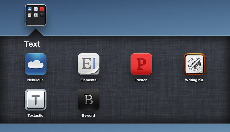
As a quick follow-up to my Nebulous Notes post on MultiMarkdown macros, I decided to put together a quick representation of how various apps I have tested handle MultiMarkdown previews on iOS.

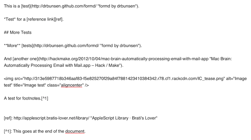
For reference, this is the text I previewed in each editor:

It’s a mix of regular Markdown (reference, inline links, bold and italics, section headers), MultiMarkdown (footnotes) and regular HTML (the centered image). I always write with this combination of syntaxes because that’s how articles end up on MacStories. The mix is also a good stress test to see how an app can handle various implementations of Markdown and HTML simultaneously.

Read more


Send Flagged Mail Messages To OmniFocus Automatically

Send Flagged Mail Messages To OmniFocus Automatically

Sven Fechner pointed today to an AppleScript published in late 2011 by Hunter Hillegas to send flagged Mail.app messages to OmniFocus’ inbox on the Mac.

In iOS 5, Apple added the ability to flag a message, just as you’ve been able to do on the desktop forever. I created an AppleScript that looks for flagged messages. When it finds them, it adds them to OmniFocus and links them back to Mail.app, just like the Services action does. It then also unflags the message, resetting the state back to normal. This script runs every five minutes.

In iOS 6’s Mail.app, it’s now even easier to mark a message as flagged. I have tried the script, and it works as advertised. I would modify it to include only the latest message of a thread in the task note, but I see the appeal of having an entire conversation saved in OmniFocus for reference.

Obviously, the script is best enjoyed if executed on a Mac that’s running all the time. In this way, you can set a message as flagged on iOS, wait a few seconds, and find it in OmniFocus right away.

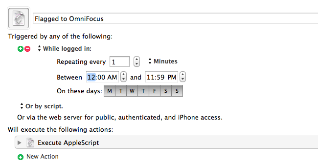
Personally, I run my own OmniFocus sync (every minute) so that I always have up-to-date sync that I can control. To implement this script in my workflow, I just had to create a new Keyboard Maestro macro (pictured above) that runs the AppleScript every minute if I’m logged in. In the way the script is designed, flagged messages are processed, then set back to “unflagged” so they won’t be added again in the future (unless you flag them manually).

You can find the AppleScript here.

Permalink

iOS 6 Concepts: Multitasking and App Store

iOS 6 Concepts: Multitasking and App Store

The past couple of days has seen a fresh round of new iOS 6 concepts surface online. Specifically, Rene Ritchie at iMore posted a series of mockups showing possible improvements for the current (poor) state of App Store search on the iPhone, while The Verge featured a forum post by member Sentry about multitasking on iOS.

For the App Store, I’ve already largely discussed why I think the new interface represents a step backwards in several areas. Especially on the iPhone, discovery is hampered by a new card-based layout for search results that’s slow and makes terrible use of information desnsity on our device’s screens. Rene offers some interesting solutions:

Taking it one step further, Apple could implement the portrait interface they use for app categories and present a few horizontal list views. The first could present search results filtered by keyword relevance, the second by rating, the third by how many “friends” have the app, the fourth by recency of release, etc. So, for example, a search for “Twitter” could result in the official Twitter for iPhone app showing up first for relevancy, Tweetbot first for friends who have the app, and Flurry for most recent.

Filters are interesting. With iOS 6, not only does Apple have data from Genius and Game Center, they also have direct integration with Facebook and Twitter. I’m not sure this is a path Apple could go down with for such a core feature of the system, but it’d be curious to see, say, how a Facebook-enabled App Store could recommend apps that my friends are liking and using. I’m not sure about the privacy implications, but the appeal of such a functionality could be big for the average user who just wants good app recommendations.

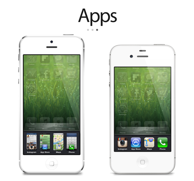
On The Verge, forum member Sentry has an elegant and very Apple-like take on how the multitasking tray could be improved. Practically unchanged since iOS 4, Sentry argues that iOS 6 should make better use of the extra screen space of the iPhone 5 for multitasking. Instead of proposing the usual Mission Control-like UI we’ve seen in dozens of mockups, he says that users are very entrenched into the simplicity of the multitasking tray: it shouldn’t change too much.

In an attempt to offer more functionality and features, they lose the core simplicity of the switcher which made it particularly usable to begin with. Some concepts use the entire screen space to display a grid of app previews, others only double the switcher height to include an extra row of icons. While both offer additional functionality, they actually hinder the flow and ease of app-switching. Whether it’s a full screen grid solution or displaying two rows in the switcher instead of one, both require more from your thumb than Apple’s original solute while tending to be overly brash in appearance as well.

I agree about the app switcher: it’s very easy to use, and, while geeks like us would like to have more options for “real” multitasking, typical iPhone users don’t have any problems with switching apps. I’m still not completely sold on the concept of live app previews for the switcher, but I know (at least I very much hope so) that Apple won’t change this part of the experience unless they come up with something better. An improvement that’s useful, not just different for change’s sake.

Check out the concepts by clicking on the source links above. Also recently: a great concept on how to enhance Spotlight by giving it Siri-like features based on text input.

Permalink

Sakura Quick Math

I’ve always been bad at mathematics. It’s not that I don’t like the subject per se: I prefer words.

However, as they teach you in school, numbers are important. Some would argue our universe is made of numbers and mathematic relationships between their entities. Personally, I’d be fine just being able to jot down a quick addition or subtraction and having the result in my head without pulling out my iPhone’s calculator. The meaning of the universe can wait.

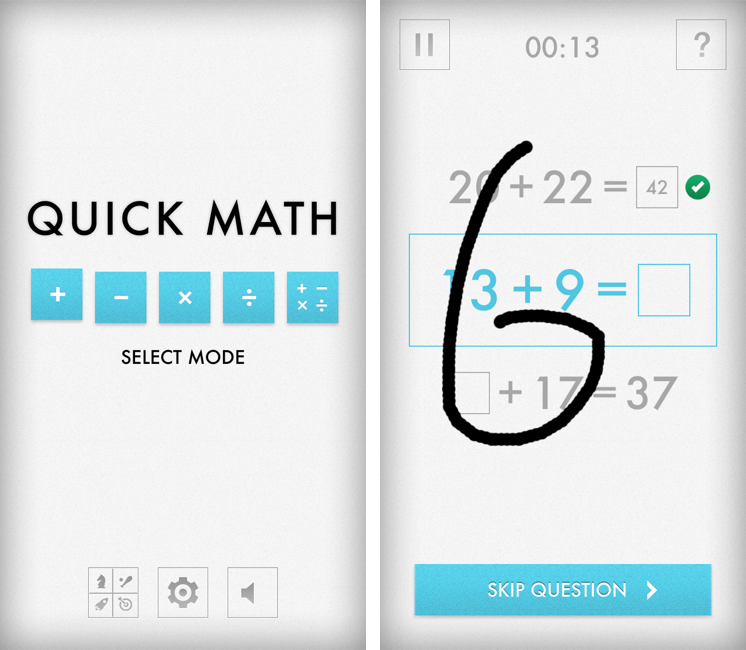
I think Sakura Quick Math is an interesting experiment for kids who want to improve their arithmetic skills for schools, as well as people like me who are way past high school and are often reminded that they’re terrible at calculations. Sakura Quick Math combines a clean, typography-oriented UI approach with the personal goal of getting better at stuff like additions, multiplications, divisions, and so forth.

Sakura Quick Math is perfect for students in grades 3, 4, 5 & 6 or those people who want to improve their all round mathematics ability. Multiple difficulty levels allow the app to grow with your skills. Developed in partnership with several schools, teachers and psychologists, with dedicated practice Quick Math should improve mathematics skills.

I like the app for a variety of reasons. It’s a game, but it’s also an educational tool; it reminds me of the Brain Age/Brain Training “games” that were so popular on the Nintendo DS a few years ago. Just like Brain Age, Sakura Quick Math takes advantage of the platform it runs on with a fully touch-based interaction. Through built-in handwriting recognition, the app “understands” the numbers you’re writing on screen. In my tests, I’ve found the app to be really clever at figuring out my scribbles, though it sometimes hung on “4” and “9”. However, it was just a matter of getting how the app wanted those numbers to be written (tip: don’t lift your finger off the screen).

There are various difficulty levels for five modes. The main screen allows you to pick one of these modes, disable sounds, or open the Settings to adjust the handwriting recognition method. You can also check out Game Center leaderboards if you want to feel bad about yourself.

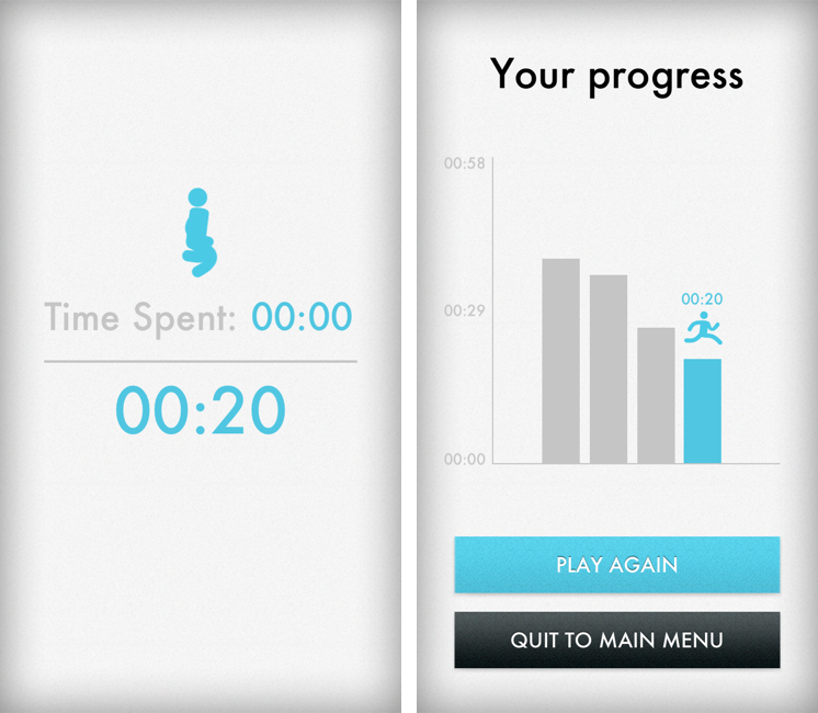
When you’re playing, you have to be fast in writing your answer, as shorter times is what you’re going after. You can write anywhere on the screen, and you can clear your answer with a two-finger swipe if you’re not sure about it. Otherwise, the game will take a correct answer as soon as it’s entered. You can skip questions, or end games and go back to the main screen. The app has a nice selection of sound effects and it displays records on a chart that puts the focus on “getting better” rather than “beating someone else”. It’s a subtle but important difference.

I’ve found Beginner to represent an enjoyable challenge, but then again I’m bad at this kind of stuff, as I said above. You’d probably want to look at the Advanced level for the last mode, which mixes everything in a single game.

Sakura Quick Math looks good, is fun to play, and it’ll probably make my rusty brain a little less old when it comes to arithmetics. Plus, it’s only $0.99 on the App Store, so check it out if you’re looking for something different than the usual Angry Birds or Temple Run-style game.


Ecoute for iOS

Ecoute for iOS

A while ago our Lukas Hermann published an in-depth review of Ecoute for iOS:

From now on, Ecoute for iOS is my new default music player for iOS. Its UI features every design decision I ever wanted to have on my iPod touch. Plus, it eases up changing and pausing tracks while browsing through your music library, something I often do while I’m on the go. I can’t wait to see this thing on the iPad as well. If you’re a music and design enthusiast like me, or just dislike the system music player on your iPhone or iPod touch, you have to try it out.

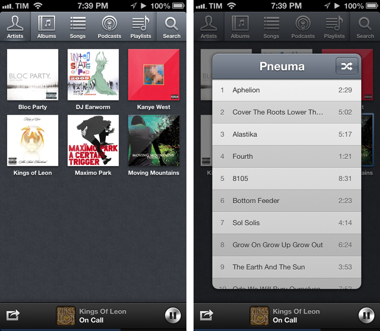
Last week, I saw Ecoute had been updated for the iPhone 5, and I decided to give it a try. I’m glad I did, because the app works perfectly for the way I think of browsing my music collection.

The thing I like about Ecoute is that it displays Artists using album thumbnails. The Music app does this only for the Albums view, and then again they’re small thumbnails arranged in a list view. Ecoute is more similar to iTunes’ grid view, which I use on my Mac. When you tap on an album, instead of going deeper into the level views, Ecoute brings up a modal popup that you can dismiss with a swipe – this is not too dissimilar from how the upcoming iTunes 11 will expand albums inline. If you tap on an artist that has multiple albums, a nice animation will “drill down” to show the album thumbnails. Last, when you tap on a song, it starts playing in a bottom bar without opening a new view in the foreground – and that’s exectly all I want from a music app.

Ecoute looks gorgeous on the iPhone 5. If you’re looking for a complete overview of all its features, check out Lukas’ review. For me, Ecoute works better than Apple’s Music app because it reflects the way I tend to browse my music collection.

Ecoute is available at $2.99 on the App Store.

Permalink

Hide Newsstand In A Folder On iOS 6 With One Click, No Jailbreak Required

After the release of iOS 5 last year, several users complained that the Newsstand app (effectively a “folder” for magazine and newspaper subscriptions) couldn’t be hidden from the Springboard. Because of its nature of glorified folder, users couldn’t even put it away in an existing folder on the Home screen. However, people soon figured out a trick to make the Springboard hide Newsstand.

This year, well-known Cydia developer Filippo Bigarella has released a simple Mac app to hide Newsstand from any iOS device with a single click. I’ve just tested the app personally on my iPhone 5 running iOS 6, and it works as advertised. Even better, the app doesn’t require a jailbreak at all, as it leverages the existing “folder trick”, albeit making it easier to access.

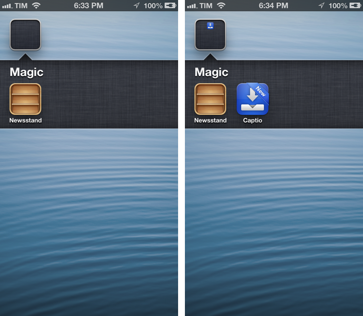
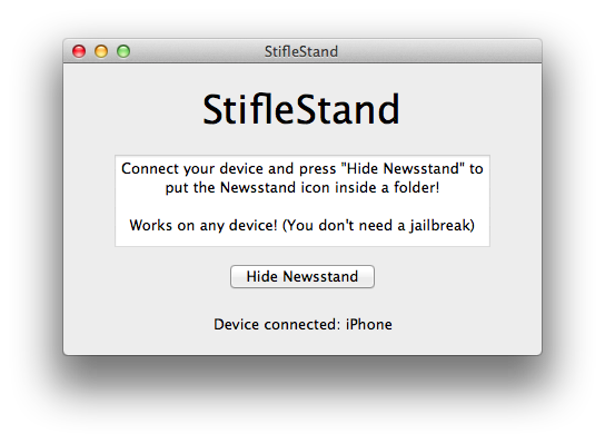
Simply download StifleStand, and open it on your Mac. Make sure a device is plugged in and recognized by the app. Hit the Hide Newsstand button, and watch as Newsstand gets put into a folder called “Magic” on your Home screen. It literally takes one second to complete.

Please note: Just like on iOS 5 last year, opening Newsstand from a folder will crash Springboard. Use this tweak only if you don’t use Newsstand.

You can then rename the folder and put more apps into it. One bug I’ve noticed is that, because Newsstand isn’t meant to be put into a folder, if the folder is closed you won’t see the smaller preview icon for Newsstand. You can avoid this by placing more apps into the folder, leaving Newsstand at the end, so you won’t see the empty spot from your Home screen.

StifleStand works on any device and it’s super-easy to use. Download it here, and watch a demo video by iDownloadBlog here.