I was looking forward to Twitterrific 3.0 for iPhone. Since Twitter (ahem) bought Tweetie from Loren Brichter, I feared no one would take the effort of developing a great Twitter client for the iPhone anymore. Fighting against the man with a paid / unofficial app? Many developers gave up, and I understand them.
The Iconfactory team didn’t gave up though. They announced a native version of Twitterrific for iPad and it was released on day one. A great app, but I eventually ended up using Osfoora HD on the iPad, more on this in a moment. After the iPad client was released, they announced their plans for the future: a completely revamped version of Twitterrific for the iPhone and a much needed 4.0 update for the Mac.
With the 3.0 version of Twitterrific for iPhone, they decided to take a radically different approach and streamline the user experience by removing all those unnecessary features that made Twitterrific 2.0 a feature creep. I think it worked.
Twitterrific 3.0 for iPhone is a “mini” version of Twitterrific for iPad, the app you know and love. Before I delve deeper into the app, a few words on this universal update. The app is now called “Twiterrific for Twitter” (smart marketing move) and it’s available for free (ad-supported) in the App Store.. I bought the in-app purchase on the iPad, and I upgraded to the “premium” version of Twitterrific 3.0 on the iPhone for free. Just tap on the green upgrade button and the app will use your iTunes info (the same you used on the iPad) to make you upgrade for free.
That said, Twitterrific 3.0 is not an app for everyone. If you’re used to having tons of features and a rather powerful client to support you on the go, if you’re used to being able to mark tweets, tweet now playing songs and having lots of settings to play with - you’re not Twitterrific’s type. Maybe you were on 2.0, but the 3.0 version is something you didn’t see coming. They’ve taken the old Twitterrific, kept the good things (attention to details, gorgeous UI), trashed the rest (settings) and repacked everything following the feedback they collected with the iPad version. This is not for power users. It’s designed for the average user, the one that picks up the iPad on the couch with a cup of coffee on the other hand. This is designed for the average user that has got an iPhone 4 and goes around taking snaps with his brand new toy.
It’s designed for the masses.
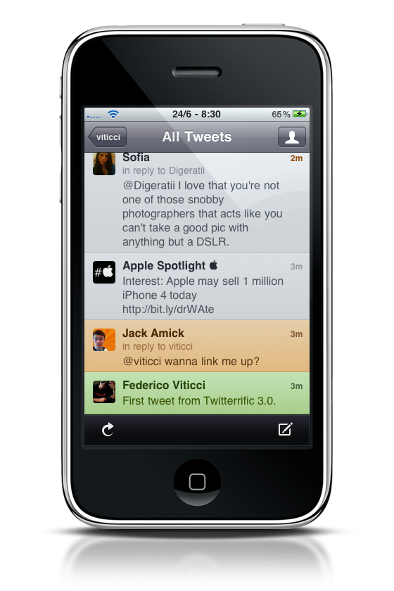
First off, the app now supports iOS 4’s multitasking, and it’s a huge improvement. Of course it is, you might say, but wait until you see the thing working. Perfect state saving, go back to the app and pick it up from where you left off. Apple should promote iOS 4 using this Twitterrific update. Now on to the app itself, the main screen is the sidebar you get on the iPad in landscape mode. Yes, this one. There’s a first section on top for all tweets, mentions, messages and favorites, then saved searches, lists and trends to follow below. Tapping on a section opens a specific timeline, just like on the iPad. I still don’t get why you can’t close and collapse the search section though.
The timeline is clean. Especially with the (gorgeous) light theme, it feels polished and elegant like never before. Only tweets and 4 buttons are on screen: refresh and compose in bottom toolbar, back and profile on top. Four average-lenght Twitter messages are displayed with the new layout, while apps such as Osfoora and Twitter display 5 messages on average. You can’t change font sizes on Twitterrific 3.0, and that’s exactly what I was talking about above. Anyway, it’s fine to me, not a big deal. There’s no swipe menu or touch gestures to perform on tweets: to do stuff with a tweet, you have to tap on it. Once you tap, a window slides up and there you’ll see the single message with the possibility to: open the author’s profile (by tapping on the avatar), close the window, mark as favorite, reply / DM / forward and retweet, replies to the author, translate and email tweet. About replies: you can’t decide to reply only to author of a tweet. If you try to reply to a mention, your message will include both usernames by default. Conversations are shown below the reply compose window, or you can view them by tapping on “in reply to” in a single tweet.
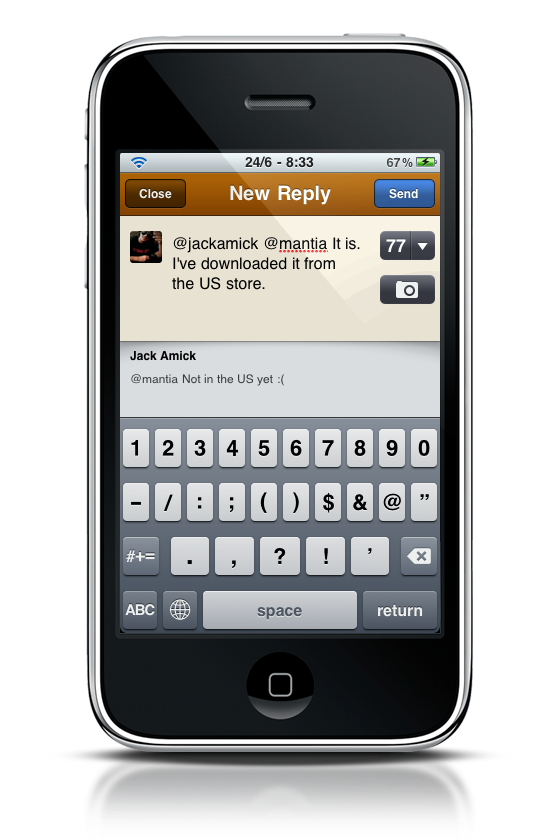
The compose window is now minimal as well. It’s a smaller version of the iPad one, where you have close and send buttons on top, a character counter on the right (which serves as clear text / shorten links action too) and an upload button right below it. You can take a new photo or video, choose an existing one from the library, change the upload service. Thank God img.ly is supported. What I love most about Twitterrific’s compose window is that it’s simple: no clutter, you just tweet. It doesn’t ask if you want to save a draft, if you enter some text and then close the window once you’ll re-open it that same text will be there.
The one thing I’m not sure of about this update is the amount of taps it takes to do stuff. Three taps to mark a tweet as favorite (tap, mark, close the window), four taps to reply. I don’t know if a better solution could have been found in the initial design process, but the iPhone smaller screen doesn’t surely help when it comes to comparing Twitterrific for iPhone to the iPad version. As for the reason I switched to Osfoora: it’s because of its perfect state-saving, which Twitterrific failed many times in the past weeks. This new update seems to have fixed things somehow so far, so I’m giving it another try.
Twitterrific for iPhone is not the best Twitter client out there because it’s not meant to be everyone’s favorite client. Twitterrific 3.0 is the best Twitter client for anyone who’ll accept its compromises, shortcomings, strenghts and selling points and enjoy a cleverly designed, straightforward and elegant app which has managed to reinvent itself and offer a simple, beautiful way to tweet and read tweets.
Great job, Iconfactory.
—
Take a look at our Twitterrific 3.0 set on Flickr.