Posts in notes

The TV App as a Supporting Actor

Joe Steel makes a good point in his look at this week’s Apple TV announcements:

Why is TV the app an app and not the Home screen on the device? It’s obviously modeled after the same ideas that go into other streaming devices that expose content rather than app icons, so why is this a siloed launcher I have to navigate into and out of? Why is this bolted on to the bizarre springboard-like interface of tvOS when it reproduces so much of it?

You could argue that people want to have access to apps that are not for movies or TV shows, but I would suggest that that probably occurs less often and would be satisfied by a button in the TV app that showed you the inane grid of application tiles if you wanted to get at something else.

As I argued yesterday on Connected, I think the new TV app should be the main interface of tvOS – the first thing you see when you turn on the Apple TV. Not a grid of app icons (a vestige of the iPhone), but a collection of content you can watch next.

It’s safe to assume that the majority of Apple TV owners turn on the device to watch something. But instead of being presented with a launch interface that highlights video content, tvOS focuses on icons. As someone who loves the simplicity of his Chromecast, and after having seen what Amazon is doing with the Fire TV’s Home screen, the tvOS Home screen looks genuinely dated and not built for a modern TV experience.

I think Apple has almost figured this out – the TV app looks like the kind of simplification and content-first approach tvOS needs. But by keeping it a separate app, and by restricting it to US-only at launch, Apple is continuing to enforce the iPhone’s Home screen model on every device they make (except the Mac).

That’s something the iPad, the Watch1, and the Apple TV all have in common – Home screen UIs lazily adapted from the iPhone. I wish Apple spent more time optimizing the Home screens of their devices for their different experiences.


  1. The Watch is doing slightly better than the other ones thanks to watchOS 3 and its Dock, but the odd honeycomb Home screen is still around, and it doesn’t make much sense on the device’s tiny screen. ↩︎

Spotify’s Release Radar is Discover Weekly for New Music

Release Radar's first take.

Release Radar’s first take.

Earlier today, Spotify unveiled Release Radar, an algorithmically-generated playlist updated Friday and designed to recommend new music. Like Discover Weekly, Release Radar tailors suggestions dynamically for your tastes, with the difference that it highlights newly released music from the past few weeks instead of anything you might be interested in. Essentially, Release Radar aims to be Discover Weekly for new song release.

The Verge has more details on how Spotify approached Release Radar after the success of Discover Weekly:

“When a new album drops, we don’t really have much information about it yet, so we don’t have any streaming data or playlisting data, and those are pretty much the two major components that make Discover Weekly work so well,” says Edward Newett, the engineering manager at Spotify in charge of Release Radar. “So some of the innovation happening now for the product is around audio research. We have an audio research team in New York that’s been experimenting with a lot of the newer deep learning techniques where we’re not looking at playlisting and collaborative filtering of users, but instead we’re looking at the actual audio itself.”

As a Discover Weekly fan, I think this is a fantastic idea. Discover Weekly has brought back the joy of discovering new music into my life, but the songs it recommends aren’t necessarily fresh. I can see Release Radar complement Discover Weekly as the week winds down with songs that I don’t know and are also new.

Already in today’s first version of Release Radar, I’ve found some excellent suggestions for songs released in the past two weeks. Spotify has their personalized discovery features down to a science at this point.

Conversely, I’m curious to see what Apple plans to do with their Discovery Mix feature of Apple Music announced at WWDC (shown here with a screenshot). Discovery Mix still hasn’t become available after four betas of iOS 10. I’m intrigued, but also a little skeptical.


Apple’s Data Collection in iOS 10

Ina Fried, writing for Recode, got more details from Apple on how the company will be collecting new data from iOS 10 devices using differential privacy.

First, it sounds like differential privacy will be applied to specific domains of data collection new in iOS 10:

As for what data is being collected, Apple says that differential privacy will initially be limited to four specific use cases: New words that users add to their local dictionaries, emojis typed by the user (so that Apple can suggest emoji replacements), deep links used inside apps (provided they are marked for public indexing) and lookup hints within notes.

As I tweeted earlier this week, crowdsourced deep link indexing was supposed to launch last year with iOS 9; Apple’s documentation mysteriously changed before the September release, and it’s clear now that the company decided to rewrite the feature with differential privacy behind the scenes. (I had a story about public indexing of deep links here.)

I’m also curious to know what Apple means by “emoji typed by the user”: in the current beta of iOS 10, emoji are automatically suggested if the system finds a match, either in the QuickType bar or with the full-text replacement in Messages. There’s no way to manually train emoji by “typing them”. I’d be curious to know how Apple will be tackling this – perhaps they’ll look at which emoji are not suggested and need to be inserted manually from the user?

I wonder if the decision to make more data collection opt-in will make it less effective. If the whole idea of differential privacy is to glean insight without being able to trace data back to individuals, does it really have to be off by default? If differential privacy works as advertised, part of me thinks Apple should enable it without asking first for the benefit of their services; on the other hand, I’m not surprised Apple doesn’t want to do it even if differential privacy makes it technically impossible to link any piece of data to an individual iOS user. To Apple’s eyes, that would be morally wrong. This very contrast is what makes Apple’s approach to services and data collection trickier (and, depending on your stance, more honest) than other companies’.

Also from the Recode article, this bit about object and scene recognition in the new Photos app:

Apple says it is not using iOS users’ cloud-stored photos to power the image recognition features in iOS 10, instead relying on other data sets to train its algorithms. (Apple hasn’t said what data it is using for that, other than to make clear it is not using its users photos.)

I’ve been thinking about this since the keynote: if Apple isn’t looking at user photos, where do the original concepts of “mountains” and “beach” come from? How do they develop an understanding of new objects that are created in human history (say, a new model of a car, a new videogame console, a new kind of train)?

Apple said at the keynote that “it’s easy to find photos on the Internet” (I’m paraphrasing). Occam’s razor suggests they struck deals with various image search databases or stock footage companies to train their algorithms for iOS 10.


Apps as Services

John Gruber, writing on the App Store changes Apple announced earlier today, makes a good point about app sustainability:

Developers have been asking for a way to do free trials and to sustain long-term ongoing development ever since the App Store opened in 2008. This is Apple’s answer. I think all serious productivity apps in the App Store should and will switch to subscription pricing.

You might argue that people don’t want to subscribe to a slew of different apps. But the truth is most people don’t want to pay for apps, period. Nothing will change that. But for those people willing to pay for high quality apps, subscriptions make sustainable-for-developer pricing more palatable, and more predictable.

The ideal scenario after Apple’s new subscription APIs: users will be able to try out different apps for free thanks to subscription trials, see which one suits their needs, and then subscribe, optionally choosing from different subscription levels. The best app wins. Developers don’t have to worry about new versions of apps to sell users on a major upgrade, and customers can keep using the app they like.

The problem, as I see it today, is that Apple is being (intentionally?) vague about which kinds of apps will be able to adopt this new pricing model. On their new Subscriptions webpage, Apple refers to “successful auto-renewable subscription apps” as the ones that offer content or “services”. They also mention that apps will soon be “eligible” for subscriptions – a wording that might suggest increased scrutiny on Apple’s part to see whether an app can implement a subscription or not.

Today’s changes have been reported as Apple’s answer to the requests of developers who have been asking for paid upgrade pricing, but, as far as I can see, nothing on Apple’s website indicates that any type of app – regardless of its functionality – will be able to switch to subscription pricing. As with most App Store changes, it’s probably best to take a wait-and-see approach here – there will be sessions at WWDC to clarify many of the aforementioned questions.

Subscription pricing is not for everyone or every app. I don’t see myself “subscribing” to an image cropping app that I might need once a year – and Apple is saying as much, too. But I also wouldn’t mind becoming a paid subscriber of the apps that I rely on to get work done on my iOS devices, even if they don’t offer a service in the traditional sense. Apps like Workflow, Ulysses, or Copied save me time every day. Their continued development is the service for me – I want them and need them to exist, no matter Apple’s classification of their “service”. I’m willing to pay a subscription to keep using the best tools for me, and I don’t think I’m alone.

I’m optimistic about subscription pricing for App Store apps. Not every app is a good fit for a subscription, but increasingly more of them are.1 Apple’s new subscription tools should help developers sell their software to their best customers on a regular basis, and I’m curious to see how the indie developer community will react. It’s great to see excitement around the App Store again.


  1. Case in point, Sketch↩︎

On the Limitations of iOS Custom Keyboards

Somewhat buried in a good Verge piece on iOS custom keyboards is a reiteration by Apple on why they don’t allow dictation for third-party keyboards:

Apple has long been a stalwart for erring on the side of caution when it comes to keeping your data private and asking you to make sure you know you’re sharing something. The company’s policy is to not allow microphone access for extensions (like these keyboards) because iOS has no way to make it clear that the phone is listening. Giving third-party keyboards access to the microphone could allow nefarious apps to listen in on users without their knowledge, an Apple spokesperson says.

As far as I know, it’s not just custom keyboards: no kind of app extension can access the microphone on iOS (plus other APIs). This has been the case since 2014 and it appears Apple still thinks the privacy trade-off would be too risky.

The principle doesn’t surprise me; at a practical level, though, wouldn’t it be possible to enable dictation1 in third-party keyboards by coloring the status bar differently when the microphone is listening?

I also have to wonder if, two years into custom keyboards, it would be time for Apple to lift some of their other keyboard restrictions. To recap, this is what custom keyboards on iOS can’t do:

  • Access the system settings of Auto-Capitalization, Enable Caps Lock, and dictionary reset feature
  • Type into secure text input objects (password fields)
  • Type into phone pad objects (phone dialer UIs)
  • Access selected text
  • Access the device microphone
  • Use the system keyboard switching popup

Aside from microphone access, secure input fields, and phone pad objects, I’d like to see Apple add support for everything else in iOS 10. More importantly, I’d like to see their performance improve. Here’s an example: when you swipe down from the Home screen to open Spotlight, Apple’s keyboard comes up with a soft transition that’s pleasing on the eye; if you do the same with a custom keyboard, the transition is always jarring, and it often doesn’t work at all.2

I struggle to understand the position of those who call custom keyboards “keyloggers” because, frankly, that’s a discussion we should have had two years ago, not as soon as Google launches a custom keyboard. Since 2014, hundreds of companies (including Microsoft and Giphy) have released custom keyboards, each theoretically capable of “logging” what you type. That ship has sailed. Apple has featured Microsoft’s Word Flow on the front page of the App Store and the entire Utilities category is essentially dominated by custom keyboards (and has been for a while). Every few weeks, a new type of “-moji” celebrity keyboard comes out and sits at the top of the Top Paid charts.

I think it’s very unlikely Apple is going to backtrack on custom keyboards at this point. It’s not just Google – clearly, people find custom keyboards useful, and Apple is happy enough to promote them.3

The way we communicate and work on iOS has grown beyond typing. Despite their limitations, custom keyboards have shown remarkable innovations over the past two years. With more privacy controls and some API improvements by Apple, they have the potential to work better and look nicer going forward.


  1. Not necessarily via Siri, so Google could use their own dictation engine in Gboard, for instance. ↩︎
  2. I’ve had multiple instances of iOS being “stuck”, unable to load a custom keyboard or switch back to the Apple one. ↩︎
  3. Unless, of course, it’s Gboard, which got no feature whatsoever this week, though it’s currently the #1 Free app in the US App Store. ↩︎

A Watch That Makes You Wait

It’s hard for me to disagree with the premise of Nilay Patel’s piece on Circuit Breaker about the Apple Watch: it’s slow.

If Apple believes the Watch is indeed destined to become that computer, it needs to radically increase the raw power of the Watch’s processor, while maintaining its just-almost-acceptable battery life. And it needs to do that while all of the other computers around us keep getting faster themselves.

I know what you’re thinking – you’re using the Apple Watch primarily for notifications and workouts, and it works well. I get that. But when something is presented as the next major app platform for developers and then every single app I try takes seconds to load (if it loads at all), you can understand why enthusiasm is not high on my list of Apple Watch feelings.

I didn’t buy the Watch for notifications. I bought it with the belief that in the future we’re going to have computers on our wrist. Patel is right here: the slowness of the Apple Watch is undeniable and it dampens the excitement for the Watch as the next big Apple platform.

I disagree, however, with his idea for another “choice” for Apple:

The other choice is to pare the Watch down, to reduce its ambitions, and make it less of a computer and more of a clever extension of your phone. Most of the people I see with smartwatches use them as a convenient way to get notifications and perhaps some health tracking, not for anything else. (And health tracking is pretty specialized; Fitbit seems to be doing just fine serving a devoted customer base.)

I’ve seen similar comments elsewhere lately. Even with the flaws of the first model, I think you’d be seriously misguided to think Apple would backtrack and decide to make the Apple Watch 2 a fancier Fitbit.

I still believe that, a few years from now, a tiny computer on our wrist will be the primary device we use to quickly interact with the outside world, stay in touch, glance at information, and stay active. All of these aspects are negatively impacted by the Watch 1.0’s hardware today. Looking ahead, though, what’s more likely – that Apple shipped a product a bit too early and then iterated on it, or that the entire idea of the Apple Watch is flawed and Apple should have made a dumber fitness tracker instead?

If anything, Apple’s only choice is to continue to iterate on the original Watch idea: your most personal device. Faster, more sensors, faster apps, smarter apps, a lot more customization options. Gradually and then suddenly, we’ll realize the change has been dramatic.

That, of course, doesn’t soften my disappointment for the state of the Apple Watch as an app platform today. But knowing how Apple rolls, it makes me optimistic for its future.


Microsoft Launches ‘Flow’ Preview for Web Automation

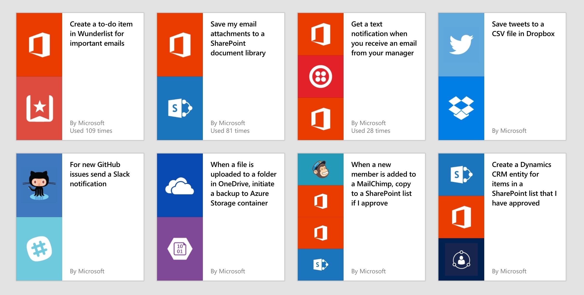
Microsoft has entered the web automation space with Flow, a new service currently in public preview that aims to connect multiple web apps together. Microsoft describes Flow as a way to “create automated workflows between your favorite apps and services to get notifications, synchronize files, collect data, and more”.

From the Microsoft blog:

Microsoft Flow makes it easy to mash-up two or more different services. Today, Microsoft Flow is publicly available as a preview, at no cost. We have connections to 35+ different services, including both Microsoft services like OneDrive and SharePoint, and public software services like Slack, Twitter and Salesforce.com, with more being added every week.

I took Flow for a quick spin today, and it looks, for now, like a less powerful, less intuitive Zapier targeted at business users. You can create multi-step flows with more than two apps, but Flow lacks the rich editor of Zapier; in my tests, the web interface crashed often on the iPad (I guess that’s why they call it a preview); and, in general, 35 supported services pales in comparison to the hundreds of options offered by Zapier.

Still, it’s good to see Microsoft joining this area and it makes sense for the new, cloud-oriented Microsoft to offer this kind of solution. Flow doesn’t have the consumer features of IFTTT (such as support for home automation devices and iOS apps) or the power of Zapier (which I like and use every day), but I’ll keep an eye on it.


Day One Adds IFTTT Integration

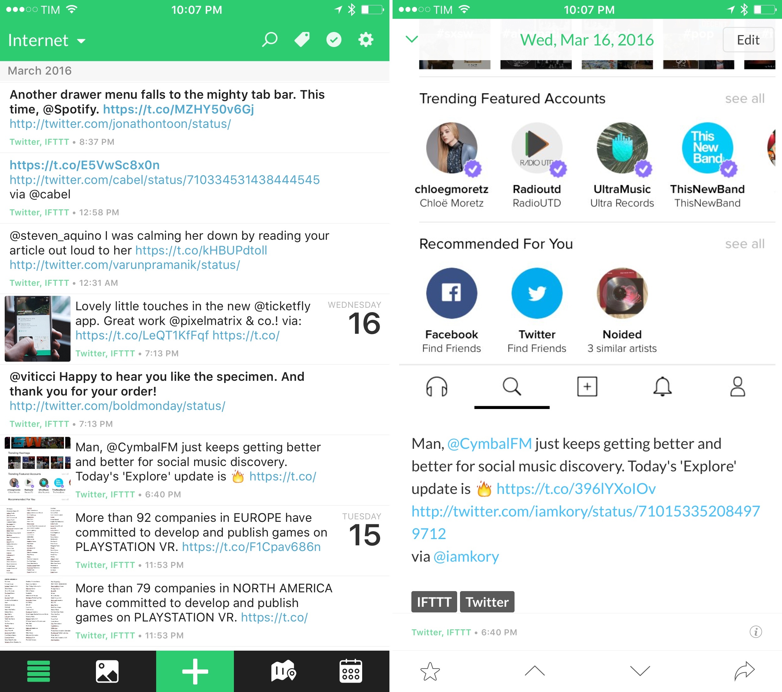
Great change for those who want to populate their journal entries with content from the web: Day One has launched their IFTTT channel today, which will let you create all sorts of automated recipes such as saving Instagram pictures to a journal, emailing a new entry to yourself, or logging check-ins from a third-party service.

Much as Day One 2 was criticized for ditching iCloud and Dropbox in lieu of its own sync, integrations like this are always better when the developers can fully control the sync platform they’re using. Thanks to Day One Sync and support for multiple journals, you can connect to IFTTT and set your recipes to save data into a dedicated journal separate from your main thoughts (something that bugged me a few years ago with a similar solution).

I’ve been playing around with the beta of Day One + IFTTT, and it works well. I have recipes to save liked tweets and YouTube videos to an ‘Internet’ journal, and I’m planning to build more soon. If you use Day One and IFTTT, this is a fantastic addition.


On Google’s iOS Apps

MacStories readers and listeners of Connected are no strangers to my criticism towards Google’s Docs suite on iOS. For months, the company has been unable to properly support the iPad Pro and new iOS 9 features, leaving iOS users with an inferior experience riddled with a host of other inconsistencies and bugs.

Earlier today, Google brought native iPad Pro resolution support to their Docs apps – meaning, you’ll no longer have to use stretched out apps with an iPad Air-size keyboard on your iPad Pro. While this is good news (no one likes to use iPad apps in compatibility mode with a stretched UI), the updates lack a fundamental feature of the post-iOS 9 world: multitasking with Slide Over and Split View. Unlike the recently updated Google Photos, Docs, Sheets, and Slides can’t be used alongside other apps on the iPad, which hinders the ability to work more efficiently with Google apps on iOS 9.

Today’s Google app updates highlight a major problem I’ve had with Google’s iOS software in the past year. One of the long-held beliefs in the tech industry is that Google excels at web services, while Apple makes superior native apps. In recent years, though, many have also noted that Google was getting better at making apps faster than Apple was improving at web services. Some have said that Google had built a great ecosystem of iOS apps, even.

Today, Google’s iOS apps are no longer great. They’re mostly okay, and they’re often disappointing in many ways – one of which1 is the unwillingness to recognize that adopting new iOS technologies is an essential step for building solid iOS experiences. The services are still amazing; the apps are too often a downright disappointment.2

No matter the technical reason behind the scenes, a company the size of Google shouldn’t need four months (nine if you count WWDC 2015) to ship a partial compatibility update for iOS 9 and the iPad Pro. Google have only themselves to blame for their lack of attention and failure to deliver modern iOS apps.


  1. I could mention the slowness to adopt iOS 9 across their other apps, or the lack of Picture in Picture and background audio in YouTube, or the many problems with rich text in Google Docs, or the lackluster iOS extension support across all their apps. ↩︎
  2. And for what it’s worth, Apple’s services still leave a lot to be desired, too – especially Siri. ↩︎