
As a Mac and iOS developer, web designer, Unix lover and all around coder, Kapeli’s Dash has become an indispensable part of my workflow. Version 3 of the reference tool was released recently, and it continues to be a tool I’d be lost without.
Posts in reviews
Dash 3: A Coder’s Best Friend
Klok Puts Interactive Time Zone Conversions in a Widget
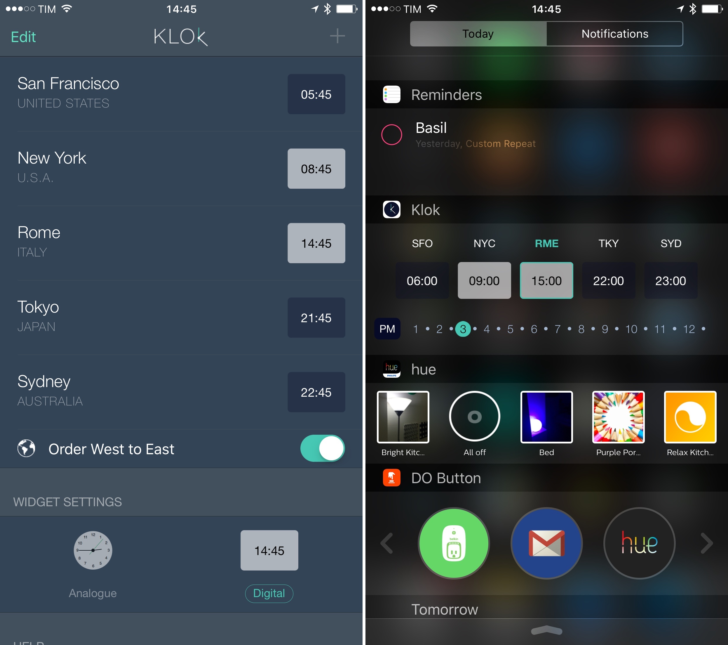
Developed by buUuk, Klok isn’t the first iPhone app to make different time zones available from a Notification Center widget. However, unlike similar apps I’ve used before, Klok allows for basic interactions in the widget, which can be useful when comparing different times at a glance without having to calculate differences between them.
Linky 5.0 Brings Better Sharing for Twitter on iOS with Images, Textshots, and More
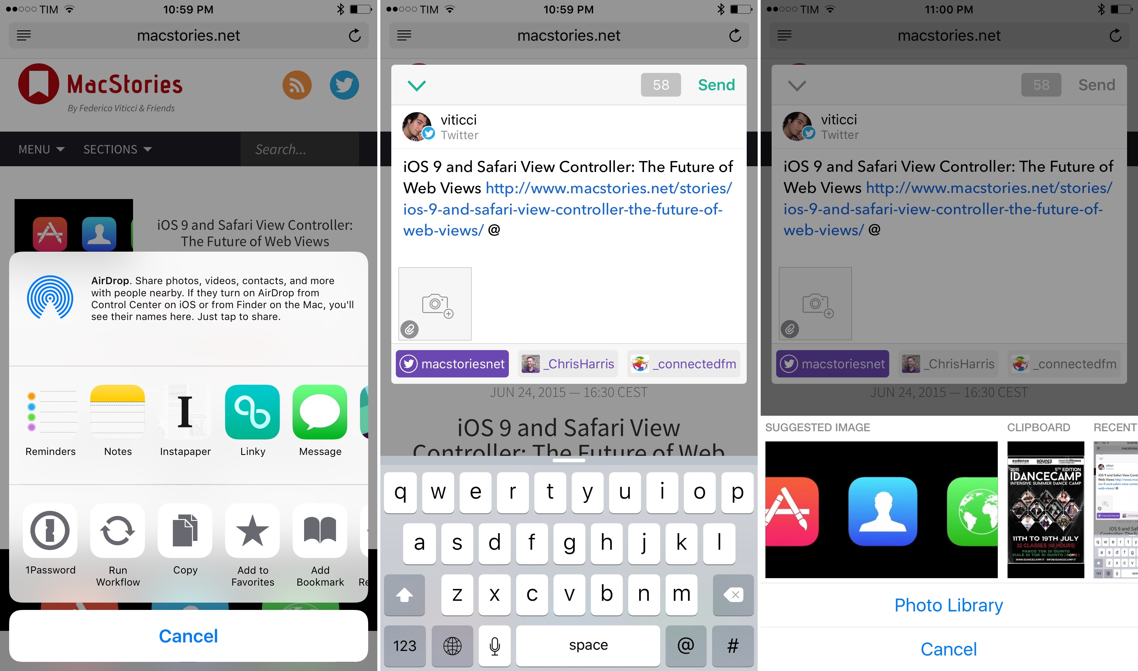
I covered Linky for iOS back in September, when the app’s iOS 8 update added a share extension that turned Linky into a supercharged share sheet for Twitter and Facebook thanks to excellent integration with any iOS app. I wrote:
Linky the share extension is a great way to tweet links from Safari on iOS 8. Once enabled, Linky will appear as an extension of Safari and other apps that can share URLs such as Instapaper or a Pinboard client. The design of the app’s composer is minimal and easy to understand. You can switch between accounts by tapping the profile picture, tap buttons to insert the title or link of a webpage (if they’ve not been automatically inserted), and there’s a character counter in the bottom right.
For the past nine months, I’ve been using Linky every day to tweet links and quotes from Safari and other apps. Unlike the built-in Twitter share extension, Linky comes with thoughtful touches such as highlighting for links and text that exceeds the 140-character count – if you share dozens of links on a daily basis, the convenience of details adds up, and Pragmatic Code found a good niche for Linky to thrive.
The problem with Linky was that it worked well for text, but it didn’t have support for images. Tweeting screenshots from my camera roll or so-called textshots accompanying links to articles has become a common practice for me, but Linky couldn’t be part of my social sharing workflow whenever I needed to post something that wasn’t just text. Linky 5.0, released today on the App Store, wants to fill this gap with built-in support for images – but like prior releases, there are several hidden details that make the experience of sharing with Linky superior to alternatives on iOS.
Editorial 1.2 Brings Powerful New Text Editing Features, More iOS Automation
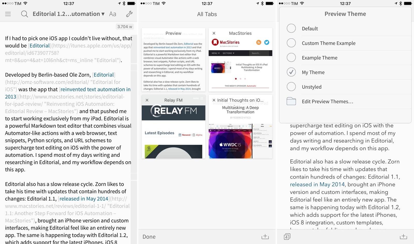
If I had to pick one iOS app I couldn’t live without, that would be Editorial.
Developed by Berlin-based Ole Zorn, Editorial was the app that reinvented text automation in 2013 and that pushed me to start working exclusively from my iPad. Editorial is a powerful Markdown text editor that combines visual Automator-like actions with a web browser, text snippets, Python scripts, and URL schemes to supercharge text editing on iOS with the power of automation. I spend most of my days writing and researching in Editorial, and my workflow depends on this app.
Editorial also has a slow release cycle. Zorn likes to take his time with updates that contain hundreds of changes: Editorial 1.1, released in May 2014, brought an iPhone version and custom interfaces, making Editorial feel like an entirely new app. The same is happening today with Editorial 1.2, which adds support for the latest iPhones, iOS 8 integration, custom templates, browser tabs, folding, and much more.
Editorial 1.2 with iOS 8 support is launching right after Apple’s announcement of iOS 9, but the wait has been worth it. The new version builds upon the excellent foundation of Editorial 1.1, and the enhancements it brings vastly improve the app for users who rely on its automation features and Python interpreter.
Rather than covering every single change, I’ll focus on the 10 new features that have most impacted the way I get work done with Editorial on a daily basis.
Spark Review: Smart Email
I’ve had a complicated relationship with email over the years. Part of the problem has been the Sisyphean effort of third-party apps that tried to modernize email: the more developers attempted to reinvent it, the more antiquated standards, platform limitations, and economic realities kept dragging them down. I’ve seen email clients for iOS rise and fall (and be abandoned); I’ve tried many apps that promised to bring email in the modern age of mobile and cloud services but that ultimately just replaced existing problems with new ones. Sparrow. Dispatch. Mailbox. CloudMagic. Outlook. Each one revolutionary and shortsighted in its own way, always far from the utopia of email reinvention on mobile.
Spark by Readdle, a new email app for iPhone released today, wants to enhance email with intelligence and flexibility. To achieve this, Readdle has built Spark over the past eighteen months on top of three principles: heuristics, integrations, and personalization. By combining smart features with thoughtful design, Readdle is hoping that Spark won’t make you dread your email inbox, knowing that an automated system and customizable integrations will help you process email faster and more enjoyably.
I’ve been using Spark for the past three weeks, and it’s the most versatile email client for iPhone I’ve ever tried. It’s also fundamentally limited and incomplete, with a vision that isn’t fully realized yet but promising potential for the future.
Rewind: Location-Based Time Tracker for iPhone
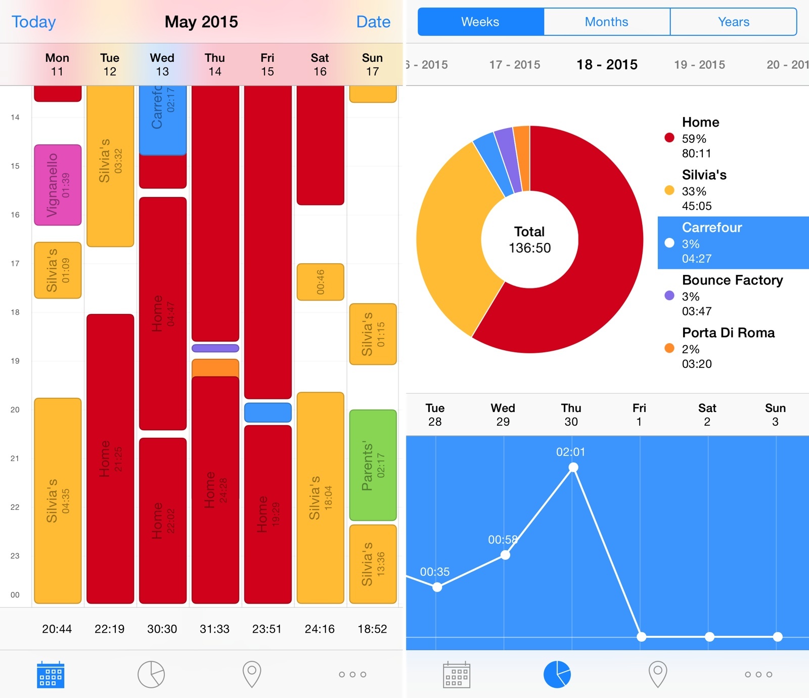
I’ve always been interested in tracking my location and how I use my time. I’m a highly visual person, and the ability to see where my time is being spent helps me optimize my schedule and tweak my habits accordingly. Unfortunately, polished and full-featured time tracking apps like Hours haven’t scaled in the long run for me – the time I want to track isn’t spent working for clients or freelance jobs, and I always forget to launch an app and start tracking time. The time I want to track is my personal, every day routine; the Google app for iOS can track locations and times continuously in the background, but its visualization is lackluster and not optimized for mobile.
Rewind is an automatic time tracker by noidentity (makers of the excellent Next for iOS) that I’ve been using on my iPhone since early March. Through location tracking and an elegant breakdown of statistics, Rewind does exactly what I want from a mobile time tracker: it tracks where I spend my time automatically in the background, every single day.
Alternote Review: Minimalist Markdown Evernote App for OS X
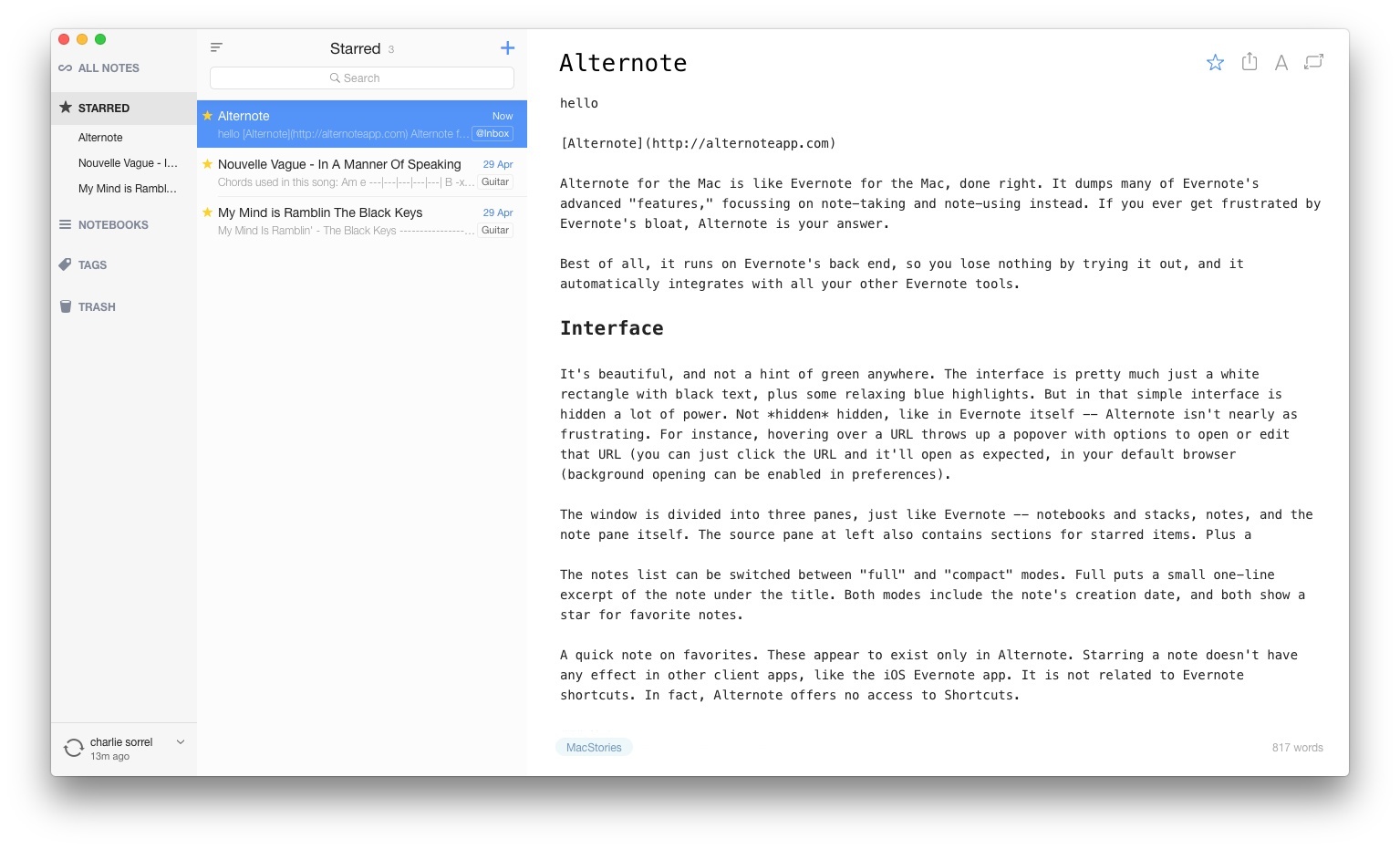
Alternote for the Mac is like Evernote for the Mac, done right. It dumps many of Evernote’s advanced “features,” focusing on note-taking and note-using instead. If you ever get frustrated by Evernote’s bloat, Alternote is your answer.
Best of all, it runs on Evernote’s back end, so you lose nothing by trying it out, and it automatically integrates with all your other Evernote tools.
Read more
Review: JamStik+ Is More Game Controller Than Musical Instrument
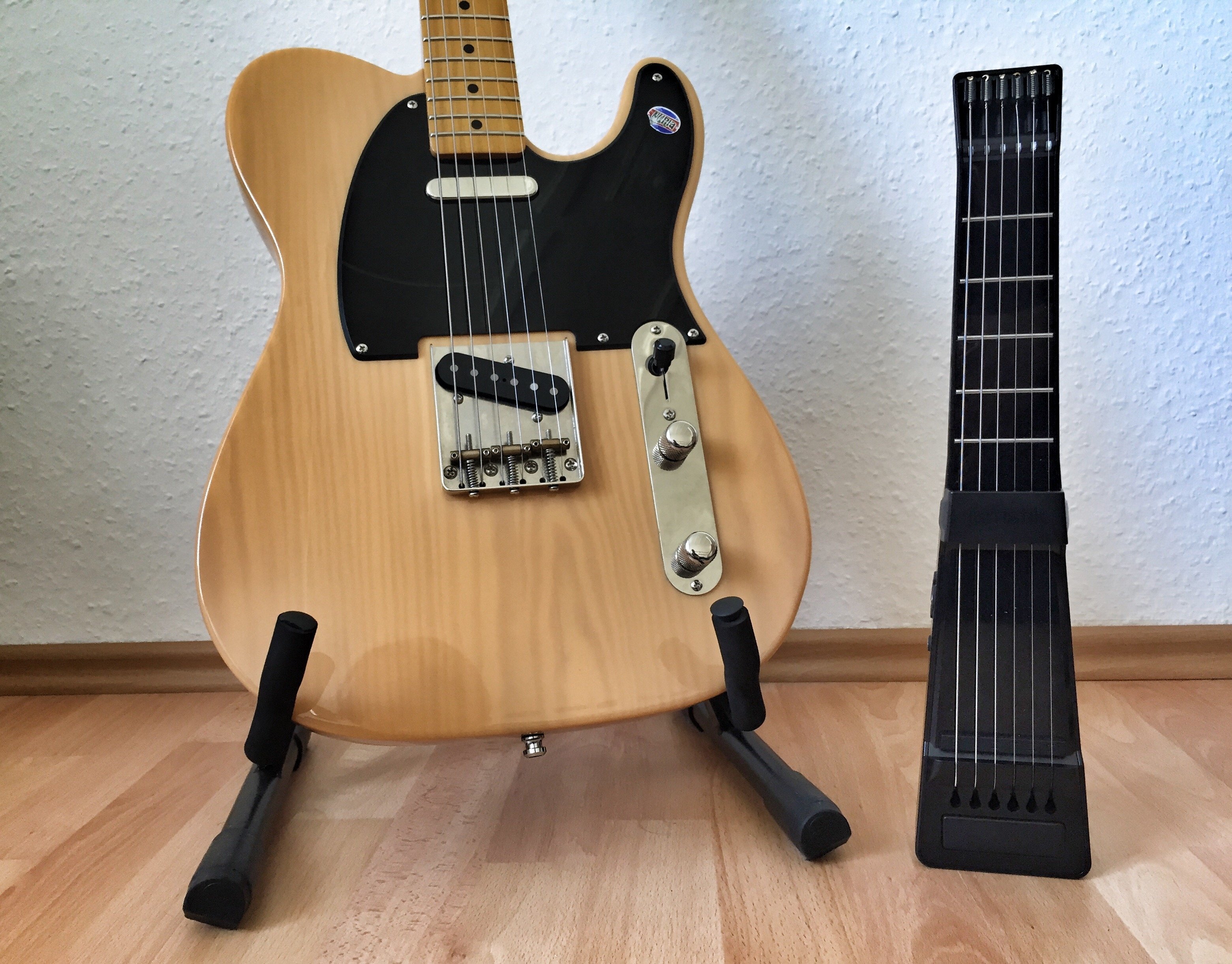
The JamStik+ is two things: a guitar learning tool, and a guitar-like MIDI controller[1]. It’s also pitched as a travel guitar, or at least, something a guitarist can use to practice when on the road, but – as we’ll see – it performs that duty rather badly. You should also know that the JamStik+ is a Kickstarter project, and follows the rules of all Kickstarter hardware/software combos. That is, the hardware is good, but the apps are not.
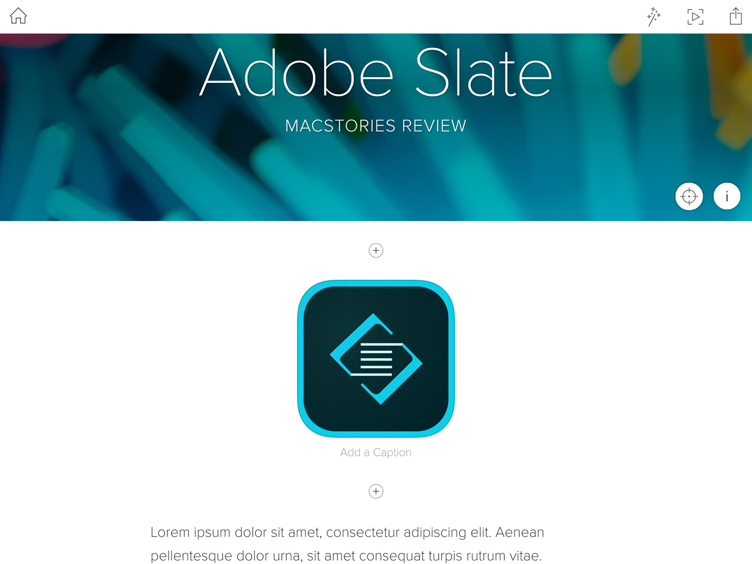
Adobe Slate Review
In recent years Adobe has made a concerted effort to develop a collection of mobile apps that make it easy to accomplish various creative tasks. But rather than make one monolothic app that does everything (like Photoshop on PCs), they’ve been splitting up features into many apps that each focus on a different, and specific, creative aspect. For example, there is Adobe Brush CC, which enables you to create custom brushes for Photoshop and Illustrator based off photos you take on your iPhone or iPad, or Adobe Color CC, which will create a custom color palette from your photos. As Adobe has continued to release more and more of these apps every few months, their efforts have become more and more impressive. Adobe now has a sizeable collection of mobile apps that are some of the most technically impressive and well designed apps available on the iPhone and iPad.
Which brings me to Adobe Slate, one of the most recent additions to Adobe’s mobile app stable. Unlike many of their other apps which directly integrate and complement Adobe’s desktop apps like Photoshop or Illustrator (such as Brush and Color, described above), Slate is its own distinct product. Adobe describes Slate as a tool to “turn any document into a beautiful visual story”, which is actually quite a good way to describe it. A more mechanical way of describing Slate would be that it is an iPad-only app for creating a webpage (not a website) for situations where the content you want to share or display is a mix of text and images.
I recently had an assignment at university that permitted a more creative format and layout than the typical essay or report. Because I had heard about Adobe Slate launching a few weeks earlier, I decided to test it out. I ended up submitting my assignment as a webpage created with Slate, and I really enjoyed using it and think the result was pretty great.[1]
Read more