One of the side effects of Apple going all-in on iOS file management with its new Files app is that it made me finally attempt to get my act together and better organize my files. Unfortunately, I was initially disappointed by the limited organization options in Files. For my root iCloud Drive folder I...
 Q&A
Q&A
Question: I use Bear for quick capture of ideas, and Ulysses for longer writing. I was trying to send a note from Bear to Ulysses via the share sheet on iOS, but I can’t get Ulysses to turn up as an option. Any other ideas for the simplest way to do this? Same question for...
Things 3

There’s one funny fact that seems true of nearly everyone who relies on a task manager: no matter how happy we may be with our current system, we’re always open to trying out the newest, shiniest solution brought into the world by developers. Things 2 was the task manager I initially bought into when...
Ulysses 12: Writing on iOS Has Never Been Better
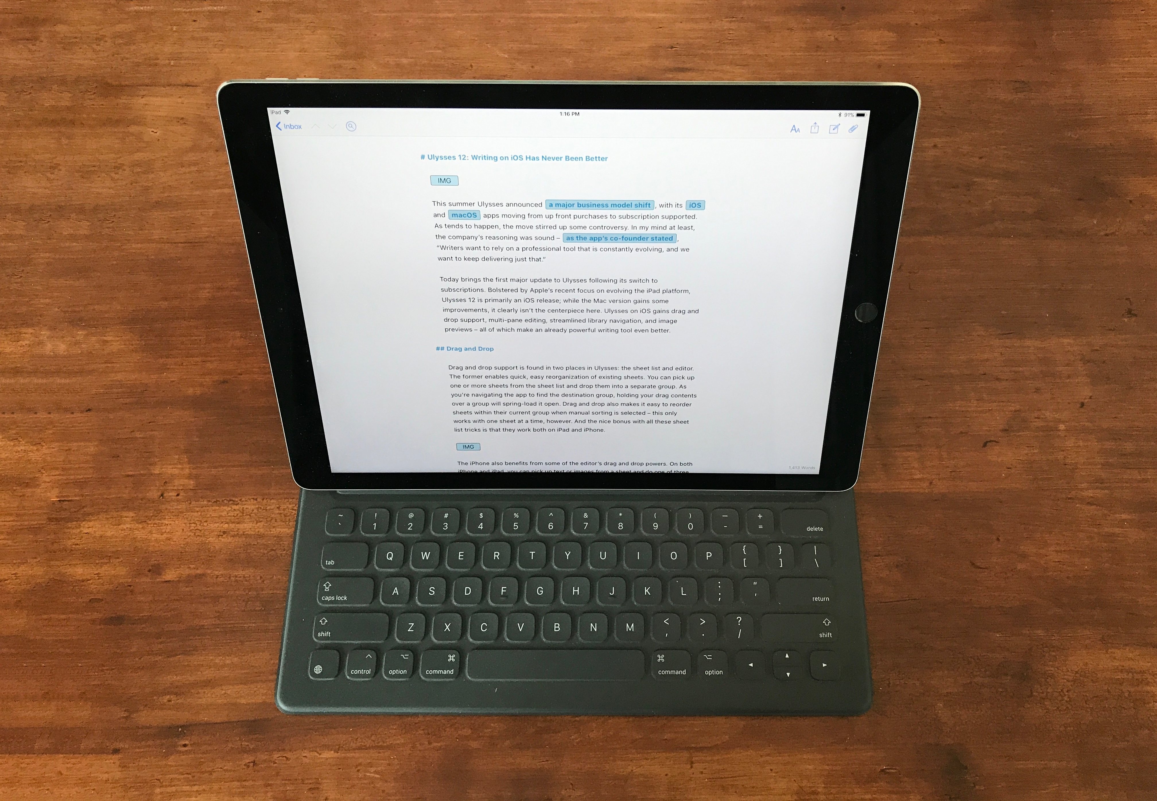
This summer Ulysses announced a major business model shift, with its iOS and macOS apps moving from up front purchases to subscription supported. As tends to happen, the move stirred up some controversy. In my mind at least, the company’s reasoning was sound – as the app’s co-founder stated, “Writers want to rely on a professional tool that is constantly evolving, and we want to keep delivering just that.”
Today brings the first major update to Ulysses following its switch to subscriptions. Bolstered by Apple’s recent focus on evolving the iPad platform, Ulysses 12 is primarily an iOS release; while the Mac version gains some improvements, it clearly isn’t the centerpiece here. Ulysses on iOS gains drag and drop support, multi-pane editing, streamlined library navigation, and image previews – all of which make an already powerful writing tool even better.
Microsoft Outlook for Mac Undergoing Major Redesign→
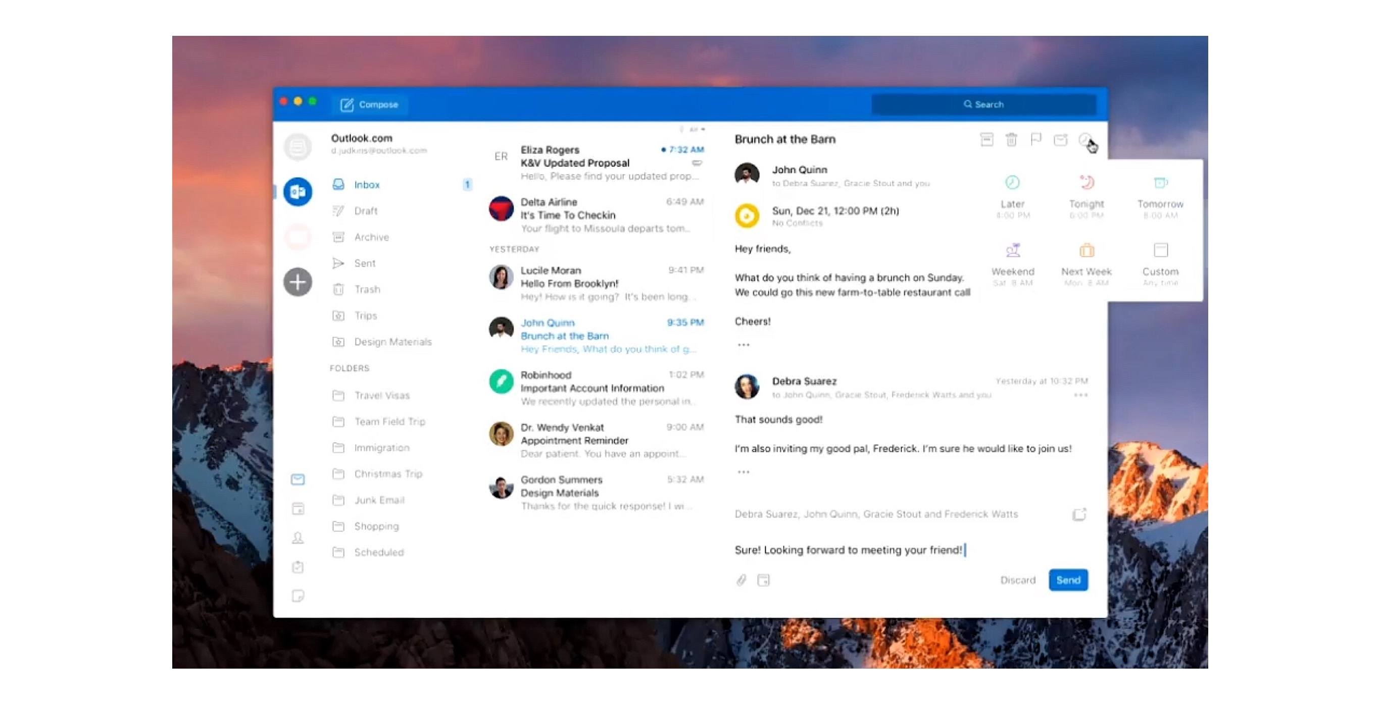
Tom Warren of The Verge reports on Outlook for Mac details shared at the Microsoft Ignite conference last month:
A lot of the changes look very similar to the Outlook for iOS app, with a single-line ribbon and a smaller set of default commands. Reducing complexity is one of the key aims of the redesign, to make it easier for new and existing Outlook users to navigate the email app.
A new customizable ribbon will let Outlook for Mac and Windows users control which buttons are available, so you can tailor the email interface to your own common tasks. The left navigation panel will include quicker access to folders across multiple accounts, and looks like the switcher in Outlook for iOS.
Outlook for iOS has long been among the top email clients on the mobile platform. It pairs a clean, beautiful interface reminiscent of iOS’ Mail.app with the power user features Apple appears content to ignore. Moving Outlook for Mac away from its traditional desktop roots and further into the modern era looks to be a clear win.
The full Ignite session detailing future Outlook changes is available on YouTube.
Notebook

Notebook by Zoho is a relatively new player to the iOS notes game, debuting in mid-2016 and quickly expanding to a variety of other platforms. Squarely aimed at targeting Evernote’s market, Notebook is now available on iOS, Mac, Android, and in a web version. My only experience is with the iOS app, but based...
More Great Shelf Apps to Boost iPad Productivity
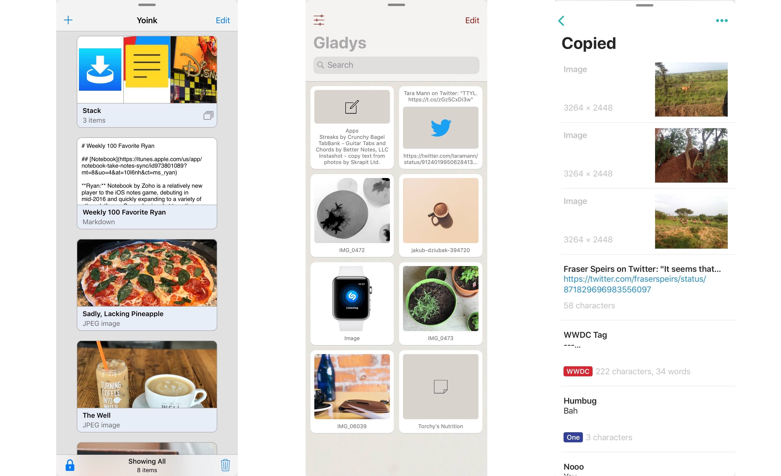
Last month after iOS 11’s launch I pulled together a roundup of iPad apps belonging to a whole new category of apps. Dropped, Workshelf, The Shelf, and Scrawl Pouch all launched as manifestations of Federico’s dream for a drag and drop-powered temporary holding place for content on the iPad. If you’re unfamiliar with this concept, here’s how I described it in my last shelf roundup:
The need for a shelf springs from the addition of drag and drop to iOS 11. It’s not always practical to drag content directly from one app to another; sometimes you know you’ll need that content soon, but you’re not ready to drop it elsewhere yet. Additionally, in some situations you may wish to drop the same data into multiple places over a short period of time, and it can be cumbersome to re-open the data’s source app to pull it out multiple times. A shelf can solve these problems: it serves as a temporary resting place for anything you know you’ll need quick access to soon. In this way it can serve a role similar to the macOS desktop, which is commonly used as a temporary holding zone.
While all the apps I originally highlighted continue to fill this role well, several additional quality apps have launched that bring new things to the table in this young category of apps.
CARROT Weather Adds New CARROT Voices, Weather Underground Improvements, and More
Within a matter of a few months, CARROT Weather has launched a major new version, then followed up with a fun AR mode, and now with version 4.2, it’s adding several key refinements to improve the overall experience.
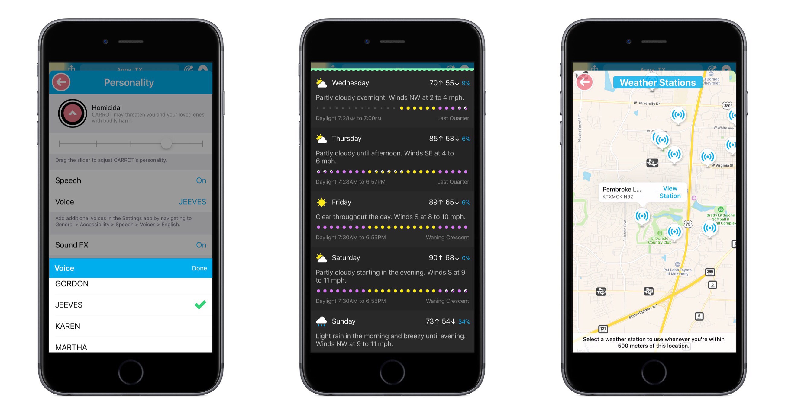
CARROT’s snarky personality is the defining characteristic of the app, yet recent updates have seen that personality gain customization options – both for users wanting more snark, and those begging for less. With today’s update, CARROT goes through perhaps an even more drastic transformation. From the Personality screen in Settings, there are now a variety of new voices that can be set for CARROT, including both female and male options. Among these is FRED, the voice used for the original Mac. My personal favorite is JEEVES, whose smug butler tone makes me feel inferior in a way I thought only the original CARROT could.
Users of CARROT Weather’s alternative data source, Weather Underground, get a couple nice updates in this release. Now, available weather stations can be seen and selected from a map view, making it much easier to get the absolute most accurate data for your current location. Also, severe weather alerts are now available for all of Europe so you’ll be kept in the know regarding official hazards.
If you prefer your weather app to provide a little more business, a little less party, CARROT’s Professional mode has been enhanced in a couple ways. Not only will the maniacal A.I. be de-snarked when set to Professional, but now the little characters and animals in illustrations will be hidden by default as well, AR mode will present a more civilized CARROT, and secret locations can now be turned on.
Premium subscribers have a new vertical view option for daily weather info, which can be accessed from Settings ⇾ iPhone/iPad ⇾ Daily ⇾ Details. I’ve found that I prefer the vertical view over the default horizontal, and I enjoy how it still fits right in with the setting of a landscape – when details slide up from the bottom, it feels like you’re simply delving deeper below the surface.
CARROT Weather keeps getting better. The additions in version 4.2 aren’t blockbuster features, but they make for an overall more complete package. Now users with all kinds of weather and personality preferences can benefit from this top-notch app and customize it to their liking. Without losing its distinct sense of flare, CARROT Weather is quickly becoming a weather app for everyone.
CARROT Weather is available on the App Store.
Spark Adds Key Email Productivity Features: Send Later and Follow-Up Reminders
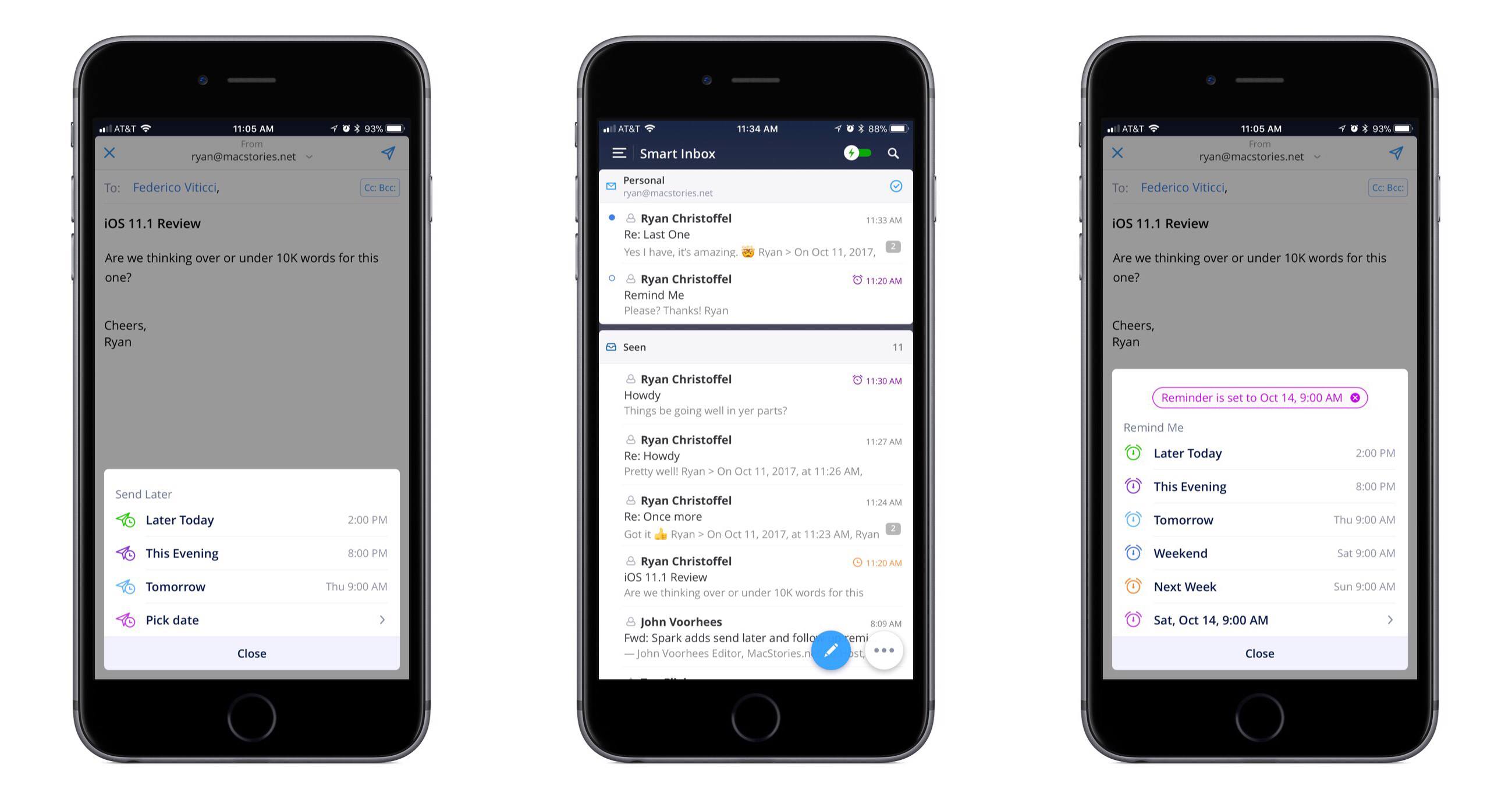
In updates to Readdle’s Spark app for iOS and macOS released today, the email client gained two key power user features: send later and follow-up reminders.
Send later works exactly as you would expect. When composing an email, hitting the send later button in the compose bar will present several default options for when you’d like the message sent: Later Today, This Evening, and Tomorrow. Perhaps the most common use case will be responding to emails late at night and wanting them to send as soon as the next work day kicks off, which the Tomorrow option is perfect for. Thankfully, you can also set a custom date and time. Once you schedule the delivery time, Spark will take care of the rest.
With follow-up reminders, there are five default options joining the custom date picker: Later Today, This Evening, Tomorrow, Weekend, and Next Week. This feature serves to stifle a key pain point I’ve regularly encountered in email management: reminding me to follow up on an email when I don’t receive a response.
In the past I’ve tackled this problem by pairing my email client with a task manager, such that after sending an important, time-sensitive message, I would assign myself a task to follow up with a second email on a certain date in the future. The problem with this approach is that it requires two apps, and that my task manager has no way of communicating with my email inbox – it doesn’t know if I received a response to the message or not, meaning I may end up with an unnecessary task on my list. Integrating this function within an email client is exactly the right move, and Spark does it well. When your set follow-up point arrives, if you haven’t received a response yet, the sent message reappears at the top of your inbox with an icon denoting it’s a reminder. It’s easy from there to open the original email and send a quick follow-up.
The team at Readdle continues adding functionality into Spark that sets it apart as a true productivity-focused email client. With third-party integrations, snoozing, deep customization options, and now the ability to send later and receive follow-up cues, Spark is growing into an email powerhouse that every power user should give a serious look.