Even before iOS and iPadOS 14 brought a new form and function to widgets on Apple platforms, one of the tried and true widget use cases in previous years was task lists. Some of my most used widgets over the years have been those provided by my task manager, so I was excited to see the slate of new widgets Todoist has introduced in its latest update for iPhone and iPad.
Before detailing the new widgets, though, it’s important to state up front that for all the advantages of iOS 14’s new widgets, they bring a regression that negatively impacts task managers especially: widgets can no longer be fully interactive. In the iOS 13 widget for Todoist, you could check off tasks as you completed them without needing to open the full app. With the app’s new widgets that’s no longer possible, because the only interactions Apple currently allows in widgets is launchers into different parts of an app. The good news is that apps are allowed to offer both iOS 13 and iOS 14 widgets to users, so on iOS 14 Todoist users will find both options available. If you really need the old functionality it’s still available to you, there’s just no way to add a legacy widget to the Home screen.
That bad news out of the way, let me focus on how Todoist’s team has made the most of the new widget system in a couple key ways.
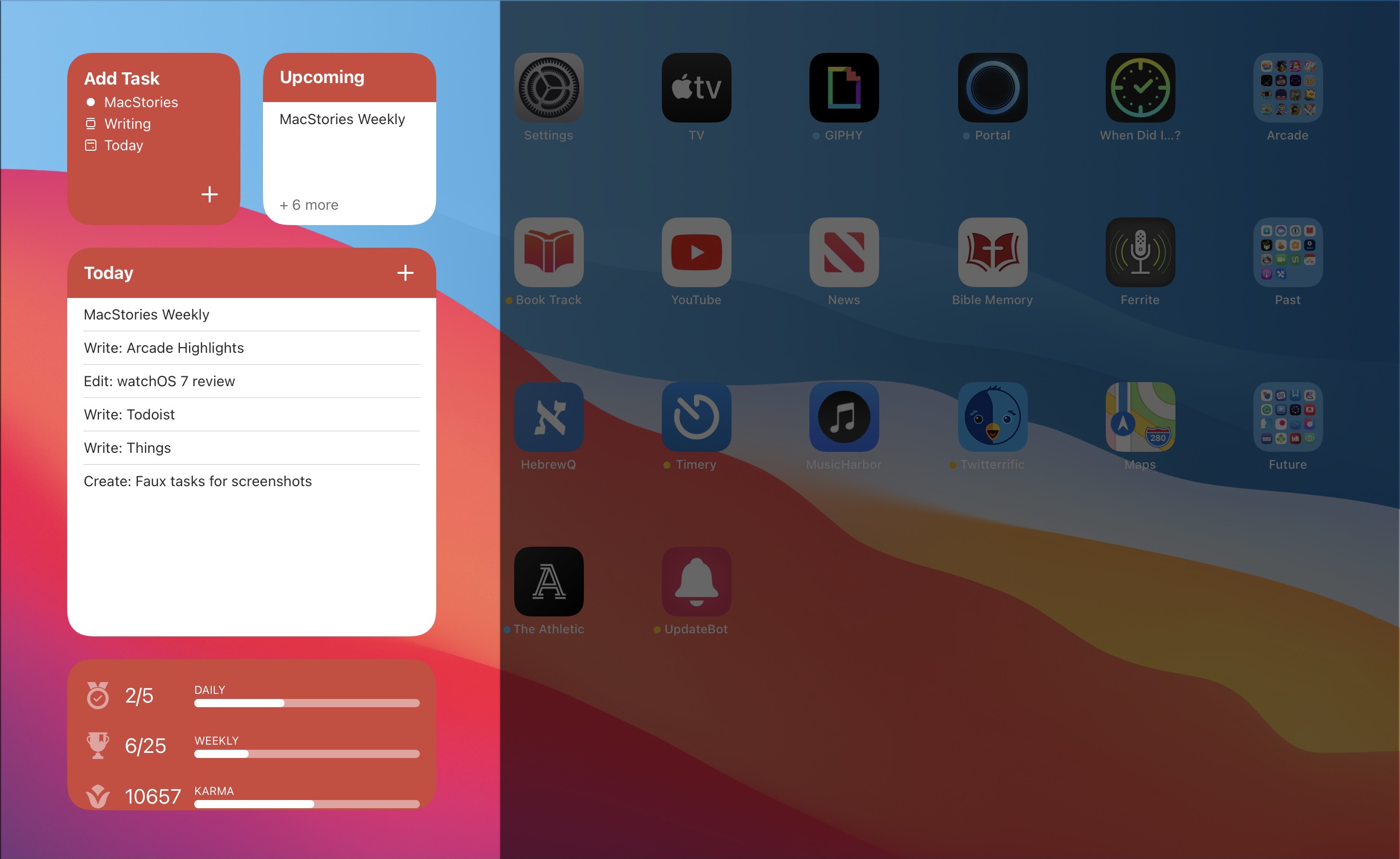
Let’s start with its basic Tasks widget. In iOS 14 you can configure a list of your tasks to appear in either a small, medium, or large widget. Each widget can be set to show tasks from your Today or Upcoming lists, or one of your projects, labels, or filters. Despite being unable to check off tasks from the widget, there are two advantages over Todoist’s previous widget: information density and the ability to create multiple widgets. Since Todoist’s developers no longer need to create large touch targets for users to check off tasks, the widget is able to display a bit more information than before. And you can now create separate widgets tied to separate lists of tasks, even stacking them if you’d like, offering a lot more flexibility than before.
Besides widgets for lists of tasks, Todoist offers two other widget types: Productivity and Add Task. The former displays stats relating to your task completion goals for the day and week, along with your karma score. I’ve never been big on tracking the number of tasks I complete in a given day, but the Productivity widget’s nice to have for users who care about those numbers. The Add Task widget, however, is exactly what I would want from every task manager.
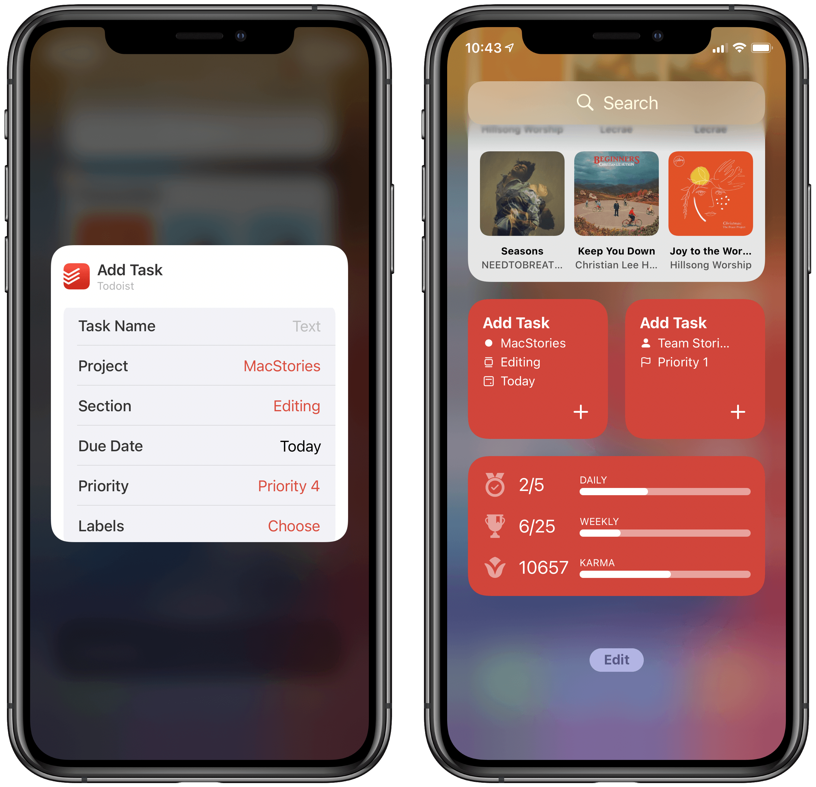
Both the medium and large Tasks widgets already offer a button to quickly create a new task inside Todoist, but the dedicated Add Task widget is special because it can be customized to create tasks that have their metadata pre-filled. You can set which project and section the newly created task will have, its due date, priority, labels, and even the task name if there’s a specific task you commonly create. Once it’s set up for your preferences, the Add Task widget eliminates the monotony of filling in metadata over and over again for every new task. If you commonly create tasks assigned to a certain project and with a certain due date, the widget is now the quickest way to do that.
Add Task is only available as a small widget and as a result it can only have a single group of pre-sets for creating a single type of task, but that makes it a perfect candidate for stacking. Using a few different Add Task widgets for different types of common tasks you create and having them stacked will still provide a faster task creation method than having to enter the metadata over and over with every new task.
Todoist already offered the fastest task creation of any task manager I’ve used thanks to its natural language input system, but now with the Add Task widget it provides an even faster method. Todoist’s developers have clearly spent time considering the needs of their users and have built a suite of widgets that meet those needs well. The OS restriction against full interaction will hopefully be removed in the future, but even if it never is, Todoist has delivered value with its new widgets that more than makes up for what it lost.
Todoist is available on the App Store.