Lukas Hermann

69 posts on MacStories since April 2012

Former MacStories contributor.

This Week's Sponsor:

Collections Database

A Powerful Database with iCloud Sync


Airlines Increasing Fuel Efficiency By Adopting The iPad As An Entertainment Device

Airlines Increasing Fuel Efficiency By Adopting The iPad As An Entertainment Device

Bloomberg reports today that startup airline Scoot Pte (their maiden flight is today) will save fuel and have increased profits by deploying the iPad as the passenger entertainment device. By cutting out old entertainment systems weighing more than two tons, they’ve saved fuel while still flying older airplanes and even expanding traditional seating capacity by 40 per cent. Increasing profit, the post-PC way.

The tablets helped the carrier cut 7 percent off the weight of planes obtained from parent Singapore Airlines Ltd. (SIA) even after a 40 percent increase in seating, Chief Executive Officer Campbell Wilson said. The savings will help Scoot, which makes its maiden flight today, cope with fuel prices that have jumped about 36 percent in two years.

Scoot Pte will rent the iPads for $17 a flight to economy-class passengers and offering them for free to those in business class. It follows moves by other airlines such as Jetstar, AirAsia and Qantas which have deployed the iPad in trials and small test runs since late last year.

Cutting costs and finding new sources of revenue will be key for Singapore-based Scoot as it seeks to make a profit flying older planes than other low-cost carriers and selling tickets as cheap as S$158 one-way to Sydney, a flight of more than seven hours. Singapore Air formed Scoot after budget operators led by Jetstar and AirAsia Bhd. won 26 percent of the city’s air-travel market.

By reducing fuel costs, parent company Singapore Airlines hopes that it can turn over a new leaf with Scoot after it tumbled 28 percent this year, exceeding the 14 percent decline for the Straits Times Index. It’s really crazy to think that something like the iPad can have such a huge impact on fuel efficiency of airplanes - today’s story is on top of  the existing trend of airlines replacing flight manuals with iPads that Tim Cook gladly shared earlier this year.

Scoot plans to increase its fleet to as many as 14 777s by the middle of the decade. The carrier will be able to pare maintenance costs by working with its parent, Wilson said.

Permalink

Ecclesia Is A Stunning Audiovisual App Experiment

Usually, I’m a quite drastic purist when it comes to music. Music is art for the ear, and made for distraction-free listening. That’s the reason why I consider music visualization as rubbish most of the time. I never liked to look at computer-generated 3D figures, which are randomly moving without being truly connected to the music.

But then I found an interesting interview on Overlapps with Eric Wahlforss, the founder and CTO of SoundCloud, the well-known social sound sharing network. He is musically active under the pseudonym Forss and recently released a new album titled Ecclesia. The record is available for free (when you sign up to Forss’ newsletter) on his website, where you can also listen to every song off it completely. But his real engagement with this album lays in the idea of making it multi-layered by creating a visualization app with 3D graphics, effects, and movement connected to the music. Together with the design studio untouch.fm and designer Leo Lass, he created an iPad app with extensive visuals to enhance his newest record with some stunning 3D artwork. Read more


Review: DM1 Drum Machine for iPad

The day the iPad was unveiled, the whole Apple community screamed that the device would change the way we look at arts and be the center of any kind of creation process in mankind’s mobile future. While this mainly came true for writing and visual arts (think of apps like iA writer or procreate), it still lacks when it comes to mobile music making. Due to the absence of multiple optical inputs like FireWire, the iPad is not suited to be the only mobile recording studio. After the first wave of electronic music software with the KORG line (iElectribe, iMS-20, iKaossilator etc.) as the most prominent example, new electronic music production environments got very rare. I was very excited, however, when I saw this new iPad drum machine on Beautiful Pixels called DM1 Drum Machine. The demo video of Fingerlab’s new product promised a decent, easy, but powerful workstation on the road for a very fair price, so I downloaded it.

And DM1 didn’t disappoint me. The DM1 was the very first drum machine software I ever bought for iOS devices; I tried iElectribe once on a friend’s iPad, but even that iconic (and expensive) app seemed more like a toy than a serious musical instrument to me. On the iPad, I am after professional software, something that encourages me to create awesome music. And because you cannot impress through the haptic feel of a synth on a flat screen, you need UI simplicity combined with a stunning feature set to get your product to the user. With the DM1, I  finally found a music app that fulfills those needs.

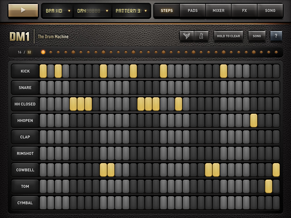
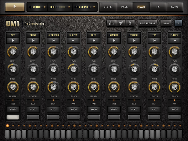
In their demo video, Fingerlab shows a 3D animation of the DM1 as a Little Phatty-like workstation with several areas for its five different main features: a step sequencer, drum pads to manually enter beats, a mixer for each sequenced kit part, effects, and song information with structuring options. In the real app, those five features are available via the top selection bar right beside the three most basic selecting options to set the basis for a song – BPM, selected sound, and the currently played pattern, and a play button. In the following lines, I’ll firstly dive into each of these parts, and cover the visual arrangement, DM1’s production possibilities, and some features I’d wish for in future app updates to make the app even more pro-oriented.

Step Sequencer and Sounds

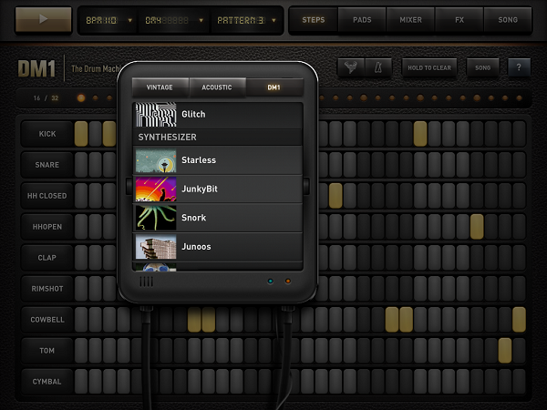
In terms of the provided variety of sounds, DM1 is the most professional effort I’ve seen to date. 19 classic drum kits (e.g. the iconic Roland machines TR-808 and TR-606), 19 acoustic sets from Ludwig drum kits to Cello sounds and Wurlitzer pianos, and 26 DM1-only kit including Bristol-styled beats and freaky synth sounds speak for themselves. In the 16/32-step sequencer, these sounds are divided into 9 kit parts: kick, snare, open and closed Hi-Hat, clap, rimshot, cowbell, tom, and cymbal. The sounds connected to these parts vary a lot, so it can occur (especially when using a synth sound) that the app plays melodic elements on the rimshot and cowbell steps.

This brings us to creating sequences with the step sequencer. In both 16 and 32 mode (which is twice as long, not twice as fast) tapping single steps works flawlessly; aiming and selecting is easy. The 4 bars are separated using different shades of grey, and they can also be easily identified using the LEDs on top, where each beginning bar is indicated with a bigger one.

Clearing steps is just as simple; you can even drag you finger around the whole screen and every step you swipe over is getting activated or de-activated, depending on what your first tap did. If this still is not fast enough for you, ou can also use the “hold to clear” button below the feature selection panel. This and the nearest three buttons (metronome, a very functional random rhythm creator, and the obligatory, very neatly implemented help menu) are also available over multiple screens.

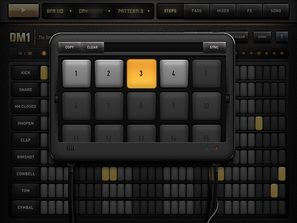
Any time you change a single step, it is automatically saved in the activated pattern. You can create up to 25 different patterns, which then can be arranged to a final piece in the “song” section (I’ll come to that later). If you want multiple patterns (which are built upon each other to create an evolving rhythm), you can also copy one pattern into another slot, add some elements to it, and the basic beat will still be the same.

Drumpads

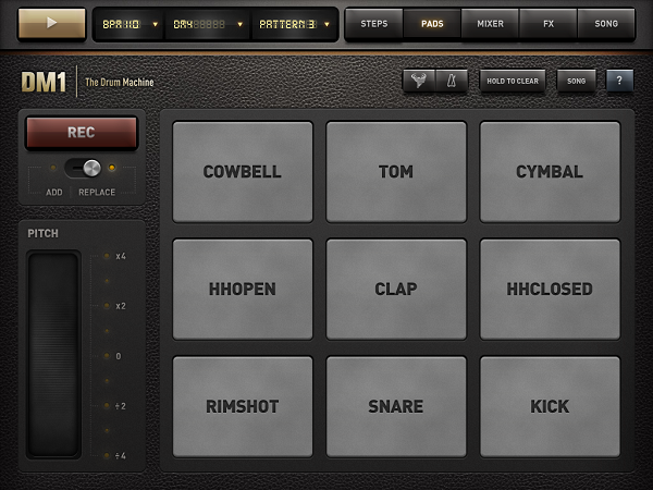
If you’re better at playing than imagining or experimenting with new rhythms using the sequencer (when you come from drumming for instance), you can use the drumpads combined with the integrated quantized recorder to teach the sequencer the rhythms you have in your head. The pads are really big and very responsive, even when double-tapping with two fingers to create a 16 step Hi-Hat beat.

Unfortunately, the app doesn’t play a bar solely with the metronome before a recording begins, so you have to wait four whole bars until you can input your beats properly. But the conversion into the single steps works perfectly and instantly. To make the recorded beats even more personal, there’s a large, functional pitch-shifting ribbon to customize the sequence further (this can also be applied after the four bars are recorded).

Mixing and Customizing Single Steps

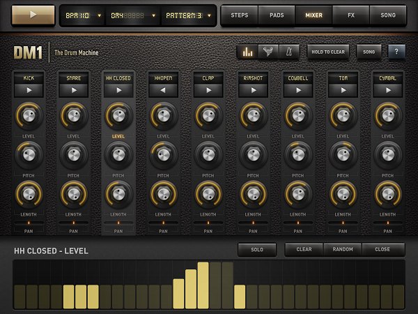
The third big feature is the most used out one, with which you can edit any part of the available kit anyhow you can imagine: the kit mixer. In a moog-styled layout you can customize every sound in level, pitch, and length to make it sounds just the way you want it. You can reverse the whole sound of a step by holding the play button, and pan the part to the right or left to create a stereo effect. Set the sound on solo mode and use the bottom bar to add or delete steps for a specific track. But the to me, the most powerful feature is the velocity leveler that you can bring up by tapping the diagram-like button in the nav bar. Although the upcoming vertical bars (of which lighter ones indicate active, changeable steps) are not perfectly responsive to sliding to change their level, you can create crescendos and decrescendos with one tap here, something I always use when I start a new project.

FX and Song Timeline

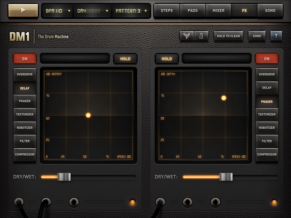
The fourth way to customize your sequences is the FX section. It’s powerful, but also pretty hard to handle properly. Here’s why: you can select an effect (overdrive, delay, phaser, etc.), set the dry/wet mix portion, tap the red “on” button, and the effect is immediately applied to your mix. Yet most of the time, you’ll then think: “This is destroying the whole thing”. The reason for that lies within the two-axis field which is used to set the two main parameters of the effects; for instance, when using the delay, these parameters are Repeat (y-axis) and Speed (x-axis) with respective values from 0 to 100. Unlike the velocity columns, this is very responsive. Every time you move the LED dot indicating the current setting just a little bit, the sound changes more or less completely. As you see, this offers both a huge amount of treasured sounds, but can be completely counterproductive.

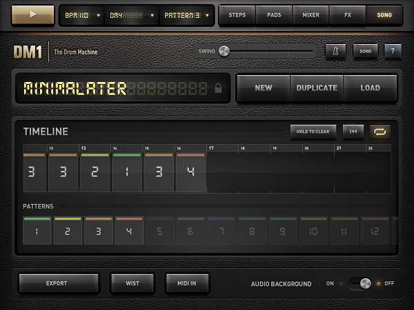
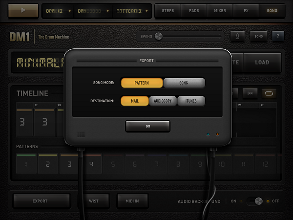
If you’re done creating, editing and customizing your sounds, tap the song panel to turn “just playing around with a drum machine app” into serious business. Here you can make an actual song out of your single beats; just drag and drop patterns into the timeline, and tap the play button to listen to your arrangement. If you like what you hear, you can export the song (or single patterns)as a .wav file to iTunes or send it via mail. You can even sync in via WIST to another device with the DM1 installed to have it on all of your devices or share your work with friends or colleagues.

Fingerlab also integrated AudioCopy to send the created beats to a variety of other music production apps like FourTrack or AirWrench. Other features in the song panel include MIDI Input (using auto or pre-selected channels to enable plug and play using a USB Camera Connection kit) and a swing option to play around with the overall song rhythm.

User Interface

The biggest issue I had with the app’s design was a really impudent one considering the immense feature set: the DM1 does not have Retina graphics. The features all worked great – my problem with the app was that it didn’t look nice. But this would need just an update, and considering the rest of the UI, I definitely excuse this lack.

I mentioned the 3D version of the machine the devs designed to visualize the feature set. This also makes the UI more understandable. Using the cool designed popups and the top navigation bars is easy after watching the demo video – don’t get me wrong, the app is very intuitive even if you don’t watch any demo, but it takes some time to find out how every feature works.

The leather background fits very well with the sepia tones the designers used for the buttons, text panels, and other controls. I disliked some buttons’ 3D look though, especially the square ones like the play button. Nevertheless, the UI design fits the needs of the feature set, making it understandable and flexible, and – what’s most important – it never privileges any feature to ensure that you will equally find and use all of them. Ultimately, this is the most intriguing aspect of the DM1: you always use every part of it and are thrown into a very clear but flexible workflow – which is optimized for mobile use, but still feels very professional and delivers great outputs.

Wish List

What follows now is something I normally avoid; I consider myself in a position to review and criticize existing features, but not suggest new ones. With music apps, though, it’s a little different. I use several desktop products including GarageBand and Ableton Live, and I always think about which features could be transferred to mobile apps while using them. DM1 offers many of such features, but some – even quite simple and obvious ones – are still missing in my opinion, and they could be easily added to make the app even more stunning.

First: better organization. If you like the app as much as I do, you will create many projects to dive into all those sounds and effects. And you’ll enjoy that for sure. What you won’t enjoy, however, is finding your favorite sounds and saved songs again. Both are displayed in one single list with dividers for categories which completely lack of folders, tags or anything. And especially the list of saved songs is designed way to small for the iPad’s large screen. A simple folder structure within this list could solve this problem, and having a separate list for your favorite sounds would also be pretty useful.

Secondly, I would like to remind developers of such professional software that iOS devices have multitouch. Please make use of it. It would’ve been both intuitive, very cool, and useful to use, say, two-finger swipe to switch between panels.

Last, but certainly not least, I imagined many possible extra features while using the DM1 to extend it up to the situation where you can have it it as your sole production platform, not just on the road, but also at home. In my opinion, the app doesn’t need not that much to reach that position. What it misses are basically just three things: 1) more options to create melodies like more synth kits (or maybe just indicating existing melodic steps better) to create whole songs with beat, basslines and hooks, 2) the creation of own drum kits on the go, and 3) the capability of applying different effects to different patterns. Currently, the two effects you set are applied to the whole song, whether you like it or not (they even cannot been disabled for single patterns). Some ideas in this direction would turn this drum machine into a full-featured workstation.

Wrap Up

I urge you to get DM1 Drum Machine for your iPad. If you’re into music and rhythm and whether you have experience in using sequencers or not, you will have a lot of fun with the app. It is flexible and offers an incredible amount of directions your sound can go. And, believe it or not, this whole package is available for just $4.99 in the App Store.


Change Displays Your Stock’s Current Value

Every time I think that there are enough stock and weather apps for iOS, I find a new one. And every time, I think something like “Please, let this one be cool”. Of all the apps that I regularly check out as a possible new topics, just 1% of them is usually worth a try. The rest is rubbish. When it comes to weather and stock apps, though, that rubbish part is also somehow twice as large. It’s as rare as an edelweiss in the Sahara that a new app with such purposes can offer a unique concept. Change by Jon Wheatley, however, is a perfect example of uniqueness and simplicity applied to stock UIs on the iPhone.

Wheatley reduced his app’s feature set to the question any stock owner always asks himself: have I gained or lost money with the stocks I own? Nothing more, because let’s be honest – more data is typically for the intellectual academics who call themselves stock analysts when reviewing iOS apps. Change is divided in two parts: a main information window, and a detailed list view to add or delete stocks you own. No preferences, no graphs, no predictions – just the current situation of your investments.

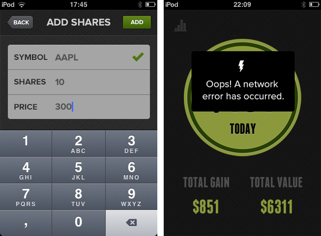
After the first launch, you have to enter the information about the stocks you own. Adding new ones afterwards is just a tap on the top right + button away. In the second panel, you have to type in the amount of stocks you own, the price you paid for them, and the stock symbol (like AAPL) of the respective company. Although the developer kindly implemented number fields for the first two panels, he did not manage to implement a search feature for the symbols, something which is totally common and useful, and definitely needs to be added in future updates.

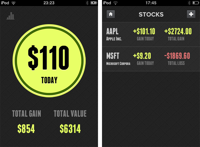
What follows is an easy calculation in the background. The overall difference (all entered stocks are included in the main window) between your stocks’ value today and the time you bought them is then displayed in a large circle in the center of the screen. If it’s red, you lost money; if it’s green, you gained some. Additionally, you get your total gain (or loss) over time and the total value of your stocks via smaller numbers below the circle.

Tap on the diagram button in the top left corner, and you get to the mentioned list view where you can also add new stocks you recently purchased. Here, a more detailed look at single stocks is provided: you can see which part of your portfolio was more profitable today and over time.

Besides the fact I had to restart Change the first time I tested it (it crashed when I refreshed the calculation by tapping the circle), Change ran flawlessly on my iPod touch 3rd Gen. The simplicity in functionality can also be seen in the app’s UI. There are no distracting tones except for the aforementioned red and blue colorization of the circle. This way, nothing is distracting the user from the app’s purpose: easily displaying changes in stock value. The rest of the app is monochrome and easy to overview – this is mainly the case due to the very tastefully chosen sans-serif typefaces in which the headlines and information are set, and the subtle, but unique background texture.

Change takes the area of stock surveillance into a whole new direction: simplicity. And another great decision Wheatley made with Change is the app’s price: you can get Change for free on the App Store.


Mailsum Enhances Your Mail Account Surveillance

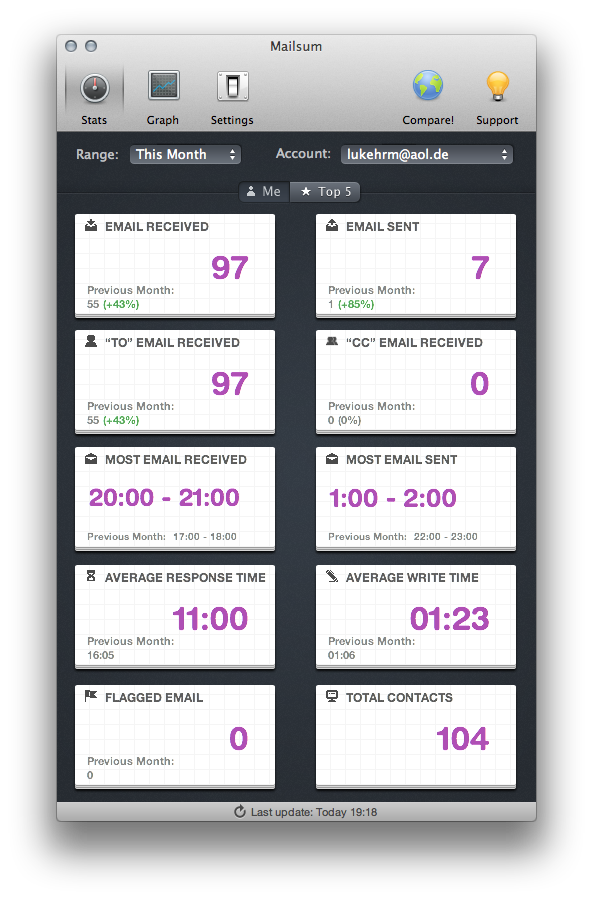
When it comes to email clients, most Mac users still stick to Apple Mail as their client of choice, although there are plenty good alternatives available. The reasons for that are clear: over years of constant development, improvement and changes, Apple managed to create a powerful, but still clearly laid out program, which fits the needs of both private and professional business users. Diversified labelling options, multiple mail signatures, folders, and diversified reply and creation features are just some examples. Nevertheless, there are still some people out there demanding one specific feature Apple mail lacks: statistics. But, as you know, there’s always an app for that. In this case, it’s Mailsum by Appmasters. Read more


CleanMyDrive Instantly Frees Your External Drives From Junk

I am a huge fan of MacPaw products. The company’s care for consistent UI design combined with huge functionality is well-known all over the Macintosh community, and I use their apps pretty frequently. In fact, Gemini was the topic of my first MacStories post.

MacPaw remained makers of desktop software only, even after the iPhone came out; this is a move I personally like a lot, as you find less well-designed Mac apps than iOS utilities nowadays, and it feels good to see some guys focusing on the desktop business. MacPaw’s newest product, CleanMyDrive, is a stripped-down, menubar version of their first and most popular app CleanMyMac, and it fulfills the task of silently freeing your external HDD and flash drives from unwanted junk data or duplicates.

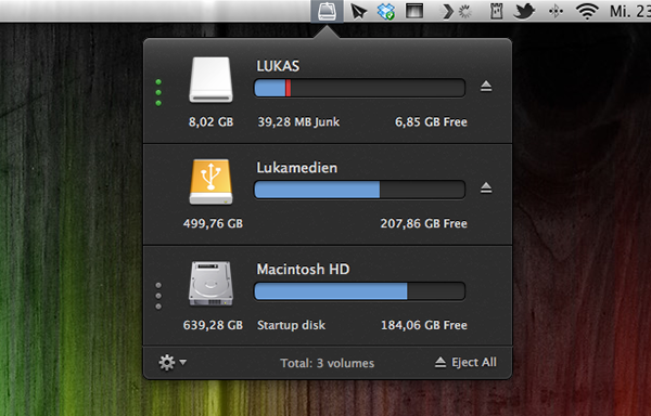
After installing the app, CleanMyDrives sits behind a nicely crafted hard disk icon in the menu bar. Click on it, and a dropdown window appears; from there, you can control the app’s features. The biggest advantage of making CleanMyDrive a menubar utility is that it’s invisible until you really need it. Now, every time you connect an external drive to your Mac CleanMyDrive will check its capacity and data — when it recognizes new ones, you’ll be asked whether it should check them as well in the future or not. The amount of used and free space is shown in a horizontal bar using blue and white parts.

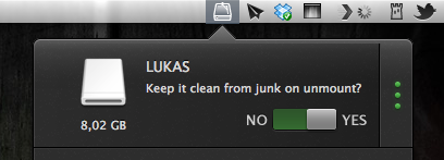
If CleanMyDrive finds junk files on one drive (things like DS_Store, Thumbs.db, Spotlight, hidden trashes and so on), it displays their portion in red (plus the exact size in MB on hover), and you can delete them instantly. If you’re lazy and don’t want to manually delete the found junk on your drives all the time, CleanMyDrive can automatically delete junk every time you eject a drive, too.

After testing the app with my USB drives, I can say that it did not delete any of my files and folders, but still freed some space – likely related to “junk” accumulated over time.

Because the app is focused on smaller drives, CleanMyDrive firstly only scans external drives with 64 GB of storage or less. However, you can change that in the preferences to any size limitation you like and even disable it completely to also include large external HDDs. However, CleanMyDrive can’t check your internal drive for junk. One could already have guessed so from the app’s name, but as the internal drive’s storage is nevertheless shown in the app’s window, I tried to scan it as well. At this point, the developers allowed themselves some advertising for their other product: the app brazenly recommended me to scan my internal drive with CleanMyMac.

For cleaning my external drives, I’ll definitely stick with CleanMyDrive; this almost instant decision was mainly made due to the app’s fantastic and — yes, that’s the way I felt about it — cute design. The UI is clutter-free, simple, and it makes intelligent use of sliding effects and hover controls; it’s fun to use. The app’s small preference window plus the rotating cog wheel to open it up — little details, something I like very much — rounded up my impression of it as a cute little companion to ease up your workflow.

CleanMyDrive can be a very useful utility, especially when you’re using (maybe even several) external drives. Plus, its unobtrusiveness and pleasant user experience make for a very useful package which comes for free for a limited time. So don’t hesitate and grab CleanMyDrive on the Mac App Store while it’s hot.


Review: FontBook for iPad

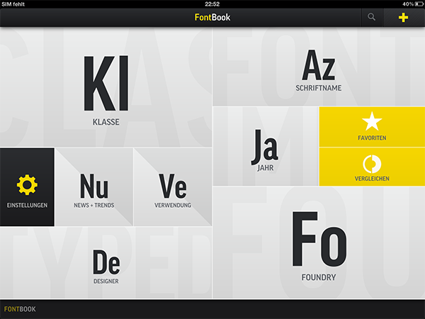
I’m a typography addict. Since I watched Gary Hustwit’s “Helvetica” documentary film, I constantly follow several type foundries and blogs (of which I consider I Love Typography and Typedia the top-notch sites) to keep myself updated on the latest news and typefaces. Hence after I saw the introduction of FontBook by FontShop (which was recently updated to version 2.1 with a Retina-optimized UI), the app was an instant-buy for me. Finally I can discover new typefaces, designers, and foundries wherever I go, offline, just with my iPad.

I usually discuss an app’s design separately at the end of a post, but FontBook has to be an exception from that, since the app itself is showing perfect use of digital typography and content curation — in no other area of design, content and design are connected as closely as in typography. FontBook is developed by a 10 person team at FontShop, one of the largest and the longstanding typeface resellers on the Internet, founded by renowned Erik Spiekermann in 1989, so it is no real surprise that it executes this need for exact design with pure perfection. Read more


Procreate Is A Full-Featured Mobile Easel And More

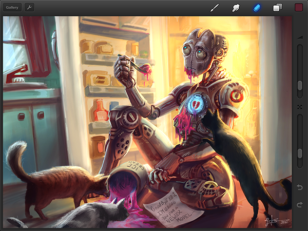
The biggest reason for why I always wanted to become a writer is because I’m not good at creating visual art. I like to look at any kind of great art — from the old masters to talented dribbble users — and this love for well-crafted visual arts helped me getting to write here at MacStories. I’m better at talking about cool pixels than creating them. However, three days ago I bought my first iPad, and Procreate by Savage Interactive is considered one of the finest apps when it comes to using all the capabilities of the new Retina display.

After testing it for some time, I have to say that Procreate seems to be a perfect companion for artists when it comes to digital sketching and painting on the road. It’s a full-featured creation app, not forcing the user to cut back in functionality at all. Before I dive in deeper into its feature set, let me shortly recap the app’s main elements and controls.

Read more


Bang On Centralizes Mobile Search

Mobile search is and has ever been a very problematic area. After nearly five years of iPhone, developers are still discussing iOS browser search functionality, speed, and the right way of implementing it into the devices workflow. When it comes to services other than Google or Bing, Apple took the easy way by dividing its mobile OS into multiple apps with each one having its own searching capability (Safari for websites, YouTube for videos, etc.). This trend did not stop after the launch of the App Store: third-party apps like Articles and more recent examples like Spotify rely on their own search engine implementation. Bang On by Derek Kepner might be able to change that. Read more