John is MacStories' Managing Editor, has been writing about Apple and apps since joining the team in 2015, and today, runs the site alongside Federico.
John also co-hosts four MacStories podcasts: AppStories, which covers the world of apps, MacStories Unwind, which explores the fun differences between American and Italian culture and recommends media to listeners, Ruminate, a show about the weird web and unusual snacks, and NPC: Next Portable Console, a show about the games we take with us.
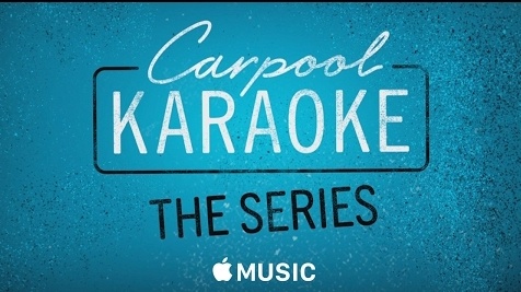
During the Grammys, Apple debuted a one minute preview of its upcoming show Carpool Karaoke: The Series, which will be available exclusively to Apple Music subscribers. The preview video features a montage of clips from the upcoming show including many of its celebrity guests. The notes accompanying the clip uploaded to Apple’s YouTube channel provide additional details:
Based on the segment that has become a global, viral video sensation on The Late Late Show with James Corden, the new CARPOOL KARAOKE series features 16 celebrity pairings riding along in a car together as they sing tunes from their personal playlists and surprise fans who don’t expect to see big stars belting out tunes one lane over.
Featuring James Corden, Will Smith, Billy Eichner, Metallica, Alicia Keys, John Legend, Ariana Grande, Seth MacFarlane, Chelsea Handler, Blake Shelton, Michael Strahan, John Cena, Shaquille O’Neal, and many more.
The question left unanswered by the clip is when the show will be available. For now, it is still ‘Coming Soon.’
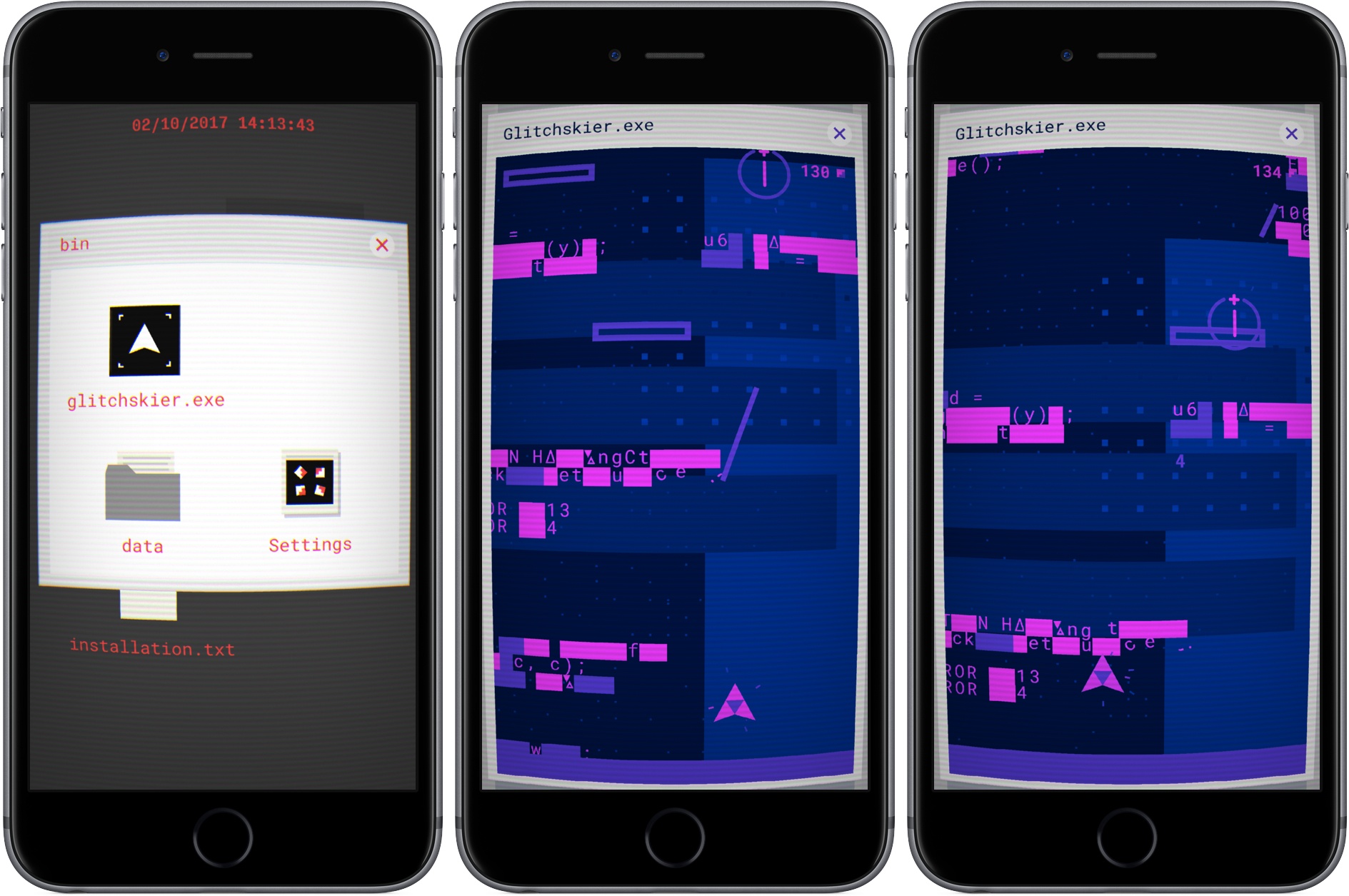
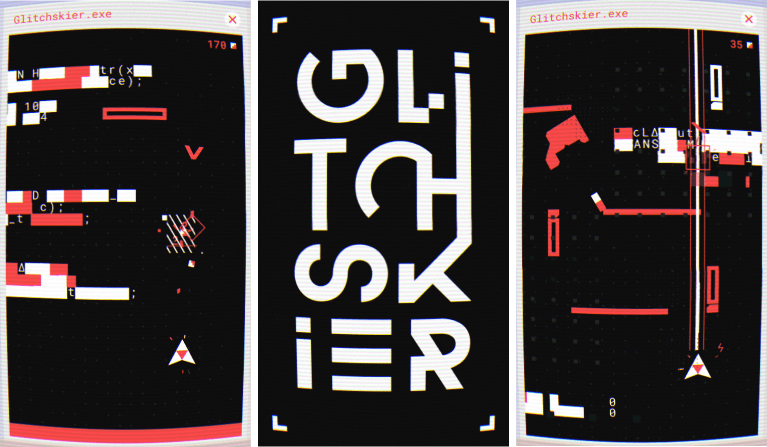
I love puzzle games and have seen some great ones debut on the App Store recently, but now and then, I want to play something different. This week, different meant Glitchskier, an endless runner-style arcade shooter by Shelly Alon. It has an off-kilter video game glitch aesthetic and challenging gameplay that together, hooked me immediately.
From the get-go, Glitchskier takes you back to early PC hardware. The screen is distorted to look like you’re playing on a curved, low-resolution CRT monitor. If the CRT look is too much for you, it can be turned off in settings. In the background, a dull hum and whir of electronics and fan blades add to the atmosphere. It’s an opinionated design that goes all-in with the retro PC look, which may turn off some people initially, but drew me in as soon as I started playing.
To start Glitchskier, you double tap a Windows-style folder and then glitchskier.exe. The gameplay is reminiscent of spaceship shooter games like Galaga. You maneuver your spaceship by dragging your finger around the screen. At the same time, the environment advances down the screen, endless runner-style. That, and the enemies that descend from the top of the screen, make avoiding your ship’s destruction difficult.
Your guns shoot automatically as long as your finger is on the screen. The more things you destroy, the higher your score climbs. As you move through the landscape, there are also weapons to collect that help you defeat enemies and bosses. Make it far enough, and you begin to unlock different colored themes too.
Part of the novelty of Glitchskier is the environment through which you fly your spaceship. The screen is littered with computer glitch obstacles like random characters that form barriers. The chaotic universe and enemies relentlessly descending on you is disorienting at first, but quickly becomes familiar and comfortable when you figure out what can be blasted to bits and what you need to avoid.
The unforgiving onslaught of enemies keeps you on your toes and requires split-second decisions. The sense of urgency is heightened by a synth soundtrack that fits perfectly with the game’s aesthetic and reminds me a little of the excellent Stranger Things soundtrack. But Glitchskier is more than just an homage to 80s arcade games. Beneath its carefully-crafted design is a fun game that’s easy to learn and extremely hard to master. The combination of the two sucks you into Glitchskier’s crazy world in a thoroughly entertaining way.
Disney Stickers: Love Lovely animated stickers featuring Disney characters like Minnie and Winnie the Pooh with a variety of hearts, hugs, and treats. Perfect to share with your partner ahead of Valentine’s Day. Toucan Stickers This toucan’s expression is both mystical and creepy. What does the toucan know that I don’t? Why is it...
I stare at one screen or another almost all day, so when the apps are cleared away, I figure I may as well look at something nice. Apple’s OSes come with some interesting wallpapers, but there isn’t much variety, so they feel old and boring after a while. Fortunately, there are plenty of...
SpellTower Zach Gage’s popular word game has received its first update in 5 years. The new SpellTower comes with a brand new dictionary licensed from Merriam-Webster, redesigned graphics, support for the latest iPads and iPhones (including haptic feedback on the iPhone 7 and a Super Tower mode built specifically for the 12.9” iPad Pro),...
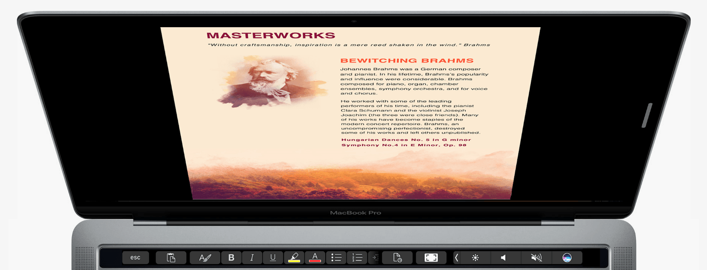
Touch Bar support for Microsoft Office was announced last fall at Apple’s MacBook Pro event and on Microsoft’s blog. Those features are beginning to appear in some of the apps in Microsoft’s Office suite through Office Insider, a public beta program that anyone can join. Touch Bar support is currently available in Word, Excel, and Powerpoint, and is expected to be added to Outlook and Skype later. Although the features are currently only available through the Office Insider program, they should be available to other users later this year. I updated to the latest Office beta and tried its new Touch Bar features.
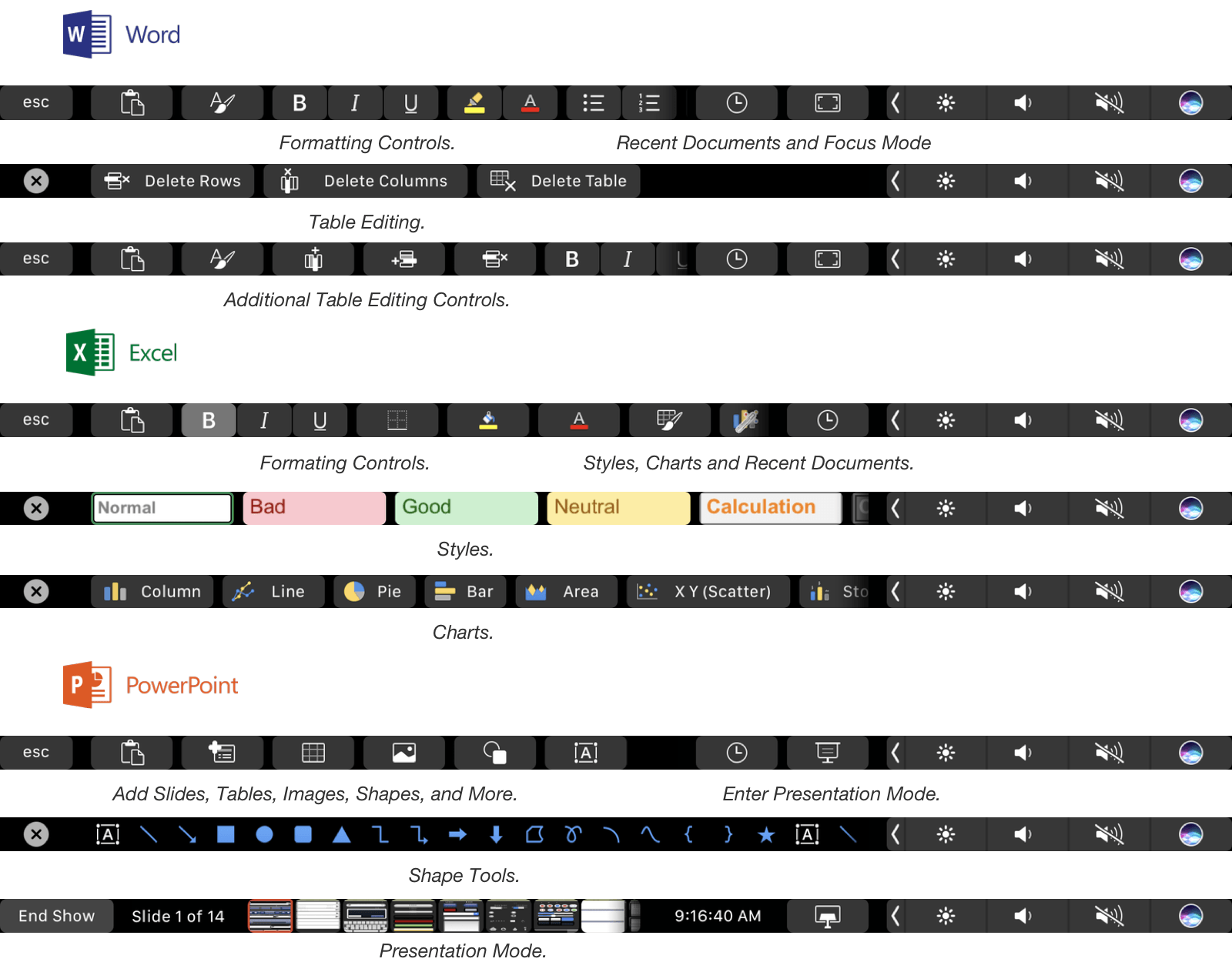
A selection of the Touch Bar functions included in Office.
In Word, Touch Bar support includes formatting, style application, and table editing buttons. A ‘Focus Mode’ has also been added to Word that eliminates all menus, controls and status bars from the app, leaving nothing but the document you are drafting on a black background. Focus Mode highlights one of the best use cases for the Touch Bar. By moving commonly-used controls onto the Touch Bar you get the best of both worlds: an uncluttered minimal writing environment in an app historically known for just the opposite, but with commonly used formatting tools close at hand.
Excel includes formatting buttons similar to Word but adds styling options specific to spreadsheets and quick access to common chart types. The style buttons are particularly nice because the Touch Bar’s OLED display allows the buttons to provide a full-color preview of the formatting that they apply. Excel also shows equation search results in on the Touch Bar as you begin typing one into a cell.
PowerPoint users get a series of mini slide images in the Touch Bar in presentation mode that make it easy to jump to a specific part of a presentation. PowerPoint also includes buttons for adding slides, tables, and shapes. Word, Excel, and Powerpoint have a button that lets you access recent documents from the Touch Bar too.
The Touch Bar is a natural fit for the feature-rich apps in Microsoft’s Office Suite. It feels like there is even more that Microsoft can do with it in each app, but it’s still early in the testing phase, so I wouldn’t be surprised if more Touch Bar functions are added in the coming weeks. If you are interested in testing Office’s Touch Bar support, you can sign up for the Office Insider program here.
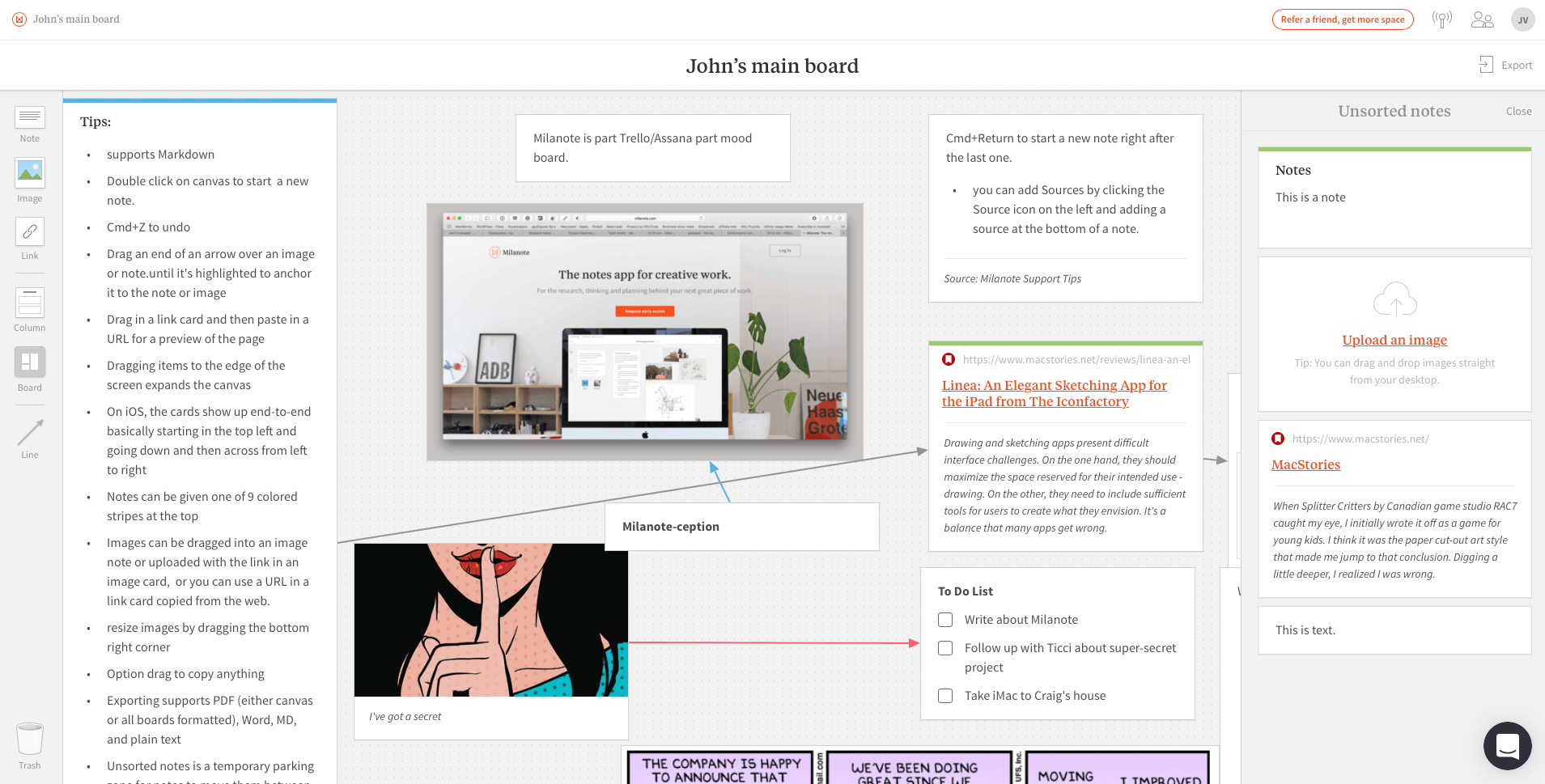
Research is an inherently messy, non-linear process. In a traditional note-taking app, text, links, and images quickly wind up a disorganized mess, and moving items around with cut and paste is cumbersome. Milanote is a free-form note-taking web app designed to bring order to the chaos.
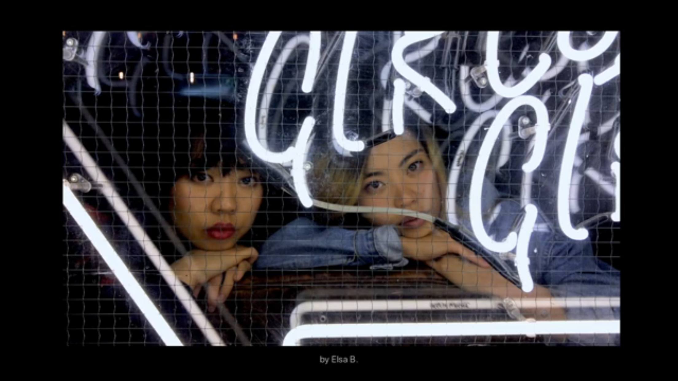
Apple posted a new video to YouTube called One Night on Earth. The video, which is part of Apple’s ‘Shot on iPhone 7’ series, features photographs taken all over the globe on one particular night, highlighting the iPhone 7’s low-light capabilities. The mashup of user-created shots is set to Snowfall, a beautiful jazz piece by the Ahmad Jamal Trio.
When Splitter Critters by Canadian game studio RAC7 caught my eye, I initially wrote it off as a game for young kids. I think it was the paper cut-out art style that made me jump to that conclusion. Digging a little deeper, I realized I was wrong. Splitter Critters is a game that anyone who likes puzzle games will enjoy. What’s more, its gameplay is truly innovative. I should have known better; this is the same team behind Dark Echo, a pioneering game from 2015 based on exploring a strange world through sound.
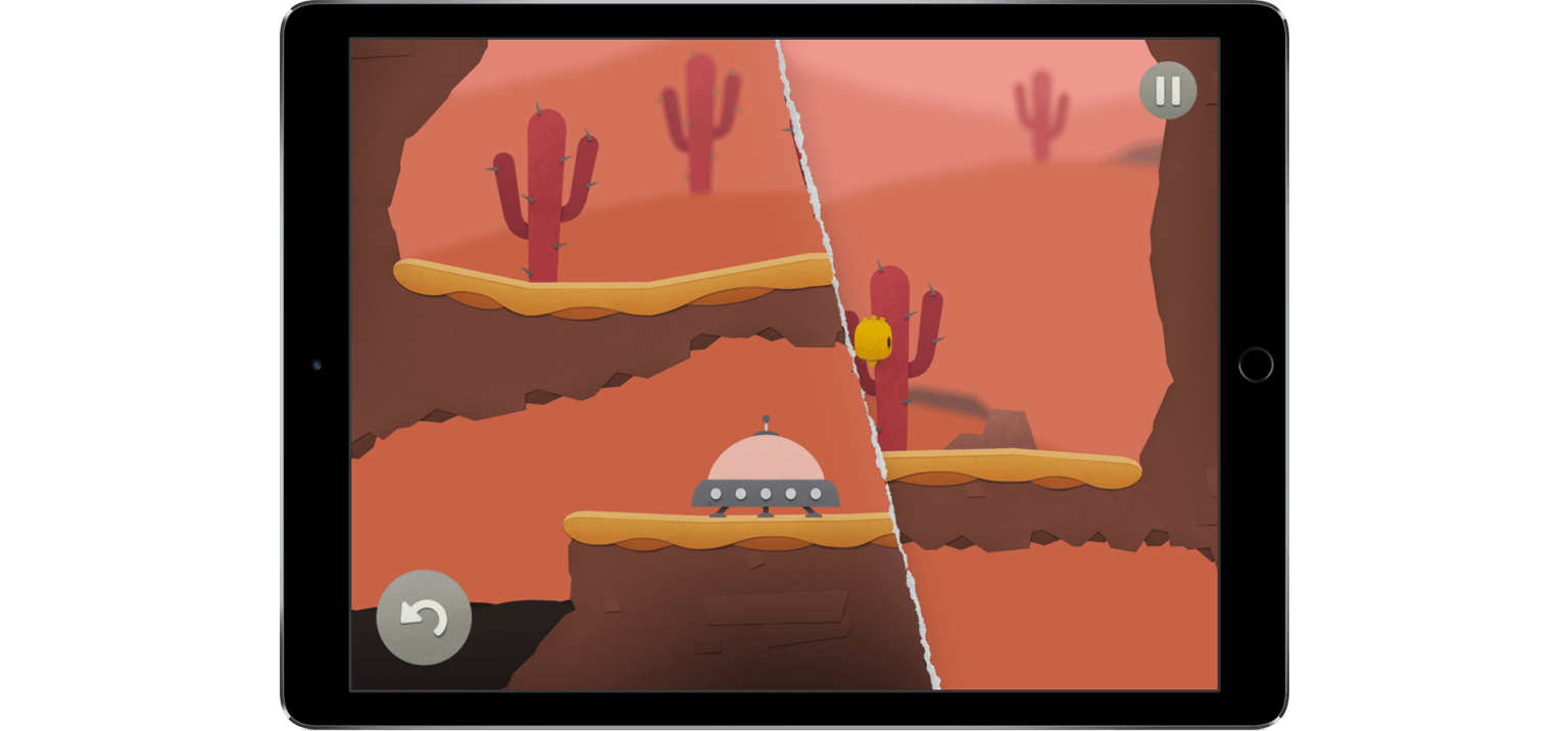
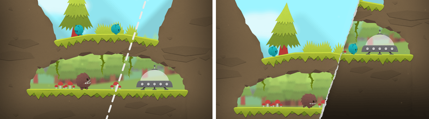
Shifting the environment to save the aliens.
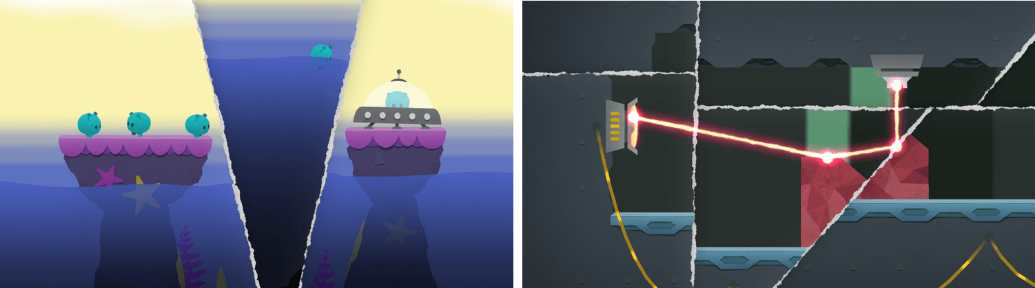
The object of Splitter Critters is to guide a group of aliens back to their spaceship. The aliens wander back and forth, trapped by the terrain. You need to create a path back to their ship, which is where the clever gameplay mechanics come in. Swiping your finger across the screen tears the environment in two. The world can be split at any angle, which opens up nearly endless possibilities. You can then shift the two pieces to alter the world around the aliens doing things like lowering a cliff on which they are trapped to a lower level where their spaceship sits. There is an element of the classic game Lemmings in Splitter Critters and the way you guide the aliens to a goal, but how you do that is so unique that the utility of the comparison is limited.
As you progress through the levels, new challenges arise. Pits of water, creatures that want to eat your aliens, lasers, and other obstacles need to be avoided. Levels are made even harder by the fact that the number of times you can adjust the background is limited, so you need to be thoughtful about your approach.
Splitter Critters’ artwork makes the creatures and their planets feel like paper cutouts, which fits perfectly with the game mechanics. I also like how the little aliens bleat as they wander around, and enjoyed the atmospheric soundtrack.
What I’ve found the most fun about Splitter Critters, though, is its deceptive simplicity. The puzzles are challenging, and the mechanics add a fresh, new approach. With millions of games on the App Store, many of which are casual puzzle games, that originality is rare, which makes Splitter Critters a must-try for anyone who enjoys this kind of game.


 Federico