It wouldn’t be fair to judge Vesper solely by the names of its creators. A new note-taking app for iPhone released today, Vesper has been designed by Dave Wiskus, developed by Brent Simmons, and directed by John Gruber. There’s more to Vesper than the fame of the all-star team behind it, though.
Long-time MacStories readers should be familiar with the iOS apps that I like and use for taking notes, collecting thoughts, and organizing tasks. For years, my entire workflow was based on Dropbox: I would save articles, notes, random bits of text, and even tasks in text files handled by apps like Writing Kit, TaskAgent, Byword, nvALT, and Notesy. Those are still excellent apps, but my setup is more variegate now: my daily thoughts and memories are collected in Day One; longer articles are still stored in Dropbox and edited with specific text editors like Sublime Text; my bookmarks are saved in Pinboard, while everything else – from reference material to annotated screenshots – goes into Evernote. On iOS, Agile Tortoise’s Drafts plays a fundamental role in the way it launches ready to receive any text and is capable of forwarding it to multiple destinations – all while allowing power users to achieve faster, automated workflows.
Specific apps, different services, all with a common thread: sync to a remote backend that ensures my text is always available anywhere.
If you take into account the apps that I have reviewed over the past two years, Vesper may seem anachronistic and uncharacteristically simple: it’s a general-purpose note-taking app with no sync, no URL scheme, no iPad version, and no Markdown integration. When I first tried Vesper a couple of weeks ago, I was skeptical in regard to the app’s reason of existence. But now, in spite of its 1.0 nature and many missing features, I see one – and, more importantly, I believe Vesper gets several things right.
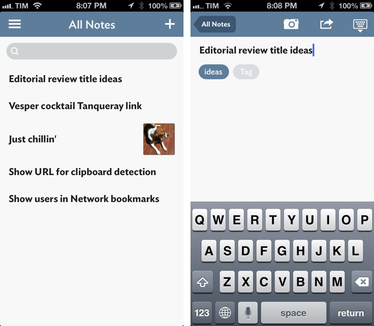
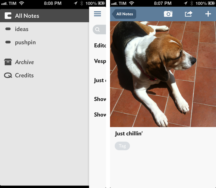
My initial thought when launching Vesper for the first time – perplexities on the icon aside[1] – was that it looked overly simplistic. A blank “All Notes” screen features a title bar with no shadows or glossy effects and just two buttons: a “+” to create a new note, and one to reveal the app’s sidebar (you can also swipe horizontally). Notes have no dates, contexts, or project fields: you can only assign tags to notes and browse notes by tag through the sidebar. Like Day One, the first line of a note is displayed as bold and you can attach a picture to each note, which will be visualized inline above the content. There are no checkboxes, collaboration features, calendar views, or social integrations in Vesper. Alas, there is no sync either. You can understand how, coming from my background of apps with sync and moderately advanced features, I was taken aback by Vesper’s uber-straightforward approach.
Vesper is about collecting thoughts with minimal friction. And not about doing so with a certain specificity in the UI – say, Day One’s emphasis on journaling or TaskAgent’s notebook motif – but in a generalized manner that revolves around one key aspect: speed. I have pondered over the motivation behind Vesper for days, and I’ve concluded that Vesper doesn’t want to be the new Drafts or Day One – rather, its aim is on Apple’s Notes app. The way I see it, Q Branch[2] didn’t want to make an app that identified itself with one facet of note-taking: they wanted one that could scale flexibly for a more generalized use. And this, I believe, has been accomplished quite well.
My favorite Vesper detail is how the app transitions between notes and note creation/editing. On iOS, users expect to be able to tap on an item in a list view and see an app “drilling down” into a deeper layer of content with a horizontal transition; a left-pointing Back button usually provides navigation to a previous section within, if necessary, the same tab. The hierarchy of views and the use of Back buttons is one of iOS’ biggest differentiators as opposed to, among others, Android’s Back and Up dichotomy.
In Vesper, tapping on a note or creating a new one fades the existing content in the background and quickly brings up new buttons alongside a note or text area in the foreground. To better illustrate this, I’ve made a GIF.[3]
Vesper’s animation for opening and closing notes isn’t just pretty – it’s functional. It looks good and it’s smooth, but it also contributes to making Vesper feel faster than other note-taking apps. It may not result faster on a stopwatch, but there is a perceptual difference in how Vesper and Apple’s Notes animate and flow in front of the user. Combined with other animations (namely for sidebar and photos), I keep thinking how Vesper’s visual lightness is reflected in the way the app transitions between layers of content. Vesper launches quickly and is fast.
Vesper does ship with some basic organizational features. While my inner geek cringes at the idea of managing tasks in an app that isn’t OmniFocus, the people whom I see firing up Apple Notes to jot down todos will disagree with me. Vesper wants to tackle this possible scenario with tags and a drag & drop gesture to reorder notes vertically inside a list. In trying to imagine myself as a daily Notes.app user, I would say that both are useful additions. I’m a fervent proponent of the one-to-many relationship between notes and tags (which I prefer to notebooks in Evernote as well), and while I haven’t used it much, I think that reordering will come in handy for those who value visual priority in a note list.
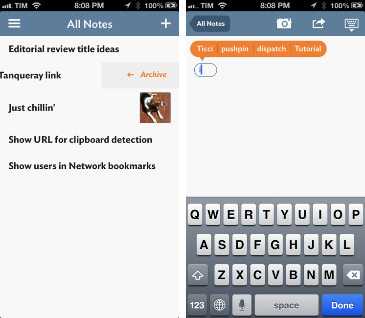
When assigning a tag to a note, Vesper will offer suggestions based on tags you’ve recently used. While tags with no notes aren’t shown in the sidebar, recent tags you’ve used will still be suggested through the app’s orange popover. Tapping on a tag bubble in the editing view will bring up another custom popover with buttons to “copy” or “remove” a tag. The advantage of using a custom popover for copy and remove is twofold: it avoids the brief, but annoying delay of the stock iOS Copy & Paste menu, and it lets you remove a tag without using the Cut function (which would place a tag in your system clipboard).
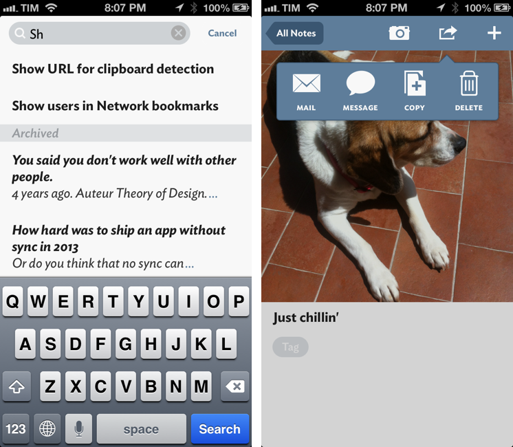
Reminiscent of Mailbox (and Dispatch), notes can be put in the Archive with a swipe. Single notes can be deleted from the app’s action menu, which also contains options for sharing via email, Messages, or copying text. I have been using Copy and Mail to overcome Vesper’s lack of third-party integrations; I wish there was an easier way to always share data between apps.[4]
Details
The rest of my experience with Vesper was defined by a series of subtle but memorable details.
- When you’re editing a note, the “+” turns into a button to dismiss the keyboard and go back to reading mode; effectively, Q Branch took the “Done” button (which Apple uses) and “rebranded” it with an iconography that is, in my opinion, clearer to understand than the semantic “Done” alternative (unchanged since 2008).
- When sharing via Mail, the first line of a note is used for the Subject field.
- Tapping on a URL will open the in-app browser that uses a custom pull-to-refresh gesture to show you the address you’re reloading. I don’t like how longer URLs are cut off, but I do like the idea as it reminds me of this old mockup by Louie Mantia.
- Notes put in the Archive will be italicized. This is reflected in the Archive’s sidebar text as well.
- The pull-to-archive gesture becomes pull-to-restore in the Archive.
- There is a Credits screen that is styled like a movie poster. In this screen, the hamburger button fades into view after a few seconds. There is a Vesper recipe at the bottom. Q Branch correctly suggests Tanqueray instead of Gordon’s.
- When you search, notes that match your query are filtered in real time.
- Vesper is accessible, with good support for VoiceOver already enabled in this first version.
- If you try to hit the + button on an empty note, Vesper will simply bring up the keyboard instead of an animation for another new note.
Directed By
During my beta testing, I took the opportunity to ask John Gruber a few questions about Vesper’s development process and the role of an “app director”.
Federico Viticci: In a talk you gave at Macworld in January 2009, you mentioned how you didn’t work well with other people in a team. Fast forward to 2013, you have teamed up with Brent and Dave for Vesper. What’s changed?
John Gruber: Great question. I’m not sure what my exact words were then, but the way I’d put it now is that I don’t work well with people I don’t like, or with people who don’t seem to get what I want. If it seems like a lack of skill, poor communication, or incompatible design taste are blocking the progress toward what I desire, I can’t abide it.
None of that has been a problem working with Brent and Dave. Dave just mentioned the other day that we’ve gotten all the way to 1.0 without having a single unresolved argument, despite the three of us being very opinionated. Not one. Every single time we’ve had disagreements – and we’ve had many – we’ve reached consensus through debate, listening, and keeping an open mind. It sounds trite, but it has been a fun collaboration.
The three of us make a good team, that’s the difference. The big thing is that all three of us are willing to try anything, and to take however long it takes to get it right. Iterate, iterate, iterate; over, and over, and over. Dave designed certain elements of Vesper dozens of times. Brent implemented many of the features and animated transitions numerous times, just so we could try different designs and see what they really felt like each way. And not only did neither of them mind this, they loved it. Brent even devised a custom framework for the app to provide us with CSS-like tweaking for things like layout, color, and animation timings.
There’s either something right about Vesper, or weird about us, because for us, this app just clicks.
FV: In the same talk of Auteur Theory of Design, you touched upon the topic of final cut for movie directors. Can you describe the process of directing Vesper? Is the app, ultimately, a reflection of your level of taste, or is that more nuanced?
JG: Ultimately, yes, Vesper is a reflection of my taste. The visual design is almost completely Dave’s; making it work is entirely on Brent’s shoulders; but at every single point, for every detail, every feature, it was up to me to say “good enough” or “not good enough”.
But I do think there is some nuance here. My basic theory is that in any creative endeavor, the overall quality of the product tends to rise or fall to the level of taste of whoever has ultimate authority – final cut, in film terms. Even with great talent on the team, if the person in charge has bad taste, the product is going to get worse and worse as it approaches the level of the director’s taste. Even with mediocre talent on the team, the product will improve over time, albeit slowly, if the director has good taste.
Brent and Dave are both so good at what they do – and fast, too – that we are not limited by talent. We’re only limited by taste.
FV: After five years of App Store, how can a new app still feel “new”?
JG: That’s the wrong way to look at it. The App Store has been a tremendous boon to distribution and discovery of new apps, but the art of creating software is as old as the first computer. It’s like asking how a movie or novel released today can feel “new”. We have great ambitions for Vesper, and certain aspects of its design are intended to push the state of the art. There is no creative field where the state of the art cannot be pushed.
FV: When you invited me to try Vesper, I was skeptical about it: an iPhone app with no power user features (at least in this 1.0 release), but, more importantly, no sync. However, as I kept going back to Vesper, I realized that the lack of sync actually contributed to the app’s “instant on” nature, speed, and simplicity. There are no sync errors or conflicted copies: just text. What’s your take on this?
JG: Your question isn’t really about sync. It’s “Why isn’t there an iPad, Mac, or web version?” Answer: because we wanted to make Vesper great on the iPhone. Once we had that, we had a product worth shipping.
FV: A movie is watched by people, an app is used. As a director, do you have an expectation in regard to people using your app as you do? How do you balance opinion with software flexibility?
JG: The analogy between app-making and filmmaking only goes so far. For us, it’s the creation process is that is loosely analogous to filmmaking. The similarity is that in movies, it’s possible that no single aspect of the resulting movie is the direct work of the director. In many cases, the director doesn’t appear on screen as an actor, doesn’t write the screenplay, doesn’t create the costumes or set designs, doesn’t operate the camera, and doesn’t edit the film. The director instead is in charge of all of these things. That’s me with this app. The code is all Brent’s. (Well, I wrote one line.) The pixels are from Dave.
There’s another similarity in that in film, you can do multiple takes of each scene. Iterating over and over until you get something that feels good. That’s what we’ve done with every element of Vesper. Take after take after take, until we felt satisfied enough to move on – with room for improvisation, when new ideas hit along the way.
The result, though, is nothing like a film. No two installations of Vesper will resemble each other, in terms of content. The content is personal.
We’ve tried to remain neutral about how to use Vesper, especially in terms of organization. It should be useful to different people in very different ways. E.g., I have a “Linked List” tag I use to collect ideas for things I want to link to on DF. That makes sense for me, but for almost no one else. Tagging is like allowing users to create their own features in the app; to create not just their own organization, but their own “system” for managing ideas and tasks.
We have, however, made some design decisions that suggest a “right way” to use Vesper. For example, we have no limit on the number of tags you can use, but the visual design purposefully suggests that you shouldn’t have many. The point isn’t to create many dozens or hundreds of tags. The point instead is to create, say, about a dozen or so tags that help you filter your library of notes into groups of related items, when necessary – more like a table of contents of book chapters, not a book index.
Also, Vesper should work great even if you don’t use tagging.
FV: If everything is a remix, what are Vesper’s source of inspiration?
JG: Loren Brichter’s Letterpress was a big one. (And Loren has been one of our most helpful beta testers; he’s provided outstanding feedback and suggestions.)
Another was Twitter apps, in general. A few years ago I wrote a piece on Daring Fireball titled “Twitter Apps Are a Design Playground”, making the case that the simplicity and enforced brevity of Twitter had resulted in a burst of varying designs in Twitter client apps. I think that remains true today. But one of the early insights we had with Vesper is that a big part of Twitter’s success is that a short snippet of text is about the length of a concise “thought”. Most of the notes we create in Vesper are tweet-length. So it seemed to make sense to draw inspiration from the Twitter apps we like best when designing Vesper. (Internally, we refer to the scrolling list of notes in Vesper as “the timeline”.)
FV: When and how did you realize you wanted to make Vesper?
JG: Q Branch got started back in October, when Brent approached Dave and me at the Çingleton conference in Montreal, with the idea that the three of us would make a good team. He thought we’d work well together. (He was right.) We agreed, but needed an idea. A few minutes of brainstorming later, I remembered an old idea I had, from around 2009, for a notes app with drag-and-drop for reordering and tags for organization. It took off from there.
FV: Vesper is devoid of settings. Do you think you’ll manage to always keep it that way? Or: is the lack of settings a deliberate choice, or simply related to a lack of additional options in 1.0?
JG: It was a stretch goal for 1.0. We’ll see where it goes from here.
FV: What plans do you have for Vesper going forward?
JG: We’re just getting started. Our near-term focus is on making Vesper an even better iPhone app than it already is. We’ve got a great roadmap for the months ahead. And we’re keenly anticipating next week’s WWDC keynote. We expect our next creative iteration to be largely about taking advantage of new stuff in iOS 7, both functionally and visually.
The Name’s Vesper
Vesper wants to eschew complexity by taking decisions. That is laudable – no one wants “kitchen sink” apps capable of doing several things very poorly – but I have to wonder whether five years of App Store have got us used to a higher degree of functionality in note-taking apps.
I believe that good software is opinionated. Vesper takes sides[5], and I respect Q Branch’s vision. But I think there are features that should be considered and added to Vesper – features that would make Vesper a better app without compromising its nature. In Vesper 1.0, you won’t find support for TextExpander touch and a URL scheme for note creation; there is no sync and no iPad app; you can’t export an entire tag or send text to other apps installed on your iPhone; there are no Settings.[6] I believe these features would improve Vesper without turning it into something else.[7]
I have asked myself just how much of Vesper’s speed is due to its lack of sync. Sync is hard, fallible, and likely to fail unexpectedly; when I enter text in Vesper, I know I don’t have to worry about 3G and WiFi. Knowing how Gruber liked using Simplenote, I wouldn’t be surprised to hear having to deal with Simplenote’s sync issues over the years was one of the reasons behind Vesper 1.0. But, then again, iOS already has general-purpose note-taking apps with sync or other exporting options – namely, Apple Notes and Drafts. Which is why I draw my conclusion: Vesper gets many things right, others should be improved, but, ultimately, it’s a matter of taste. Personally, I miss iPhone-to-iPad sync.
I am conflicted, because I love Vesper’s speed and simplicity, but I also like having my notes everywhere, typing them out with TextExpander snippets and adding text from the browser with a URL scheme. And I understand that some may also be surprised by the price of a “simple” iPhone app: Vesper is $4.99 on the App Store. However, knowing that Q Branch is investing greatly on Vesper’s future, I support their decision.
I decided to give Vesper a fair shot in my iPhone’s dock. I have been using Vesper as the scratchpad that comes before Drafts. Vesper lets me add multiple notes in rapid succession, organizing related ones with tags and – this is something Drafts can’t do – allowing me to attach photos and screenshots to notes. Drafts is where I end up when I know my text is going somewhere else; Vesper is where I jot down my grocery list and quick thoughts – stuff that I know will eventually be archived or deleted forever. Vesper is where I save a few bullet points for app feedback to developers, questions for an email interview, names of cocktails I want to try, or – as a modern Birdhouse – drafts of screenshots I want to tweet.[8] Should these pieces of information live in OmniFocus or be exported from Drafts to Evernote? I don’t know. They seem to be just fine in Vesper.
Vesper is a solid app with a clear vision: it is an elegant and purposefully unspecific destination for thoughts. It’s not a diary, a reminder app, or a plain text-based todo manager – but it’s fast, nice-looking, and easy to use. In my opinion, Vesper’s glaring 1.0 omissions are an iPad version with sync and TextExpander integration – two missing features that you should consider before purchasing the app. I am extremely optimistic for Vesper’s future and – what matters most – I have enjoyed using it on a daily basis.
Vesper is available on the App Store.
- Spoiler: it’s a tag. It makes sense when you “get it” (at first I thought it was a wallet). It certainly is a polarizing icon, which some people won’t like. Ultimately, it’s a matter of taste. It’s been growing on me. ↩
- Of course Gruber would be involved in a company called Q Branch. Not to mention the Vesper (which, by the way, is a nice play on the word itself). ↩
- Using GIF Brewery and Reflector. ↩
- “Open In” wouldn’t make sense in Vesper because the app isn’t dealing with text files. Better inter-app communication should happen at the OS level, and shouldn’t have to be hardcoded by developers into their apps. ↩
- A simple example: lack of formatting in a note. Only the first line can be bold. ↩
- I am curious to see if Q Branch will go through a process similar to Marco Arment’s. ↩
- URL scheme and TextExpander are invisible if you don’t know about them (or if you don’t have TextExpander installed). Other features that I would like to see include: date or tag headers to better divide notes in the All Notes screen; changing the “Untitled Photo” description for notes with images and no text to a generic format with a timestamp (inspired by Evernote); a way to show “tag bundles” in the sidebar (like Smart Playlists – “notes that contain both
tagandtag2). ↩ - There is no tweet button yet. I want to be able to tweet a screenshot from Vesper. ↩


