Today, Facebook introduced version 6.0 of their iOS app for iPhone and iPad. The Verge has a solid overview of the changes (with a video as well). Unrelated to the iOS update, but still of note in regards to Facebook’s growing design team, Atebits’ Loren Brichter is now “helping out” at Facebook. Considering Brichter’s skills in graphics and animations and Facebook’s interest in physics engines with Chat Heads, I wouldn’t be surprised to hear Brichter is going to help the design team in that field.
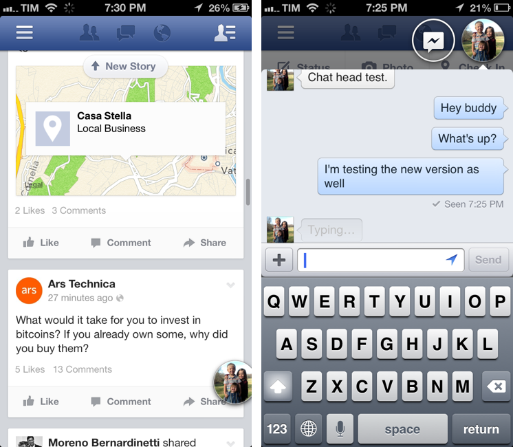
Facebook 6.0 for iOS is, essentially, a cleaner Facebook app with Chat Heads. The slide-out navigation is still there, but it has been tweaked to feature new icons, consistent with Facebook’s new take on News Feed; the iPhone app now comes with filters to browse specific feeds for photos, music, games, close friends, and more; the iPad app has a cleaner design for the News Feed with avatars on the left; and both apps come with Chat Heads, Facebook’s new floating bubbles for private messaging (or, as they call it, “private sharing”). The Chat Heads feature is still rolling out, just like the updated News Feed design.
I’ve been able to try Chat Heads, which are enabled for my account. Unlike Facebook Home for Android, Chat Heads are limited to the Facebook app: per iOS’ architecture, Facebook can’t display Chat Heads anywhere in the operating system. The implementation of Chat Heads is consistent across the iPhone and iPad, but there are also some minor differences worth noting.
As soon as I launched Facebook 6.0, a friend of mine pinged me via private message, and the Facebook app (I was on my iPhone) popped up his Chat Head in the top right corner of the screen with a floating preview and, later, a red unread badge. Tapping on the Chat Head opened a modal overlay with our private conversation, but it didn’t put the cursor immediately in the text field, therefore forcing me to manually bring up the iOS keyboard. I think that tapping on a Chat Head with an unread message and having the iOS keyboard also come up would be a good idea.
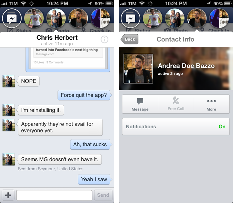
At the top of a modal private conversation there’s a small “i” button to view a friend’s Contact Info card, which is displayed inline with a Back button to return to the conversation (you can tap anywhere in the title bar to open Contact Info). If you tap on Message from the Contact Info card, the app will slide back to the conversation; but if you tap More, then View Timeline, the Chat Head’s overlay will shrink into the Chat Head again, keeping the floating circle on screen. The position of a Chat Head is kept across transitions between views and taps to reach other pages.
Chat Heads can be dragged and repositioned on screen with a single swipe. Facebook said that they spent a large amount of time researching and developing their own physics engine to ensure the animation and “weight” of Chat Heads would feel right on screen, and it shows. You can drag a stack of Chat Heads (if you have multiple chats open, the latest chat will be the frontmost one, with other Heads stacked underneath it) and drop it on the other side of the screen, or you can “throw it” around and see it bounce before settling on a new position (Chat Heads are always docked at one of the screen’s edges).
To discard a Chat Head (or multiple ones at once), you can throw them away at the bottom of the screen where a “Drag down to close” area awaits for Chat Heads to sacrifice in the name of OCD. As you slowly drag a Chat Head onto the “trash”, the “x” button becomes slightly bigger with a quick, delightful animation.

Playing around with Chat Heads is fun. It’ll make for a good demo for my friends tonight.
Chat Heads don’t just open when you receive a new message: tapping on the app’s Messages icon in the title bar will show the usual Messages popover; now, selecting a thread won’t navigate further into the popover – it will pop up a new Chat Head on screen. By default, new Chat Heads open in the top right corner: interestingly, that’s also where the Chat button is on the iPhone, making this corner arguably the “best” position for a stack of Chat Heads.[1]
On the iPhone, Chat Heads are arranged horizontally at the top of the screen: even if you drag around the stack when browsing the app, starting a conversation will always reposition Chat Heads horizontally at the top. Thus, you can have four simultaneous Chat Heads – each with its own thread – on an iPhone, plus the default Messages one. If you have four Chat Heads and try to bring up another friend, the last (first from the left) Chat Head will be swapped with another nice animation.
If you start a conversation with multiple friends in a single thread, the Chat Head bubble will try to show each participant’s profile picture. Overall, on the iPhone, Chat Heads animations are snappy and responsive.
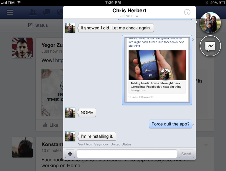
On the iPad, Chat Heads are displayed vertically at the side of the screen, and they retain the same deal of physics and bouncing of the iPhone’s counterpart, with some obvious UI changes for the iPad (larger popovers, tap areas, etc). In spite of the iPad’s larger screen, you can’t have more than four Chat Heads at once. The limitation feels strange: I don’t know if it was dictated by a specific design choice (perhaps the fact that the iPad has two orientations?) or a technical hurdle (seems unlikely), but I was certainly surprised to find larger Chat Heads with more space available, and yet the same four-bubble threshold. I also noticed that, on my iPad mini, Chat Heads animations aren’t nearly as smooth as on the iPhone 5: popovers are slower to open, and there are some occasional hiccups when expanding a stack of Chat Heads.
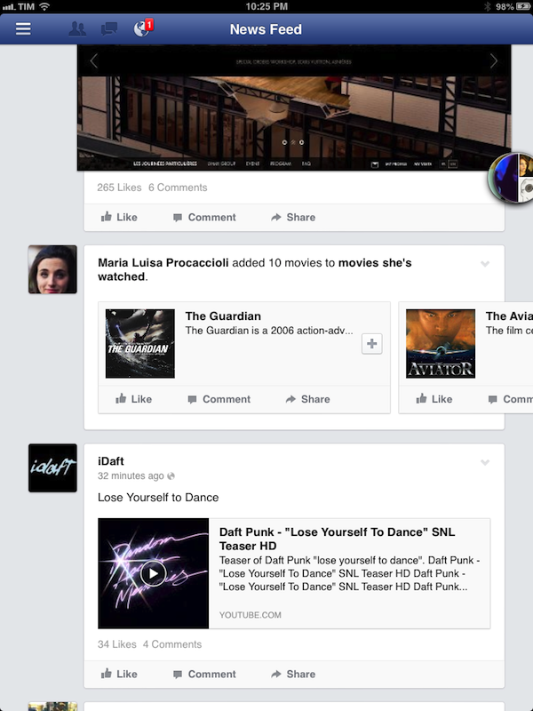
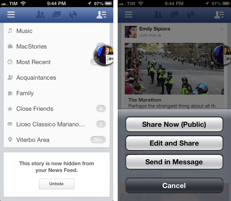
Speaking of the iPad app, Facebook 6.0 comes with a refreshed, cleaner News Feed. There are less separators between posts, everything feels more spaced out, and user avatars have been moved out of status update boxes and are now listed on the left as rounded rectangles. To me, the new iPad News Feed looks like a mix of the old Facebook and a Twitter client with Cards expanded by default. According to Ollie Wagner, designer of the mobile News Feed, there are “several more subtle changes” in this update. For instance, the Like/Comment/Share buttons have been moved all the way to the left below each status update, making them easier to reach. Or, the Share button now presents three options to Share Now, Edit and Share, and Send in Message (the latter doesn’t open the Chat Heads UI).
Font sizes have been tweaked as well, but the change that stood out the most to me is the shift from blue to black for people’s names. Everything may be more consistent and neutral, but names look less tappable. I wonder if this – a diminished feel of “tappability” – could lead users to search more (that wouldn’t be a surprise).[2]
I’m still not completely sold on the idea of Chat Heads. I personally don’t spend much time messaging my friends via Facebook for iPhone, and if I were, I’d use the dedicated Messenger app. But I guess that Facebook has its reasons to build Home, the HTC First, and to deploy Chat Heads in the standard iOS app as well. Clearly there’s less value in having Chat Heads confined inside an app than having them follow you around the entire OS, but, then again, it comes down to how much you’re using the Facebook app and chatting with friends on iOS.
From an implementation standpoint, Chat Heads look good and the animations are delightfully fun, but I don’t like how they cover portions of text of status updates in the News Feed (especially an issue on the iPhone) and how the modal view can be confusing at times.
The Chat Heads’ overlay doesn’t bother me on the iPad – where I’m used to popovers – but it makes everything feel cramped and constrained on the iPhone, where you can see the conversation, the keyboard, the row of Chat Heads, and a tiny amount of app in the background. Furthermore, there’s a dichotomy between Chat Heads and the old Messages UI, which is still available in the app.[3]
On the flip side, I appreciate how easy it is to jump back and forth between conversations with less taps then before, and I’m sure people will like the fun and intuitive nature of Chat Heads. Only time, however, will tell whether Chat Heads’ novelty will wear off or if they’ll prove to be a solid foundation for the future of the company’s private sharing.
I’m a fan of Facebook’s modern design philosophy, and I’m cautiously intrigued by Chat Heads. I’m looking forward to see what comes next.
- The stack will cover the chat button, but you’ll still be able to access all messages and the compose button by selecting the Messages chat bubble (the one with a message glyph). ↩︎
- Plain URLs are the only blue links now. ↩︎
- My guess is that the old Messages interface will stick around as a way to view more than four ongoing conversations, but I wouldn’t be surprised to see it get a less prominent spot in the sidebar. ↩︎