Posts tagged with "iPadOS"

Instagram Launches an iPad App

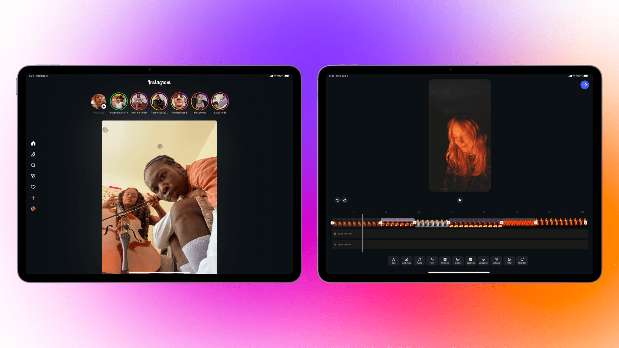
Yes, you read that right. Instagram has finally released an iPad version, and you know what, it looks good, too.

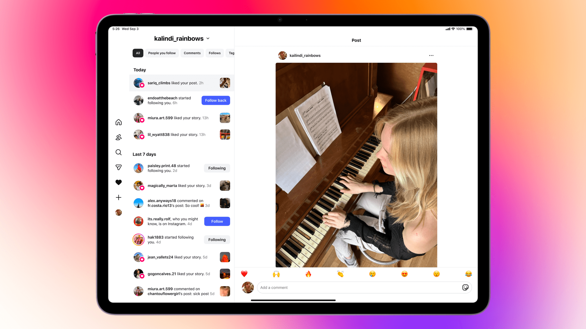
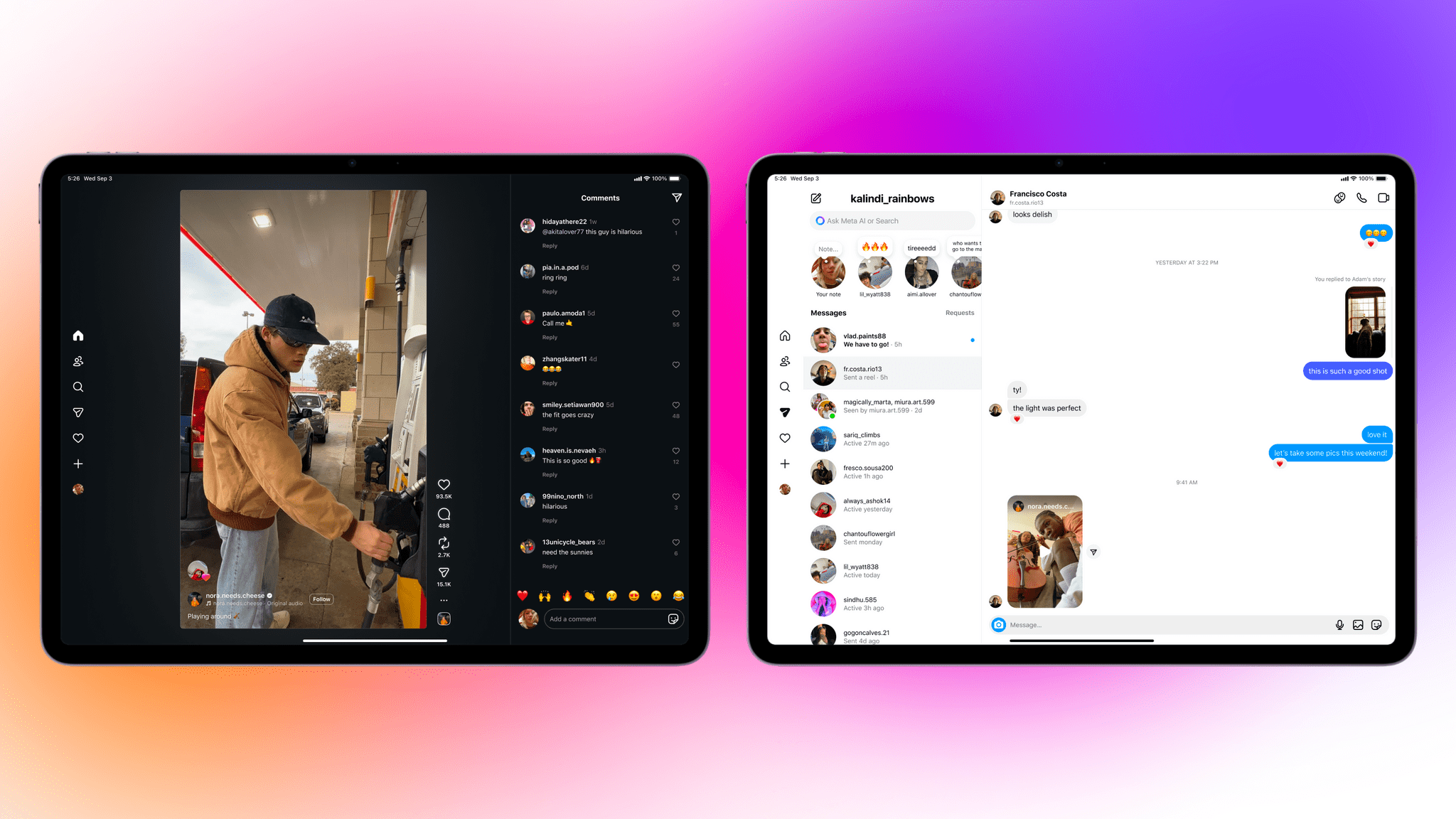
Announced on Instagram’s blog today, the new iPad app supports iPadOS 15.1 and later and includes the features you’d expect like Reels and Stories, plus a new “Following” tab that includes sections for posts and Reels from Friends who follow you back, a “Latest” section that’s sorted chronologically, and an “All” section. Instagram’s messaging is supported and the extra screen real estate allows you to view your inbox and threads simultaneously. It even supports keyboards, trackpads, and the Apple Pencil.

I gave up any expectation that Instagram would ever be released on the iPad years ago. I never really understood the notion that it wouldn’t work on a bigger screen, especially since what Instagram does has expanded a lot in recent years. I’m not a big Instagram user, but I’m glad to see it on the iPad finally. Not only does it work full screen, but with windowing coming in iPadOS 26, you’ll be able to enjoy the more iPhone-like look if you prefer too.

I’m not seeing the app on the App Store yet, but it’s rolling out now and should be available to everyone shortly as a free download here.


Cassette: A Video Time Machine

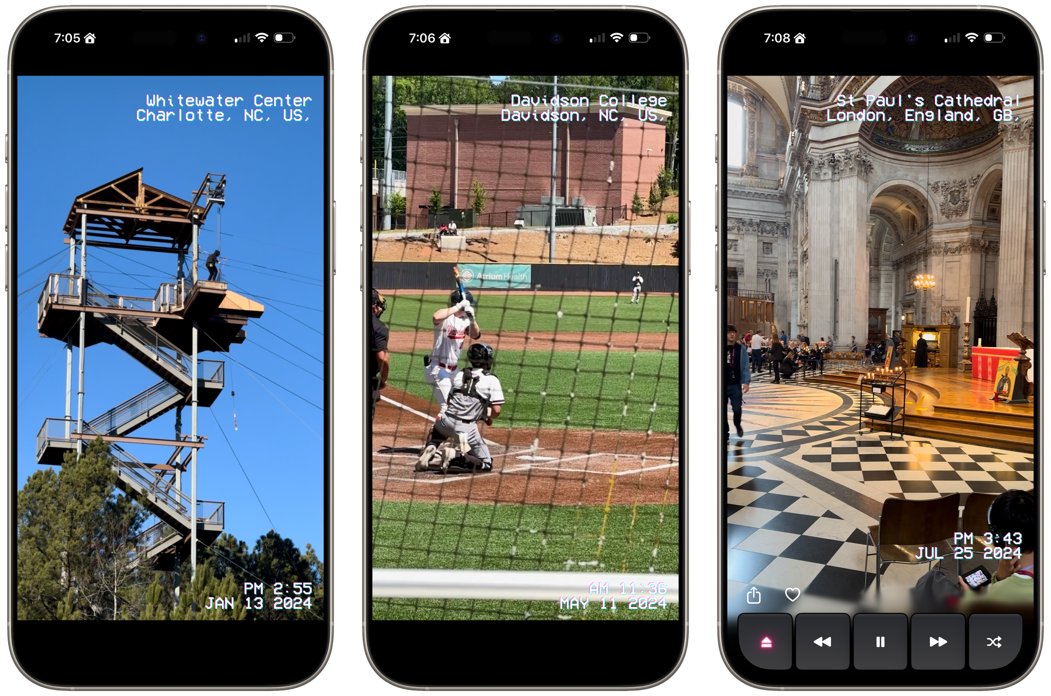
Devin Davies, the developer of Crouton whom Federico and I interviewed after he won an Apple Design Award in 2024, has released a new app called Cassette. It’s an app for browsing videos from the photo library on your iPhone or iPad that has a fun design twist.

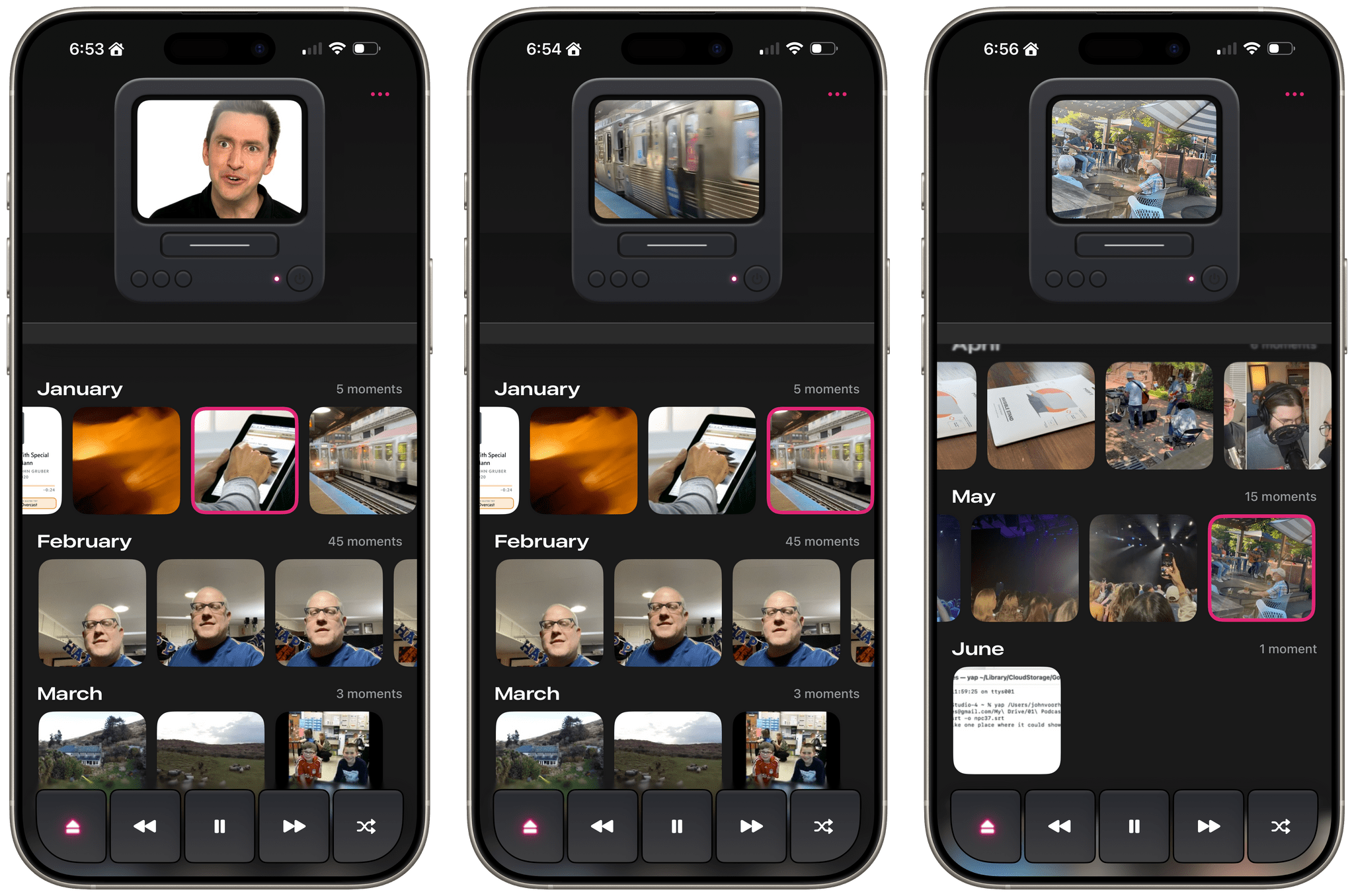
Leaning heavily into the nostalgia of watching old videos of friends and family, Cassette sorts your videos using a VCR metaphor. Videos are organized by year and by collection, with video cassette art and a label identifying each. At the top of the screen is an old CRT TV with a built-in VCR. Tap a year or collection, and it loads into the TV with satisfying haptic feedback on the iPhone.

Videos running full-screen.

Videos running full-screen.

Tap the virtual TV, and the video goes full-screen with date and location data that’s reminiscent of a VCR’s UI. While watching videos, the app offers standard playback controls along with a shuffle button, buttons to share and favorite videos, and an eject button to return to your video collections.

Videos cycle from one to the next and then loop back to the beginning, where playback continues. You can also swipe through videos TikTok-style, skipping over any you don’t want to watch. Finally, there’s a ‘Take Me Somewhere’ button at the bottom that drops you at a random location in your video collection, eliminating the need to pick something yourself.

Most of the functionality found in Cassette is available in other video players, but that doesn’t make it any less fun or delightful. What sets the app apart is its focus on design and framing. From the drop, Cassette is designed to transport you to the past with its VCR-inspired UI and singular focus on videos, transforming into a sort of handheld time machine.

Cassette is available on the App Store as a free download. Certain features are only available via a $0.99/month or $5.99/year subscription or a $7.99 one-time payment.


Thoughts on iPadOS 26: Hello, It’s Good to Be Back

iPadOS 26.

iPadOS 26.

Apple released the first public betas of iOS and iPadOS 26 last week, and I’m going to cut to the chase with this story: although I’m still wrapping my head around Liquid Glass and trying to understand where this new design language will land, iPadOS 26 has fundamentally revolutionized my workflow in just a little over a month. While talking to Craig Federighi at WWDC, I did get the sense that Apple was approaching the iPad platform from a different – perhaps more humble – perspective, with a newfound willingness to listen to power users and find a better balance between the simplicity of the iPad and its flexibility. Actually using iPadOS 26, however, has far exceeded my expectations – which pushed me to completely rethink my desk setup (again) and the apps I use around the iPad Pro and iPadOS 26.

Conversely, I’ve been struggling to understand iOS 26 and the role of Liquid Glass. I’ve documented my issues with Apple’s new design with a variety of examples recently, but the truth is that at this point in the beta cycle, I don’t know what to write about Liquid Glass yet. For this reason, despite my many attempts to write this story over the past few weeks, I’ve decided to take a different approach.

Today, I only feel comfortable sharing my opinion about iPadOS 26, and I’ve chosen to delay my analysis of iOS 26 until later this year. I’ve found it incredibly challenging to form an opinion on Liquid Glass and iOS 26 when everything is still so in flux and being adjusted on a beta-by-beta basis. I feel like sharing what I think about Liquid Glass right now would be a fruitless exercise, or shortsighted perhaps, one way or another. Instead, since I find iPadOS 26 to be more of a known entity at the moment, I’ve decided to focus on that and how this software update is changing the way I work. The time will come for me to write about Liquid Glass and Apple’s vision for the future of its software design. Today, though, I’m all about the iPad.

It’s been an interesting month since WWDC. This year more than ever, I have a feeling that Apple isn’t done tweaking its OSes and much will continue to change between now and September. But for now, as always, let’s dive in.

Read more


Interview: Craig Federighi Opens Up About iPadOS, Its Multitasking Journey, and the iPad’s Essence

iPadOS 26. Source: Apple.

iPadOS 26. Source: Apple.

It’s a cool, sunny morning at Apple Park as I’m walking my way along the iconic glass ring to meet with Apple’s SVP of Software Engineering, Craig Federighi, for a conversation about the iPad.

It’s the Wednesday after WWDC, and although there are still some developers and members of the press around Apple’s campus, it seems like employees have returned to their regular routines. Peek through the glass, and you’ll see engineers working at their stations, half-erased whiteboards, and an infinite supply of Studio Displays on wooden desks with rounded corners. Some guests are still taking pictures by the WWDC sign. There are fewer security dogs, but they’re obviously all good.

Despite the list of elaborate questions on my mind about iPadOS 26 and its new multitasking, the long history of iPad criticisms (including mine) over the years, and what makes an iPad different from a Mac, I can’t stop thinking about the simplest, most obvious question I could ask – one that harkens back to an old commercial about the company’s modular tablet:

In 2025, what even is an iPad according to Federighi?

Read more


iOS 26, iPadOS 26, and Liquid Glass: The MacStories Overview

During today’s WWDC 2025 keynote, held in person at Apple Park and streamed online, Apple unveiled a considerable number of upgrades to iOS and iPadOS, including a brand-new design language called Liquid Glass. This new look, which spans all of Apple’s platforms, coupled with a massive upgrade for multitasking on the iPad and numerous other additions and updates, made for packed releases for iOS and iPadOS.

Let’s take a look at everything Apple showed today for Liquid Glass, iOS, and iPadOS.

Read more


WWDC 2025: All the Small Things (Bento Box Version)

Source: Apple.

Source: Apple.

Every keynote, Apple is well-known for summarizing sections of the presentation with immaculately laid-out bento boxes containing key features. They often serve as good, easily digestible overviews of all the new features for each OS.

With that in mind, let’s take a look at all the bento boxes from today’s WWDC 2025 keynote.

Read more


Shareshot 1.3: Greater Image Flexibility, New Backgrounds, and Extended Shortcuts Support

If you have a screenshot you need to frame, Shareshot is one of your best bets. That’s because it makes it so hard to create an image that looks bad. The app, which is available for the iPhone, iPad, Mac, and Vision Pro, has a lot of options for tweaking the appearance of your framed screenshot, so your final image won’t have a cookie-cutter look. However, there are also just enough constraints to prevent you from creating something truly awful.

You can check out my original review and coverage on Club MacStories for the details on version 1.0 and subsequent releases, but today’s focus is on version 1.3, which covers three areas:

  • Increased image size flexibility
  • New backgrounds
  • Updated and extended Shortcuts actions
Adjusting sizes.

Adjusting sizes.

With version 1.3, Shareshot now lets you pick any output size you’d like. The app then frames your screenshot and fits it in the image size you specify. If you’re doing design work, getting the exact-size image you want out of the app is a big win because it means you won’t need to make adjustments later that could impair its fidelity.

A related change is the ability to specify a fixed width for the image that Shareshot outputs. That means you can pick the aspect ratio you want, such as square or 16:9, then specify a fixed width, and Shareshot will take care of automatically adjusting the height of the image to preserve the aspect ratio you chose. This feature is perfect if you publish to the web and the tools you use are optimized for a certain image width. Using anything wider just means you’re hosting a file that’s bigger than necessary, potentially slowing down your website and resulting in unnecessary bandwidth costs.

Shareshot is stripey now.

Shareshot is stripey now.

Shareshot has two new categories of backgrounds too: Solidarity and Stripes. Solidarity has two options styled after the Ukrainian and Palestinian flags, and Stripes includes designs based on LGBTQ+ colors and other color combinations in a variety of styles. All of the new categories allow you to adjust several parameters including the angle, color, saturation, brightness, and blur of the stripes.

Examples of angles.

Examples of angles.

Finally, Shareshot has revamped its Shortcuts actions to take advantage of App Intents, giving users control over more parameters of images generated using Shortcuts and preparing the app for Apple’s promised Smart Siri in the future. The changes add:

  • Support for outputting custom-sized images,
  • A scale option for fixed-width and custom-sized images, and
  • New parameters for angling and blurring backgrounds.

The progress Shareshot has made since version 1.0 is impressive. The app has grown substantially to offer a much wider set of backgrounds, options, and flexibility without compromising its excellent design, which garnered it a MacStories Selects Award last year. I’m still eager to see multiple screenshot support added, a feature I know is on the roadmap, but that’s more a wish than a complaint; Shareshot is a fantastic app that just keeps getting better.

Shareshot 1.3 is free to download on the App Store. Some of its features require a $1.99/month or $14.99/year subscription.


Notes on Mercury Weather’s New Radar Maps Feature

Since covering Mercury Weather 2.0 and its launch on the Vision Pro here on MacStories, I’ve been keeping up with the weather app on Club MacStories. It’s one of my favorite Mac menu bar apps, it has held a spot on my default Apple Watch face since its launch, and last fall, it added severe weather notifications.

I love the app’s design and focus as much today as I did when I wrote about its debut in 2023. Today, though, Mercury Weather is a more well-rounded app than ever before. Through regular updates, the app has filled in a lot of the holes in its feature set that may have turned off some users two years ago.

Today, Mercury Weather adds weather radar maps, which was one of the features I missed most from other weather apps, along with the severe weather notifications that were added late last year. It’s a welcome addition that means the next time a storm is bearing down on my neighborhood, I won’t have to switch to a different app to see what’s coming my way.

Zooming out to navigate the globe.

Zooming out to navigate the globe.

Radar maps are available on the iPhone, iPad, and Mac versions of Mercury Weather; they offer a couple of different map styles and a legend that explains what each color on the map means. If you zoom out, you can get a global view of Earth with your favorite locations noted on the map. Tap one, and you’ll get the current conditions for that spot. Mercury Weather already had an extensive set of widgets for the iPhone, iPad, and Mac, but this update adds small, medium, and large widgets for the radar map, too.

A Mercury Weather radar map on the Mac.

A Mercury Weather radar map on the Mac.

With a long list of updates since launch, Mercury Weather is worth another look if you passed on it before because it was missing features you wanted. The app is available on the App Store as a free download. Certain features require a subscription or lifetime purchase via an in-app purchase.


Terminology 5: Rebuilt and Better than Ever

It’s been quite a while since I did a full review of Agile Tortoise’s Terminology, an extensible dictionary and reference tool for the iPhone and iPad. It’s hard to believe the app has been around for 15 years now, but with today’s release of version 5.0, Greg Pierce has introduced a thoroughly modern ground-up rewrite of the app that is richer and more extensible than ever, making it one of my favorite research tools.

Let’s take a look at what’s new.

Read more