
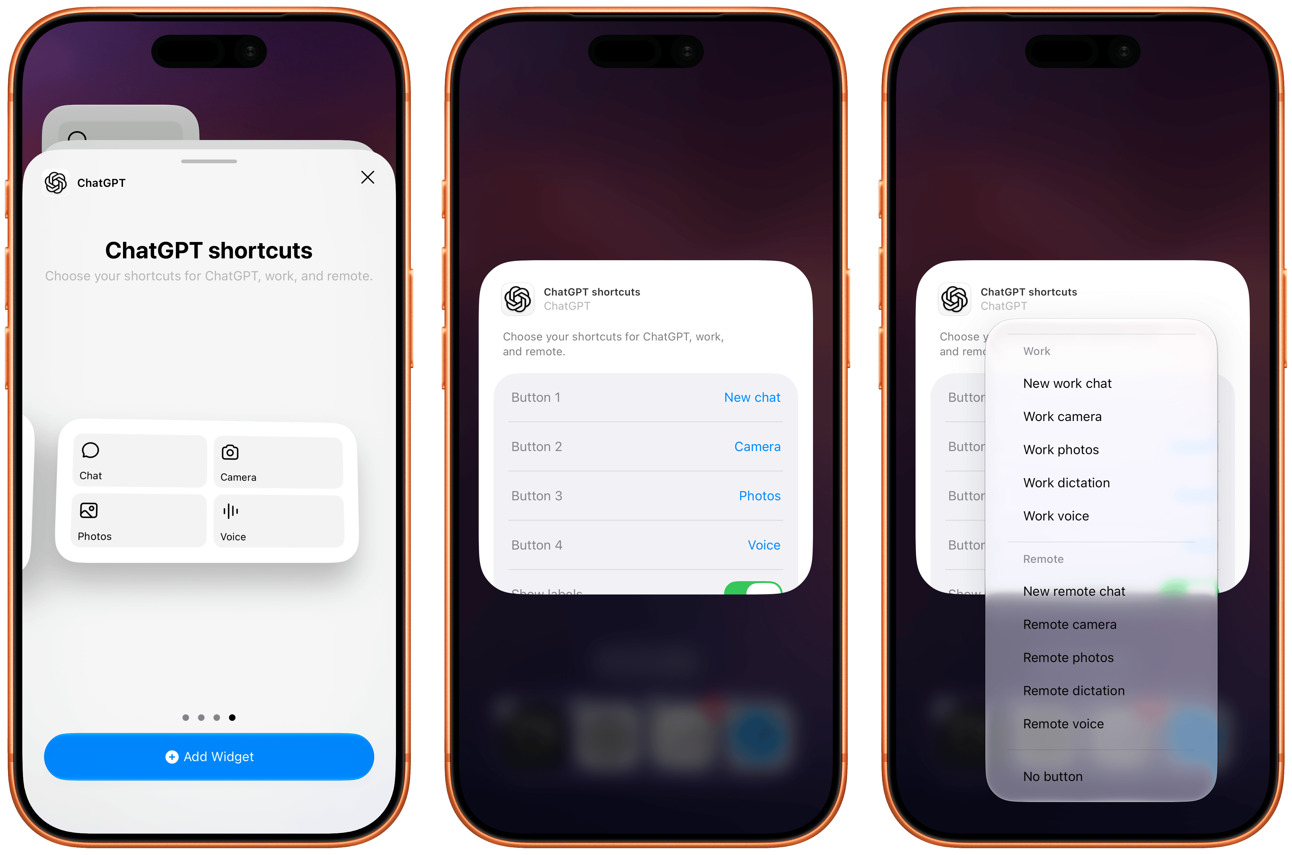
The most recent update to the ChatGPT app for iOS has introduced a new feature that will make those who rely on the company’s AI assistant for work-related tasks quite happy: a customizable widget that lets you control which shortcuts can be placed for convenient access on the Home Screen.
Posts tagged with "home screen"
OpenAI Updates ChatGPT for iOS with Customizable Widgets for ChatGPT Work and Codex Remote
Lock Launcher Introduces “No Redirect” Launchers, XL Widgets for iOS 27
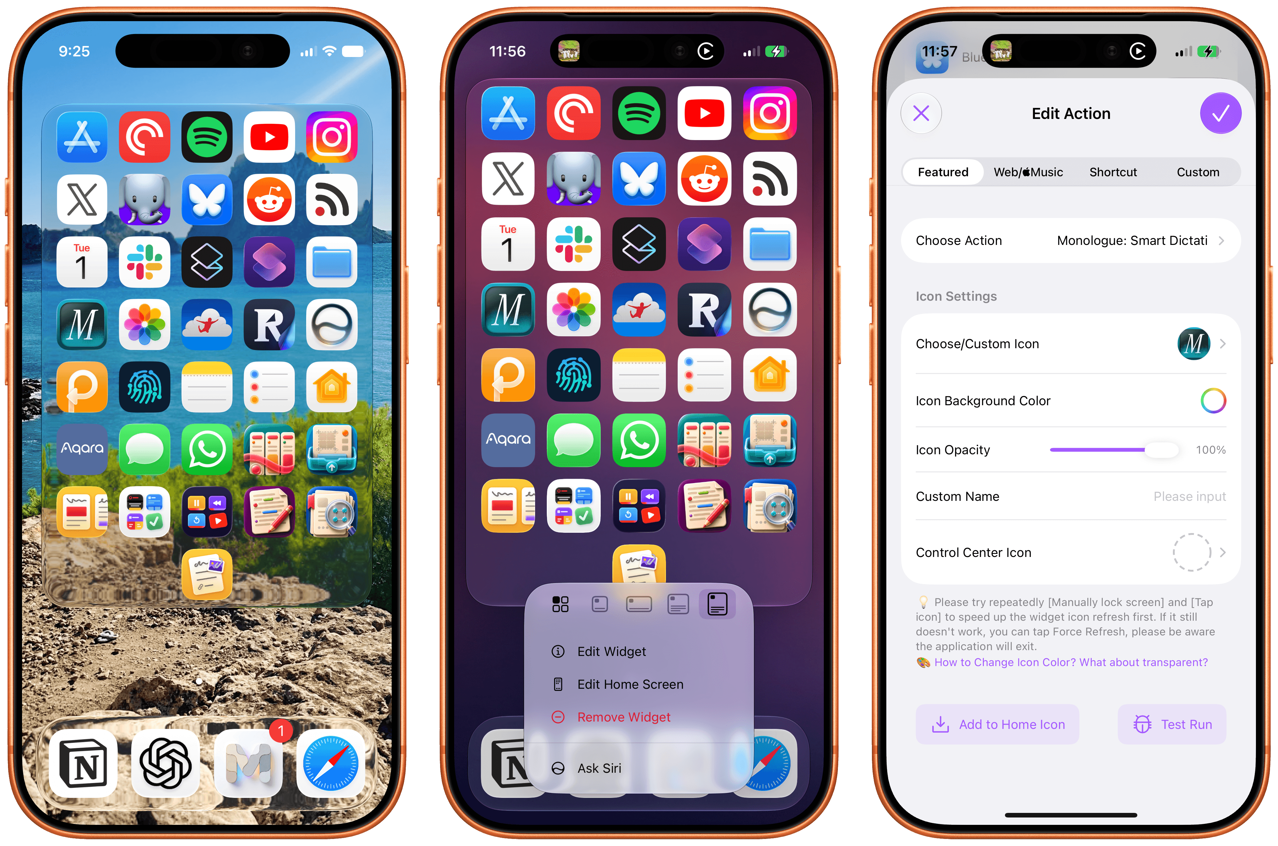
I don’t think I ever mentioned it on MacStories (although I probably did at some point on AppStories or Unwind), but my favorite “launcher” app for iOS is a utility called Lock Launcher, which I’ve been using on and off for the last couple of years. Lock Launcher started as an app for adding URL schemes to the Lock Screen a few years back, and it gradually evolved into a comprehensive “widget studio” app to design launcher widgets of all kinds for the Home Screen, Lock Screen, Dynamic Island, Live Activities, and more.
Anyway, I’m covering the app on the site today because it was updated with two features that I didn’t think were possible or allowed on the App Store, and I want to highlight them for our readers. I’m not really sure how the developers were able to add these features to the app; you may want to download it from the App Store quickly, just in case.
For starters, Lock Launcher now lets you create launcher shortcuts that open apps directly and immediately, rather than redirecting you to the Lock Launcher app first.
For years now, launcher apps on the iPhone have had to employ this workaround: you’d tap on a shortcut that opened, say, Ivory, but you would see the launcher app flash onscreen briefly before redirecting you to the actual destination app you selected. Somehow, Lock Launcher is now circumventing this limitation with a ‘Direct Open’ mode that I haven’t seen in other launcher apps for iOS. That sequence of widget, host app, and destination app was, ultimately, the reason why I always stopped using third-party launcher apps, and I love that it’s been removed by Lock Launcher.
Launching apps without redirects via Lock Launcher.Replay
At long last, I’ve been able to create a dense Home Screen with 40 icons (36 in the widget plus 4 in the dock), and they all launch directly when tapped.
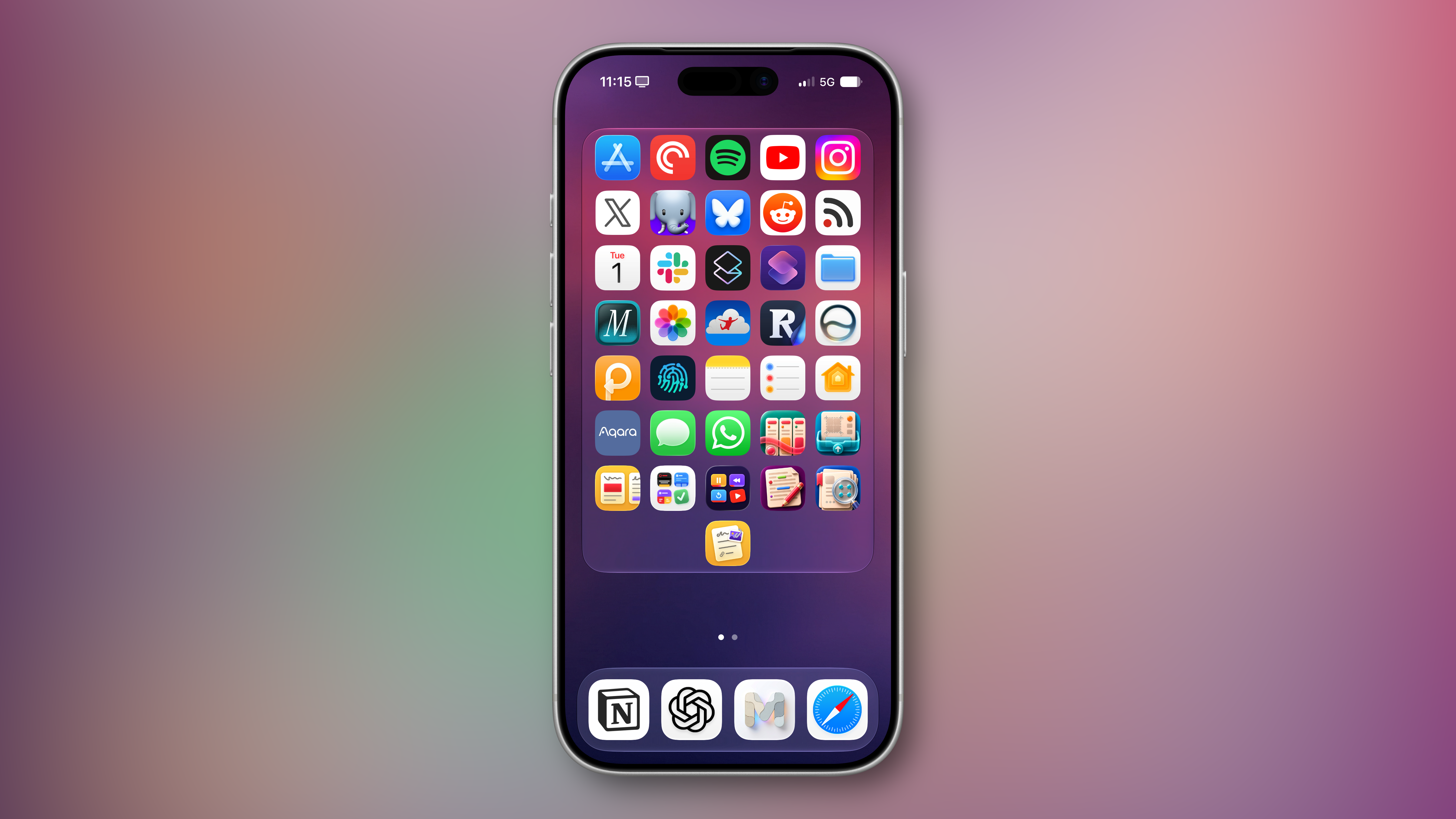
The screenshot above brings me to the second feature added in the version of Lock Launcher currently available on the App Store: XL widgets on iPhone in iOS 27.
Now, as far as I know, if an app wants to adopt an API exclusive to a future version of iOS, it typically needs to be built against that version’s SDK using the corresponding Xcode beta. However, the App Store isn’t currently accepting apps built with the iOS 27 SDK. And yet, the Lock Launcher developers must have figured out a way to support the new systemExtraLargePortrait widget size and make it work on devices running iOS 27 even though the app was built with the iOS 26 SDK. My best guess: they’re using a workaround that involves visionOS 26 APIs, since the Vision Pro received support for that family of widgets last year. (I’d love to know more about this.)
These two features, combined with the ability to apply the Liquid Glass material to widgets for beautiful refractions of the system wallpaper, make Lock Launcher the most powerful and customizable launcher utility on iOS to date. I hope writing about it doesn’t get the developers in trouble.
Lock Launcher is available for free on the App Store, with advanced features available through an optional Pro in-app purchase.
I Shared my iPhone Home Screen and More on the Home Screens Podcast→
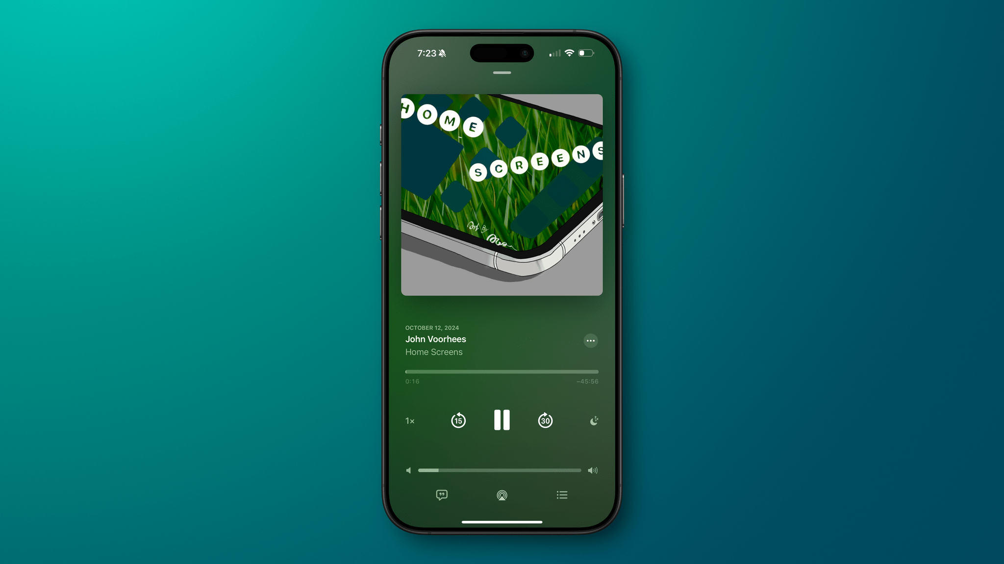
I joined Lee Peterson on his podcast, Home Screens, for a tour of my iPhone Lock Screen, Home Screen, and Control Center pages.
The theme that ties it all together is ‘quick entry.’ Whether it’s a task, idea, link, or something else, I’ve picked apps and widgets and arranged my iPhone to make it easy to capture those things as effortlessly as possible. Hopefully, some of the ideas in the episode can help others organize their iPhones, too.
Using Apple Journal to Track Home Screen Setups→
I love this idea by Lee Peterson: using Apple’s Journal app (which got some terrific updates in iOS 18) to track your Home Screen updates over time.
Every so often, I see screenshots from people on Threads or Mastodon showing their Home Screens from over a decade ago. I routinely delete screenshots from my Photos library, and it bums me out that I never kept a consistent, personal archive of my ever-changing Home Screens over the years. Lee’s technique, which combines Journal with the excellent Shareshot app, is a great idea that I’m going to steal. Here’s my current Home Screen on iOS 18:
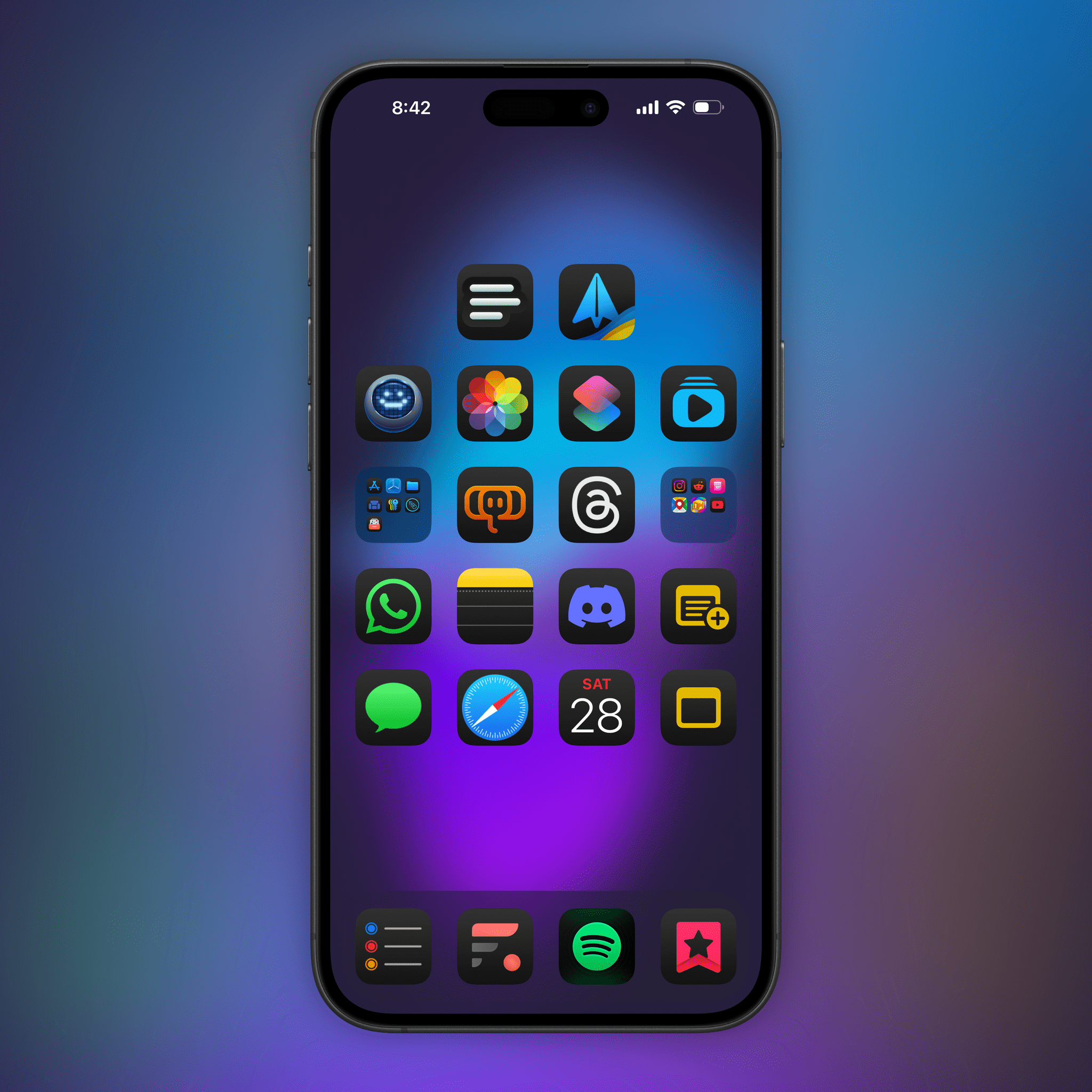
As you can see, I’m trying large icons in dark mode and there are some new entries in my list of must-have apps. The Home Screen is similar, but a bit more complex, on iPadOS, where I’m still fine-tuning everything to my needs.
I plan to write about my Home Screens and Control Center setup in next week’s issue of MacStories Weekly. In the meantime, I’m going to follow Lee’s approach and begin archiving screenshots in Journal.
Designing Dark Mode App Icons→
Apple’s announcement of “dark mode” icons has me thinking about how I would approach adapting “light mode” icons for dark mode. I grabbed 12 icons we made at Parakeet for our clients to illustrate some ways of going about it.
Before that though, let’s take some inventory. Of the 28 icons in Apple’s preview image of this feature, only nine have white backgrounds in light mode. However, all icons in dark mode have black backgrounds.
Actually, it’s worth noting that five “light mode” icons have black backgrounds, which Apple slightly adjusted to have a consistent subtle black gradient found on all of their new dark mode icons. Four of these—Stocks, Wallet, TV, and Watch—all seem to be the same in both modes. However, no other (visible) icons are.
Fantastic showcase by Louie Mantia of how designers should approach the creation of dark mode Home Screen icons in iOS 18. In all the examples, I prefer Mantia’s take to the standard black background version.
See also: Gavin Nelson’s suggestion, Apple’s Human Interface Guidelines on dark mode icons, and the updated Apple Design Resources for iOS 18.
How iPadOS 15 Ruined Chris Welch’s iPad Home Screen→
Chris Welch, writing for The Verge, covers an aspect of iPadOS 15 I also pointed out in my review: iPadOS 15 no longer keeps the same icon grid layout in portrait and landscape orientations, and, if you place widgets on the Home Screen, its density is reduced.
Welch concludes:
Some will see this as a very minor inconvenience and carry on with updating to iPadOS 15 for all of the other benefits. Since the App Library is now there, you can even go in the complete opposite direction and load your homescreens up with widgets everywhere and only a few app icons. If that’s you, don’t let me stop you. On the whole, it’s a very good release.
But I’m really hoping in a future software update, Apple will add a setting to restore the old layout that kept everything more consistent. It’d be even better if the company made the grid more customizable on the whole. If we’re letting people choose between new and old Safari designs, why not offer a choice between having more things on-screen or a less dense grid that’s better optimized for widgets? There’s already a “Home Screen and Dock” section in settings, after all. Letting you adjust the grid to your liking is something that Android phones and tablets already get right. It’s not a huge ask.
I think the point about customization is exactly right, and also why I’m not complaining about the ability to choose a layout in Safari. As iPads are used by a variety of less tech-savvy and more experienced pro users, it’s now increasingly challenging for Apple to cover the platform’s full spectrum of workflows with non-customizable features. Welch makes a great point about the Home Screen grid’s rigidity and lack of control; I hope Apple provides more options for this in the future, along with a denser grid if you have widgets placed on the iPad Home Screen.
Homescreen.me Adds Track, Follow and Notifications→
Homescreen.me, which we first covered in June, has today received a big update which significantly enhances the utility of the website. Préshit Deorukhkar writes:
Ever wondered how your Homescreen has evolved over time? What if you could go back in time and see which apps you were using a month ago? Well, now you can.
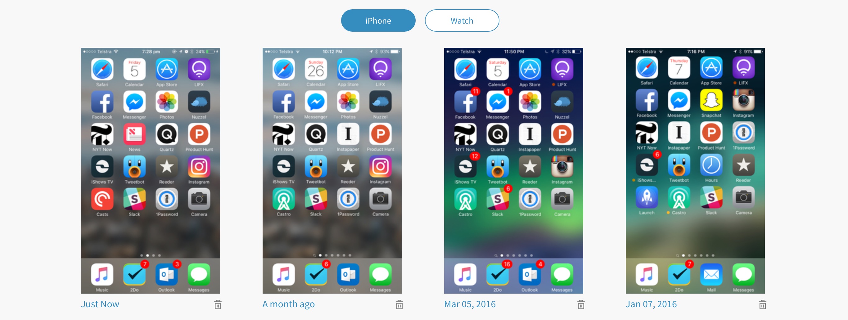
You can now browse all your Past Homescreens on the site. All the screenshots that you’ve uploaded since you signed up here are available for your perusal. So go ahead, take a trip down memory lane.
I love this feature, and although I’ve only uploaded four Home screens to Homescreen.me so far, I look forward to regularly uploading my Home screen and seeing how it changes over a longer period of time. I’m still hoping that the folks at Homescreen.me implement a reminder system that sends me an email once a month reminding me to upload a new Home screen. But until that happens, I’ve created a recurring reminder in Due.
The other big new feature to come to Homescreen.me is the ability to follow your favorite users. Home screens from the people you follow will appear on the Timeline page of Homescreen.me. Also, because Homescreen.me is a website that you may only visit occasionally, you’ll also get an email notification for when someone you follow posts a Home screen.
Homescreen.me: Upload and Share Your iPhone Home Screen
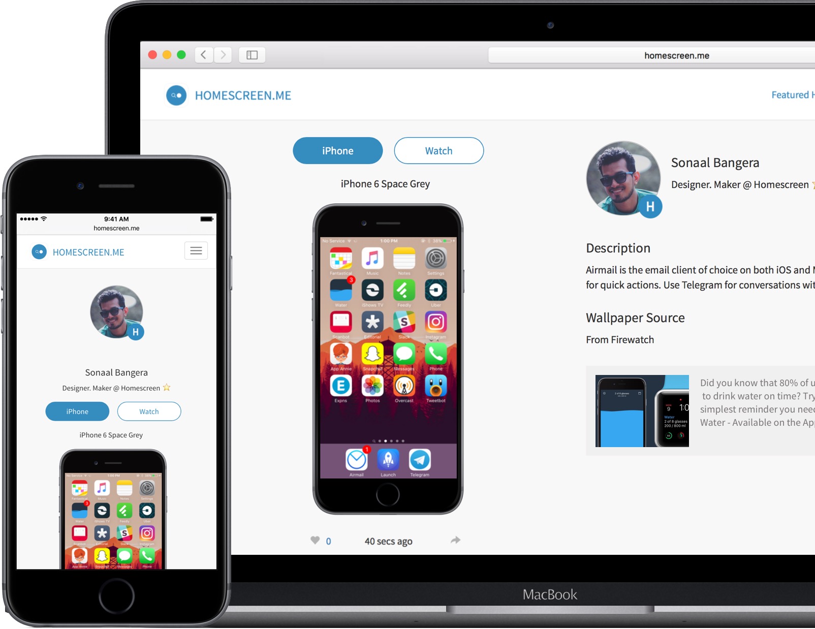
How different people arrange their iPhone Home screen is a natural curiosity for most of us with an interest in technology. We’ve featured Home screens in the vast majority of MacStories Weekly email newsletters, and it has easily been one of the most popular sections.
The iPhone has become an integral part of our lives, and seeing the apps that different people elevate to their Home screen provides insights into how they work and live their lives. But it also gives us the opportunity to discover new apps, find a new wallpaper, or re-think the layout and structure of how we organize the apps on our own Home screens.
If you find yourself curious about the iPhone Home screens of others, the relaunch of the Homescreen.me website might interest you. The basic pitch is that it allows anyone to upload and share their iPhone Home screen and Apple Watch watch face. The team behind Homescreen.me is also featuring the Home screens of different users, giving you the opportunity to get inspired and discover new apps.
A particularly nice touch with Homescreen.me is that in your profile settings you can choose which iPhone (model and color) and Watch (model) you own. This selection has an impact because the screenshots you upload will be superimposed onto the correct device. When you upload your screenshot you’re also given the option to provide a description, and a wallpaper source.