On the iPad, Reeder is my default app for RSS feeds reading. It’s so beautiful, fast, feature rich and, at the same time, elegant I don’t see myself switching to another application anytime soon. But our job is to try new apps and keep you in the loop, right? So when I stumbled upon the preview page of this new iPad app – ReadSquare – I was very excited to try the app and I started waiting for it to show up in iTunes.
Last week, the app was released as free for a limited time. It’s available here for download. But while I was looking forward to see the app in action and whether it could deliver on what the developers promised (what actually got me interested in the first place), I now have to admit the execution is, sadly, very poor.
In the announcement post, the developers wrote:
ReadSquare finds articles and saves them to your iPad. It finds them in three types of account, providing three kinds of recommended articles:
Google Reader: All the articles from sites you already read regularly.
Twitter: Recommended articles from sites you don’t normally read.
Facebook: Interesting articles from friends in areas outside your normal interests.
We relate articles together based on keywords and source. You can read everything about a topic, or from a person or site.
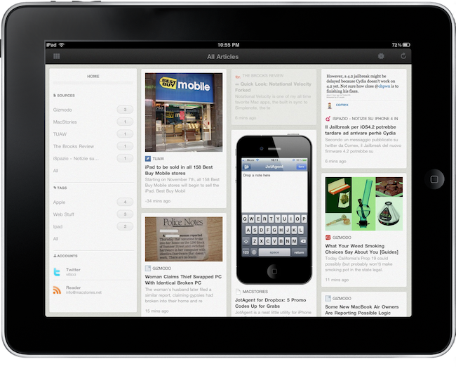
Even though I didn’t really get what the app was supposed to do and how did their algorithm manage to find recommended articles, I was intrigued. The app looked a little too much similar to Reeder in my opinion (the sepia background color, the top bar, the glyphs), but I really wanted to see the features in action. I downloaded the final version of ReadSquare a couple of days ago, and I’m very disappointed by the results. Sure, the app is free and when something’s free you can’t complain about it, right? Maybe, but I was looking forward to this and it’s my job to write about the lack of stability, features and user-friendly approach ReadSquare sports. The app basically asks you to log in with your Twitter, Facebook or Google Reader credentials, otherwise nothing will be displayed. Ok. To find the actual section to add an account, you have to tap on the settings icon in the top right, a sidebar slides in and here you can add your credentials to the three services. No confirmation message is displayed when you’ve added one.
That’s when I started to realize the thing wasn’t working. I put my Twitter info in the app, I hit save, nothing happened. I tried again and nothing happened, there were no articles to be seen on screen. So I thought Twitter was having issues, and I went on with Google Reader. Google Reader worked. Oh, by the way: to dismiss the account sidebar you can’t tap again on the settings icon. You either have to tap on a small arrow next to “Accounts”, or hit another icon to dismiss the entire sidebar. But you can also tap on another icon to enable the grid view…which is enabled by default and nothing will happen. Navigation is not intuitive and, to me, feels like it’s broken. Also: if you tap on an item in the sidebar such as a tag or a source, the app will automatically adjust to close the sidebar – you’ll have to re-open it every single time. Who beta tested this?
Anyway, Twitter is still not working for me – and I doubt the problem is that I don’t have any recommended articles. With 700+ people sharing links all day, I guess there should be a way to find some material for me. Perhaps Twitter changed something on an API level, maybe the app really doesn’t work…I don’t know. It just doesn’t pull articles from Twitter. Where it works, though, is in Google Reader. The app successfully manages to retrieve stuff from Reader, but it’s weird because it doesn’t get all my unread or starred items, it doesn’t sync and it looks just random to me. For instance, I have the same articles sitting in there since yesterday morning, and I did hit the refresh button.
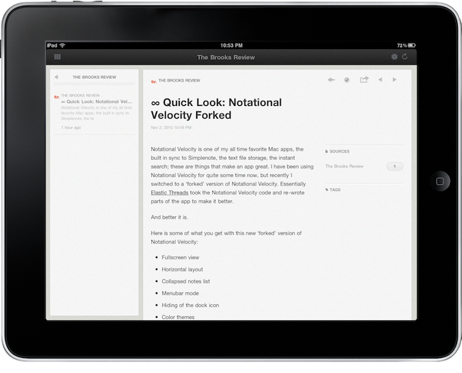
What happens with the actual articles is curious as well. You tap on a single articles and the full text slides in – very fancy. But here comes the mess again: there are some buttons above the article’s title I don’t really understand and are confusing at best. There’s a back button that doesn’t slide the post off again but acts on the sidebar – it doesn’t feel right. Then there are two more arrows to navigate back and forward, but if you go forward you can’t go back. Awesome. When you’re stuck in the article you’ve just gone forward to, you can’t tap on the former back button either as it won’t do anything. At this point you’re forced to tap on the icon to bring up the grid view or browse by tags in the sidebar which, you guessed it, will bring up another grid view containing posts with a specified tag. But who chose that tag? I don’t know. It’s magical.
Then, the UI. Whether it’s simple inspiration or something more than that, the app looks an awful lot like Reeder. I get it: Reeder is the best RSS app on the market and it’s an app many developers look up to. But getting inspired by its color schemes and overall feeling so much? I don’t know, but the similarity is in there. Users will notice it.
ReadSquare could have been great. If the developers had chosen the right beta testers and had paid more attention to important details like a simpler navigation, ReadSquare would have stood a chance against more popular apps. If the app had actually worked, this review would have been different.