Last week, Soapbox Software (Ben McCarthy and Aaron Vegh) released Indigo, an iPhone, iPad, and Mac app that offers a unique take on social media, allowing you to log into both Bluesky and Mastodon in a single app. In the increasingly fractured social media landscape we live in, it’s a fantastic idea. Instead of bouncing back and forth between two services that have a lot of overlap for some users, why not use just one?
This isn’t Soapbox’s first collaboration. You may recall Croissant, the cross-posting utility that I covered when it released in 2024. We were so taken by the app that we gave it the Best New App award in the 2024 MacStories Selects Awards. That pedigree shows in what is a much deeper and more complex app.
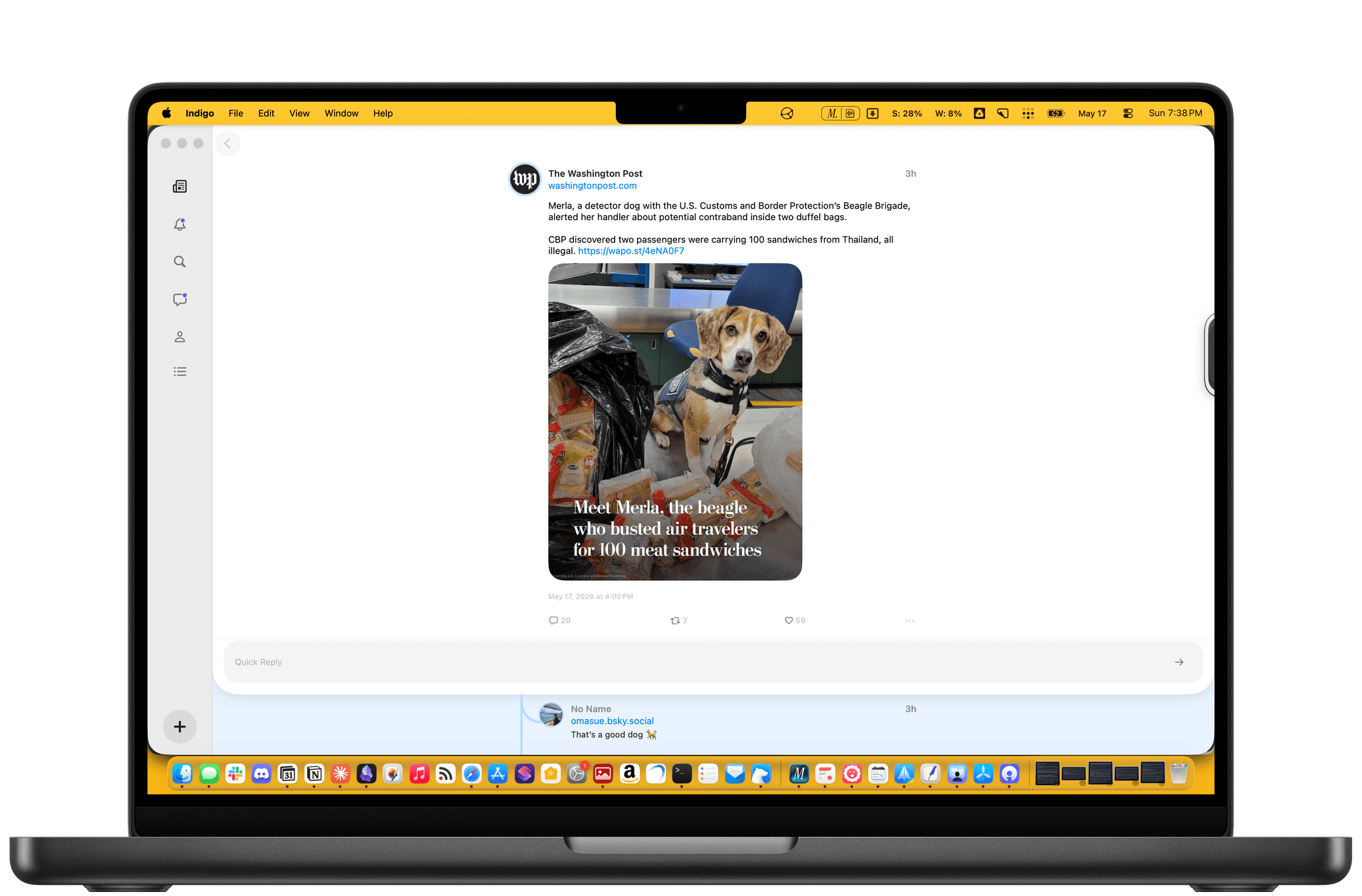
Like Croissant, Indigo lets you cross-post to Bluesky and Mastodon and is beautifully designed. But unlike Croissant, Indigo is a full-blown timeline app for simultaneously catching up on your Bluesky and Mastodon feeds at the same time.
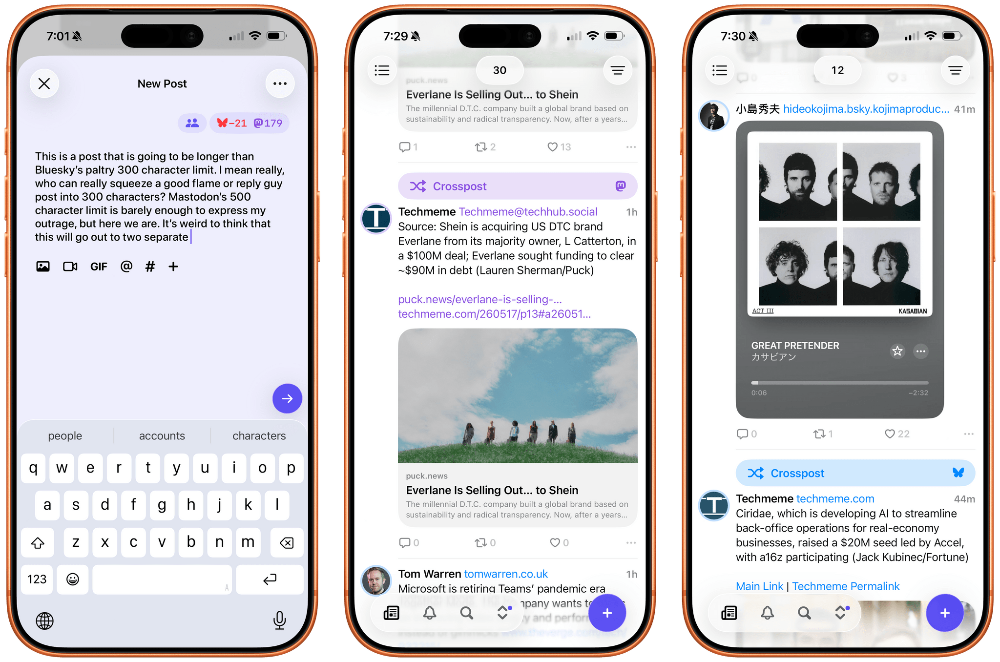
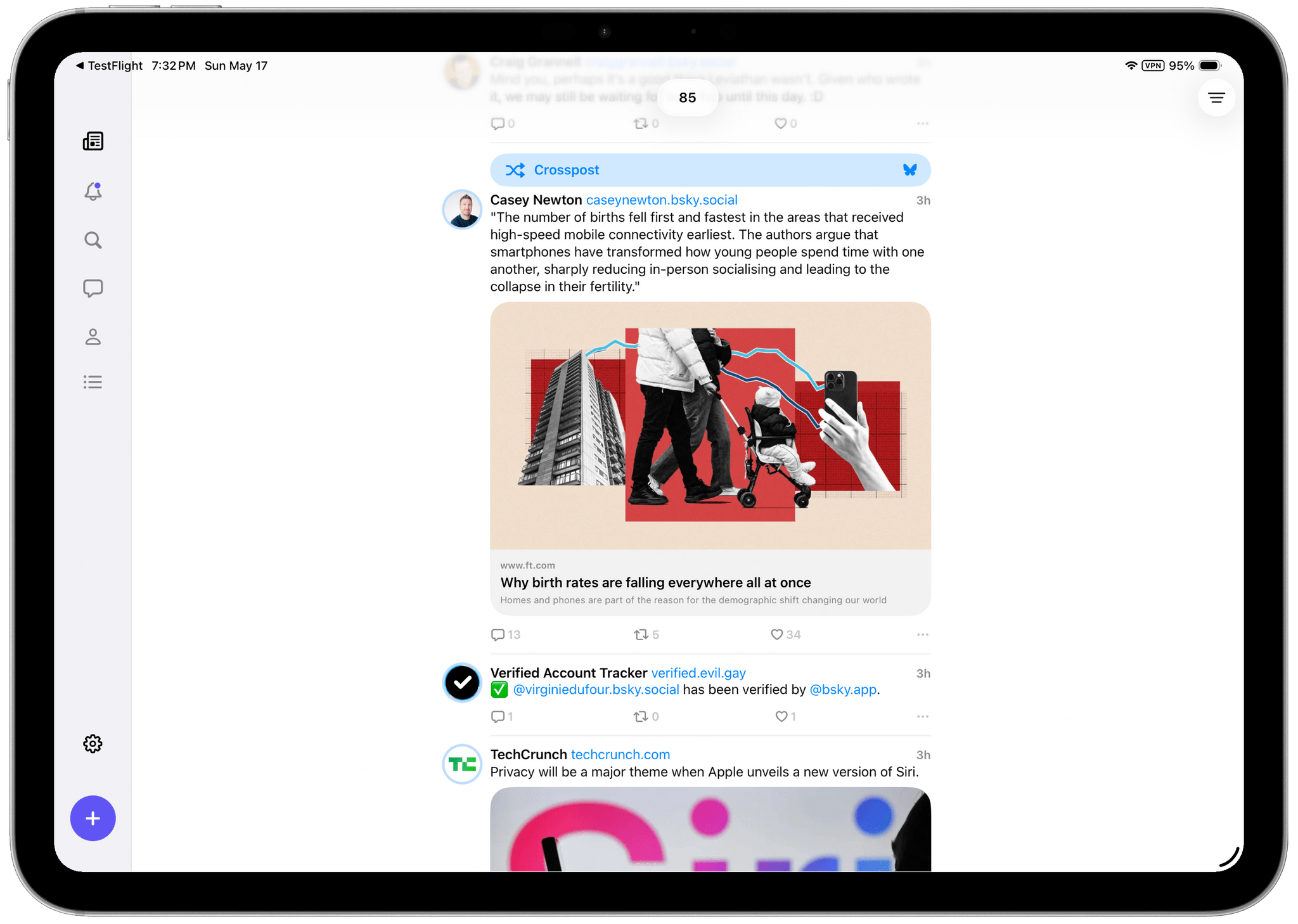
Depending on who you follow on each service, a mashup of the two has the potential to generate a timeline full of duplicates, but Soapbox took that into account with Indigo. There’s no need to change who you follow or make any other sort of adjustment yourself; instead, the app automatically detects duplicate posts and removes them from sight. However, if for some reason you want to see both, the duplicate post is always available behind the tap of a Crosspost button. It’s a great feature that alerts you to the fact that one of your timelines has been altered while also giving you the chance to check out the other post.
Other touches, such as the color of links, provide subtle clues to convey a post’s provenance, but the shades of blue and purple used are close enough that you might not notice the difference until you run across a Crosspost button. I also appreciate the separate character limit countdowns for each service on the New Post screen, which let you know when you’re going to have to forgo Bluesky for a chattier Mastodon post. Fortunately, the app lets you just post to one or the other service if you’d like by tapping on the character countdown.
All of the other core features you’d expect are available, too. Photos, videos, and GIFs are supported, as are @mentions and hashtags. You can filter who can see your post and who can reply to it, with some inherent differences in the underlying services’ support for those features. The app also includes search, notifications, direct messages, profile viewing, and a bunch of settings you can tweak. That said, power users of apps like Ivory may feel a little constrained in Indigo. It’s an excellent 1.0, but it doesn’t yet match the full functionality of Ivory.
Indigo strikes me as a good solution for a couple of different types of users. If you want a simple, beautifully designed way to read your Bluesky or Mastodon timeline, this is a great one. While the cross-posting and deduplication features are what will set Indigo apart for many, it works well as a standalone option for either service.
However, I expect the core audience will be people who use both Bluesky and Mastodon and follow many of the same people in both places. Especially if the people you follow cross-post a lot, Indigo greatly improves the experience.
I’ve enjoyed playing around with Indigo for the past few weeks and noticed a couple of things. Despite following roughly the same number of people on both services, the Bluesky accounts I follow are a lot chattier than those on Mastodon. I also have far fewer Crosspost buttons in my timeline than I expected. I guess I just follow very different accounts on each.
If you’ve ever felt the fatigue of jumping back and forth between a Bluesky and Mastodon timeline and found it hard to keep up with both, be sure to give Indigo a try. It makes the entire experience much nicer. You can download Indigo from the App Store on iPhone, iPad, and Mac and unlock its full feature set by purchasing the Ultraviolet tier, which costs $4.99/month, $34.99/year, or a one-time payment of $119.99.