Pushpin, a powerful Pinboard client that was recently updated to version 3.0, got its first major update to 3.1 today, which introduces more advanced functionalities to get the most out of Pinboard navigation, feeds, and saved searches.
For keyboard users, a big change is the addition of keyboard shortcuts to the app. As documented on Lionheart Software’s website, it’s now possible to scroll through bookmarks, open the editing view, toggle statuses, and select fields using an external keyboard. This makes Pushpin one of the most versatile iOS 7 apps with keyboard integration.
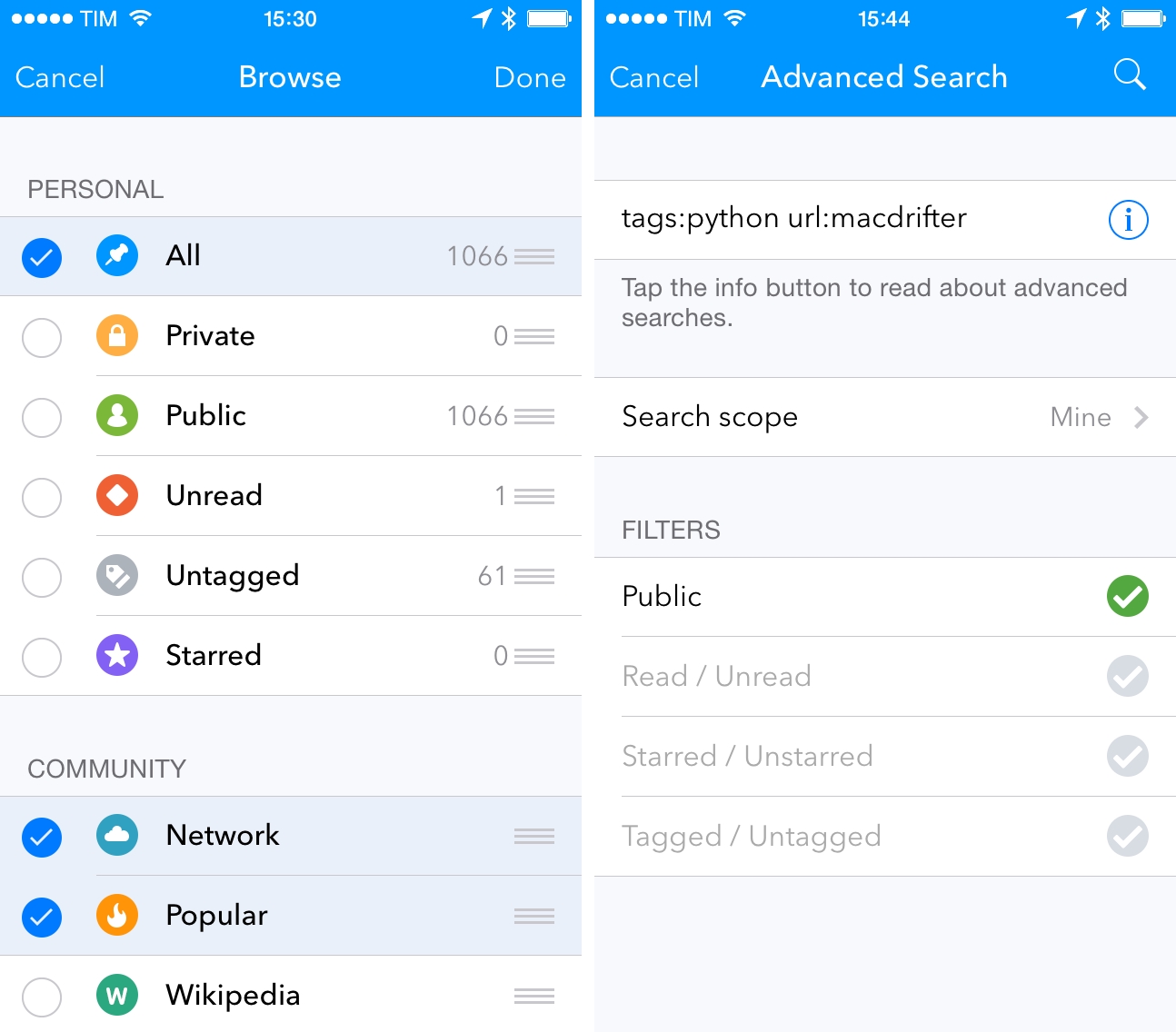
In my previous coverage of Pushpin, I noted the lack of customization for feeds and sections in the app’s sidebar, which forced me to keep certain items I wasn’t interested in – such as Pinboard’s Wikipedia and Fandom sections – always visible. In Pushpin 3.1, feeds on the main screen can be hidden and reordered; in combination with custom feeds for tags and users, Pushpin now has the most flexible main screen for users who want to tailor the Pinboard navigation experience to their needs – a solid enhancement if you use Pinboard as a news source more than a simple bookmark aggregator. In this version, Pinboard Notes make a comeback (although they’re still read-only due to a limitation of the Pinboard API) and there’s a new Recent feed to view all recent bookmarks from all Pinboard users.
For power users, an advanced search feature has been added, which can look for bookmarks that match specific criteria in a Pinboard account. Based off the SQLite FTS technology, advanced searches can be created with filters for URLs, titles, tags, and a combination (or exclusion) or multiple ones at once, opening up several options for searches that filter down specific results. The special syntax for advanced searches is limited to bookmarks for a configured account, which caused some confusion when I first tried the feature (it doesn’t work with Pinboard’s web search for public bookmarks).
With today’s update, Pushpin has become the fastest, most customizable, and most powerful Pinboard client on my devices. With feed reordering and keyboard shortcuts, I can now navigate Pinboard with ease on my iPad, removing feeds that I don’t need; overall, Pushpin has evolved into a fantastic, feature-packed Pinboard client with a clean interface and tons of options.
Pushpin 3.1 is available on the App Store.