I first reviewed Weather Line in October 2013. As I wrote:
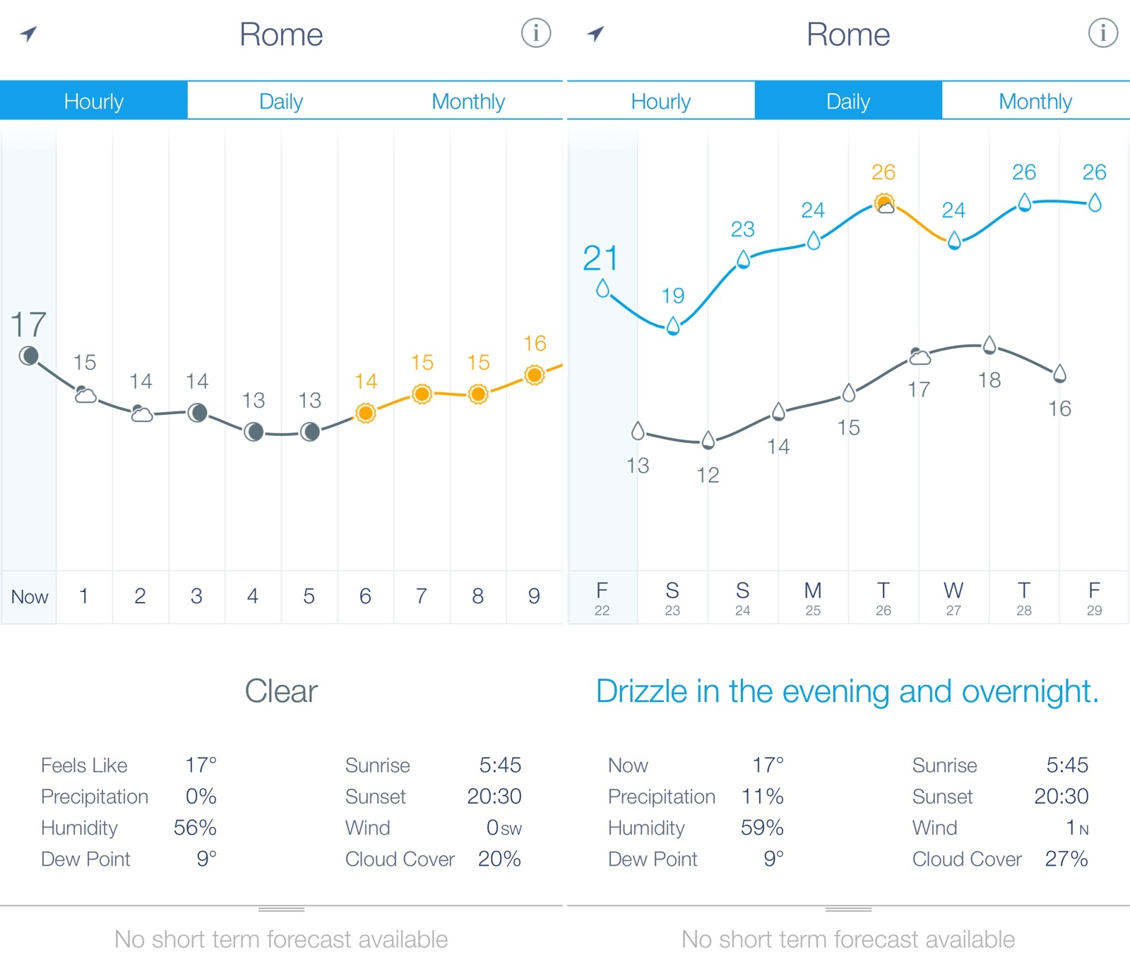
I see Weather Line as a combination of a casual weather app for the average user like me and a more advanced solution for the data nerd who wants to know numbers and other weather stats. By sitting somewhere in the middle of these two categories, Weather Line can appeal to both kinds of users thanks to its simple but effective design that uses a line to contextualize forecasts. I have been using Weather Line alongside Apple’s Weather, Yahoo Weather, and Today, and, while I still can’t settle on just one weather app, I have been enjoying Weather Line’s design and presentation.
Weather Line was last updated in November 2013, but, like many others, I kept using it throughout 2014 in spite of its lack of support for iOS 8 and the latest iPhones. Weather Line’s visualization of forecasts and temperature was just too good and its simplicity was unparalleled.
I’m happy to see that Weather Line is back with an update that properly supports iOS 8, the latest iPhone generation, and extended forecasts with more data. Weather Line was one of the first iOS 7 apps to truly take advantage of color in its interface to display different sets of information, and the app still looks and works great.
$1.99 on the App Store, and currently on sale. Recommended.