Ben Bajarin’s First Week With the Apple Watch

Ben Bajarin has a thoughtful take on the Apple Watch as a new computing platform that uniquely blends new hardware and software.

Unlike other tech reviews published today, he’s a fan of notification filtering done from the Apple Watch app on an iPhone:

The Apple Watch became my primary notification panel/dashboard. It is not only the most natural place to be notified and to decide what action needs to be done but, because the entire user experience was built for quick interactions, notifications may have found where they were destined to exist.

Apple allows for a tight filtering of the notifications you want to occur. By limiting what I want to be notified of, I ensured only the most important things — from email, to texts, to calls, and even relevant app notifications — are exactly what I want to be notified about. It ensures each notification is meaningful.

In a tweet, he also confirms that the Watch automatically adjusted its activity goals over the course of a week.

Permalink

John Gruber on Apple Watch

The first Apple Watch reviews are out today, and the first one I read was John Gruber’s.

Gruber, I think, has a done a good job at covering the Watch from the perspective of a traditional watch wearer and iOS user. His article has some great points about the Apple Watch compared to traditional watches, as well as the Watch as a new Apple device with an array of new features.

Here’s Gruber on the Watch as a watch:

I’ve worn a watch every day since I was in 7th grade, almost 30 years ago. I’m used to being able to see the time with just a glance whenever there is sufficient light. Apple Watch is somewhat frustrating in this regard. Even when Wrist Raise detection works perfectly, it takes a moment for the watch face to appear. There’s an inherent tiny amount of lag that isn’t there with a regular watch.

And on Force Touch and the Taptic Engine:

This is the introduction of a new dimension in input and output, and for me, it’s central to the appeal of Apple Watch. By default, Apple Watch has sounds turned on for incoming notifications. I can see why this is the default, but in practice, I keep sounds turned off all the time, not just in contexts where I typically silence my phone. Taps are all I need for notifications. They’re strong enough that you notice them, but subtle enough that they don’t feel like an interruption. When my phone vibrates, it feels like it’s telling me, Hey, I need you now. When the Apple Watch taps me, it feels like it’s telling me, Hey, when you get the chance, I’ve got something for you.

Highly recommended read.

Permalink

WALTR: Sync MKV, AVI, FLAC, MP3 to iPhone & iPad w/out iTunes or Conversion [Sponsor]

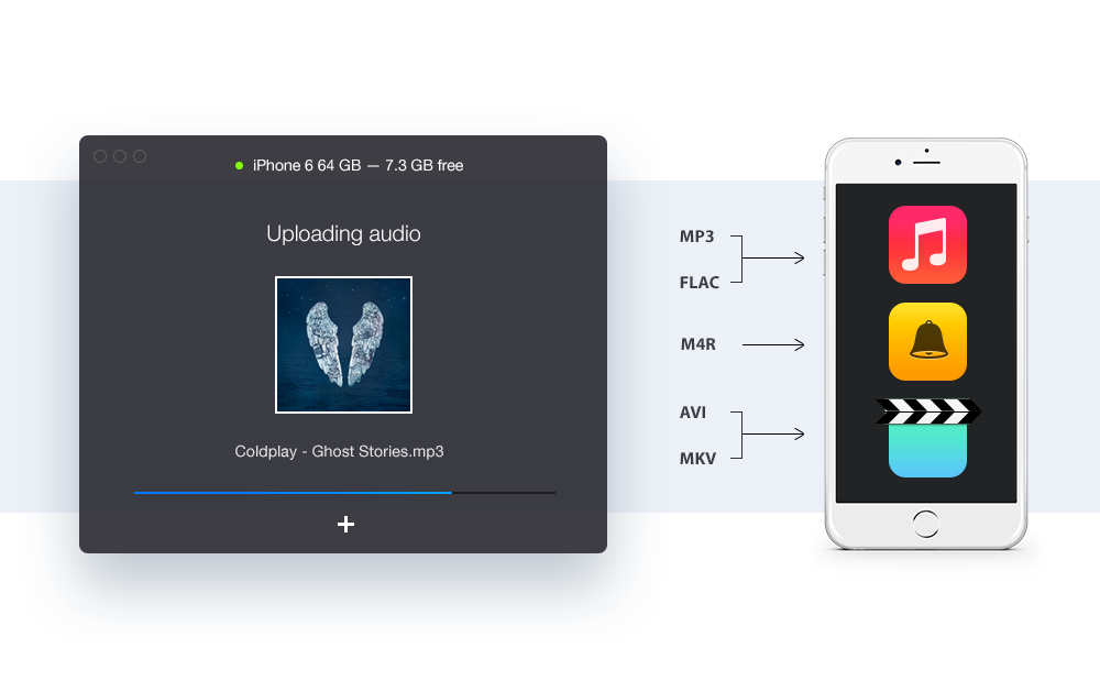
WALTR is a revolutionary OS X app that lets users upload and play unsupported formats such as MKV, AVI, FLAC & more – directly from the native Videos/Music app on iOS.

An incredible amount of innovation went into WALTR. Instead of uploading the limited file formats that iPad/iPhone & iTunes are compatible with, Softorino engineered a technology that allows users to upload and watch MKV, AVI, MP4 videos on their iPhone or iPad without having to convert the files before-hand. WALTR is the first Mac app that enables this – and it’s also the same app that discovered 4K video playback on iPhone 6.

With a name inspired by Walter White of Breaking Bad, WALTR has a simple UI based on drag & drop that doesn’t make you go through any extra steps, such as converting files beforehand or installing third-party iOS apps. You just launch the app, connect your device, drag a movie or audio file onto it and it automatically starts uploading to your iPad or iPhone. And that’s it. The developers have even made a super-quick but amusing demo video to show WALTR in action.

Users can download WALTR for free with unlimited trial for 14-days. A special discount is available just for MacStories readers: enter coupon code ‘SUPERSPECIALANDLONGCOUPONJUSTFORMACSTORIES’ at checkout, and you’ll get 33% off. A direct purchase link available here.

Our thanks to WALTR for sponsoring MacStories this week.


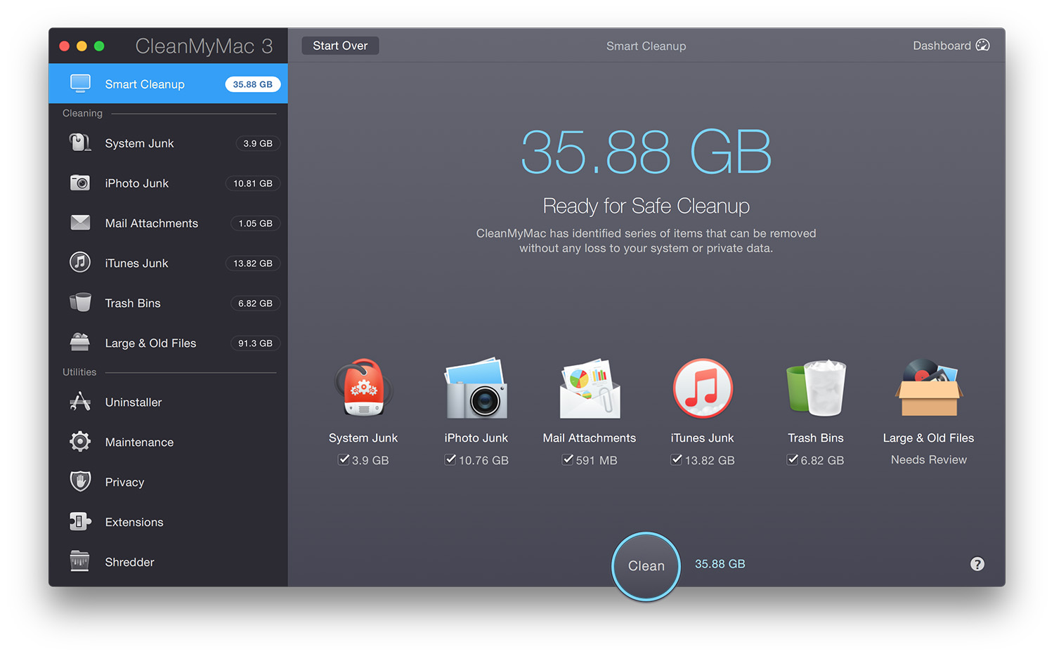
CleanMyMac 3 Brings Mail & iTunes Cleaning, Maintenance, and Privacy Features

Editorial Preview

MacPaw, the software company behind CleanMyMac, Gemini, and Hider 2, has today released CleanMyMac 3. This latest release of the Mac disk space ‘cleaner’ comes with a refreshed user interface that fits much better with the new design of OS X Yosemite, but it also includes new features that allow it to detect more unnecessary or redundant data, as well as some new maintenance and privacy features.

Read more


Connected: The Robocop of Apple Watches

This week, Stephen and Federico are joined by David Smith to talk about Tim Cook and WatchKit apps.

Last week’s episode of Connected was a good one, with special guest Underscore David Smith talking about Apple Watch and making Watch apps. You can listen here.

Sponsored by:

  • lynda.com: An easy and affordable way to help individuals and organizations learn. Free 10-day trial.
  • Screens: Access your computers from wherever you are.
  • Wealthfront: The automated investment service that makes it easy to invest your money the right way.
Permalink

Apple Launches Apple Watch Guided Tours

After confirming that pre-orders will kick off at 12:01 AM PT next Friday, Apple has launched a new webpage with guided tours for the Apple Watch.

To take advantage of its size and location on your wrist, we’ve given Apple Watch new interactions and technologies.These Guided Tour videos will show you how to use them to do all kinds of amazing things.

As the company did with the iPhone before, these short videos demonstrate the device’s UI, built-in apps, and user interactions. Right now, you can find videos for Messages, Faces, Digital Touch, and the general user interface of the Watch; more are coming soon.

Two details that stood out to me: Apple often says “press firmly” instead of “use Force Touch”; at one point, they clearly state that the Digital Crown is the equivalent of the click wheel on the iPod.

Permalink

Evernote for iOS Gets New Camera Mode

Speaking of scanning documents, Evernote released version 7.7 of their iOS app today, bringing a new “Scannable-inspired” camera mode that automatically detects document types. From the Evernote blog:

We learn a lot about what features work well and how people use them when we build products like Skitch and Evernote Scannable.

The successes of our stand-alone products can help quickly deliver improvements within our core apps like with this update to Evernote for iOS.

We’re very excited to debut an all-new, Scannable-inspired camera experience in the latest Evernote for iOS (update 7.7).

That’s not exactly reassuring for users of their standalone apps, though – the latest compatibility update to Skitch was in September 2014, and a feature update goes all the way back to June 2014 (version 3.2). I, like others, appreciate the simplicity of standalone utilities that are tightly integrated with Evernote, but the company makes it sound like these apps are more like experiments for features that are eventually added to the main Evernote app.

The new camera mode is nice – it’s the Scannable engine, only in the Evernote app. At this point, however, I’m curious to know if Scannable will suffer the same fate of Skitch, or if Evernote has plans to keep it as a standalone app with more functionality. Having the same features available in multiple apps from the same company seems confusing.

Permalink

Scanbot Adds Slack, Wunderlist Integration

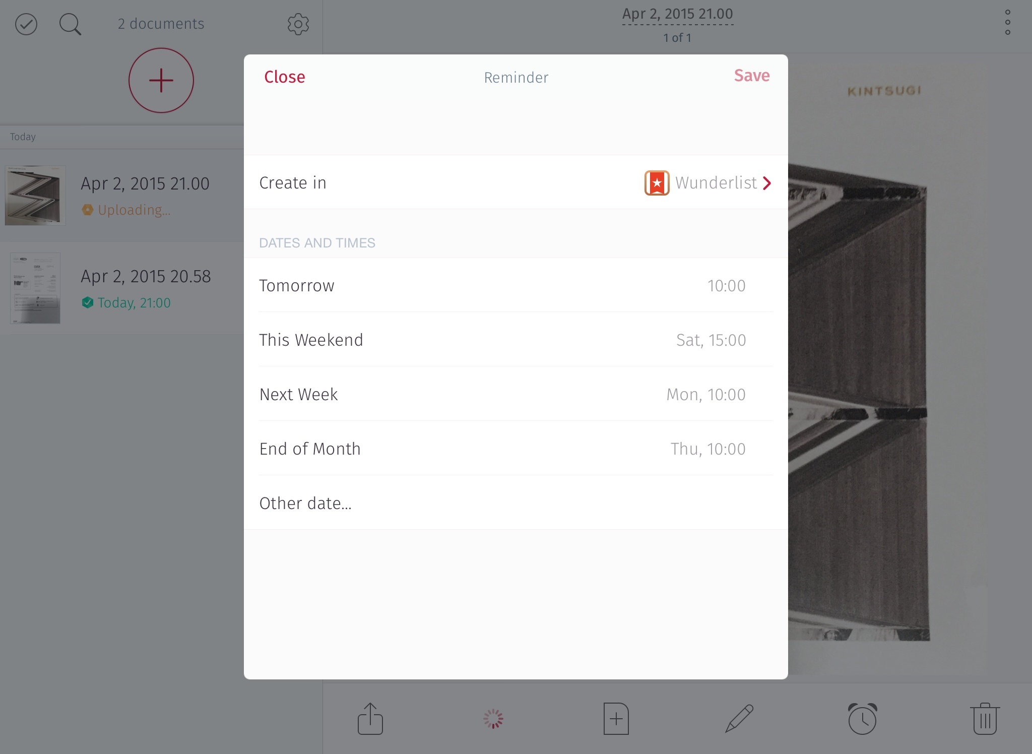
I’ve recently accepted the fact that I’m never happy with my paperless setup, and this freed me from the burden of feeling bad whenever I’m trying different apps to scan documents and archive them online. One of the apps I’m trying alongside Evernote Scannable is Scanbot, which has received some interesting updates over the past few months (such as themes and smart naming features). Today, Scanbot was updated with Slack and Wunderlist support, and I’m a fan of these integrations.

Read more


The Secret History of the Apple Watch

Good story by David Pierce at Wired on the history of the Apple Watch and the design process at Apple.

The article includes quotes from Kevin Lynch and Alan Dye, plus screenshots of the Apple Watch UI and San Francisco font. This tidbit caught my attention as it suggests Apple tested and discarded a timeline interface – one of the selling points of the Pebble Time.

As the testing went on, it became evident that the key to making the Watch work was speed. An interaction could last only five seconds, 10 at most. They simplified some features and took others out entirely because they just couldn’t be done quickly enough. Lynch and team had to reengineer the Watch’s software twice before it was sufficiently fast. An early version of the software served you information in a timeline, flowing chronologically from top to bottom. That idea never made it off campus; the ideas that will ship on April 24 are focused on streamlining the time it takes a user to figure out whether something is worth paying attention to.

Permalink