When Twitter rolled out support for longer tweets yesterday, we mentioned that Tweetbot – the popular third-party client – would soon support the new format natively. Tapbots has released updates to the iOS and macOS apps today that let you view and create longer tweets (where media, polls, and quotes don’t count against 140 characters) without having to rely on Twitter’s official app. You can get the iOS update here.
Tweetbot Updated with Support for Longer Tweets→
Apple Pay Arrives on Safari
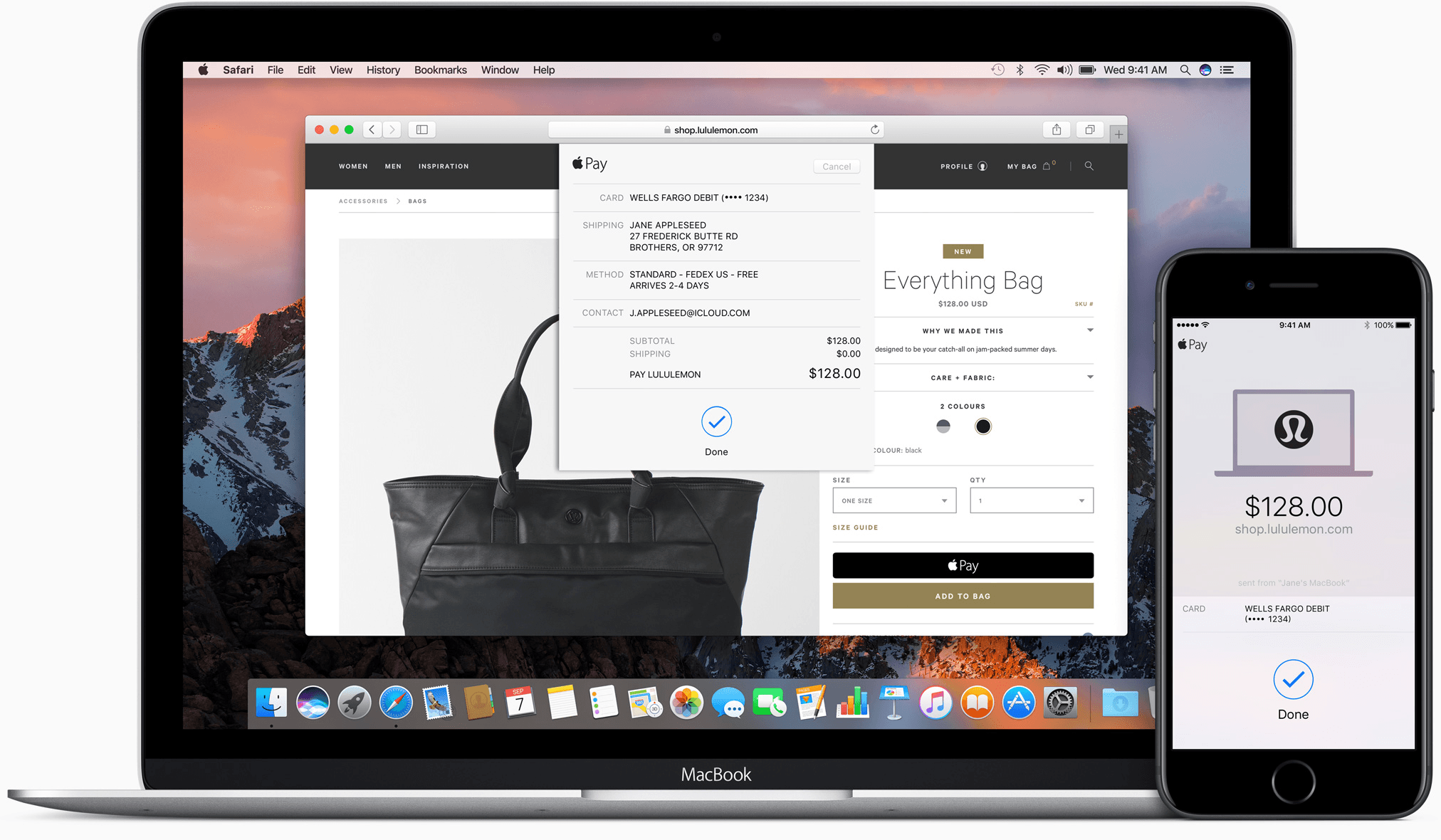
Apple Pay started with point of sale terminals and iOS apps. With iOS 10 and macOS Sierra, Apple has extended Apple Pay to include web-based purchases made with its Safari browser. Despite being limited to Safari, Apple Pay’s combination of simplicity and security has the potential to make it a de facto requirement for online retailers.
macOS Sierra: The MacStories Review
Messages
Messages in macOS Sierra did not get nearly the overhaul that its iOS counterpart did this year. In fact, the only changes that the messaging app received were the bare minimum amount to keep it capable of understanding messages sent from iOS users.
The updated Messages app is capable of receiving sticker messages coming from iOS devices, and it does its best to place them in the same way that they were placed by the sender. In my experience, between my iPhone, iPad Pro, and MacBook Pro, the MacBook has been the only one to sometimes have issues with misplacing stickers by short distances. Even a short distance can completely change the purpose of the sticker, so that aspect is a bit disappointing. I hope future updates will get the scaling worked out to place stickers with higher accuracy.
Sadly, Messages for Mac has no support at all for placing stickers on Messages. It’s not surprising that iMessage Apps aren’t going to run in the Mac version of Messages, but I see no reason why sticker placement should not have been built-in.
Speaking of features missing despite no technical limitations, Messages for macOS neither has support for sending nor even viewing messages sent with bubble or screen effects. The Messages app in iOS 10 has a whole set of effects that can be applied to sending messages, such as having them appear with lasers or balloons behind them, or having them “slam” into place when they’re received. Messages for macOS has no support for sending messages with these effects, but even weirder than that is the way the app receives them. Messages knows when it has received a message sent with a bubble or a screen effect, but rather than displaying the animation, the app instead just shows the message regularly and then adds a parenthetical underneath it describing what effect it was sent with. “(sent with Lasers.)” or “(sent with Slam Effect)” are examples of what it might say, but it varies based on the effect that was used.
The only effect that does work on Messages for macOS is the “invisible ink” effect, which obscures the text with sparkles that can then be moved out of the way to read it. On iOS, you clear the way by swiping across the message or tapping within it. On macOS your mouse just acts like a finger, and sliding over the message will reveal its contents.
The final new feature of Messages is the only one that works for sending as well as receiving: expanding links inline. If you send or receive a URL in Messages for macOS, the OS will grab the contents of the website or video behind the URL and expand a preview of the page’s content inline right in the app. If the link is to a video from a supported website, such as YouTube, the video will be available to watch directly within the confines of the Messages app. This is a great feature which other messaging apps like Facebook Messenger and Slack have had for a long time. It’s great to see it finally make its way to Apple’s messaging platform as well.
That’s it for Messages for macOS Sierra. With all of the fanfare and excitement over Messages for iOS 10, I was expecting quite a bit more from the desktop version. At the very least, the app should be able to play screen and bubble effects, but I think that the Mac should also get access to sticker packs and be capable of placing stickers. I hope Apple brings Messages for macOS back up to date quickly. I would hate to see their messaging platforms diverge when one of their greatest strengths has always been the availability of the same features across all Apple product lines.
iTunes

At this point, it’s starting to seem like no major update of Apple’s desktop operating system will be complete without iTunes getting some sort of slight design refresh. macOS Sierra is no different, marking another year in which the behemoth of an application continues to drag along, devoid of the disassembly that it sorely needs. For this year’s new paint job and minor feature bump, Apple has placed the spotlight on the Apple Music section of the app.
iTunes works more or less the same as it did last year, but now the For You, Browse, and Radio sections of the app have been updated to reflect the same new design language as the iOS 10 Music app. Mainly, this consists of extra bold headlines and large artwork.
If you’re an Apple Music subscriber, the For You tab has two interesting new playlists now placed prominently at the top of the screen: My New Music Mix and My Favorites Mix. As a whole, I haven’t been particularly impressed by Apple Music’s algorithmic and curated “for me” content over the last year. These two new algorithms, however, are a different story.
The My Favorites Mix seems to pick very close to the standard set of favorite songs that you listen to. In my experience, it’s been including about 60-70% songs that I listen to on a regular basis. The rest are all songs I do not listen to but which are by artists that I do listen to. I’ve been very much enjoying this playlist because it stays within my comfort zone while still branching out the scope of songs I listen to by my favorite artists.
The My New Music Mix playlist also takes your favorite songs into account, but in my experience it doesn’t include any of those songs themselves. Instead, it clearly tries to branch out a bit further than the My Favorites Mix. In the last few weeks of using this playlist, I’ve found that it generally contains about 25% artists that I listen to (although always different songs from them than I generally listen to) and 75% completely new music. It doesn’t hit the sweet spot quite as directly as the My Favorites Mix for me, but it’s not supposed to. By definition, this mix is supposed to help us find new music, and it’s not going to be able to do that without sometimes picking songs that we don’t enjoy. That’s what the skip button is for.
Back to iTunes, below the two new Mix playlists you’ll find recently played albums, followed by daily featured playlists and albums, then artist spotlights, and finally new releases at the very bottom. Overall, I like the new For You interface: it’s a lot more straightforward and less cluttered than the previous version. I’ve found myself going to use it more in this new update than I did throughout most of last year (on my Mac and on iOS).
If you’re wondering what happened to the Connect tab, it isn’t gone entirely. It has simply been demoted to a sub-section of the For You interface. At the very top of For You there are two tabs now. The default Recommendations tab has all of the above which I already touched on. Next to it is the Connect tab, which contains a grid of cards making up posts from any artists you follow.
Beyond For You, the Browse tab does what its name suggests. It has five tabs itself: New Music, Curated Playlists, Videos, Top Charts, and Genres. All of these are more or less self-explanatory, and nothing has changed since last year except for the bolder design that is seen across the Apple Music UI. The same can be said for the Radio section of the app.
Overall, the most interesting aspect of the changes to the Apple Music sections of iTunes are the introduction of the Mix playlists. If you check out nothing else about the new iTunes refresh (and you’re an Apple Music subscriber), make it those two weekly playlists. I’ve already found several great new songs and artists that I hadn’t known about in just a few weeks of the playlists being out.
Beyond Apple Music, the other big new feature of iTunes in macOS Sierra is the addition of official lyric support in the interface. Lyrics can be found via the Up Next/History button, which now has a new tab added for them. While iTunes will not be able to identify lyrics for every song, when it can find them it shows them in the popover window.
If you’re controlling your music via the iTunes MiniPlayer, you can see lyrics there too, although they’re a bit hidden. First, you’ll need to click the “…” button to open the dropdown menu, then from there choose ‘Show Up Next’. This will expand the MiniPlayer downward to display the songs coming up next, and you can then click the dropdown arrow next to ‘Up Next’ and change it to ‘Lyrics’.
The last step there might not be necessary, because the MiniPlayer’s selection will mimic that of the main iTunes window selection for Up Next, History, or Lyrics. However, regardless of which is shown or hidden, the button in the dropdown menu will always read ‘Show/Hide Up Next’.
iTunes does not have any fancy features for their lyric integration, such as highlighting which line is currently playing in a song as it goes. This is one advantage that user-driven services such as Musixmatch have over the first-party lyric features. In my personal experience, Musixmatch also seems to have a more comprehensive library of lyrics than iTunes does at this time.
Regardless, it’s great to have official lyric support in iTunes. I’m sure Apple will improve their database over time, and maybe at some point we’ll start to get more advanced features like those offered by other services.
The new iTunes update in macOS Sierra is fairly minor overall, but still manages to bring some nice improvements. Lyric integration is great to have in the official music app for macOS, and the new Mix playlists are fantastic additions for Apple Music subscribers. The new For You section in general is a bit more coherent too, which I appreciate.
At some point in the future, it feels like Apple will have to handle the unbundling of iTunes’ myriad of parts. The application now contains the interfaces for on-device music, Apple Music, iOS device syncing and management, the iTunes Music Store, the iTunes movie and TV show stores, Apple’s podcasts directory, the iOS App Store (yeah, that’s still embedded in iTunes, too), burning music onto discs, iTunes U… I could keep going, but I think you get the point. The application is very good at hiding all of these parts so that it doesn’t look as complex as it is, but all that really does is make it harder for people to find other features when they need them.
Someday, I will feel great satisfaction and joy as I finally get to write the story of The Great iTunes Deconstruction. Today is not that day.
Tabs
Here’s a new feature which will bring enjoyment to any tab lovers out there. In macOS Sierra, most document-based applications which have the ability to open new windows will now also have the ability to open those windows as tabs. Interestingly, the feature is going to work automatically for many third-party apps, requiring no work from their developers at all.
To control the tabs feature, there is a new setting in the Dock section of System Preferences. The default is to always open new windows as tabs when apps are running in Full Screen mode. You can choose instead to always open new windows as tabs (where possible) even when not in Full Screen, or to only ever do it manually. Most apps will allow this manual behavior through the familiar Command-T command, or if not then through the File menu. If it isn’t an option in the File menu, the app likely does not support the new behavior.
This isn’t a particularly far-reaching feature, but it’s nice to have choice for anyone who prefers the interface of tabs over that of new windows. Personally, while I think tabs are great for web browsers, I prefer separate windows most of the time for other apps. That said, if I ever do run an app in Full Screen mode, creating new windows as tabs is a far better experience than the alternative, which will create an entirely new Desktop for the window and then show a slow Desktop sliding animation as you transition over to it.
The actual interface of tabs in these apps is exactly what you’d expect from Safari, Terminal, and other apps that already had tabs. Most of the time, the standard key commands for moving amongst tabs still work (this may not be true in third-party apps which have assigned those key commands to other features), and dragging tabs around to reorder or create new windows from them has the same behavior as you’d expect.
Picture in Picture

Picture in Picture is an extremely welcome new feature in macOS Sierra. It comes in the form of a new button which shows up in the bottom right corner of supported video players.
Clicking on the button causes the video to pop out of its window into a smaller rectangle, which then floats on top of other content. The rectangle’s size can be adjusted manually to a maximum of a little less than 1/4 the size of the screen (on a 13” MacBook Pro). Moving the box around will cause it to snap to one of the four corners of the screen. If you want it to stay exactly where you place it without snapping, you just have to hold down the Command key as you move it.
There’s not much else to Picture in Picture. It is a simple feature that gets its job done well, and I’m excited to have it coming to macOS. I’ve been using Picture in Picture on my iPad Pro for nearly a year now, and it’s a great way to watch video while doing other tasks.
The last thing to discuss here is compatibility. While many websites will have the Picture in Picture button inserted by default into their video players, others will not. Unfortunately, websites which use customized video players, such as Netflix, are not going to have the Picture in Picture option without building support for it themselves 1. This means that we’ll have to rely on the developers of these websites to put in extra work in order to support the feature. Based on how long it has taken for iPad Picture in Picture support to be built into many apps, I wouldn’t expect these companies to move quickly here either.
Conclusion
macOS Sierra is not a game-changing update. It is an iterative improvement to the solid structure that is Apple’s desktop operating system. This is an operating system that is mature enough to only need such iterative improvements from here on out, building slowly on what came before and choosing carefully where it wants to go next.
Sierra proposes several brand new routes for the next steps of this operating system. The iCloud Drive improvements show Apple’s first moves toward a possible future where Macs can be backed up to and restored from iCloud as easily as iOS Devices. Optimized Storage is a glance in the direction of the idea of Macs with “boundless” memory; where data’s presence on the machine is fluid, and unnecessary for the the user to worry about.
Apple’s work on search in Photos could open many doors through the use of advanced computer vision and machine learning. Apple Pay on the web imagines a future without worrying about entering credit card information into insecure web pages. Nearly every aspect of Sierra is looking to the future.
Time will tell which of these new directions will pay off. We’ll revisit them next year for macOS 10.13, and see where Apple has continued to take them. While future updates may hold more excitement, macOS Sierra brings improvements without compromise. It is a solid addition to the foundation of macOS, and both the system and its users are better off because of it.
- Surprisingly, it’s possible to activate Picture in Picture mode on YouTube. You just have to right click twice in a row, which will cause a second menu to pop up that contains an “Enter Picture-in-Picture” option. ↩
Sketch Updated with Improved Vector Editing→
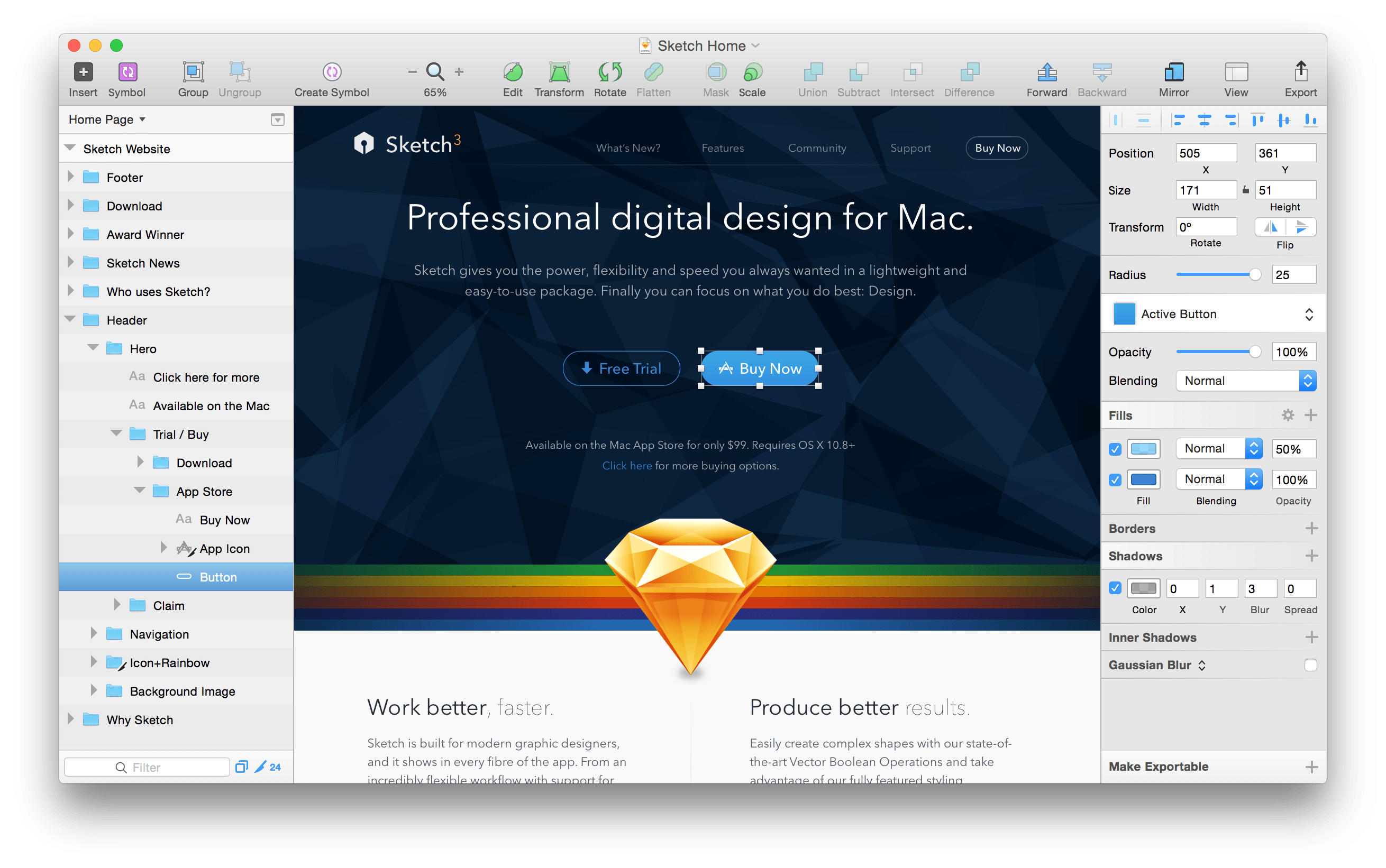
Bohemian Coding, the maker of Sketch, the popular vector design program, announced a significant update to the app today. Sketch 40, simplifies and improves the editing of complex vector shapes:
In Sketch 40, you can now simply press the Enter key on [a complex shape with multiple subpaths and points] to reveal all the points and paths contained within it, no matter how many layers are there. With multiple points selected, across different layers, you can adjust them at once without the need to select each layer individually.
Bohemian Coding also improved existing text transformation features, which are contained behind an Options button in the Inspector, by making them non-destructive. Complete release notes describing other enhancements and bug fixes in Sketch 40 are available here.
Sketch, which moved to an annual license model for upgrades in June, is $99 and available on Bohemian Coding’s website.
Daylite: A Business Productivity App for Mac and iOS [Sponsor]
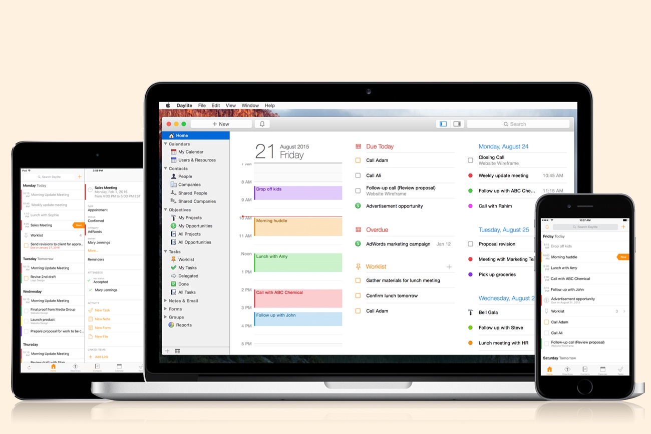
Daylite is a business productivity app for Mac, iPhone, and iPad.
Organize you and your team’s contacts, calendars, projects, tasks, emails, notes, and new business opportunities all in one app.
Track sales and set reminders for follow-ups. See a full history of all emails, calls, and notes for each customer. Customize your own pipelines to track sales and projects. View your whole team’s calendar to make scheduling meetings simple. Daylite even integrates with Apple Mail so you can update customer info, set tasks and reminders, and add appointments to your calendar – all without leaving Mail.
Automate lead generation from online web forms with Daylite & Zapier integration. When someone fills out a form on your website through Google Forms or Wufoo, a new contact and business opportunity are creating in Daylite. You can then segment leads for specific email campaigns and track all of your communication with them in Daylite.
Always have your business info no matter where you go. Daylite is a native app so you can access your information on your Mac, iPhone, or iPad even when you don’t have an Internet connection.
Read how businesses all over the world are becoming more efficient with Daylite.
Our thanks to Daylite for sponsoring MacStories this week.
Google Photos Introduces Movie Concepts→
In addition to improvements for sharing between users, Google has announced a new feature for Google Photos dubbed ‘movie concepts’. Automatically generated like the service’s previous slideshows and Assistant creations, movie concepts are based on “creative concepts” – themes found in your photos that go beyond recent uploads.
As Google writes:
We’re also upping our game when it comes to automatic creations. Google Photos has always made movies for you using your recently uploaded photos. Now we’re going further, with new movies that are based on creative concepts — the kinds of movies you might make yourself, if you just had the time. And they’re not only limited to your most recent uploads.
And:
Look out for a concept to commemorate the good times from this summer, and another one for formal events like weddings. And you don’t need to do a thing — these movies get made automatically for you.
Here’s an example of a concept created by Google Photos:
Casey Newton, writing for The Verge, has more details:
Tim Novikoff, who joined Google last year when it acquired his video-editing company, Fly Labs, said the feature takes advantage of Google’s advancements in deep learning and computer vision. The idea, he said, was “let’s leverage this to make movies that are emotionally powerful — that make your really smile, or even make you cry and reminisce and show your family.”
More concept movies are planned. “You can imagine where this goes,” Novikoff said. “Christmas, Halloween, Thanksgiving, Little League highlights, dance recitals. All the things that people do, we can make special movies around them.”
The new feature comes less than a week after the launch of iOS 10, which includes Memories – a feature of Apple’s Photos app that creates personalized movies based on location, dates, and people recognized in your photo library. From Google’s description and Novikoff’s comments, it sounds like movie concepts will be more advanced than iOS’ automated creations, but we’ll have to test them in practice and see if the promise holds up. I’m curious to compare Apple’s Memories to Google Photos’ concepts.
Google Trips Debuts on iPhone

Google launched a free trip planning app called Google Trips today with a deep set of features that work online and off. The motivation for the app was described by Richard Holden, a Google vice president of product management, to Casey Newton of The Verge in an interview:
We’re doing a great job on the planning stages, but we really need to help consumers when they’re actually at their destination.
I have spent a short time with Google Trips and it looks like Google has delivered.
After signing into Google Trips with the Gmail account I typically use to make travel plans, Trips showed an upcoming trip to Austin and past trips going back to 2008. Tapping on a trip opens a page with buttons to view any reservations the app finds in your Gmail, ‘Things to Do,’ ‘Food & Drink,’ and ‘Saved Places,’ which are any destinations you mark with a star as you browse through Trips’ suggestions.

Trips’ recommendations are further divided into categories like ‘Top Spots’ and ‘Outdoors’ for activities, and restaurants, cafes, and places near where you are staying for food and drink suggestions. Results can be viewed in a list view, where each item can be tapped to view more detail, or on a map. A toggle on the first page of each trip gives you the option to download the trip, a handy feature if you are traveling internationally and want to limit your data use.
Of course, to get the most out of Google Trips, you need to log into it with a Google account. If you are uncomfortable with Trips scanning your Gmail and search history to customize what it presents to you, Trips is probably not the app for you.
Google Trips is an iPhone-only app and is available as a free download on the App Store.
Twitter Reclaims Space for Text in Tweets
Update: As noted below, the changes to how the Twitter character limits are counted are available to third party developers. MacStories has learned that Tweetbot and Twitterrific will both be updated soon to support the changes to Twitter’s APIs.
 and Twitterrific will soon be updated to implement the changes to Twitter's character limits.")
Tweetbot (pictured in screenshots) and Twitterrific will soon be updated to implement the changes to Twitter’s character limits.
Twitter began rolling out changes that take back space for text in tweets. As Twitter has gradually become a multimedia experience full of images, GIFs, videos, quoted tweets, and other things, each has encroached on the 140 character limit of a tweet leaving less room for text. That just changed.
https://twitter.com/twitter/status/777915304261193728
With a tweet today, Twitter began to roll out features, first announced earlier this year, that exclude certain things from the 140 character count limit. Users will still be limited to 140-character messages, but, as first reported by The Verge last Friday, media attachments (including images, GIFs, videos, and polls) and quoted tweets will no longer count against the 140-character limit, making more room for text.
James Corden Stars in New Apple Music Ad

Airing for the first time last night during the 2016 Emmy Awards, Apple debuted a new extended 2 minute advert for Apple Music featuring James Corden.
The tongue-in-cheek advert sees a serious Corden attempt to pitch ideas for an Apple Music advert to Apple executives Jimmy Iovine, Bozoma Saint John, and Eddy Cue. Corden’s ideas range from the bizarre, with Corden impersonating famous musicians, to the melodramatic, swimming through 40 million Apples. The trio of Apple executives rebuff Corden’s extravagant ideas, simply pointing out that Apple Music is available offline, that there are over 40 million songs, and playlists are handpicked for users.
This is not Apple’s first collaboration with Corden. Earlier this year Apple bought the Carpool Karaoke scripted TV series which was based on the segment that began in the The Late Late Show with James Corden. Corden also appeared with Tim Cook in a Carpool Karaoke skit for the opening video of Apple’s September 6 keynote earlier this month.